VisualizeR
Contents
Background
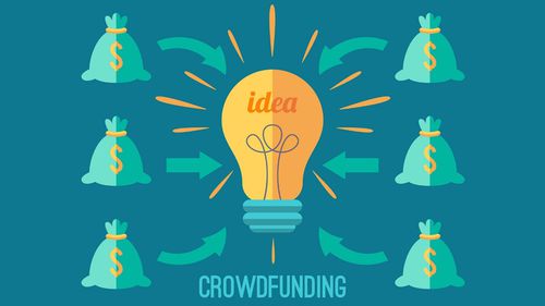
Crowdfunding is the practice of using small amounts of capital from a large number of individuals to fund a project or venture typically through the Internet. Crowdfunding makes use of the easy accessibility of vast networks of friends, family and colleagues through social media websites like Facebook, Twitter and LinkedIn to get the word out about a new business or campaign and attract investors. Mobile Apps are a popular growing medium along with the above mentioned social media websites for helping campaigns and projects to publicize and seek funding for their work. Campaigns can range anywhere from technology, business, nonprofit, political, charity, commercial, or financing for a startup. With the rise of such online platforms allowing people to easily create campaigns, crowdfunding has emerged as a particular area ripe for research. In the dataset for this paper, the proportion of successful campaigns ranges anywhere from 5% to 10% depending on the category.
About the Dataset
BootLoader is a mobile app that helps people crowdfund their creative projects. Anyone with an idea, dream, and 2-minute video can post their project on BootLoader. Others then donate money to the project to help bring it to fruition. Dennis Ridesalot, a BootLoader user, has a new concept for a 3-speed bicycle made from recycled parts with a $20 price point. The BootLoader team wants to send a push notification to their users, prompting them to fund the project. However, they don't want to send a message to all of their users--only those who they think would be interested. As a data expert at BootLoader, we have to create a visualization that helps answer: what kinds of users would be interested in the bicycle project? Based on the outcomes of visualizations/data science, we can then send push notification to segments of users, based on attributes like location, age range, gender, and mobile device. For example, a push notification to all iOS users in Chicago, IL that says "Deep dish lovers unite! Help fund the largest pizza in the world on BootLoader."
Objectives
As an area of analysis, crowdfunding has largely featured literature that focused more on predicting the success/failure of campaigns. However, as a field of visualization, the data has relatively been left untapped; most visualizations that exist simply show the accuracy of these prediction algorithms.
Our objective here is to create an interactive visualization that would help us answer what segments of users would be interested in the specific project (Health/Environmental/ Technological/ Sports/Politics, etc.) that the app launches. Usage of clustering algorithms will drive the finding of patterns on segments/users as well as predictive algorithms to find the right segment of users who would fund or endorse the project that the app is trying to publicize. Both researchers of crowdfunding and group behavior as well as people interested in starting their own campaigns can benefit from such tools as they can utilize these visualizations to make better sense of the data. Because of this emerging domain, the visualizations explored would just be the beginning of what can be an ever-increasing domain of research and analysis for this growing field.
Questions to be answered from the data are:
- Which potential users are suitable for each project category to fund the projects?
- Where the potential donators are coming from for the proposed projects?
- How much potential amount of money donated for new proposed projects?
Approach
- Provide the capability to convert JSON/TXT/etc. based data files to CSV/EXCEL for further analysis.
- Provide visualization catalogue for EDA and Analysis.
- Provide the capability to perform basic data exploration to understand the levels and frequencies for categorical data; min, max, median, SD, quantiles for continuous data.
- Provide the capability to remove any outliers the user deems unfit for further analysis.
- Provide the capability to apply machine learning algorithms - unsupervised (for finding clusters/patterns) as well as supervised (for predicting logistic regression or SVMs for finding the potential new funders.
- Provide the capability to visualize the algorithms.
- Communicate the interpretations/findings/conclusion of the above work.
Visualization Plan
-
Expected Challenges
- A lot of data manipulation and sub-setting will be needed to make different specific plots in ggplot2/plotly in R.
- Complicated codes will be involved for building layers in ggplot2/plotly and generating interactive maps visualization in R shiny.
- There would be noises in the data that need to be determined and addressed carefully to satisfy the assumptions of the algorithms.
- Visualization for algorithms would be difficult.
Timeline
-

