ISSS608 2016-17T3 Group15 Report
|
|
|
|
|
PandemViz: An interactive analytics tool for understanding pandemic outbreaks through data visualisation
By Chua Gim Hong, Huang LiWei and Ngo Siew Hui
Contents
Abstract
A pandemic is an epidemic or outbreak of infectious disease that spreads rapidly not only to many people, but across countries. The unprecedented mobility of people and food over the last 30 years has seen a steady increase in the frequency and diversity of disease outbreaks. No country is immune to this growing global threat. Scientists are predicting that it is not a matter of if, but when the next pandemic will happen. Singapore, as a small city state, with the highest population density in the world and one of the highest air passenger traffic, is particularly vulnerable.
There are reasons to remain optimistic, as Singapore’s SMART Nation initiatives and modern healthcare systems’ electronic records have open up new possibilities in the fight against potential infectious disease outbreaks in the country. Data will be increasingly ubiquitous as the world, including Singapore, continues to make significant advancement in the digitalisation age. Insights from the data have the potential to offer a critical line of preparedness needed through early identification, rapid effective response, and containment of disease outbreaks. To leverage on this increasing availability of data, we will need appropriate and affordable data exploratory, visualisation and analysis tool.
In view of this, our project aims to develop an interactive visual analytics tool, PandemViz, using R Shiny and R data visualization packages such as calendar heatmap and trellis plot. PandemViz will be useful for understanding pandemic outbreaks through data visualisation. In our development, R programming will be used to analyse a synthetic dataset (i.e. computer- and human-generated data) relating to a major disease outbreak that spanned several cities across the world in 2009. In an actual disease outbreak scenario, PandemViz can potentially be used by health officials to analyse the hospitalisation data to understand the spread of the pandemic across countries so as to mount effective responses as part of overall efforts to contain the pandemic.
This presentation consists of four main sections. First, the motivation and objectives of the project will be discussed. This is followed by a detailed discussion on the principles and concepts of key visualisation methods used. After which, the R packages used to develop the application and the user-interface designed will be discussed. Using the synthetic dataset, we will demonstrate how the functions of our tools can be used to detect the patterns and attribute distributions that characterize a pandemic spread. The efficacy of each of these visual analytics techniques will be discussed in detail. The presentation will conclude with a sharing of valuable insights gained through working on the project and potential application areas of our visualisation tool. We will also suggest possibilities for future works by combining hospital records with other data sources.
[VAST Challenge 2010 - Characterisation of Pandemic Spread]
Motivation of the application
There are various perspectives that motivates our application:
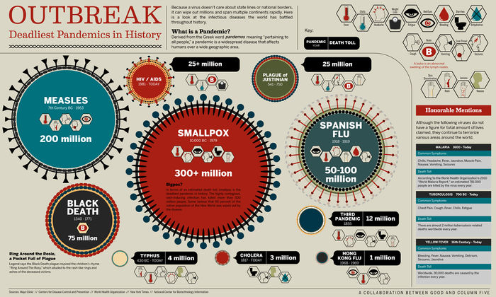
1. Epidemiological. Figure xx shows the staggering number of deaths caused by pandemics throughout history, not to mention the millions of suffers who survived the ordeal. A pandemic is an epidemic or outbreak of infectious disease that spreads rapidly not only to many people, but across geographical areas. Many pandemic experts, believe that a pandemic would occur sometime in the next two generations.
Figure xx – Outbreak of Pandemic in History. (An infographic from a partnership of Mayo Clinic, Centres for Disease Control and Prevention, World Health Organisation, New York Times and National Centre for Biotechnology Information. https://www.good.is/infographics/infographic-the-deadliest-disease-outbreaks-in-history)
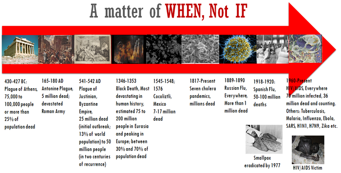
The enemy is microscopic, but the effect is devastating. In some cases, a part or whole of a city was wipe out (see Figure xx). Epidemiologists are bracing themselves for what has been called the next "Big One" - a disease that could kill tens of millions of people.
Figure xx - A time perspective of deadliest pandemic outbreaks in history
Review and critic on past works
Design framework
A detail description of the design principles used and data visualisation elements built (Refer to Section 3: Interface of this paper [1].
Demonstration
Sample test cases
Discussion
What has the audience learned from your work? What new insights or practices has your system enabled? A full blown user study is not expected, but informal observations of use that help evaluate your system are encouraged.
Future Work
A description of how your system could be extended or refined.
Installation guide
including hardware configuration and software integrationn. Sample Installation Guide
User Guide
Step-by-step guide on how to use the data visualisation functions designed.
References


