ISSS608 2016-17 T3 Assign ZHOU YUHUI Data Preparation
|
|
|
|
|
Data Preparation
0.Observe The Data
Before starting any data preparation or data analysis, I find it necessary to closely observe the dataset itself first. Here are some points I would like to discuss after observing the data:
1) Car ID is a one-time ID only
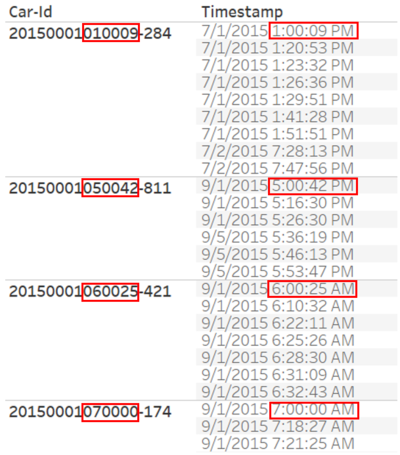
The Car ID in this dataset is not an identifier for each car, but for each trip of one car. In other words, if the same car enters and exits the park twice, it should have 2 Car IDs. This is because I found that the last 6 digit of the Car ID are exactly same as the time of timestamp.
This should make it easier for us to analyze the pattern of cars as we do not need to make extra efforts to separate multiple trips of one same car. Also it makes it easier to spot those suspicious ones.
2) Observation Period:
The Observation Period is from May 2015 to May 2016. There are altogether 13 months in the observation period, May counted for twice. Therefore when using “month” as a time dimension, we should also look at the year, otherwise it would be misleading.
3) Rangerstop0 and Rangerstop2 are not restricted gates
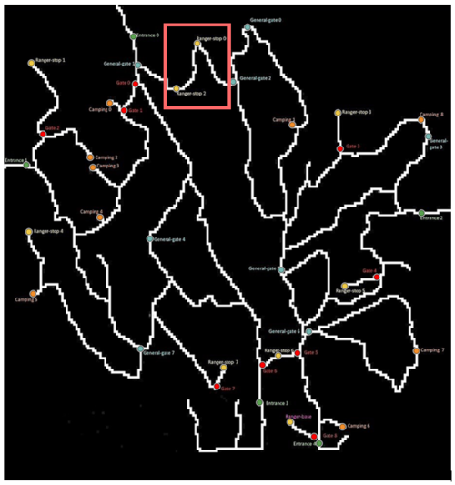
As mentioned in the Data Description, “Ranger-stops. These sensors represent working areas for the Rangers, so you will often see a Ranger-stop sensor at the end of a road managed by a Gate. Some Ranger-stops are in other locations however, so these sensors record all traffic passing by.”
According to the map, ranger-stop 0 and 2 are those which record all traffic passing by, thus they don’t represent restricted areas.
1.Data Preparation
1) Per Timestamp Level data preparation:
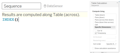
Sequence Number: Per Car ID, label the sequence number of each gate it visited.
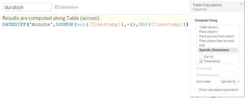
Duration: Calculate the time it takes for the car to move from one gate to the next.
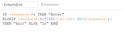
Enter/Exit/In: Label every row as “Enter” if it’s the first timestamp of a Car ID, “Exit” if it is the last timestamp of a Car ID, “In” for the rest.
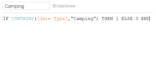
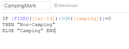
Camping: Mark each row whether it is at a campsite or not.
2) Per Car-ID Level data preparation:
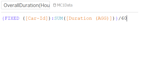
Overall duration: calculate each car’s overall time spent in the park.
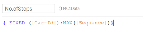
Overall No. of Stops: Calculate no. of stops each Car ID has made for the whole trip in the park.
Camper or Not: Label each Car ID whether they have any camping record or not.
Overnight or Not: Label each Car ID whether they stay in the park overnight or not.
Behavior Type: Group all Car IDs into different Behavior Types according to their attributes.
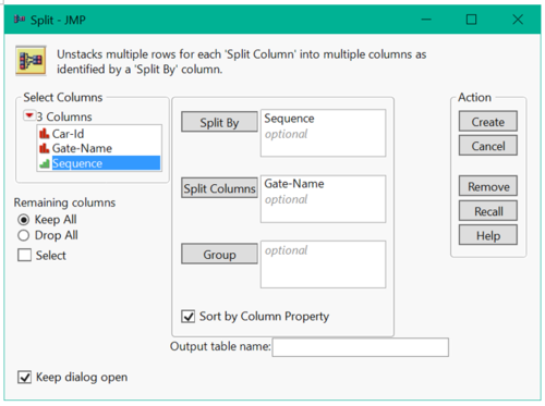
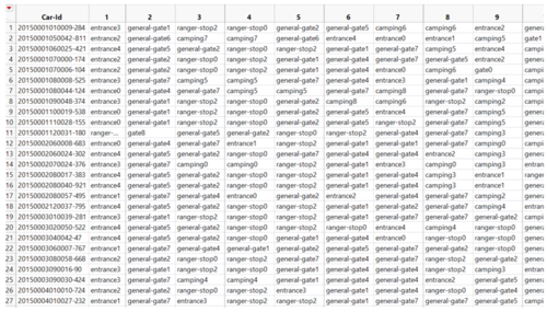
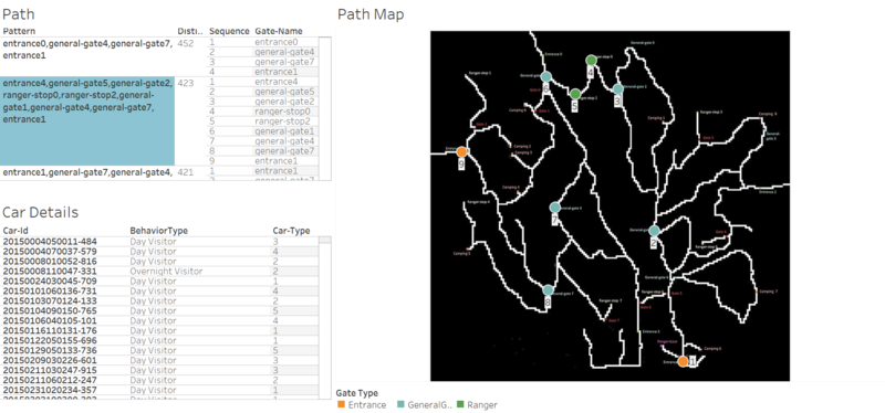
Transform data into path format: Use “split” function to make data into one row per Car ID.
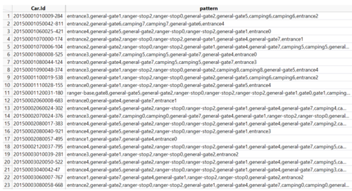
Import data into R, use “paste” function to merge all gates into one column that forms the path for each Car ID.
Get the output as below:
Methodology of Visualization
Scatter Plot
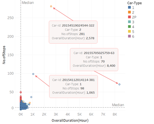
No. of Stops VS Overall Duration
X axis – Overall Duration; Y axis – No. of Stops.
Basically, overall duration and no. of stops should be highly correlated. I used scatterplot to find out those outliers whose no. of stops or overall duration are extremely high or not correlated at all.
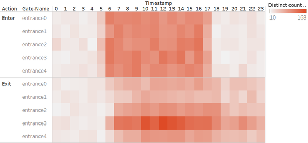
Heatmap
Heatmap is a good method to visualize multidimensional data. I used heatmap for the following visualizations:
Distinct count of Car-IDs per day in calendar format. By looking at the color, we can easily tell : 1) generally which month got higher number of visitors, which got lower; 2) more specifically which days got extremely high number of visitors.
Entrance/Campsite Customer Flow by Hour: To look at the time(at hour level) at which cars enter and exit an entrance/campsite, we focus on short period pattern, which is daily pattern. The color can tell which entrance/campsite at which time of a day, got how many number of customers for which purpose(enter or exit).
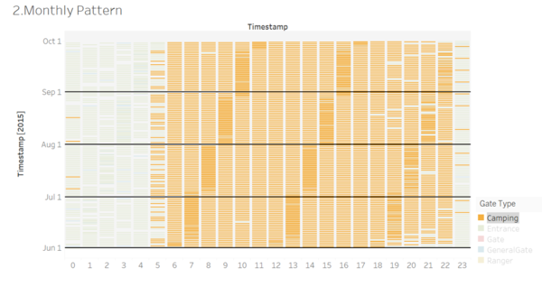
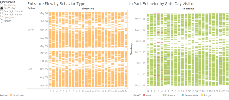
Gantt Bar
Gantt bar can visualize large number of data points at same time, without summarizing. Each gantt bar represents one data point only. The more compact the Gantt bars are, the more data points there are. It is helpful for us to find out patterns within a large group of data points. Just focus on any compact bars appearing and there is high chance that some special pattern is there! Another advantage of using gantt bar is that outlier could be easily detected. Rare records would easily pop out from blank area.
Patterns over period: Color by Gate Type/Gate Name, to see if there are any compact bars showing up on a regular basis. If yes, there shall be some event held regularly.
Behavior Detail by Behavior Type: zoom in on each behavior type. First, color the bars by behavior type to see what time they enter and exit the park. Second, observe their own ways of traveling around the park by coloring the bars by gate type.
Map Background
Visualize the path of the cars on the park map to get a clearer idea of how the car travels

