Data Visualizations Q1 Sumalika
Data Visualization:
Dataset: Sensor Data
Tools & Techniques:
1. JMP
2. Tableau
3. Excel
Methodology:
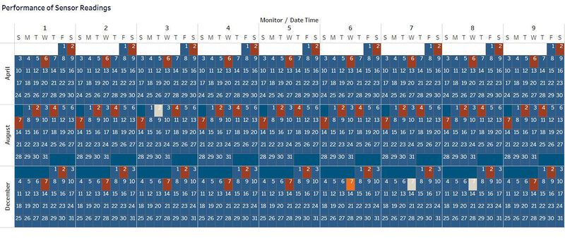
1. Sensor Performance (Calendar Plot):
This calendar plot is constructed by taking Monitor(Sensors) and Weekday(Sunday to Saturday) on columns and Months on rows.
Date time is broken down by Monitor, Month and Week. Color shows sum of Number of Records. The marks are labelled by Day of the month.
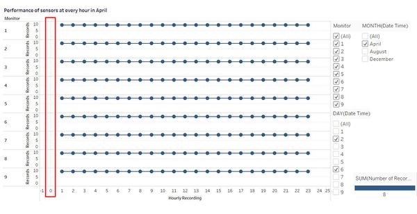
2. Performance of sensors at every hour in April ( Dual Axis Line Graph):
This dual axis line graph is created by taking Monitor on rows along with sum of Records and Hour of the day on columns. Both axis represent the hour of day. One line graph is used to show time and the other axis is used to denote dot graph.
The trends of sum of Number of Records for Date Time Hour, further broken down by Monitor(Sensors). Color shows Number of Records. The data is filtered on Month and Day.
Filtered on Month: APRIL
Filtered on Day: 2nd and 6th (April)
Filtered on View Monitor: 1 – 9
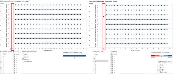
3. Performance of sensors at every hour in August (Dual Axis Line Graph):
This dual axis line graph is created by taking Monitor on rows along with sum of Records and Hour of the day on columns. Both axis represent the hour of day. One line graph is used to show time and the other axis is used to denote dot graph.
The trends of sum of Number of Records for Date Time Hour, further broken down by Monitor(Sensors). Color shows Number of Records. The data is filtered on Month and Day.
Filtered on Month: AUGUST
Filtered on Day: 2nd and 6th (April)
Filtered on View Monitor: 1 – 9
The second chart is filtered on the same as above except for Day: 2nd (August)
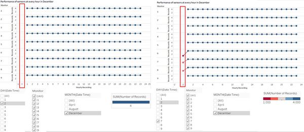
4. Performance of sensors at every hour in December (Dual Axis Line Graph):
This dual axis line graph is created by taking Monitor on rows along with sum of Records and Hour of the day on columns. Both axis represent the hour of day. One line graph is used to show time and the other axis is used to denote dot graph.
The trends of sum of Number of Records for Date Time Hour, further broken down by Monitor(Sensors). Color shows Number of Records. The data is filtered on Month and Day.
Filtered on Month: DECEMBER
Filtered on Day: 4th (December)
Filtered on View Monitor: 1 – 9
The second chart is filtered on the same as above except for Day: 2nd (August)
5. Chemicals released from Sensors:
Heat map is used to denote the no of readings for each chemical and this is created by taking Monitor on columns and Chemical as rows. Sum of number of records is used to color sort and label.
Sum of number of records are sorted by color (red to blue, red being the minimum and blue maximum).
6. Chemicals released from sensors (detailed):
A detailed heat map showing the no of readings for each chemical. The steps to create this chart is same as above. Sum of number of records should ideally be 24.
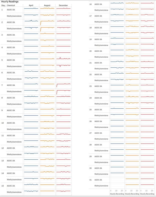
7. Hourly Readings of AGOG-3G and Methylosmolene:
By taking month and hour on Columns and Day, chemical and count of the number of records on Rows, obtain a line graph for all the three months and colour sorted on each month.
Filtered on Chemicals: AGOG-3A and Methylosmolene
