ISSS608 2016-17 T3 Assign MANISH MITTAL Visualizations
|
|
|
|
|
Contents
Tableau public
https://public.tableau.com/profile/manish2482#!/vizhome/GoodWindrose/Question3?publish=yes
Q1
Q: Characterize the sensors’ performance and operation. Are they all working properly at all times? Can you detect any unexpected behaviors of the sensors through analyzing the readings they capture?
By looking at the calendar plot we can see at some specific dates of April, August and December the number of readings recorded are less than usual. There are 3 dates in August for which the number of records are less 2nd, 4th & 7th. One thing to be noted by this graph is that on 2nd on every month the number of recordings are less. We further will dig down to find out the reason.
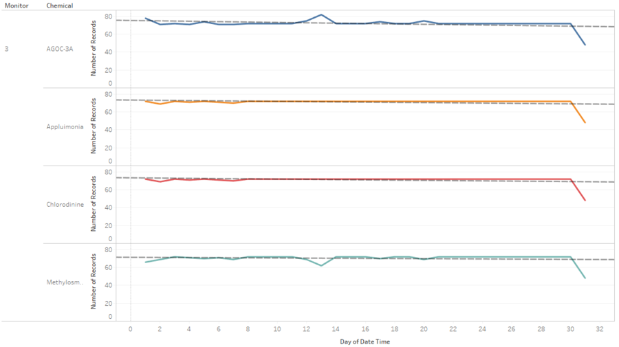
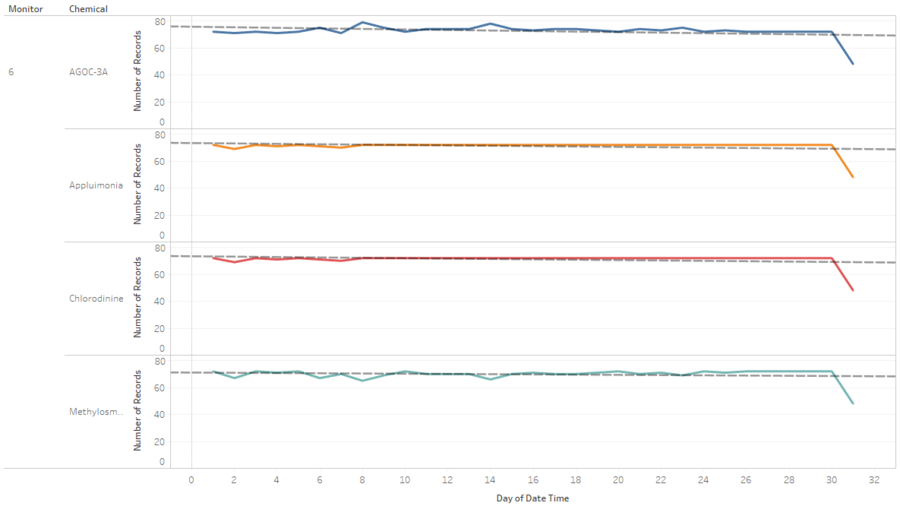
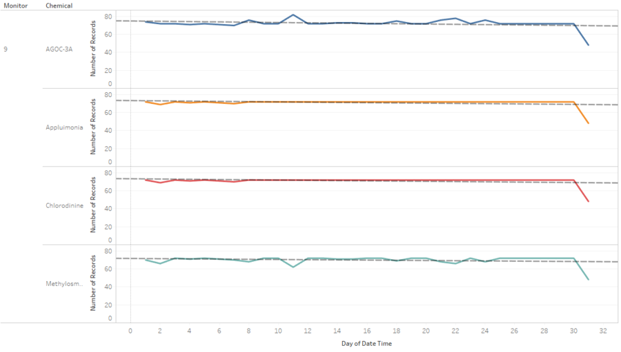
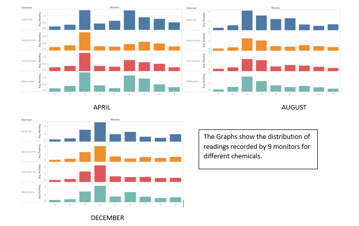
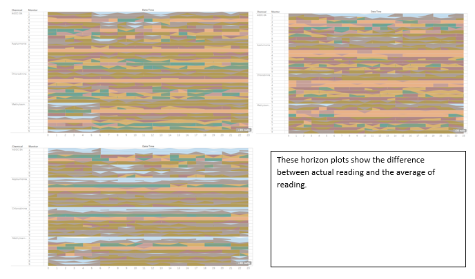
Unusual pattern of number of records were recorded by monitors 3, 4, 5, 6 and 9. The Above screenshots shows that the unusual pattern was mainly due to the chemical AGOC – 3A. The monitors are taking multiple reading where they are not supposed to be. Looking the graphs whenever there are higher number of records noted by monitors for chemical AGOC -3A, there are lower number of records recorded for chemical Methylosmolene which means monitors are confusing the AGOC – 3A chemical with Methylosmolene. This unusual pattern is shown throughout the year for all months. This can be verified by looking at the number of records for other two chemicals Appluimonia & Chlorodinine. For these two the number of records are almost constant throughout the year.
This unusual pattern was shown for monitors 7 & 8 also for the month of April which later got fixed in August & December.
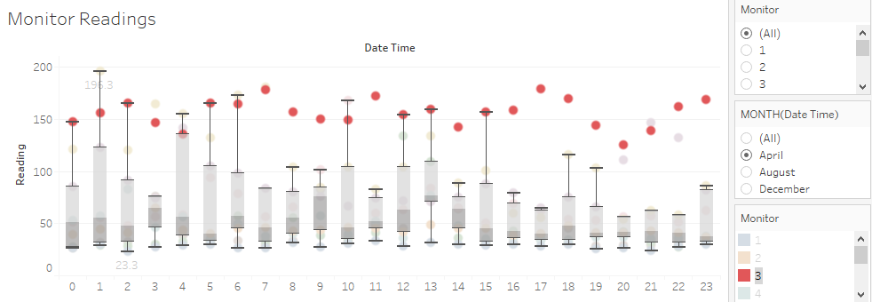
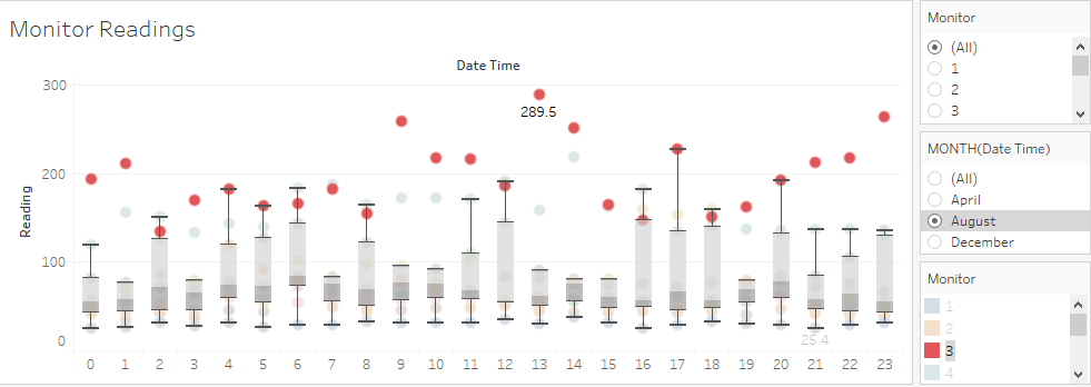
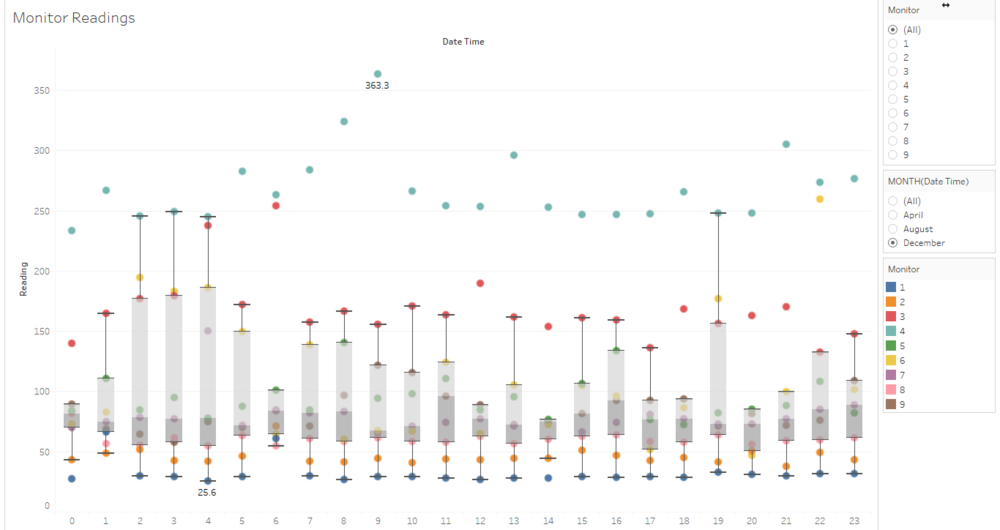
Monitor 3 & 6 shows unusual pattern in readings as well. For all the 3 months, monitors 3 & 6 are showing extremely high readings. The same pattern was observed for monitor 4 as well but for the month of December only. We can conclude that In the month of December the wind direction was towards north west where the monitor 4 exists and hence the reading was more in monitor 4 specifically.
Q2
Which chemicals are being detected by the sensor group? What patterns of chemical releases do you see, as being reported in the data?
The graphs on the left hand side show the distribution of readings by different monitors for different chemicals. The few observations are - 1. Sensors 3 & 6 contribute to the high number of readings in the month of April for all the chemicals which is followed by 7 & then 8th sensor. 2. For the month of August, sensors 3 & 4 recorded the maximum readings for all 4 chemicals, which is further followed by sensor 6. 3. For the month of December, Sensor 4 shows the highest readings for all the 4 chemicals which is followed by sensor 3 & sensor 6.
In most of the cases, sensors 3 & 4 contribute to the maximum readings which is due to the location of sensors and the wind direction. We further dig down to figure out the different patters.
Q3
Q: Which factories are responsible for which chemical releases? Carefully describe how you determined this using all the data you have available. For the factories you identified, describe any observed patterns of operation revealed in the data.
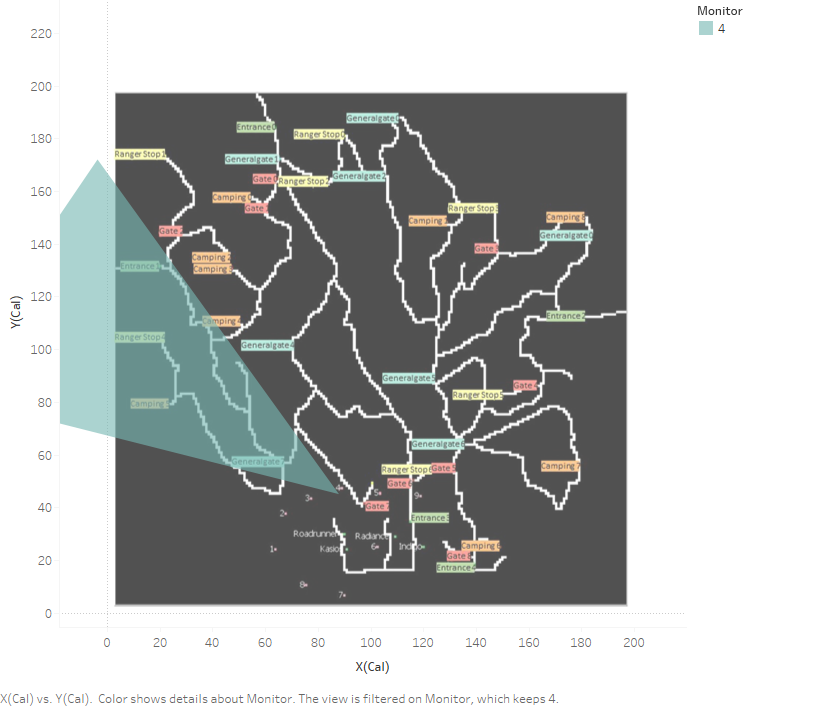
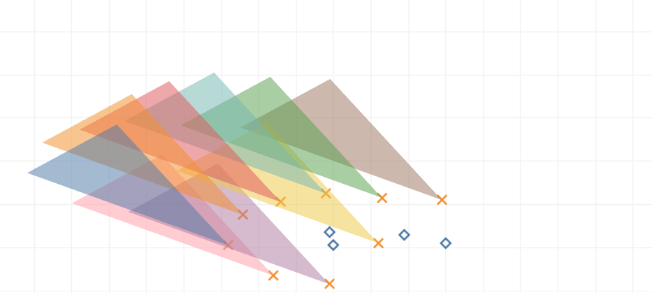
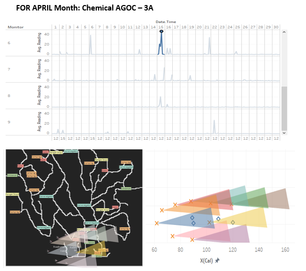
To answer this question, the dashboard can be used. The release of chemicals can be traced by looking at the spikes in the reading of different monitors. Line graphs are plotted based on the days, months & hours for the monitors are the recorded readings. The polygons are created to show the direction of wind which further are used to observe of they are overlapping any factory coordinates. This overlapping shows a possible indication that which factory is responsible for releasing which chemical. The angle parameter is used to adjust the spread of the wind in certain ambiguous situations which will be further elaborated in the later part. Latitude & Longitude are plotted based on the angle calculated. Crosses show the position of sensors & rectangles show the positions of factories.The map used is given below -
On 15th April at 12PM, we can clearly see there is a spike in monitor 6. The average reading it gives is 45.51 which is quite high as compare to other days. The polygons created to show the wind direction for monitor 6 overlaps the INDIGO factory. We can say AGOC is coming out from INDIGO factory.
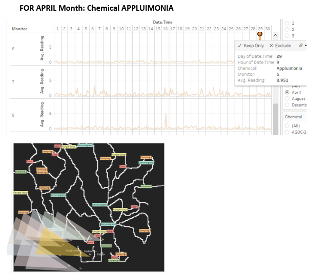
On 29th April at 9PM, we can clearly see there is a spike in monitor 6. The average reading it gives is 8.91 which is quite high for chemical Appluimonia. The polygons created to show the wind direction for monitor 6 overlaps the ROADRUNNER & KASIO factory. We can say Appluimonia is coming out from ROADRUNNER & KASIO factory.
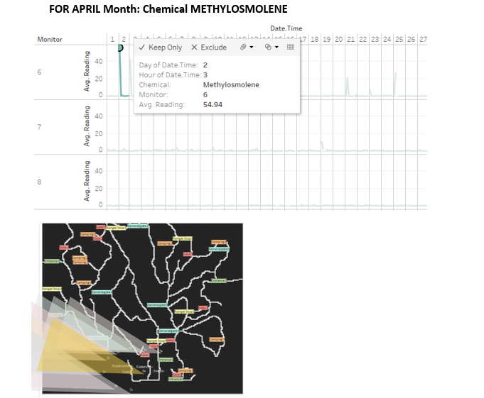
On 2nd April at 3PM, we can clearly see there is a spike in monitor 6. The average reading it gives is 54.94 which is quite high for chemical METHYLOSMOLENE. The polygons created to show the wind direction for monitor 6 overlaps the ROADRUNNER & KASIO factory. We can say METHYLOSMOLENE is coming out from ROADRUNNER & KASIO factory.
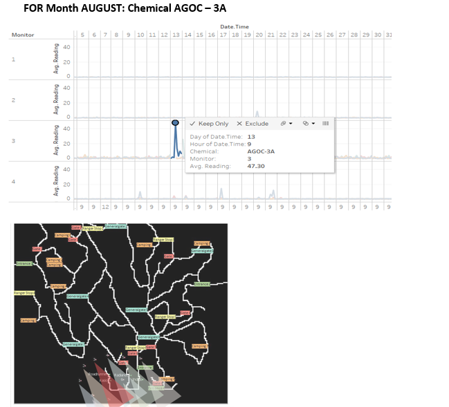
On 13th August at 9PM, we can clearly see there is a spike in monitor 3. The average reading it gives is 47.30 which is quite high for chemical AGOC – 3A. The polygons created to show the wind direction for monitor 6 overlaps the KASIO factory. We can say AGOC – 3A is coming out from KASIO factory.
FOR Month DECEMBER: Chemical AGOC – 3A We could see the clear graph for December month as well. The spikes are coming for monitor 4 and due to wind direction it is covering the factories Roadrunner & Kasio.
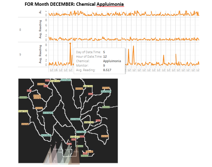
On 5th December at 12PM, we can clearly see there is a spike in monitor 9. The average reading it gives is 8.517 which is quite high for chemical Appluimonia. The polygons created to show the wind direction for monitor 6 overlaps the INDIGO factory. We can say Appluimonia is coming out from INDIGO factory.
[[File:Q3-6.png|900px]
On 11th December at 9PM, we can clearly see there is a spike in monitor 5. The average reading it gives is 9 for chemical CHLORODININE. The polygons created to show the wind direction for monitor 6 overlaps the INDIGO factory. We can say CHLORODININE is coming out mostly from Roadrunner factory.


