ISSS608 2016-17 T3 Assign CHIAM ZHAN PENG
Contents
- 1 VAST Challenge 2017: Mini-Challenge 1
- 2 Data Preparation & Data Visualization
- 3 Patterns of Life Analysis
- 3.1 Usual Daily Patterns
- 3.1.1 1. Movement hours and cars in the park: 8a.m to 5p.m peak hour
- 3.1.2 2. Traffic behavior: General-gate is most accessed and silent hours of campsite and ranger-base
- 3.1.3 3. 2 & 3 axles buses & 4x truck bypass through the park and do not camp
- 3.1.4 4. Time taken between public checkpoints and Rangerstops: < 24 mins and 1hr
- 3.2 Usual Multiple Days Patterns
- 3.3 Unusual Patterns
- 3.4 Top 3 Possible Causes
- 3.1 Usual Daily Patterns
- 4 Comments & Discussions
VAST Challenge 2017: Mini-Challenge 1
Mistford is a mid-size city is located to the southwest of a large nature preserve. It has been discovered that the number of nesting pairs of the Rose-Crested Blue Pipit, a popular local bird due to its attractive plumage and pleasant songs, is decreasing! Provided several datasets, it is required to investigate the reason for the decrease of Rose-Crested Blue Pipit. In Mini-Challenge 1, traffic movement dataset is given to analyze patterns of life of vehicles through out the reserve, and detect unusual patterns that are potentially harmful to the birds. Questions raised are:
- Describe up to six daily patterns of life by vehicles traveling through and within the park.
- Describe up to six patterns of life that occur over multiple days (including across the entire data set) by vehicles traveling through and within the park.
- Describe up to six unusual patterns (either single day or multiple days) and highlight why you find them unusual.
- What are the top 3 patterns you discovered that you suspect could be most impactful to bird life in the nature preserve?
This webpage will guide you through my investigations and help to save Rose-Crested Blue Pipit!
Data Description
Entry gates are positioned at the Preserve entrances. Each vehicle receives an entry ticket at the gate and is assigned a vehicle class; the entry is recorded. The entry ticket contains an RF-tag that enables the Preserve sensors to pick up the passage of a vehicle through the Preserve. Each vehicle surrenders their entry ticket when exiting the Preserve and the exit is recorded. A .csv file containing data recorded from sensors around the Boonsong Lekagul Nature Preserve. A map containing the locations of roadways and sensors throughout the Preserve is also provided.
Data Preparation & Data Visualization
Data Preparation
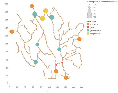
| 1. Mapping the coordinates of each checkpoint and checkpoint type Each checkpoint is mapped using JMP Map creator on a 200x200 coordinates and labelled according to the 6 checkpoint types. |
 |
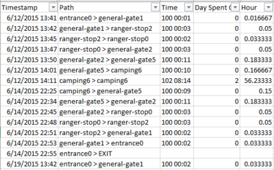
| 2. Set the Origin ("From") and Destination ("To") & Path and 1 visit or episode (Entrance and Exit)
Each sensor record with timestamp indicate a checkpoint with correlate a origin, destination and path. Each path is labelled an sequential path number to identify the sequence. |
| 3. Calculate the duration from one point to another.
Using the timestamp entry value and taking difference, duration is calculated using mdd hh:mm format and compute the time duration in hours format. |
| 4. Preparing the path intensity data format
Each path count is calculated with an path ID and duplicated in another row for it to be visualize in Tableu as per link. |
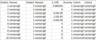
| 5. Preparing the chord diagram data format
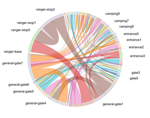
In order to create the chord diagram, each origin to destination path's percentage needs to be first calculated and labelled as color1 and color2 accordingly. |
Data Visualization
Go through interactive visualization storybook to understand and discover patterns and trends. Simply select, filter and hover for more details!
- Using Tableau 10.3 published in Tableau public
Main workbook: https://public.tableau.com/profile/zac.chiam#!/vizhome/Book3_5732/VASTStoryMC1?publish=yes
Chord Diagram: https://public.tableau.com/profile/zac.chiam#!/vizhome/ParkChordv2/Dashboard2?publish=yes
Patterns of Life Analysis
Usual Daily Patterns
1. Movement hours and cars in the park: 8a.m to 5p.m peak hour
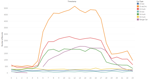
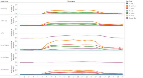
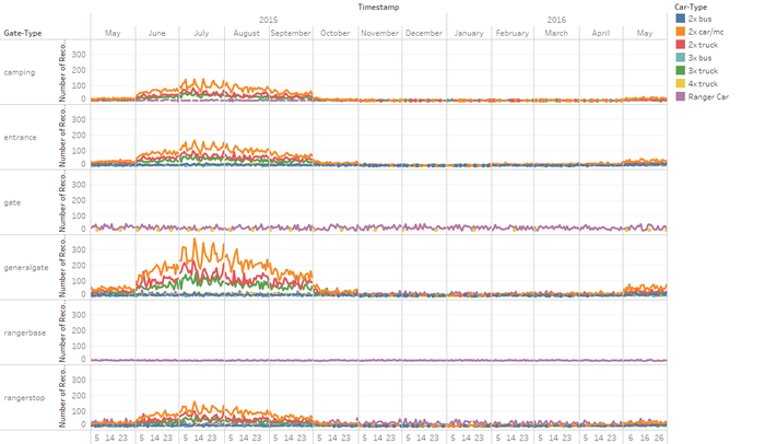
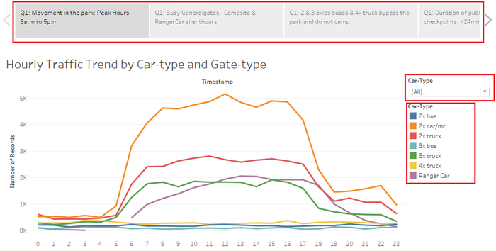
- People started to arrive in the park from 5 am onwards until 7 pm; with peak hour roughly between 8a.m to 5p.m.
- Even at quiet hours between 7 p.m. to 5 a.m., there are all types of vehicles that travels within all the gate types in the park
- Most common vehicle types are 2 axle car/motorcycle & 2 axle truck
2. Traffic behavior: General-gate is most accessed and silent hours of campsite and ranger-base
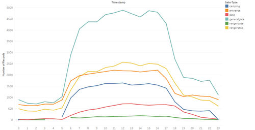
- General-gate are the most accessed checkpoints in the park
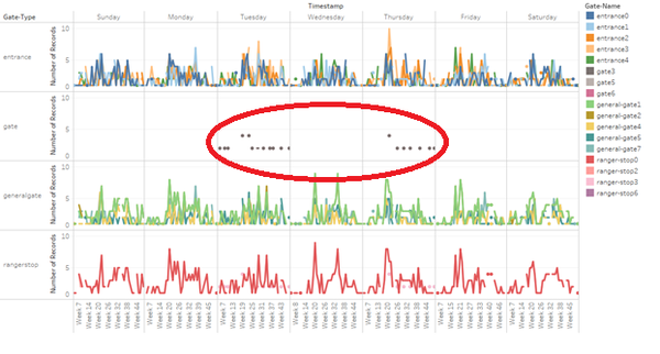
- Campsite: There is no movement at the campsite between 12a.m to 5a.m.
- Ranger-base: There is no movement of ranger-car and at the ranger-base between 3a.m. to 6.a.m.
3. 2 & 3 axles buses & 4x truck bypass through the park and do not camp
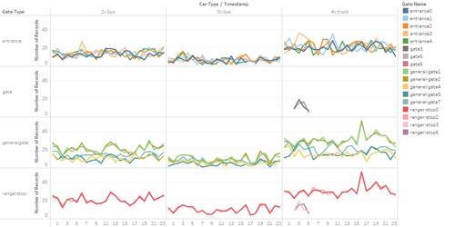
- 2 & 3 axles buses move throughout the park at all hours but not to camp sites. It passes through:
- all entrances 0,1,2,3,4
- some general gates 1,2,4,5,7
- some ranger stops 0, 2, which is on the main route
- 4 axles truck move throughout the park at all hours but not to camp sites. It passes the same checkpoints as 2 & axles buses and in additional:
- gate 3, 5 & 6
- ranger stops 3 & 6
4. Time taken between public checkpoints and Rangerstops: < 24 mins and 1hr
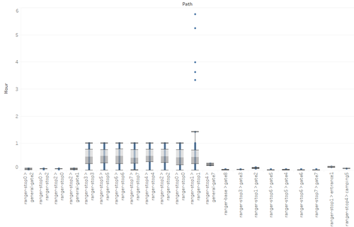
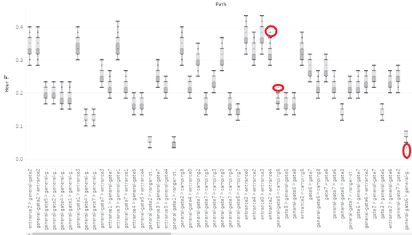
- The average time taken to travel between checkpoints for public checkpoints (excluding ranger-stop andis under 0.4hrs or 24 mins.
- Rangers typically spend less than 1hr at all rangerstops except for ranger-stop 1 which has exceptions up till almost 6 hours.
Usual Multiple Days Patterns
1. Visitors during summer
- Most visitors during the summer (June – Sep) when it is warm in the park and peak month in July. As can see, the traffic is increasing in May 2016 as the weather is warmer and approaches summer.
2. More visitors during the weekend
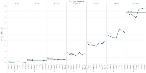
- More people during weekends (2 axles car/motorcycle). Traffic increases on Friday till Sunday and drops when during when it approaches weekdays.
3 Weekend camping at the campsites
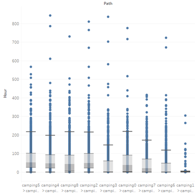
- The campsites are where the average time spent per location is highest meaning people spent most of their time at camping in the park. Average duration is about 2 days across most campsite except for campsite 1.
4. Multiple episodes visits: Transport vehicles & Weekend camping
- There are various multiple (more than 1) episode/visits to the park by mainly by 2, 3 & 4 axles truck probably as transport vehicles and 2 axles car/motorcycle for weekend camping at campsite 4, 6, 0.
5. North and central route heaviest traffic
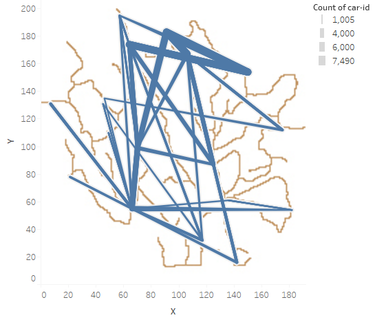
- Path in the northern part of the park from gate 3 to general-gate2 and range-stop 0 & 2 than general-gate1 are the highest, followed by in the central of the park from general-gate1 to general-gate4, 7 and 2.
Unusual Patterns
1. 4 axles truck entering ranger-stops
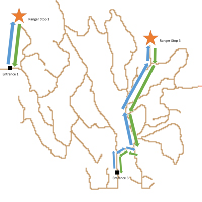
- There are a total of 23 entries of 4 axles truck that goes to ranger stop 3 & 6 which is restricted area for rangers only, that travel on the same route path and time that avoids the ranger-vehicle.
2. 2 axles car/motorcycle entering ranger-stops
- There are a total 6 (20152416012433-808, 20152810102819-458, etc) of 2 axles car / motorcycle who also went to ranger-stop 1 which is restricted area for rangers on the same day 10 July 2015 at about 1035am. TThe route for both the 4 axles truck and 2 axles car are mapped out and this could be an suspected organized group activity.
3. Repeated (16 times) weekend camper moving in the late night
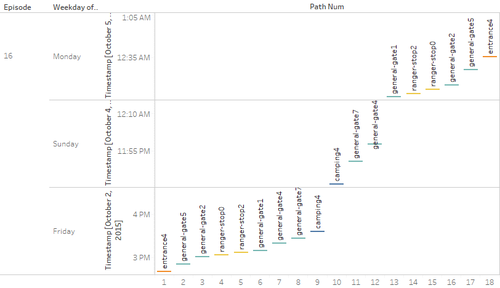
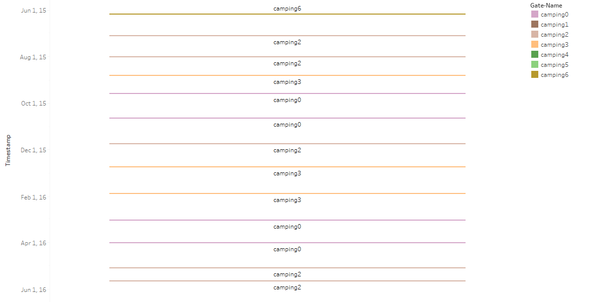
- There is a visitor, 20154519024544-322 on a 2 axles truck that repeatedly enters the park to campsite 4 and leave the park at past Sunday midnight or early Monday morning which is an odd hour to travel and possibility avoiding to be notified or seen.
4. Long-term resident camper
- There is a visitor, 0155705025759-63 that has been in the park since 5 June 2015 to 20 May 2016, of more than 11 months without leaving the park. Key question is on the source of food and possibly hunting on animals or birds in the park.
5. Vehicles travelling too fast and slow
- There are a couple of cars that are taking longer time than average between the routes that might be doing something other than driving. There are also some cars taking lesser time than average which means they are probably speeding above the speed limit of 25 mph.
Top 3 Possible Causes
- 1. 4 axles truck that enters ranger-stop 3 & 6 on multiple occasions that avoid the ranger-park vehicles operating hours. It is a heavy vehicle that can be used for transportation, or carrying equipment to perform quite a wide possibility such as deforestation that can potentially affect wildlife and cause for the decreasing bird population.
- 2. Long-term camping “resident”, 0155705025759-63 that has been in the park since June 2015, key question is on his source of food and activities at the various campsites.
- 3. Multiple episode/visits overnight camper, 20154519024544-322 that stayed at campsite 4 before leaving during the midnight. This is an unusual behavior that can be intentionally avoiding attention or being seen by others.
Comments & Discussions
|
Hi Zac,
Clarity:
Thank you, |
| Hi,Zac Great work! I enjoyed reading through your analysis findings. Yet, I have the following suggestions that hopefully are useful in further improving your work: Aesthetics:
Clarity:
Good work! I enjoyed reading through your visual analysis. Hopefully my comments can add value.
|
| comment3 |
