ISSS608 2016-17 T3 Assign CHEN YUN-CHEN conclusion
|
|
|
|
Tableau: https://public.tableau.com/profile/jeanchen#!/vizhome/MC2_1/MC2?publish=yes
Contents
Q1
Q: Characterize the sensors’ performance and operation. Are they all working properly at all times? Can you detect any unexpected behaviors of the sensors through analyzing the readings they capture?
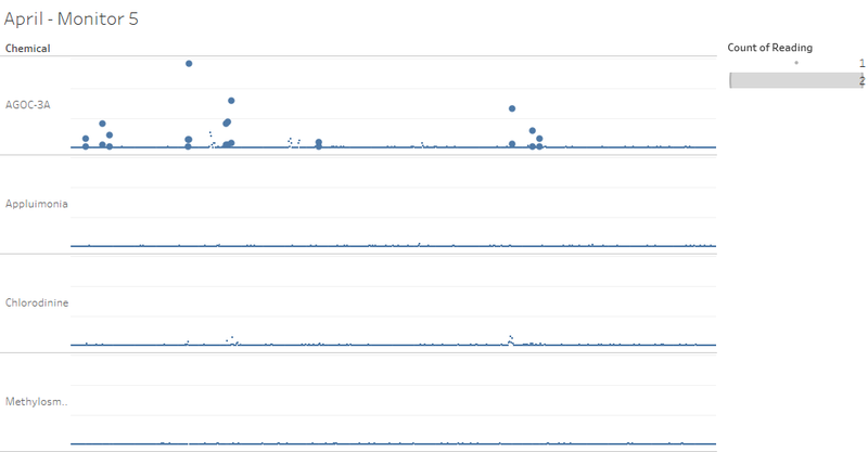
Not all monitors are working properly at all times. This conclusion can be derived from the fact that there are multiple records read from the same monitor at the same time of the same date on the same chemical. Furthermore, there are readings abnormally much higher than ordinary level.
Sample is as following.
In terms of the monitors that might have not been working properly, higher likelihood goes to monitor 3, 4, 5, 6, and 9 in all 3 months. Monitor 7 and 8 used to have multiple records in April, but the issue was resolved later and the problem did not surface in August and December.
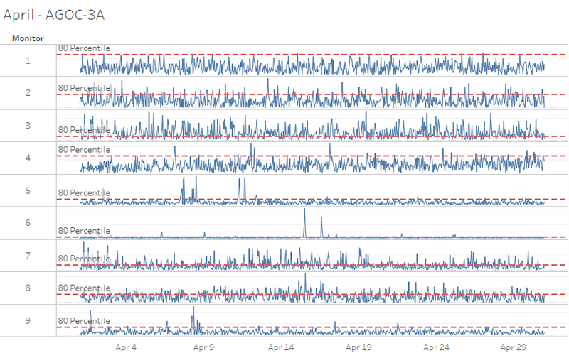
We also took those records above mean + 3 * std and saw whether they were due to wind. If not, we treated them as incorrect records and excluded them as well.
In this sample, monitor 2 and 5 have high readings were due to wind while monitor 7 was not.
Monitor 3, 4, 5, 7 and 9 have more serious issue of extremely high readings across all 3 analyzed months, while Monitor 6 showed better and better performance along the way from April to December.
Putting both multiple records and extremely high readings into consideration, top 3 monitors that have the worst performance or are working most improperly are monitor 4, 5, and 9. It is recommended to have a thorough scrutiny of these 3 monitors immediately.
Q2
Q: Which chemicals are being detected by the sensor group? What patterns of chemical releases do you see, as being reported in the data?
To observe the pattern of chemicals, we use dataset which is cleaned after wind check.
We set 80 percentiles (use percentile instead of standard deviation is to ensure the amount of data for next-step analysis) of all reading information as threshold and filter out those records above threshold to do next-step analysis.
Sample is as following.
After filtering out those records above threshold, we also exclude those sensors with less than 50 records over threshold for each chemical to ensure robustness in statistics in next-step analysis.
In April, it is shown that sensor 3 detected the most of all these four chemicals, followed by sensor 7 and 8.
In August and December, sensor 3 and 4 detected more of the four chemicals than other 7 sensors in August and December.
In all three months, there is no distinct difference across the four chemicals in terms of number of records above threshold.
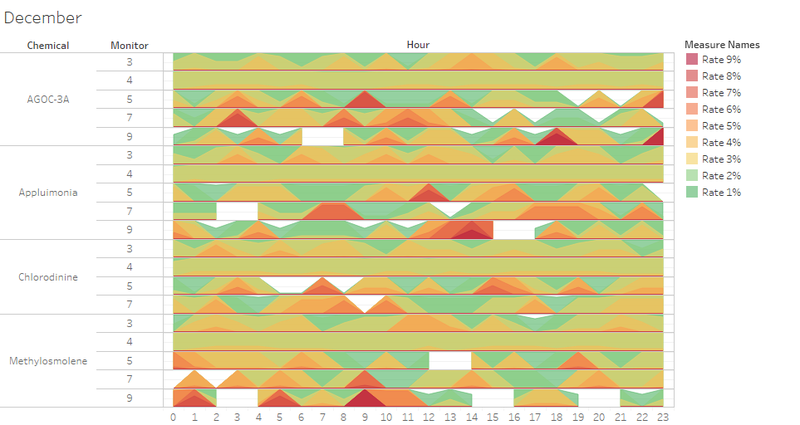
The four chemicals have been observed with various release patterns across sensors and months due to different sensor locations and changing seasonal wind directions.
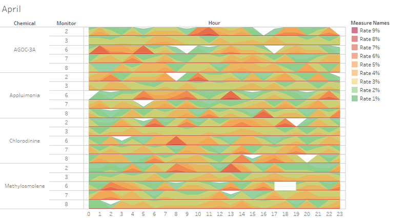
In April, sensor 2 and 6 tracked high readings of all 4 chemicals more concentrated than other sensors, which can be indicated by more red spikes in April hourly pattern chart.
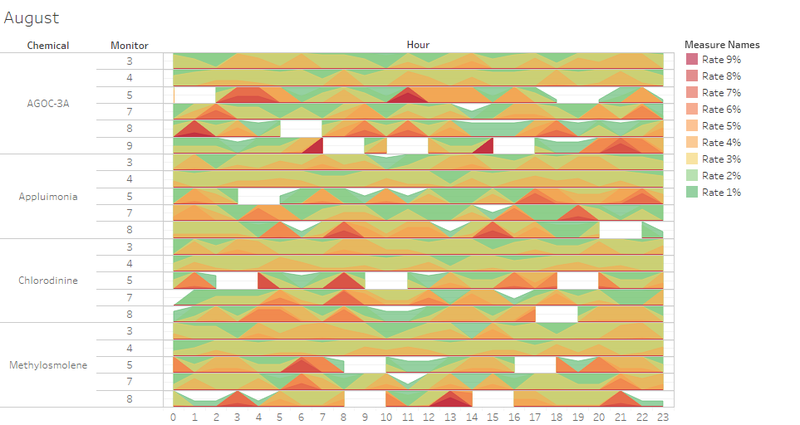
In August, sensor 8 tracked high readings of AGOC-3A, Appluimonia and Methylosmolene more concentrated. Sensor 2 and 6 no longer tracked any high reading of any chemicals.
In December, sensor 7 and 9 tracked high reading of AGOC-3A, Appluimonia and Methylosmolene more concentrated, while sensor 5 tracked high reading of AGOC-3A, Appluimonia and Chlorodinine more concentrated. Sensor 8 no longer tracked any high reading of any chemicals.
In April and December, high readings are observed more often before 15:00, while in August, high readings are observed more often before 09:00 and after 14:00.
August and December have seen more concentrated pattern than April.
Q3
Q: Which factories are responsible for which chemical releases? Carefully describe how you determined this using all the data you have available. For the factories you identified, describe any observed patterns of operation revealed in the data.
We checked the influence area created by wind of each factory. In this sample, Kasios and Roadrunner should be responsible for high reading of monitor 7 while Roadrunner was the only reason which made monitor 8 have a high reading.
We combined the dataset of wind with factory and the dataset prepared by question 2.
We counted the records who were above threshold and in the influence area of each factory.
The result is as following.
It is shown that Kasios and Roadrunner were both responsible for about 30% for four chemicals in April while they were just responsible for less than 20% and around 10% in August and December respectively.
On the other side, Indigo and Radiance are the main responsible parties for the four chemicals in August and December.
Two possible reasons might lead to this observation. One is Kasios and Roadrunner recognized the environmental problem and enhanced their anti-pollution system. Another reason is, on the other side, Indigo and Radiance produced more and more chemicals. We expect the first season to be more likely.
It is observed from the April Wind Check animation that wind blows torwards five main directions – north, northwest, west, south, southwest. This explains why in April sensor 2, 3, 6, 7 and 8 detected high hourly readings while other sensors are relatively dormant.
Sensor 6 is located on the east and southeast side of Roadrunner and Kasios factories. That is why in April Sensor 6 will not detect much chemical from these two factories.
In April, Sensor 6 detected most chemical from Indigo and Radiance factories. Reading from the hourly chemical release pattern chart in April, AGOC-3A and Appluimonia have higher readings than the other two chemicals. This observation can deduce that Indigo and Radiance are mainly responsible for AGOC-3A and Appluimonia.
On the other side, sensor 2 is furthest from Indigo and Radiance factories and nearest to Roadrunner and Kasios. Reading from the hourly chemical release pattern chart in April, Chlorodinine and Methylosmolene have higher readings than the other two chemicals. This observation can deduce that Roadrunner and Kasios are mainly responsible for Chlorodinine and Methylosmolene.
Comments
Hi Jean,
You have done really good work. You were able to give explanation not just visually but also statistically. Here are below some of the improvements you can work upon.
- You have brilliantly used the no of records for all your analysis.
I would also suggest that you can incorporate the sensor readings which will give a broader understanding of the analysis you have done.
- I also notice that in your dashboard you are missing the color legend and also the labeling information for many of your graphs.
It will be a very good idea to incorporate not only the color legend but also all other essential details in your dashboard.
- For Question 1 record check, one suggestion might be that you can increase the size of the record points so that the graph can be
seen properly.
P.S Keep up the good work!
Thanks,
Debasish Behera
Hi Jean,
Nice work! Combine the visualization and statistics very well.
Below are some concerns:
- About Q1 you have excluded the reading mean+3*std that not due to the wind, will it be more reasonable not to exclude them? Because these extreme high reading may probably result from other factories. And in the subsequent analysis we need to see all chemical release pattern, not just the chemical release from these four given factories.
- Will it be more rational to plot the wind triangle from each monitor then inverse the direction to check if which factory is under this area? Since these wind direction and speed data is detected by each sensor. We can detect the influence area of the reading of this specific monitor.
Thanks and Regards.
Xiaoqing
Hi Debasish and Xiaoqing,
Thanks for your suggestions.
Regards,
Jean
Hi Jean,
Thanks for the detailed report! I really learnt a lot from your work :)
I especially like the design of your 'storyboard', and the individual dashboards are very clear and well-explained.
You might want to consider reversing the direction of the 'wind triangles' (as mentioned in the comment above). It does seem more intuitive that way.
Regards,
Ngo Siew Hui
Hi Jean,
Thank you for the great work! I also learnt a lot:) I think the way you deal with wind triangles is right, as chemicals are released from factories. In Q1, you might want to mention that the double recording is caused by the wrongly recording the name and amount of another chemical. For Q3, will it be more intuitive if you make an interactive dashboard of wind and chemical release pattern?
Thanks, Jiaqi

