Q2
|
|
|
|
|
|
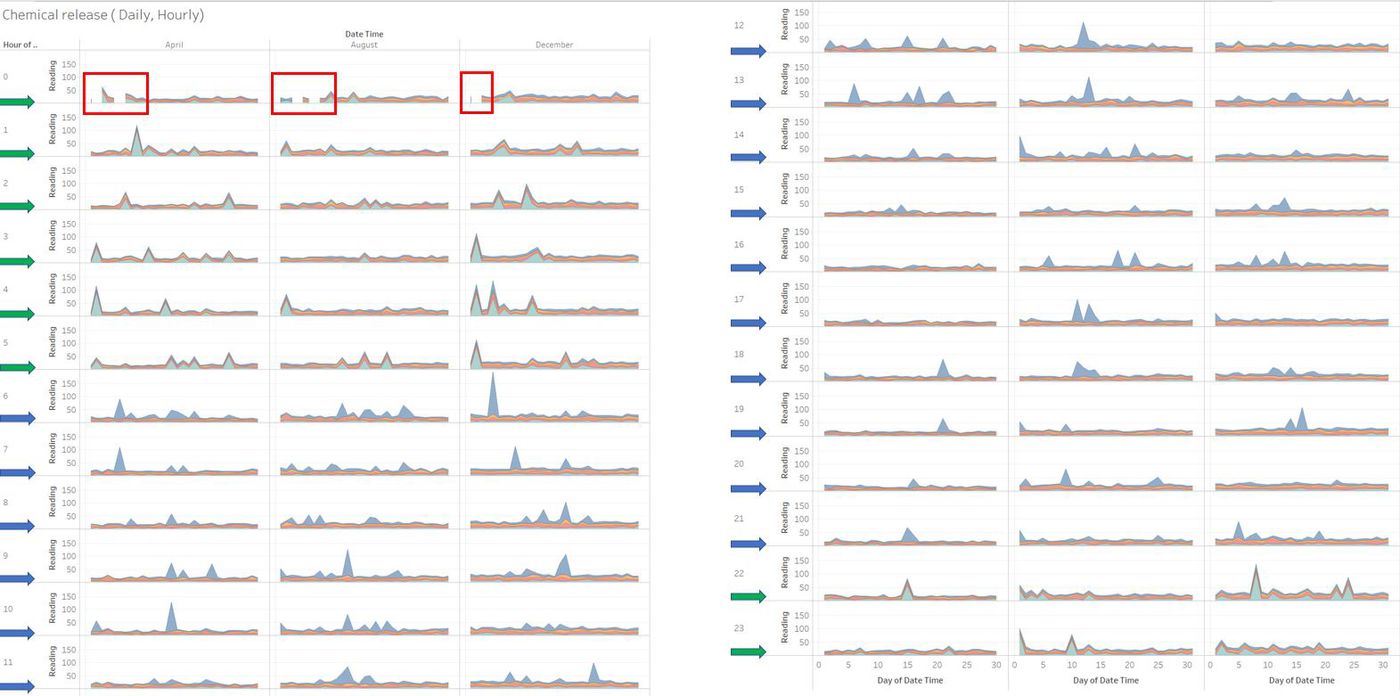
After finding excess readings captured by the monitors of AGOG-3A chemical and less of Methylosmolene, it is imperative to see if they were released in huge quantities. If yes, then we can deduce that the high release of AGOG in large number of quantity is affecting the habitat of the nature park. To analyse the release of chemicals and their readings, a stacked graph is drawn at regular hourly interval.
In the above graph, Blue represents AGOG-3A, Yellow represents Appluimonia, Red represents Chlorodinine and Green represents Methylosmolene. It is evident that there are no readings at 0th hour (12 AM) on few days of the month and this is in sync with our previous analysis on the sensor readings and its performance. The observations that can be drawn from the stacked graph is the release of chemicals at every hour. There is pattern here, every day of the three months excess of Methylosmolene is released from 10PM till 6AM and excess of AGOG-3A is released from 6AM to 9PM.
Analysis of Chemicals:
Methylosmolene:
1. Further analysis can be done on this chart to see if the release of these excess gases is consistent or not. Specially in the month of December there was excess release of Methylosmolene at around 4 AM. This could be due to several reasons such as - Factory operations, Activities in the factory abnormal from the daily routine or also the weather. Usually in many regions of the world, December is meant to be cold and the wind direction can also affect the readings.
2. Comparing all the peaks of this chemical in the above chart, it is evident that most of them occur in December than in April and August.
AGOG-3A:
1. Most of the peaks in AGOG-3A are seen during the early hours of the day when compared to evenings.
2. Wind direction and weather report will give more details to analyse and find the reason behind this excess release of AGOG- 3A.
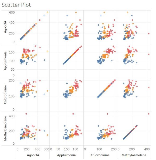
Not much information can be derived about Appluimonia and Chlorodinine from the above stacked graph. To know further about the correlation between the release of each chemical, a scatter plot is drawn for each chemical based on their daily readings.
1. There is a correlation of 0.84 between Appluimonia and Chlorodine. Thus we can deduce that as Appluimonia increases Chlorodine increases and vice versa.
2. Even though a correlation was seen in the previous question between the number of records captured of AGOG- 3A and Methylosmolene, the chemicals released are dispersed and extreme chemical reelease is seen.


