ISSS608 2016-17 T3 Assign ERIC PRABOWO CUNDOMANIK
Contents
Comments and Feedback
1
2
3
Background [Mini Challenge 2]
VAST Challenge 2017 MC2
Ornithology student Mitch Vogel was immediately suspicious of the noxious gases just pouring out of the smokestacks from the four manufacturing factories south of the nature preserve. He was almost certain that all of these companies are contributing to the downfall of the poor Rose-crested Blue Pipit bird. But when he talked to company representatives and workers, they all seem to be nice people and actually pretty respectful of the environment.
Problem
The primary job for Mitch is to determine which (if any) of the factories may be contributing to the problems of the Rose-crested Blue Pipit. Often, air sampling analysis deals with a single chemical being emitted by a single factory. In this case, though, there are four factories, potentially each emitting four chemicals, being monitored by nine different sensors. Further, some chemicals being emitted are more hazardous than others. Your task, as supported by visual analytics that you apply, is to detangle the data to help Mitch determine where problems may be.
Questions
- Characterize the sensors’ performance and operation. Are they all working properly at all times? Can you detect any unexpected behaviors of the sensors through analyzing the readings they capture?
- Now turn your attention to the chemicals themselves. Which chemicals are being detected by the sensor group? What patterns of chemical releases do you see, as being reported in the data?
- Which factories are responsible for which chemical releases? Carefully describe how you determined this using all the data you have available. For the factories you identified, describe any observed patterns of operation revealed in the data.
Dataset Description
[in progress..]
Data Preparation and Cleaning
[in progress..]
1. Create X, Y coordinate Excel file for sensors and companies
2. Clean meteorological data
3. Duplicate meteorological data (wind data) for building the polygon shape in Tableau
- Add 3 additional columns: Angle, Length, and Point
These new columns are specifically for building the polygon shape for the Wind Rose on the chart. Each of them are for building components of the lines of the Wind Rose, for example the Angle is Tripled with the additional +10 and -10 degree from the original data.
- Triple the data
Triple the data by adding 3 columns above, there should also be copying process of the data. Data should be copied 3 times for each of the angle, before applying formula to calculate the Angle and Length column.
4. Connecting to Tableau with inner join method
- Going forward to Tableau, add the 3 flat files of the data (Sensor, Coordinate, and Meteorological in sequence). This will make Sensor as the key data point, and connect to both Coordinate and Meteorological data. For meteorological data used is the one tripled, or modified by copying the data 3 times for the polygon shape drawing on Wind Rose.
- Add another dataset in Tableau by joining a new combination, where the dataset is not tripled (as for the polygon shape drawing). Use the Sensor, Coordinate, and Meteorological (non-modified meteorological dataset).
Data Visualization Charts
[in progress..]
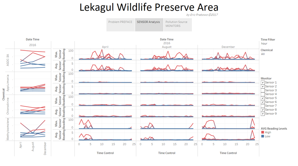
Tableau Dashboard Overview
Question Answers
Question 1
Characterize the sensors’ performance and operation. Are they all working properly at all times? Can you detect any unexpected behaviours of the sensors through analysing the readings they capture? Limit your response to no more than 9 images and 1000 words.
Sensor 4
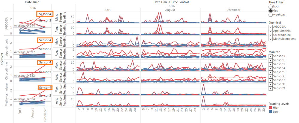
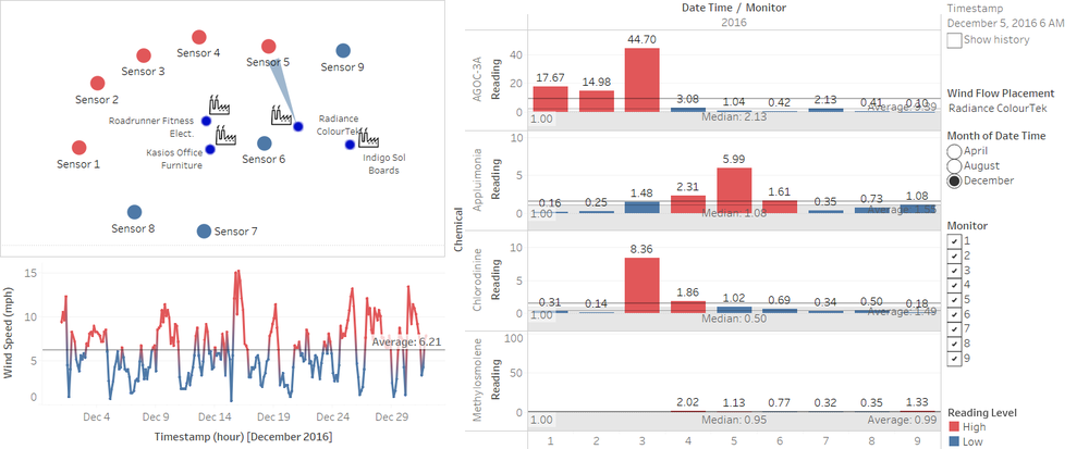
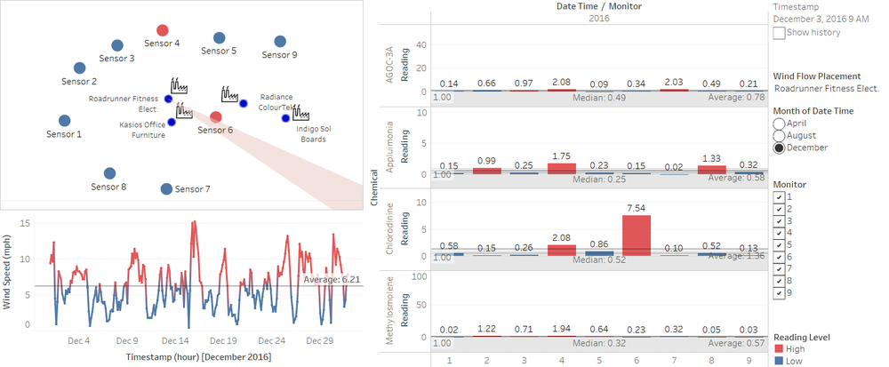
Sensor performance and operation are overall good, except for sensor 4 which shows an unusual pattern compared to sensor 3 and 5, which is nearby. Sensor 4 have a problem on detecting the amount of chemical pollution, where it is increasing in August and December compared to April. Probably the measurement sensor is not performing well from the unusual behaviour.
Sensor 3
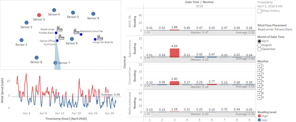
Sensor 3 shows unusual measurement of chemical pollution detected. Overall average of measurement is higher for sensor 3 within 3 months of data, for all chemicals detected. This indicates measurement problem of the sensor 3, where measurement unit calculation is inaccurate. Conversion of the data should provide a more accurate result.
Sensor 9
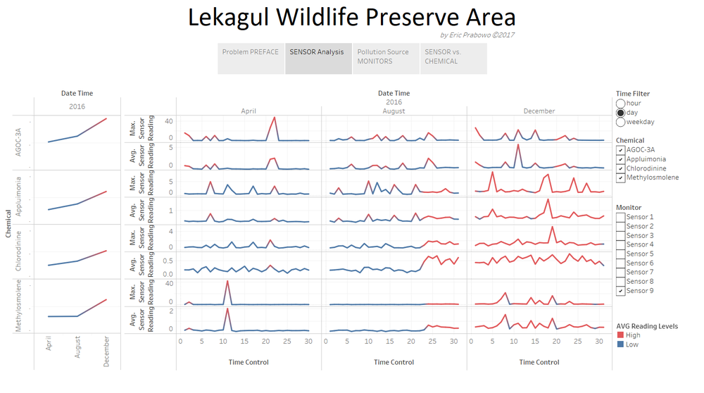
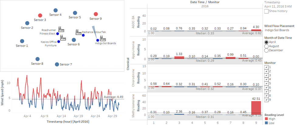
Sensor 9 shows unusual measurement of chemical starting 23rd of August / last quarter of August, and the whole December. This pattern might show a broken sensor indication from Sensor 9 for certain chemicals reading.
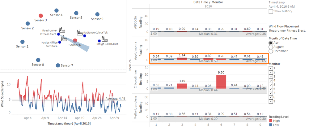
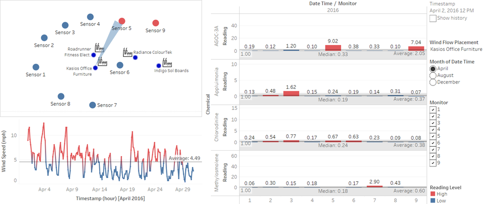
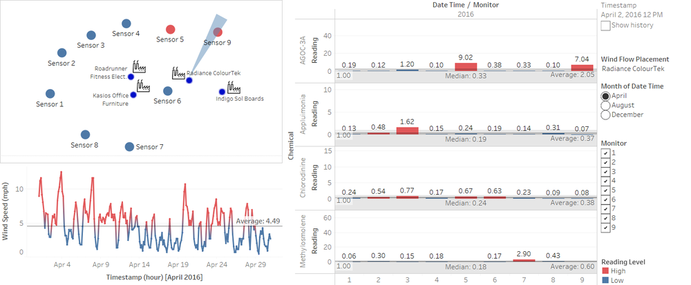
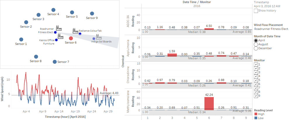
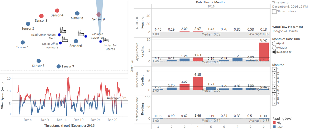
In details, the data also given a prove that wind direction does not match the amount of chemicals detected on the sensors as shown in the image below. As a result, the amount of Appluimonia and Chlorodinine is probably not the real detected amount of chemicals.
Sensor 7
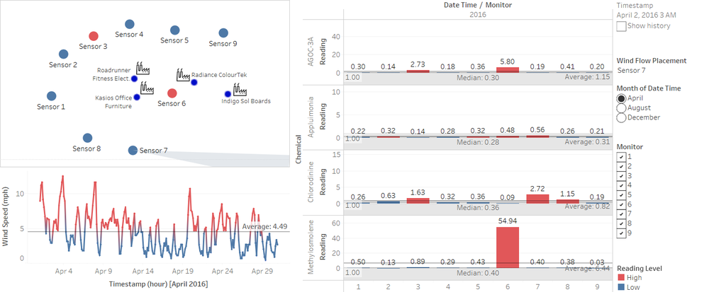
The dashboard data also shows that sensor 7 is not performing well, as Chlorodinine is showing up on the sensor, while the wind direction is not showing indication of direction from any factories.
Sensor Reading Pattern
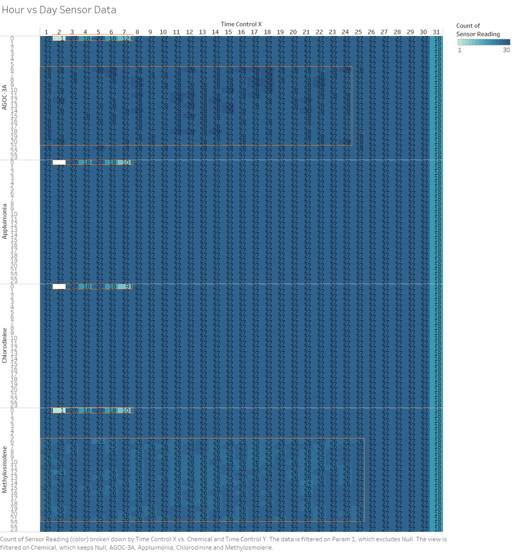
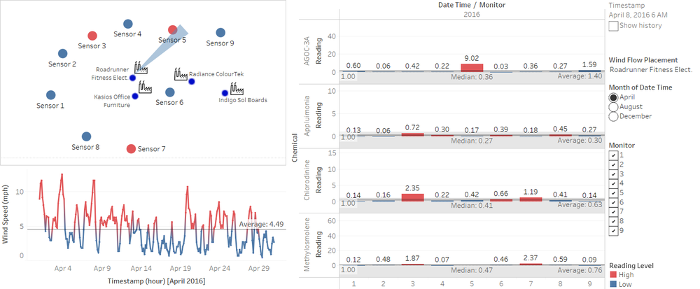
When readings on AGOC-3A is intense, sensors cannot read both AGOC-3A and Appluimonia at the same time altogether. So, when it comes to high intensity reading of AGOC-3A, Appluimonia data is not actually recorded by the sensors, as shown in image below. There is also an indication of blank data every second (2nd), fourth (4th), sixth (6th), seventh (7th) day of the month at exactly 12am, indicating sensor maintenance or restart, where it is not capturing data.
Question 2
Which chemicals are being detected by the sensor group? What patterns of chemical releases do you see, as being reported in the data?
Chemical Hourly Release Pattern
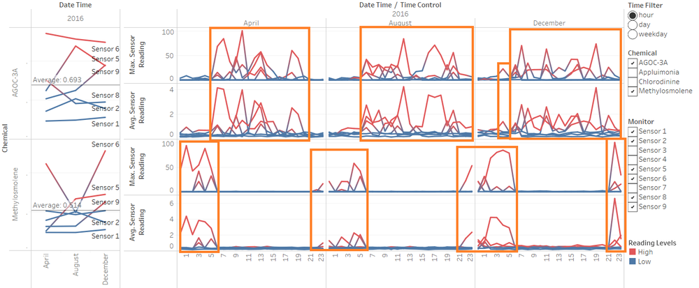
On hourly filtered data, the chemicals detected have patterns of releases. These indicates production hour of certain chemicals detected.
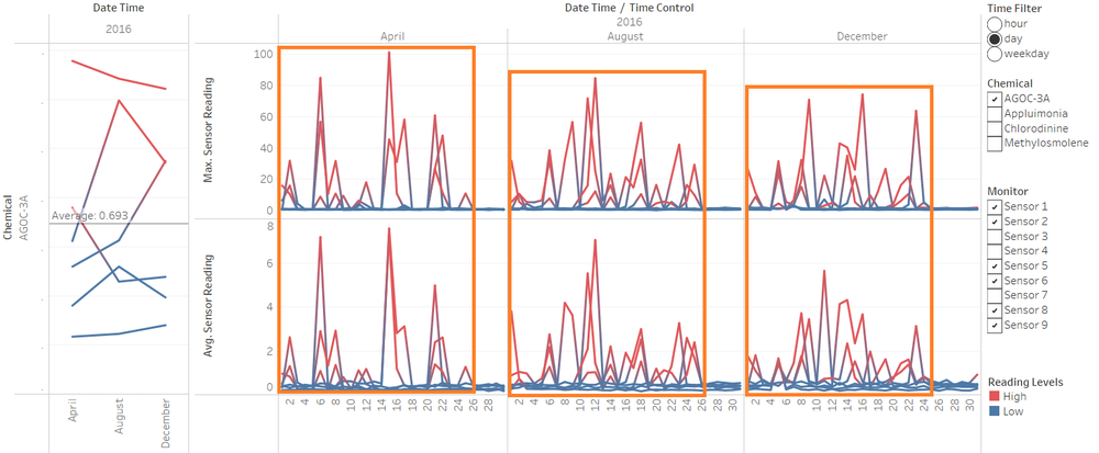
As shown on the line chart above, the pattern shows production time that uses AGOC-3A is 05:00-20:00 in August. Production pattern is shown by aggregated daily data within 3 months on the similar hour of the day. This production pattern time gap is increasing in August and December. In August, production time is 05:00-23:00. In December, AGOC-3A production time is 06:00-23:00, however there is an additional peak of AGOC-3A waste at 04:00. Second pattern shown on the data is that, Methylosmolene is being released by production starting from 9pm to 6am in the morning. This shows production patterns of Methylosmolene is done in midnight hours.
Chemical Significant Readings
On the Dashboard Monitor, Appluimonia shows significant read from most of all sensors. This shows indication that the chemical pollution is not coming from the factories. Instead, it might come from surrounding areas.
Chemical Monthly Release Pattern
Chemicals reading pattern for AGOC-3A shows there are monthly indication of lower production at the very beginning of the month, and no production at the end of the month. This chemical pattern shows production behaviour of companies using AGOC-3A, where production tend to increase in the middle of the month, and stopped at about day 25th of every month. Except for December, production stops early at 22nd December.
Question 3
Which factories are responsible for which chemical releases? Carefully describe how you determined this using all the data you have available. For the factories you identified, describe any observed patterns of operation revealed in the data.
Companies responsible for the chemical wastes are:
- Kasios: AGOC-3A
- Radiance ColourTek: AGOC-3A, Chlorodinine
- Roadrunner Fitness Elect: Methylosmolene, Chlorodinine, AGOC-3A
- Indigo: Methylosmolene, Appluimonia
Kasios
Radiance ColourTek
Roadrunner Fitness Elect.
Indigo Sol Boards
References
Wind Polygon: https://community.tableau.com/thread/148044
VAST Challenge 2017 [Mini-Challenge 2]: http://www.vacommunity.org/VAST+Challenge+2017+MC2
