ISSS608 2016-17 T3 Assign HUANG LIWEI
Presented by: HUANG Liwei (liwei.huang.2016@mitb.smu.edu.sg)
Visualization tool: Tableau
Contents
Overview
|
Mistford is a mid-size city is located to the southwest of a large nature preserve. The city has a small industrial area with four light-manufacturing endeavors. Mitch Vogel is a post-doc student studying ornithology at Mistford College and has been discovering signs that the number of nesting pairs of the Rose-Crested Blue Pipit, a popular local bird due to its attractive plumage and pleasant songs, is decreasing! The decrease is sufficiently significant that the Pangera Ornithology Conservation Society is sponsoring Mitch to undertake additional studies to identify the possible reasons. Mitch is gaining access to several datasets that may help him in his work, and he has asked you (and your colleagues) as experts in visual analytics to help him analyze these datasets. |
 |
Task
The primary job is to determine which (if any) of the factories may be contributing to the problems of the Rose-crested Blue Pipit. Often, air sampling analysis deals with a single chemical being emitted by a single factory. In this case, though, there are four factories, potentially each emitting four chemicals, being monitored by nine different sensors. Further, some chemicals being emitted are more hazardous than others. Your task, as supported by visual analytics that you apply, is to detangle the data to help Mitch determine where problems may be. Use visual analytics to analyze the available data and develop responses to the questions below. In addition, prepare a video that shows how you used visual analytics to solve this challenge. Novel visualizations and analysis approaches are especially interesting for this mini-challenge. Please do not use any other data in your work (including other Internet-based sources or other mini-challenge data).
Please visit Mini Challenge 2 for more details.
Questions and Solutions
Question 1
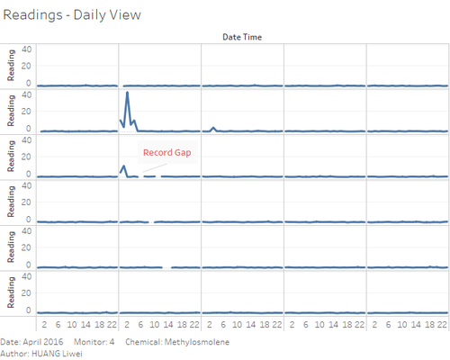
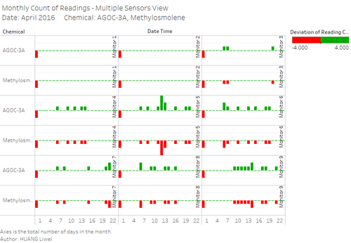
Characterize the sensors’ performance and operation. Are they all working properly at all times? Can you detect any unexpected behaviors of the sensors through analyzing the readings they capture?Limit your response to no more than 9 images and 1000 words.
Question 2
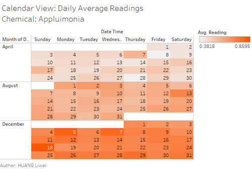
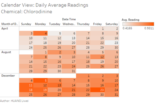
Now turn your attention to the chemicals themselves. Which chemicals are being detected by the sensor group? What patterns of chemical releases do you see, as being reported in the data? Limit your response to no more than 6 images and 500 words.
Question 3
Which factories are responsible for which chemical releases? Carefully describe how you determined this using all the data you have available. For the factories you identified, describe any observed patterns of operation revealed in the data. Limit your response to no more than 8 images and 1000 words.
Comments
Comment 1:
Overall, very interesting analysis and easy to understand visuals.
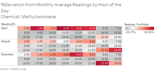
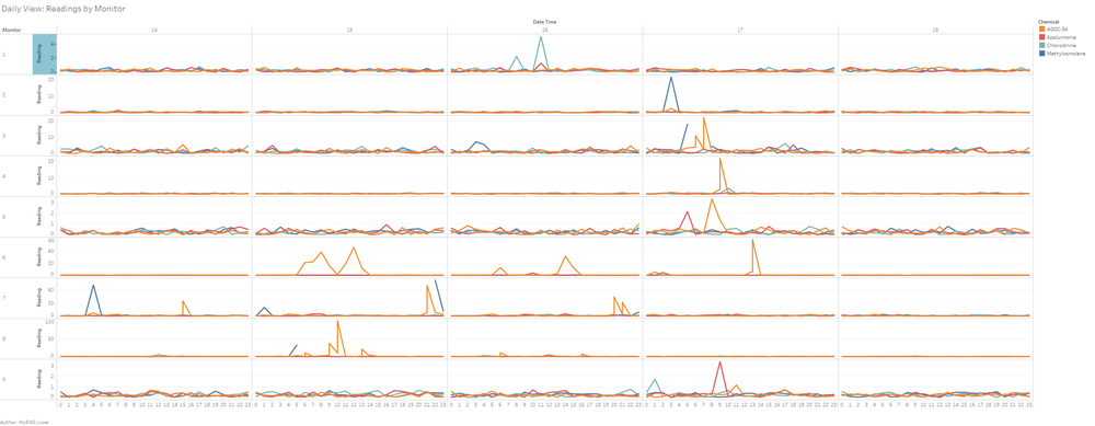
Please explore if you can improve on both aesthetics and clarity by having larger graphs for 2nd and last figures. Do consider light shades of grey for your non-graphic portions.
From: Chua Gim Hong
Comment 2:
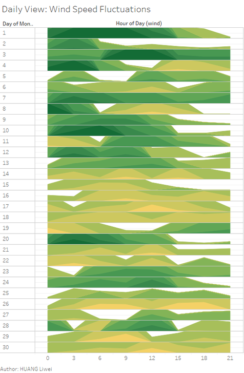
Well-done! I like your representation of the wind analysis in Qn 3. It is very clear to view the wind speed and direction at the hourly basis. That said, a minor point regarding the y-axis of the chart. Would it be possible to add the y-axis label (scale), so that we can view the wind speed? For now, we can only view the relative wind speed on the chart (i.e. hourly comparison) but not the actual wind speed.
Also, for the map graph in Q3, it would be clearer if a larger size image can be displayed on the wiki-page :)
From: Ngo Siew Hui

