ISSS608 2016-17 T3 ROGER VISUALIZATIONS
|
|
|
|
|
|
|
|
Radar Chart
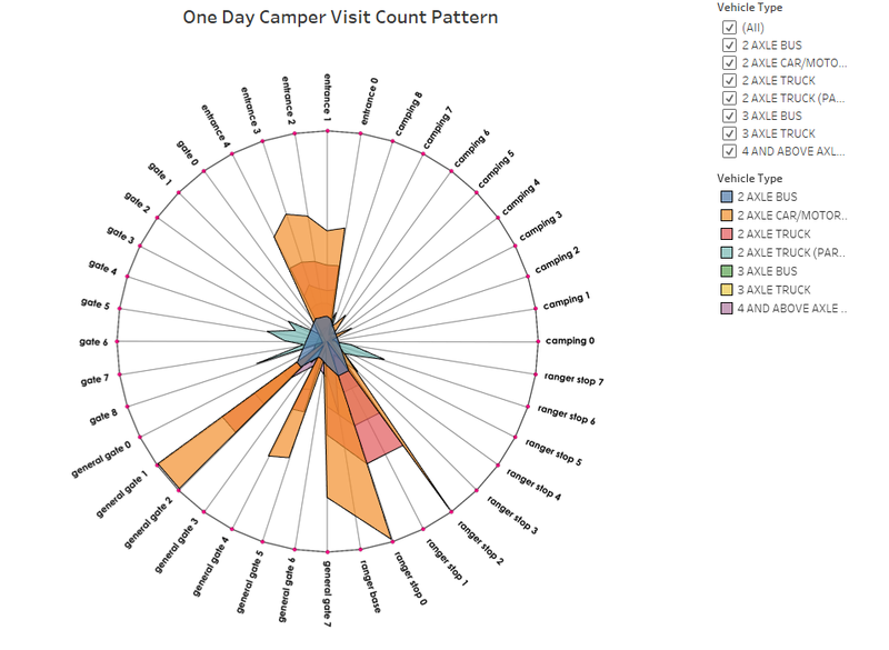
For this analysis, radar plot along with the geospatial visualization of the Boonsong Leakgul Preserve is provided. Radar charts, also known as Spider or Web charts, are a way of comparing multiple variables. This is useful to find which variables are similar and which variables has an outlier. In this case, the variables are the different location points where the sensors are located. The number of visits are considered as the quantitative measures of the variables. With the radar plots, similar and unusual patterns in different locations are observed.
Source: http://www.datavizcatalogue.com/methods/radar_chart.html
Some visuals from the analysis are show below
Radar Plot
In the above plot, each edge corresponds to a location (say entrance gates, general gates, gates, camping sites etc.) and the values represent the number of unique vehicles at each and every location point.
For example, the number of unique 2 axle cars/motorcycles at ranger stop 0, ranger stop 2, general gates 1 and 2 are almost the same as these 4 points lie on the same route and there are no diversions in between.
Geospatial Visualization
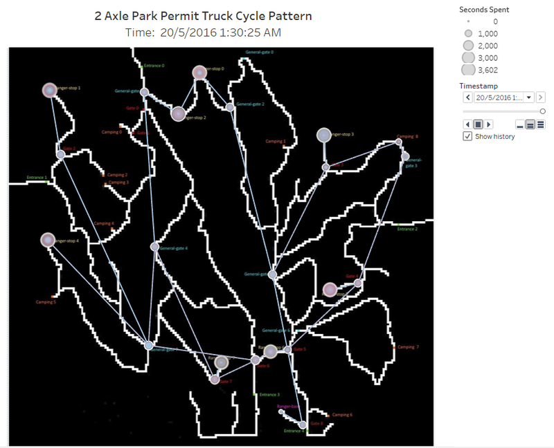
The above shows is a sample geospatial visualization showing the movement of 2 axle trucks inside the preserve. This will be explained more in detail during the analysis.


