Difference between revisions of "Project Proposal"
Yrzhang.2016 (talk | contribs) |
|||
| Line 89: | Line 89: | ||
===== DT ===== | ===== DT ===== | ||
The package name 'DT' is an abbreviation of 'DataTables'. It can turn normal datatables into more interactive including sorting, searching and turning pages. | The package name 'DT' is an abbreviation of 'DataTables'. It can turn normal datatables into more interactive including sorting, searching and turning pages. | ||
| − | |||
| − | |||
| − | |||
| − | |||
| − | |||
| − | |||
| − | |||
| − | |||
| − | |||
| − | |||
| − | |||
| − | |||
| − | |||
| − | |||
| − | |||
| − | |||
| − | |||
| − | |||
| − | |||
| − | |||
| − | |||
| − | |||
| − | |||
| − | |||
| − | |||
| − | |||
| − | |||
==User takeaways== | ==User takeaways== | ||
Revision as of 14:25, 7 August 2017
Discovering traffic patterns by using network graph visualisations
|
|
|
|
|
|
|
Contents
Project Proposal
Steps in planning and preparation of the application
- Making sense of the data provided.
- Selecting a real world practical use-case (Traffic networks).
- Choosing R and deriving maximum value of the ggraph and ggnetwork packages.
- Making the dataset reactive to user inputs and choosing the appropriate inputs.
- Compiling the deliverables to make a complete story through an interactive application.
- Drafting poster for quick readability and preliminary understanding.
Using R to visualise traffic networks
An overview on previous works on network graphic visualisations in R
Network visualisation in R has been quite popular in order to derive trends on association, social networks, etc. It has increasingly gained traction with new trends emerging especially in the field of social networks. Facebook launched the Graph API to track social network behavior in the form of nodes, edges and fields. These keywords form the pedestal upon which most network visualisations are built.
Developers have constantly strived to produce visualisations using various R packages such as visNetwork, ggnet, network, sna, etc. The blogs published by such developers provide an initial overview and reference for us to develop network visualisations. With ggraph being a relatively new package, similar ideologies applied in other network packages in R can be compared to see how ggraph produces visual outputs. A good example is provided by Katya Ognyanova and Francois Biratte.
What are the R packages needed?
The key packages used in the application include:
shiny
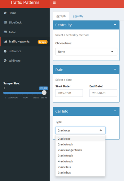
Shiny provides a web application framework for R. It enables easy development of interactive web applications by wrapping an user interface with a server script. Rending the app allows various interactive features such as dropdowns, sliders which will greatly enhance the user experience whilst using R. An example of a shiny interface which shows dropdowns, data range selectors is as shown.
shinydashboard
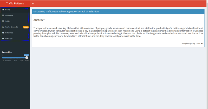
As business increasingly adopt the buzzword called ‘dashboards’ where a one-stop view is readily accessible, shinydashboard enables to embed a shiny application in a similar form. With a real world traction, we believe shinydashboard helps to make a comprehensive dashboard with customisable panes to show aspects such as data, visualisations and text. An example of how our dashboard helps achieve this is as shown in the below figure. In this example, we have included a set of presentation slides, text inputs, data tables which are rendered based on selection, and the overall shiny interface itself.
ggplot2
ggplot2 is a system for declaratively creating graphics, based on The Grammar of Graphics. You provide the data, tell ggplot2 how to map variables to aesthetics, what graphical primitives to use, and it takes care of the details. We use ggplot2 to build the network graph and manipulate the elements inside.
ggnetwork
Geometries to plot network objects with 'ggplot2', which is necessary for building network graph by ggplot.
ggraph
The grammar of graphics as implemented in ggplot2 is a poor fit for graph and network visualizations due to its reliance on tabular data input. ggraph is an extension of the ggplot2 API tailored to graph visualizations and provides the same flexible approach to building up plots layer by layer. We use ggraph to build the network graph as well.
igraph
Routines for simple graphs and network analysis. It can handle large graphs very well and provides functions for generating random and regular graphs, graph visualization, centrality methods and much more. Igraph object can be handled by ggraph. Nodes and edges information are required to create an igraph object.
tidygraph
While network data itself is not tidy, it can be envisioned as two tidy tables, one for node data and one for edge data. "tidygraph" provides a way to switch between the two tables and provides "dplyr" verbs for manipulating them. Furthermore it provides access to a lot of graph algorithms with return values that facilitate their use in a tidy workflow. Before building graph, we need to cleanse and transform the data into the correct format by using "tidygraph".
lubridate
Date-time data can be frustrating to work with in R. R commands for date-times are generally unintuitive and change depending on the type of date-time object being used. Moreover, the methods we use with date-times must be robust to time zones, leap days, daylight savings times, and other time related quirks, and R lacks these capabilities in some situations. Lubridate makes it easier to do the things R does with date-times and possible to do the things R does not. There is a lot of date format data and we need to transform and extract relevant information.
plotly
It's very powerful and make plots much more interactive. For plot created by ggplot, we can use "ggploly" function to make plot interactive including tooltips, brush action and so on.
DT
The package name 'DT' is an abbreviation of 'DataTables'. It can turn normal datatables into more interactive including sorting, searching and turning pages.
User takeaways
Network analysis can be a very useful tool to provide insights in the realm of data analytics. In our case, it is used to visualize time series data by building a network map revealing the patterns of traffic volumes at different points of the day at different corridors. Concepts such as betweenness and closeness centrality help us identify nodes that play an important role in facilitating paths from any two points and measures such as road expansion to smoothen the traffic or installation of gantries to divert them away may be necessary.
Going on further, network analysis can be applied to a myriad of problems and definitely not limited to just the visualization of traffic. For instance, suppose now the nodes were changed to people on facebook and the edges represent the relationship between them weighted by the number of likes and comments (the amount of activity). Such visualization can allow us to identify people who are influential on social media using relevant concepts such as eigenvector centrality and this information will be valuable to companies launching a new product and seeking to penetrate the social media effectively. In short, the usage of network analysis is highly relevant in solving real world problems and data analysts incorporating that tool into their arsenal can gain a significant competitive advantage.
Assumptions
The main underlying assumption lies with the mapping of the travel route for each vehicle. The data does not provide the GPS location of the cars at the different timestamps. Hence, a sorting of the timestamps is done based on records provided by the different entrances and it follows that a car travels directly to the next entrance after passing the current one where in fact it could have made a detour or take other routes without passing any entrances hence no data is being recorded.
Limitations
The ggraph package needs a well defined nodes and edges table in order to produce visualisations. While R Shiny enables development of quick and open source applications, extensive data transformation and reshaping is needed from the dataset in order to make full utilisation of the package for seamless performance of the application.
Future Scope
With the help of the timestamp and coordinate information of specified nodes, speeds of various vehicles can be derived, since the distance travelled and time spent between any two nodes are known. This will help to understand corridors in a vicinity where most speeding incidents occur, where there is higher congestion, etc. Also, at corridors with higher congestion typically in rush hours or after work hours, ERP pricings can be revised to divert the traffic to less congested areas.

