Difference between revisions of "ShinyNET Data Prep"
Rogers.2016 (talk | contribs) |
Rogers.2016 (talk | contribs) |
||
| Line 33: | Line 33: | ||
</div> | </div> | ||
| − | The data was available in public but the data of 12 carrier airlines were in PDF format. This data cannot be used for analysis. The flight schedule data is effective from 26th March 2017 to 28th October 2017. Since this data is in PDF format, it must be converted into excel first. We used online PDF to excel converter tool to convert this into excel documents. Some values in the excel format were out of place and those were corrected.<br /> | + | Since our visualisation is a geospatial network data, we need both geolocations and network data. The geolocation data is the location coordinates of airports. There are 77 airports in total. For getting geolocation coordinates, we used batch geocoding.<br /> |
| + | |||
| + | We used an online reverse geocoder to get the location coordinates of 77 airports. We keyed in the names of 77 airports and we get latitude and longitude values of all 77 inputs in order as output. The result latitude and longitude coordinates are combined with airport names and stored in an excel file.<br /> | ||
| + | |||
| + | For network data, we need to create nodes and edges data. The nodes data is the excel file that has the airport name and its latitude and longitude coordinates created above.<br /> | ||
| + | <center> | ||
| + | [[File:Data5.png|500px]] | ||
| + | </center> | ||
| + | |||
| + | The edges are the routes data that tells you the arrival and destination airport details of every flight. The routes data was available in public but the data of 12 carrier airlines were in PDF format. This data cannot be used for analysis. The flight schedule data is effective from 26th March 2017 to 28th October 2017. Since this data is in PDF format, it must be converted into excel first. We used online PDF to excel converter tool to convert this into excel documents. Some values in the excel format were out of place and those were corrected.<br /> | ||
<center> | <center> | ||
| Line 64: | Line 73: | ||
7. And finally concatenate all the 12 carrier files into one single big file.<br /> | 7. And finally concatenate all the 12 carrier files into one single big file.<br /> | ||
| − | A sample of the final prepared data file is shown below:<br /> | + | A sample of the final prepared routes data file is shown below:<br /> |
<center> | <center> | ||
[[File:Data4.png|500px]] | [[File:Data4.png|500px]] | ||
</center> | </center> | ||
| − | The data is now prepared and ready for visualisation. | + | The edges and routes data is now prepared and ready for visualisation. |
Revision as of 21:43, 6 August 2017
shinyNET:A web-based flight data visualisation toolkit using R Shiny and ggraph
|
|
|
|
|
|
Data Preparation
Since our visualisation is a geospatial network data, we need both geolocations and network data. The geolocation data is the location coordinates of airports. There are 77 airports in total. For getting geolocation coordinates, we used batch geocoding.
We used an online reverse geocoder to get the location coordinates of 77 airports. We keyed in the names of 77 airports and we get latitude and longitude values of all 77 inputs in order as output. The result latitude and longitude coordinates are combined with airport names and stored in an excel file.
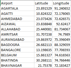
For network data, we need to create nodes and edges data. The nodes data is the excel file that has the airport name and its latitude and longitude coordinates created above.
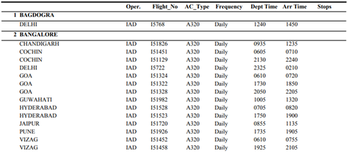
The edges are the routes data that tells you the arrival and destination airport details of every flight. The routes data was available in public but the data of 12 carrier airlines were in PDF format. This data cannot be used for analysis. The flight schedule data is effective from 26th March 2017 to 28th October 2017. Since this data is in PDF format, it must be converted into excel first. We used online PDF to excel converter tool to convert this into excel documents. Some values in the excel format were out of place and those were corrected.
We need a separate arrival and destination city column for our analysis so we transformed the converted excel file into the format shown below.
The frequency columns show what days of the week are the flights available. It contains either “Daily” or a sequence of characters between 1 and 7 (2357, 12347). Daily means the flight is available on all 7 days in a week. Whereas, value like 147 means the flight is available only on Sunday, Wednesday and Saturday (1-Sunday, 4-Wednesday, 7-Saturday).
We used python to do the following transformations:
1. Departure and Arrival time must be in HH:MM format.
2. The frequency column is transformed such a way that we replicated the flight based on what days are available between the effective time period. For example, if the frequency is “1”, then the particular flight is replicated for every Sundays between 26th March 2017 and 28th October 2017.
3. Additional carrier column has to be added indicating the carrier.
4. Adding date and day column to show date and day of the flight.
5. Replace all null values in stops column to 0.
6. Add frequency column (different from the original column). This frequency column shows the number of flights happened for a particular flight between the effective time period.
7. And finally concatenate all the 12 carrier files into one single big file.
A sample of the final prepared routes data file is shown below:
The edges and routes data is now prepared and ready for visualisation.


