Difference between revisions of "The Indian Story Report"
| Line 36: | Line 36: | ||
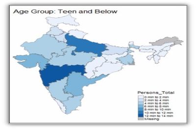
We were able to encode population parameters into color hue - Minimal colors were used so the map is clear enough. These maps helped visualise which state is dominant for a particular category like “number of Male literate” or “number of female illiterate”. | We were able to encode population parameters into color hue - Minimal colors were used so the map is clear enough. These maps helped visualise which state is dominant for a particular category like “number of Male literate” or “number of female illiterate”. | ||
We built the choropleth maps using R's tmap package along with QGIS for simplifying shape files. | We built the choropleth maps using R's tmap package along with QGIS for simplifying shape files. | ||
| + | |||
A sample of a choropleth map is as shown below: | A sample of a choropleth map is as shown below: | ||
| + | [[File:Picture1.jpg| 400 px]] | ||
The tab in the Shiny app that shows Choropleth is as shown: | The tab in the Shiny app that shows Choropleth is as shown: | ||
| − | + | [[File:ChoroplethTab.jpg| 400 px]] | |
As seen above in the diagram, the maps show the education level performances of each state by age group which can be further filtered by Gender. The bar plot gives us the distribution of population by States in India. | As seen above in the diagram, the maps show the education level performances of each state by age group which can be further filtered by Gender. The bar plot gives us the distribution of population by States in India. | ||
Revision as of 21:02, 6 August 2017
Contents
Motivation of the Application
In this era of increasing openness, the importance of information created or held by the government has become impossible to deny. Government is one of the largest producers of information in many areas, such as business information, health data, geographic data, census data, and legal information. Allowing the public to access public information has become an important objective in many of the latest data.gov initiative of countries worldwide. Despite the increasing availability of government data, the use of these data by the public is often hampered by a general lack of appropriate and unaffordable data exploratory and analysis tool. This is particularly true if the data is geospatial and high-dimensional in nature. In view of this, our project aims to design and develop a geo visual analytics tool for data discovery from geographically reference statistical data.
The application we developed is called CenViz. It is developed using R Shinny framework and several R data visualization packages such as tmpa, micromap and treemap. This presentation consists of four sections.First, the motivation and objectives of the project will be discussed.This is followed by a detailed discussion on the principles and concepts of micromap. After which, the R packages used to develop the application and the user-interface designed will be discussed. Using the latest census data of India, we will demonstrate how the functions of CenViz can be used to detect the geospatial patterns and attribute distributions of literacy in the country.
Review and critic on past works
Design Framework
Totally there are three tabs which will provide various data visualisations from different perspective with the user in our application.
Tmap
Choropleth maps gave context to our story. Even the audience not aware of India and its states could easily visualize the geographical map clearly displaying states. We were able to encode population parameters into color hue - Minimal colors were used so the map is clear enough. These maps helped visualise which state is dominant for a particular category like “number of Male literate” or “number of female illiterate”. We built the choropleth maps using R's tmap package along with QGIS for simplifying shape files.
A sample of a choropleth map is as shown below:

The tab in the Shiny app that shows Choropleth is as shown:
 As seen above in the diagram, the maps show the education level performances of each state by age group which can be further filtered by Gender. The bar plot gives us the distribution of population by States in India.
Treemap
Micromap
Demonstration
- Sample test cases
Discussion
- What has the audience learned from your work? What new insights or practices has your system enabled? A full blown user study is not expected, but informal observations of use that help evaluate your system are encouraged.
Future Work
- A description of how your system could be extended or refined.
Installation Guide
- including hardware configuration and software integrationn.
Sample Installation Guide
User Guide
- Step-by-step guide on how to use the data visualisation functions designed.
Sample User Guide
