Difference between revisions of "ISSS608 2016-17 T3 Assign ASMIT ADGAONKAR"
Asmita.2016 (talk | contribs) |
Asmita.2016 (talk | contribs) |
||
| Line 35: | Line 35: | ||
Distance (in miles) of each sensor from each factory | Distance (in miles) of each sensor from each factory | ||
[[File:Distancematrix.png| 200]] | [[File:Distancematrix.png| 200]] | ||
| − | [[File:Map1.png| | + | [[File:Map1.png| 200]] |
| + | |||
| + | It can be concluded from the distance matrix that sensor 6 is the closest sensor for all the factories and sensor 9 is farthest for Kasio and RoadRunner, whereas sensor 1 is farthest for Radiance and Indigo. | ||
| + | A combined average proximity of each sensor from the factories can be utilized to see a pattern in the sensor performance and operations. | ||
| + | Below clustered tree map shows sensors split into 3 clusters based on their proximity to the factories. It can be inferred that the sensor 6 is clearly the most closest to the factories whereas average proximity of sensor 5,9,7,4 fall in the same cluster/distance and sensor 3,8,2,1 fall in the last cluster of sensors that can be considered as sensors in the far reach of the factories. | ||
| + | |||
| + | [[File:Clusters_of_Sensors_Proximity_to_Factories.png| 400]] | ||
| + | |||
| + | |||
| + | A general hypothesis can be framed to expect that the sensors in the close proximity would show higher pollutant readings. | ||
| + | However, building a similar tree map for the readings of the sensors reveal that sensor 5 which considerably falls in close proximity of the factories demonstrates quite low readings in the month of April. | ||
| + | |||
| + | [[File:Treemap_of_the_4_chemicals_by_Day_Night_and_by_Monitor.png| 555]] | ||
Revision as of 22:11, 7 July 2017
MC2.1 – Characterize the sensors’ performance and operation. Are they all working properly at all times? Can you detect any unexpected behaviours of the sensors through analysing the readings they capture? Limit your response to no more than 9 images and 1000 words.
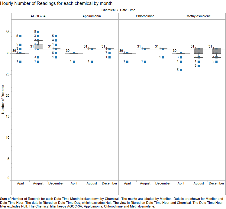
With the help of a boxplot of the hourly number of readings for each chemical each month, we can see a pattern in the aberration of sensor performance and operations.
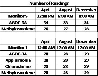
It can be seen that Monitor# 5 has failed to collect readings for Methylosmolene at 12 pm in April, 6 am in August and at 8 am in December. In contrast, the monitor has actually gone on to record those numbers and assign it to AGOC-3A chemical. A further investigation for this matter can be demanded to analyze the sensor logs and understand the manner in which sensors are designed to collect readings. Wind speed and wind direction can also be looked at these times to see if that has any influence on this flaw of sensor operation. Last but not the least, this particular behavior of showing overweight on AGOC and underweight on Methylosmolene should also portrayed on the big picture of whether the companies are any reason behind the tampering of the readings. Are these companies tampering the sensor to stay in compliance of the pollutant readings?
Similarly, it can be seen that Monitor#1 has failed to capture readings at midnight for all the chemicals for atleast 2-3 days in each of the months. It would be worth investigating if this is due to some sort of maintenance activity for the sensors or is there a genuine flaw in the operations there.
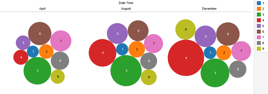
On similar lines, a quick bubble chart for each of the 3 months involving the readings of all the monitors tell us that readings/pollutants have increased gradually from April to December. However, special mention goes to sensor #4 which has increased significantly with the passage of time. It would be worth investigating if sensor 4 had any issues in April or whether it is largely influenced by wind speed and direction flowing in the line of the sensor.
2. The below dashboard was built to find out any significant patterns or dependency of wind speed category on the readings recorded by the sensors.
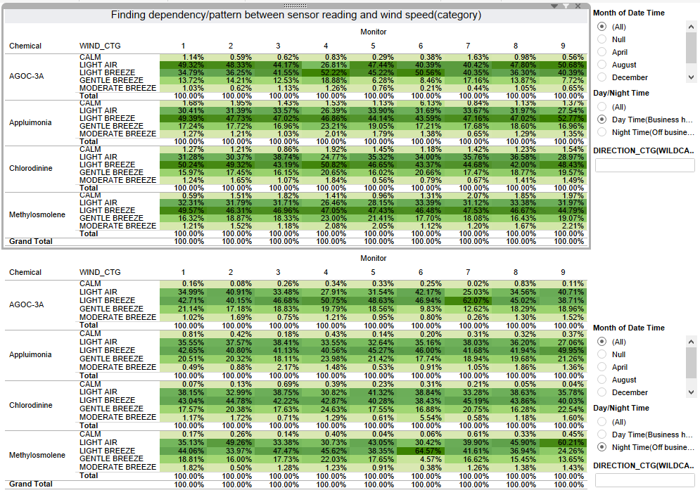
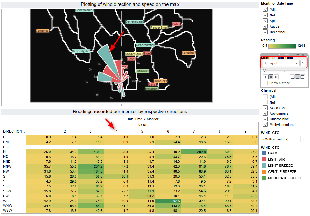
However, it can be inferred that pretty much all the sensors are following a similar pattern for the wind speed categories and there are no major differences leading up to any specific sensor pattern. Light Air and Light Breeze have each shown about 30-40% of the readings during day time (6 am to 6pm) whereas during night time (6pm to 6 am), gentle breeze seems to have increased it contribution to the readings for all sensors and for all chemicals, making light air, light breeze and gentle breeze as the major contributors for the readings. Re-visiting the significant increase in readings of monitor 4, and plotting the aggregated direction of wind for each of the months, it can be seen that there was considerable wind activity in the direction of sensor 4. It can be inferred that the wind was strong enough to blow away the chemical readings on sensor 4 and hence sensor 4 has been very strong enough to adjust to the high wind speed scenario witnessed in its direction.
A similar plot for the month of August and December help to support our findings about the influence of speed of wind and direction in the line of sensor 4 affecting its readings.
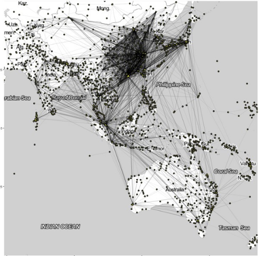
3. Performance of sensors is dependent on the direction of the wind and distance of the factories from each of the sensors. Based on the information provided that the map of 200*200 corresponds to 12*12 miles, we can calculate the distance between each sensor and each factory using the latitude-longitude points provided in the dataset.
Distance (in miles) of each sensor from each factory
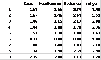
It can be concluded from the distance matrix that sensor 6 is the closest sensor for all the factories and sensor 9 is farthest for Kasio and RoadRunner, whereas sensor 1 is farthest for Radiance and Indigo. A combined average proximity of each sensor from the factories can be utilized to see a pattern in the sensor performance and operations. Below clustered tree map shows sensors split into 3 clusters based on their proximity to the factories. It can be inferred that the sensor 6 is clearly the most closest to the factories whereas average proximity of sensor 5,9,7,4 fall in the same cluster/distance and sensor 3,8,2,1 fall in the last cluster of sensors that can be considered as sensors in the far reach of the factories.
A general hypothesis can be framed to expect that the sensors in the close proximity would show higher pollutant readings.
However, building a similar tree map for the readings of the sensors reveal that sensor 5 which considerably falls in close proximity of the factories demonstrates quite low readings in the month of April.
