Difference between revisions of "The Indian Story Report"
| Line 31: | Line 31: | ||
=Design Framework= | =Design Framework= | ||
Totally there are three tabs which will provide various data visualisations from different perspective with the user in our application. | Totally there are three tabs which will provide various data visualisations from different perspective with the user in our application. | ||
| − | == | + | ==Treemap== |
| + | Treemap is most appropriate for hierarchical data. Certain packages in R related to treemap adds interactivity to the data and helps drill down through the hierarchy. | ||
| − | + | Treemap in the given context allows users to select a given state and then drill down further to town level literacy rates for various categories (e.g. Gender - Male, Education Level - Graduates). Size of the treemap shows population, colour is represents literacy rates(Education Level). | |
| − | + | R’s d3TreeR package for creating interactive tree maps were used to build the treemaps, and Tidyverse and tidy r packages for modifying the data. | |
| − | |||
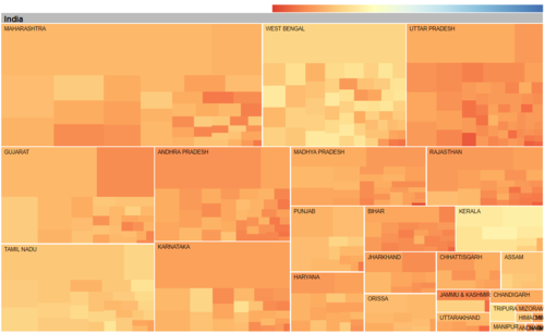
| − | A sample | + | A sample treemap that shows all states in India which can be further drilled down to city level is as shown below. |
| − | [[File: | + | [[File:Treemap.jpg| 500 px | left]] |
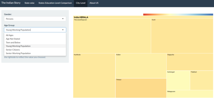
| − | The tab in the | + | The Cenviz tab that helps interact with treemap looks as in the following figure. |
| − | [[File: | + | [[File: InteractiveTreemap.jpg| 700 px | center]] |
| − | |||
| − | |||
==Treemap== | ==Treemap== | ||
Revision as of 21:33, 6 August 2017
Contents
Motivation of the Application
In this era of increasing openness, the importance of information created or held by the government has become impossible to deny. Government is one of the largest producers of information in many areas, such as business information, health data, geographic data, census data, and legal information. Allowing the public to access public information has become an important objective in many of the latest data.gov initiative of countries worldwide. Despite the increasing availability of government data, the use of these data by the public is often hampered by a general lack of appropriate and unaffordable data exploratory and analysis tool. This is particularly true if the data is geospatial and high-dimensional in nature. In view of this, our project aims to design and develop a geo visual analytics tool for data discovery from geographically reference statistical data.
The application we developed is called CenViz. It is developed using R Shinny framework and several R data visualization packages such as tmpa, micromap and treemap. This presentation consists of four sections.First, the motivation and objectives of the project will be discussed.This is followed by a detailed discussion on the principles and concepts of micromap. After which, the R packages used to develop the application and the user-interface designed will be discussed. Using the latest census data of India, we will demonstrate how the functions of CenViz can be used to detect the geospatial patterns and attribute distributions of literacy in the country.
Review and critic on past works
Design Framework
Totally there are three tabs which will provide various data visualisations from different perspective with the user in our application.
Treemap
Treemap is most appropriate for hierarchical data. Certain packages in R related to treemap adds interactivity to the data and helps drill down through the hierarchy.
Treemap in the given context allows users to select a given state and then drill down further to town level literacy rates for various categories (e.g. Gender - Male, Education Level - Graduates). Size of the treemap shows population, colour is represents literacy rates(Education Level). R’s d3TreeR package for creating interactive tree maps were used to build the treemaps, and Tidyverse and tidy r packages for modifying the data.
A sample treemap that shows all states in India which can be further drilled down to city level is as shown below.
The Cenviz tab that helps interact with treemap looks as in the following figure.
Treemap
Micromap
Demonstration
- Sample test cases
Discussion
- What has the audience learned from your work? What new insights or practices has your system enabled? A full blown user study is not expected, but informal observations of use that help evaluate your system are encouraged.
Future Work
- A description of how your system could be extended or refined.
Installation Guide
- including hardware configuration and software integrationn.
Sample Installation Guide
User Guide
- Step-by-step guide on how to use the data visualisation functions designed.
Sample User Guide


