Difference between revisions of "Project Proposal"
| Line 63: | Line 63: | ||
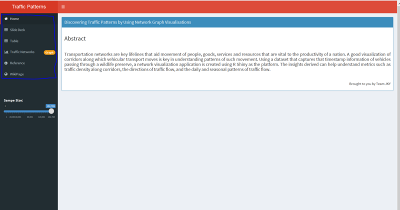
<p style="text-align: justify;"><span style="font-size: 11pt; font-family: Arial; color: #000000; background-color: transparent; font-weight: 400; font-variant: normal; text-decoration: none; vertical-align: baseline; white-space: pre-wrap;">As business increasingly adopt the buzzword called ‘dashboards’ where a one-stop view is readily accessible, shinydashboard enables to embed a shiny application in a similar form. With a real world traction, we believe shinydashboard helps to make a comprehensive dashboard with customisable panes to show aspects such as data, visualisations and text. An example of how our dashboard helps achieve this is as shown in the below figure. In this example, we have included a set of presentation slides, text inputs, data tables which are rendered based on selection, and the overall shiny interface itself.</span></p> | <p style="text-align: justify;"><span style="font-size: 11pt; font-family: Arial; color: #000000; background-color: transparent; font-weight: 400; font-variant: normal; text-decoration: none; vertical-align: baseline; white-space: pre-wrap;">As business increasingly adopt the buzzword called ‘dashboards’ where a one-stop view is readily accessible, shinydashboard enables to embed a shiny application in a similar form. With a real world traction, we believe shinydashboard helps to make a comprehensive dashboard with customisable panes to show aspects such as data, visualisations and text. An example of how our dashboard helps achieve this is as shown in the below figure. In this example, we have included a set of presentation slides, text inputs, data tables which are rendered based on selection, and the overall shiny interface itself.</span></p> | ||
| + | |||
| + | [[File:Group1_ShinyDashboardExample.PNG|800px|centre]] | ||
===== ggraph ===== | ===== ggraph ===== | ||
Revision as of 12:08, 5 August 2017
Discovering traffic patterns by using network graph visualisations
|
|
|
|
|
|
|
Contents
- 1 Project Proposal
- 2 Using R to visualise traffic networks
- 3 User Guide to develop the visualisations
- 4 User takeaways
- 5 Assumptions
- 6 Limitations
- 7 Future Scope
Project Proposal
Steps in planning and preparation of the application
- Making sense of the data provided.
- Selecting a real world practical use-case (Traffic networks).
- Choosing R and deriving maximum value of the ggraph and ggnetwork packages.
- Making the dataset reactive to user inputs and choosing the appropriate inputs.
- Compiling the deliverables to make a complete story through an interactive application.
- Drafting poster for quick readability and preliminary understanding.
Using R to visualise traffic networks
An overview on previous works on network graphic visualisations in R
Network visualisation in R has been quite popular in order to derive trends on association, social networks, etc. It has increasingly gained traction with new trends emerging especially in the field of social networks. Facebook launched the Graph API to track social network behavior in the form of nodes, edges and fields. These keywords form the pedestal upon which most network visualisations are built.
Developers have constantly strived to produce visualisations using various R packages such as visNetwork, ggnet, network, sna, etc. The blogs published by such developers provide an initial overview and reference for us to develop network visualisations. With ggraph being a relatively new package, similar ideologies applied in other network packages in R can be compared to see how ggraph produces visual outputs. A good example is provided by Katya Ognyanova and Francois Biratte.
What are the R packages needed?
The key packages used in the application include:
shiny
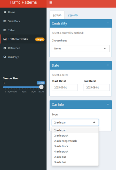
Shiny provides a web application framework for R. It enables easy development of interactive web applications by wrapping an user interface with a server script. Rending the app allows various interactive features such as dropdowns, sliders which will greatly enhance the user experience whilst using R. An example of a shiny interface which shows dropdowns, data range selectors is as shown.
shinydashboard
As business increasingly adopt the buzzword called ‘dashboards’ where a one-stop view is readily accessible, shinydashboard enables to embed a shiny application in a similar form. With a real world traction, we believe shinydashboard helps to make a comprehensive dashboard with customisable panes to show aspects such as data, visualisations and text. An example of how our dashboard helps achieve this is as shown in the below figure. In this example, we have included a set of presentation slides, text inputs, data tables which are rendered based on selection, and the overall shiny interface itself.
ggraph
tidygraph
igraph
ggnetwork
lubridate
plotly
intergraph
DT
ggplot2
scales
User Guide to develop the visualisations
Transforming data in R to develop network graphs
In order to make the network graph render, a well defined nodes and edges table is necessary. Once the main data table is uploaded onto R, the data manipulation functions from R are used in order to achieve the objectives to segregate into a nodes table and edges table.
Deriving new variables for user interactivity:
In order to make the network graph render, a well defined nodes and edges table is necessary. Once the main data table is uploaded onto R, the data manipulation functions from R are used in order to achieve the objectives to segregate into a nodes table and edges table.
Developing the nodes table
In order to make the network graph render, a well defined nodes and edges table is necessary. Once the main data table is uploaded onto R, the data manipulation functions from R are used in order to achieve the objectives to segregate into a nodes table and edges table.
Developing the edges table
In order to make the network graph render, a well defined nodes and edges table is necessary. Once the main data table is uploaded onto R, the data manipulation functions from R are used in order to achieve the objectives to segregate into a nodes table and edges table.
Developing a network graph using ‘ggraph’:
In order to make the network graph render, a well defined nodes and edges table is necessary. Once the main data table is uploaded onto R, the data manipulation functions from R are used in order to achieve the objectives to segregate into a nodes table and edges table.
Developing a network graph using ‘ggnetwork’:
In order to make the network graph render, a well defined nodes and edges table is necessary. Once the main data table is uploaded onto R, the data manipulation functions from R are used in order to achieve the objectives to segregate into a nodes table and edges table.
Adding interactivity to the plots using ggplotly:
In order to make the network graph render, a well defined nodes and edges table is necessary. Once the main data table is uploaded onto R, the data manipulation functions from R are used in order to achieve the objectives to segregate into a nodes table and edges table.
Making the shiny dashboard:
Design Framework: A detail description of the design principles used and data visualisation elements built (Refer to Section 3: Interface of this paper [1].
The application developed is available at the App & Deliverables tab.
User takeaways
Discussion - What has the audience learned from your work? What new insights or practices has your system enabled? A full blown user study is not expected, but informal observations of use that help evaluate your system are encouraged.
Discussion - What has the audience learned from your work? What new insights or practices has your system enabled? A full blown user study is not expected, but informal observations of use that help evaluate your system are encouraged.
Assumptions
The main underlying assumption lies with the mapping of the travel route for each vehicle. The data does not provide the GPS location of the cars at the different timestamps. Hence, a sorting of the timestamps is done based on records provided by the different entrances and it follows that a car travels directly to the next entrance after passing the current one where in fact it could have made a detour or take other routes without passing any entrances hence no data is being recorded.
Limitations
The ggraph package needs a well defined nodes and edges table in order to produce visualisations. While R Shiny enables development of quick and open source applications, extensive data transformation and reshaping is needed from the dataset in order to make full utilisation of the package for seamless performance of the application.
Future Scope
Future Work - A description of how your system could be extended or refined.
With the help of the timestamp and coordinate information of specified nodes, speeds of various vehicles can be derived, since the distance travelled and time spent between any two nodes are known. This will help to understand corridors in a vicinity where most speeding incidents occur, where there is higher congestion, etc. Also, at corridors with higher congestion typically in rush hours or after work hours, ERP pricings can be revised to divert the traffic to less congested areas.

