Difference between revisions of "ISSS608 2016-17 T3 ROGER DATA EXPLORATION"
Rogers.2016 (talk | contribs) |
Rogers.2016 (talk | contribs) |
||
| Line 116: | Line 116: | ||
Tick “Show history” box and set the configurations to map traces. | Tick “Show history” box and set the configurations to map traces. | ||
<br /> | <br /> | ||
| − | [[File:15 Traces.png| | + | [[File:15 Traces.png|400px|centre]] |
<br /> | <br /> | ||
Now, the final picture is ready to be used. | Now, the final picture is ready to be used. | ||
Revision as of 11:31, 16 July 2017
|
|
|
|
|
|
|
|
Data Preparation
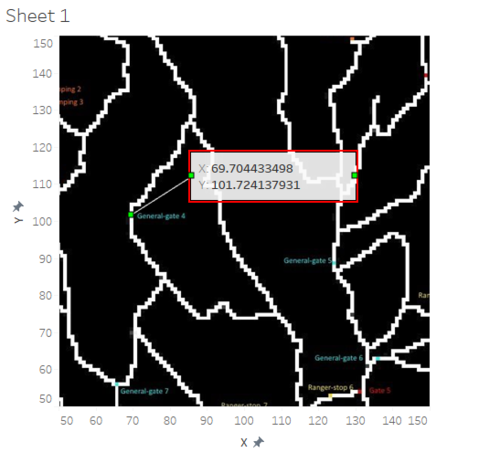
First, the map has been added in tableau. At every location point right click is done, and annotate point option is selected. This gives us the X and Y coordinates for every point.
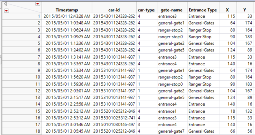
In this similar way, all the location coordinates are found and is joined with the given sensor data based on the gate names.
The formula used to calculate seconds spent is shown below. Only if the previous car id and current car id are the same, then the number of seconds spent is calculated by subtracting time with the time of the previous row.
From the date, the day and the hour are calculated using the data and time functions.
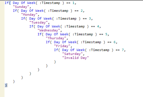
The day of the week is captured using the formula as shown below.
For multiple day users, the day of the trip is calculated using the below formula.
To find single day users and multiple day users,
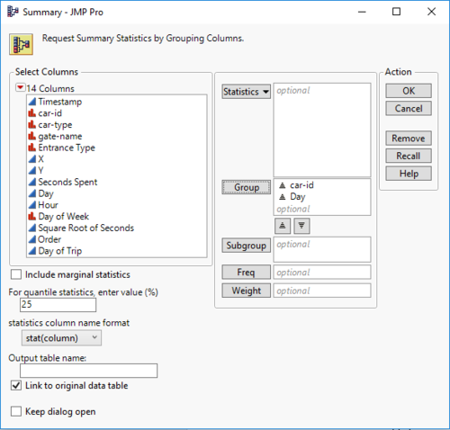
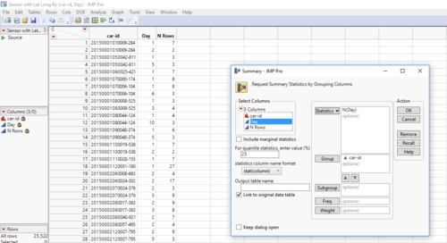
1. Create a summary table by grouping car-id and day fields.
2. Another summary table is made by grouping car id and providing N(days) as value.
3. The result provides car id with no of days spent.
4. Now filter one day visitors where N(day) is 1 and the rest are multiple day users. These filtered data sets can be used for analysis.
Creating dashboard data
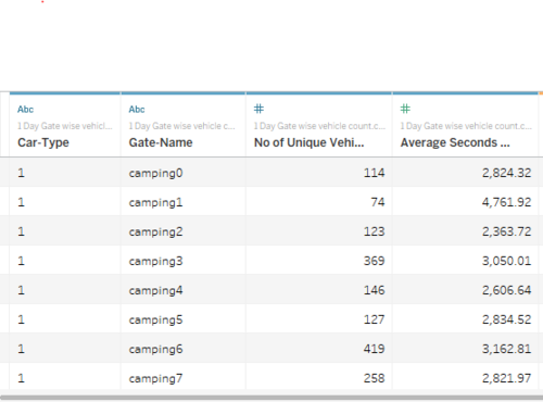
From the above filtered data, the vehicle counts per location point data is calculated.
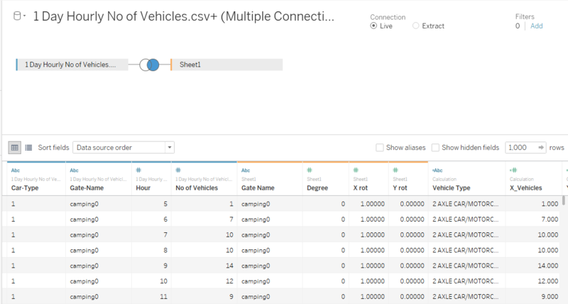
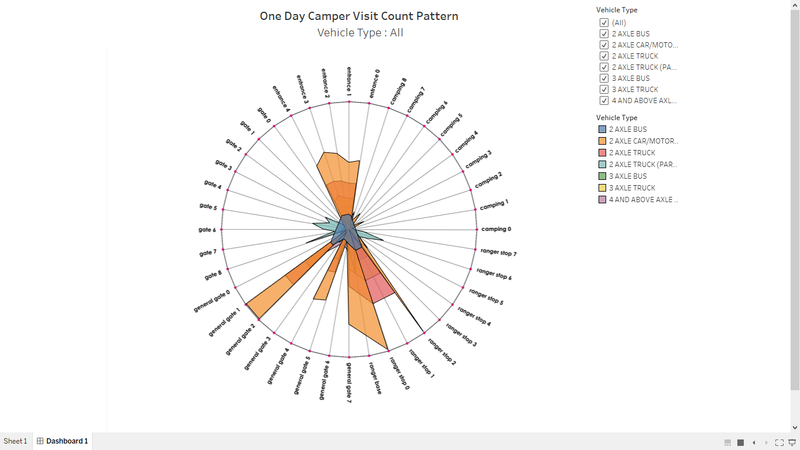
To create a radar plot, the list of gates in order and a specific degree (0-359) is assigned. Then for every gate, cos(degree) and sin(degree) is taken as the rotation coordinates.
This is imported to tableau along with the previously prepared data and joining is done based on gate name.
Vehicle counts are then multiplied with X_rot and Y_rot (aggregated to avg) to get the actual X and Y coordinates are radar plot.
Once the points are placed, the marks is set to polygon for filled color. Details, color and filter are given based on calculated vehicle type.
Finally ,hour is added into pages section to navigate vehicle counts over hour.
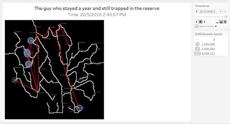
For pattern movements
Filter the data with fishy pattens.
Plot them in the map.
Set SUM(Seconds) as size.
Put timestamp as the pages.
Tick “Show history” box and set the configurations to map traces.
Now, the final picture is ready to be used.

