Difference between revisions of "The Indian Story Report"
| (22 intermediate revisions by 2 users not shown) | |||
| Line 31: | Line 31: | ||
Let us look at some of the existing visualizations. <br/><br/> | Let us look at some of the existing visualizations. <br/><br/> | ||
| − | [[File: Critic.png| | + | [[File: Critic.png| 500 px]] [[File: TreemapCritic.png|550px]] <br/><br/> |
* The choice of a scatter plot here does not seem appropriate. To see growth, bar or line graphs seem more sensible. | * The choice of a scatter plot here does not seem appropriate. To see growth, bar or line graphs seem more sensible. | ||
| Line 37: | Line 37: | ||
* While this is just one example of the study, in the overall study, there was no context provided. If one does not know India, the study is extremely difficult to relate to. | * While this is just one example of the study, in the overall study, there was no context provided. If one does not know India, the study is extremely difficult to relate to. | ||
* The aesthetics make it only harder to understand the insights further. The various visualizations were not well connected to build a story. | * The aesthetics make it only harder to understand the insights further. The various visualizations were not well connected to build a story. | ||
| + | |||
| + | * Treemaps built in this study are at state level and mostly provides just the population related information. Further drilling down in the hierrachy would have helped. | ||
| + | * Since there is no context provided about the country itself, treemaps at state level rather than at city level doesn't seem sufficient for users to udnerstand the insights. | ||
| + | * Aesthetics of the treemap does not seem appropriate either, with too many shades of blue. One of the most important visual design guidelines is the optimal usage of color. | ||
| + | * Most existing study have static visualizations that restricts users from exploring data more. | ||
Therefore, in our study, we followed some important visual guidelines to ensure the graphs provide context, no junk charts, good amount of interactivity, and also involves referential statistical. | Therefore, in our study, we followed some important visual guidelines to ensure the graphs provide context, no junk charts, good amount of interactivity, and also involves referential statistical. | ||
| − | <br/> | + | <br/><br/> |
=Design Framework= | =Design Framework= | ||
| Line 46: | Line 51: | ||
Choropleth maps gave context to our story. Even the audience not aware of India and its states could easily visualize the geographical map clearly displaying states. | Choropleth maps gave context to our story. Even the audience not aware of India and its states could easily visualize the geographical map clearly displaying states. | ||
We were able to encode population parameters into color hue - Minimal colors were used so the map is clear enough. These maps helped visualise which state is dominant for a particular category like “number of Male literate” or “number of female illiterate”. | We were able to encode population parameters into color hue - Minimal colors were used so the map is clear enough. These maps helped visualise which state is dominant for a particular category like “number of Male literate” or “number of female illiterate”. | ||
| − | We built the | + | We built the Choropleth maps using R's tmap package along with QGIS for simplifying shape files. |
| − | A sample of a | + | A sample of a Choropleth map is as shown below, and on the right is the Shiny app interface. |
| − | |||
| − | |||
| − | |||
| − | |||
| + | [[File:Picture1.jpg| 500 px]] | ||
[[File: ChoroplethTab.jpg| 700 px]] | [[File: ChoroplethTab.jpg| 700 px]] | ||
| Line 88: | Line 90: | ||
=Demonstration= | =Demonstration= | ||
| − | Tmap | + | ==Tmap== |
| + | One of the use cases that helps best evaluate out Tmap is for the users to select 'Persons' in Gender filter, and 'Graduates' in Education Level. | ||
| + | The Tmap for the age group Teen and Below should be empty with no colors signifying, no Teen and Below aged person can be a Graduate. | ||
| + | The result of the search is shown below. | ||
| + | [[File:TeenAndBelow.jpg| 500 px]] | ||
| − | + | ==Treemap== | |
| + | For treemap, let us take a use case of Comparing number of graduates in India before independence and India after independence. | ||
| + | In treemap, select Education Level to be Graduates and Age group as Senior Citizens. The following map appears. | ||
| − | + | [[File:TreeMapDemo1.png| 500 px]] | |
| + | <br/> | ||
| + | Next, in the treemap, select Education Level as Graduates and Age group as Young Working Population. The following treemap appears. | ||
| − | <br/> | + | [[File:TreeMapDemo.png| 500 px]] |
| + | |||
| + | In the first treemap, number of graduates is extremely low as represented by the color red, while in the second treemap, number of graduates is extremely high compared to the first map. The current population that falls under 65 - 80+ years old belong to British era, while the Young Working population is the current - mostly IT India. | ||
| + | The increase in the number of graduates within 20 years shows India is growing. | ||
| + | |||
| + | ==Micromap== | ||
| + | Let us take the same scenario of studying Micromaps for Graduates. | ||
| + | Uttarakhand seems to have high number of graduates. To support this result, when we look at the corresponding Treemap of the state Uttarakhand, the city Roorkee has the highest number of graduates. IIT Roorkee being one of the finest institutes in India supports the hypothesis further. | ||
| + | The result of the stated use case is shown below. <br/> | ||
| + | [[File: MicromapUseCase.png| 500 px]] | ||
| + | [[File: MicromapUseCase1.png| 700 px]] | ||
| + | <br/><br/> | ||
=Discussion= | =Discussion= | ||
* Top 5 populous states: Maharashtra, Uttar Pradesh, Andhra Pradesh, Gujarat, West Bengal. | * Top 5 populous states: Maharashtra, Uttar Pradesh, Andhra Pradesh, Gujarat, West Bengal. | ||
| − | * | + | * Top illiterate cities: Rampur, Amroha, Sambhal in Uttar Pradesh, Bagaha in Bihar with illiterace rate of around 45%. |
| + | * Top literate cities: Kochi, Thrissur in Kerala, Darjiling, Khardaga, North Barrackpur in West Bengal with literacy rate of around 90%. | ||
* Most literate state: Kerala. | * Most literate state: Kerala. | ||
* Most graduates - especially IT are moving towards the IT triangle in the South - Bangalore, Hyderabad, and Chennai. | * Most graduates - especially IT are moving towards the IT triangle in the South - Bangalore, Hyderabad, and Chennai. | ||
| − | * | + | * Number of graduates have tremendously increased in 20 years which is a clear representation of India growing! |
| + | * For the age group “Teen and Below”, Anantnag & Srinagar in Jammu & Kashmir have the highest primary education rate of around 70%. While Tiruppur, Rajapalayam in Tamil Nadu have the lowest primary education rate of around 25%. Many towns in Andhra Pradesh also have low primary education rate. | ||
| + | * S.A.S Nagar in Punjab, Panchkula in Haryana and Bidhan Nagar in West Bengal have the highest graduates rate (40%) in India. | ||
<br/> | <br/> | ||
=Future Work= | =Future Work= | ||
| − | 1) | + | 1) For the state-wide view (four map and one bar chart), since four variables are used, the more appropriate data visualisation will be parallel coordinates or heatmap. This can be considered for future work.<br/> |
| − | + | [[File:ChoroplethTab.jpg| 600 px]] | |
| − | [[File: | ||
<br/><br/> | <br/><br/> | ||
| − | 2) Micromap package has a limitation that the micromap cannot be embedded into the Shiny app. However, it can be displayed as pop-up from the Shiny app. | + | 2) Micromap package has a limitation that the micromap cannot be embedded into the Shiny app. However, it can be displayed as pop-up from the Shiny app. <br/> |
[[File: InteractiveMicromap.jpg| 600 px]] | [[File: InteractiveMicromap.jpg| 600 px]] | ||
| − | <br/> | + | <br/><br/> |
=Installation Guide= | =Installation Guide= | ||
The installation guide is introduced in detail at: https://wiki.smu.edu.sg/1617t3isss608g1/The_Indian_Story_Application | The installation guide is introduced in detail at: https://wiki.smu.edu.sg/1617t3isss608g1/The_Indian_Story_Application | ||
| − | <br/> | + | <br/><br/> |
=User Guide= | =User Guide= | ||
| − | + | 1) Go to CenViz application link - https://mandiluo.shinyapps.io/The_Indian_Story/ | |
| − | + | ||
| + | 2) The tab ‘State-wise’ provides Choropleth visualizations that provides context to data. | ||
| + | |||
| + | 3) There are 2 filters - Gender and Education Level. Click on the corresponding filters and click on ‘Search’ button to see the relevant Tmap result. | ||
| + | |||
| + | 4) Navigate to the next tab ‘City-level’ that provides a Treemap per state, further drilled down to City level. | ||
| + | |||
| + | 5) There are 3 filters – Gender, Age Group and Education Level. Click on the corresponding filters and click on ‘Search’ button to see the relevant Treemap result. | ||
| + | |||
| + | 6) The next tab is ‘States-Education-Level-Comparison’ which provides Micromap visulaization. This tab is not interactive owing to the limitation of the Shiny server that does not support the popup functionality used to display Micromap on Shiny. However, a detailed guideline to interact with Micromaps is explained in the Installation Guide. | ||
Latest revision as of 01:46, 7 August 2017
Contents
Motivation of the Application
In this era of increasing openness, the importance of information created or held by the government has become impossible to deny. Government is one of the largest producers of information in many areas, such as business information, health data, geographic data, census data, and legal information. Allowing the public to access public information has become an important objective in many of the latest data.gov initiative of countries worldwide. Despite the increasing availability of government data, the use of these data by the public is often hampered by a general lack of appropriate and unaffordable data exploratory and analysis tool. This is particularly true if the data is geospatial and high-dimensional in nature. In view of this, our project aims to design and develop a geo visual analytics tool for data discovery from geographically reference statistical data.
The application we developed is called CenViz. It is developed using R Shinny framework and several R data visualization packages such as tmpa, micromap and treemap. This presentation consists of four sections.First, the motivation and objectives of the project will be discussed.This is followed by a detailed discussion on the principles and concepts of micromap. After which, the R packages used to develop the application and the user-interface designed will be discussed. Using the latest census data of India, we will demonstrate how the functions of CenViz can be used to detect the geospatial patterns and attribute distributions of literacy in the country.
Review and critic on past works
Some of the existing studies include only the statistical maps which mostly give the distribution of literacy among states and cities, by gender, and education levels.
Let us look at some of the existing visualizations.
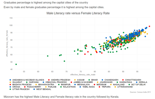
- The choice of a scatter plot here does not seem appropriate. To see growth, bar or line graphs seem more sensible.
- Moreover, in the above graph, multiple states have the same color, and the legend is not well described.
- While this is just one example of the study, in the overall study, there was no context provided. If one does not know India, the study is extremely difficult to relate to.
- The aesthetics make it only harder to understand the insights further. The various visualizations were not well connected to build a story.
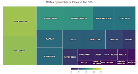
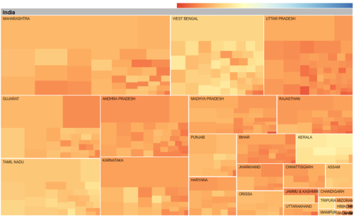
- Treemaps built in this study are at state level and mostly provides just the population related information. Further drilling down in the hierrachy would have helped.
- Since there is no context provided about the country itself, treemaps at state level rather than at city level doesn't seem sufficient for users to udnerstand the insights.
- Aesthetics of the treemap does not seem appropriate either, with too many shades of blue. One of the most important visual design guidelines is the optimal usage of color.
- Most existing study have static visualizations that restricts users from exploring data more.
Therefore, in our study, we followed some important visual guidelines to ensure the graphs provide context, no junk charts, good amount of interactivity, and also involves referential statistical.
Design Framework
Totally there are three tabs which will provide various data visualisations from different perspective with the user in our application.
Tmap
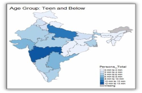
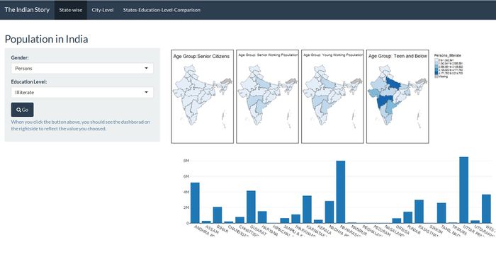
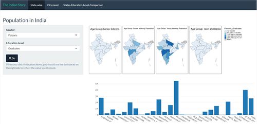
Choropleth maps gave context to our story. Even the audience not aware of India and its states could easily visualize the geographical map clearly displaying states. We were able to encode population parameters into color hue - Minimal colors were used so the map is clear enough. These maps helped visualise which state is dominant for a particular category like “number of Male literate” or “number of female illiterate”. We built the Choropleth maps using R's tmap package along with QGIS for simplifying shape files. A sample of a Choropleth map is as shown below, and on the right is the Shiny app interface.
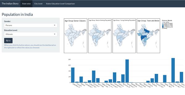
As seen above in the diagram, the maps show the education level performances of each state by age group which can be further filtered by Gender. The bar plot gives us the distribution of population by States in India.
Treemap
Treemap is most appropriate for hierarchical data. Certain packages in R related to treemap adds interactivity to the data and helps drill down through the hierarchy.
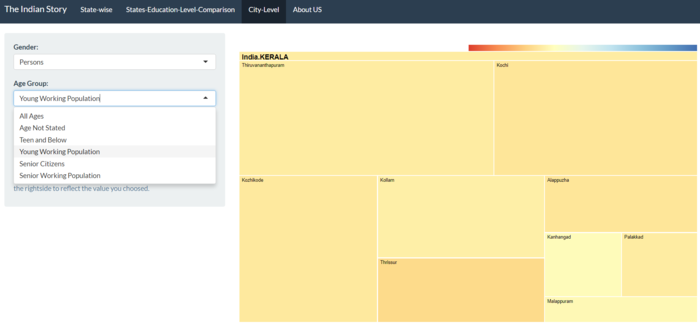
Treemap in the given context allows users to select a given state and then drill down further to town level literacy rates for various categories (e.g. Gender - Male, Education Level - Graduates). Size of the treemap shows population, colour is represents literacy rates(Education Level). R’s d3TreeR package for creating interactive tree maps were used to build the treemaps, and Tidyverse and tidy r packages for modifying the data.
A sample treemap that shows all states in India which can be further drilled down to city level is as shown below. Cenviz tab (on the right) that helps interact with treemap.
Micromap
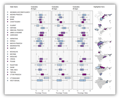
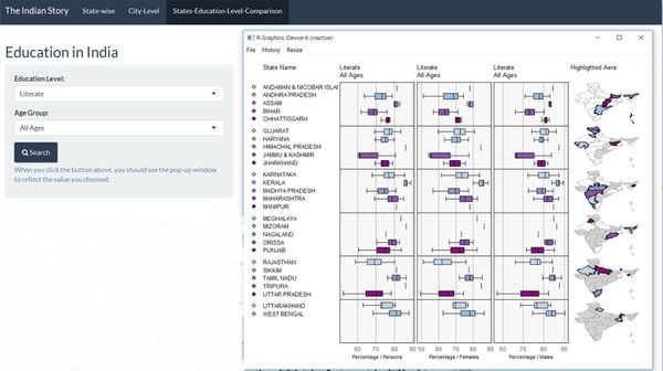
Micromaps helps understand the distribution of education levels across cities per state. It not only adds statistical inferences, but also gives a geographical context. In the given context, for example,for “Males”, “Females” and “all” it plots the box plot of literacy rates based on town-wise literacy rate data. It gives a look “into” the states themselves that helps us understand what cities cause a skewed distribution, thereby portraying different results than the actual. R’s micromap package for creating the choropleth, QGIS for simplifying the shape files were used to build micromap.
A sample micromap is as shown below.The tab on Cenviz that helps interact with the micromap is shown on the right.
Demonstration
Tmap
One of the use cases that helps best evaluate out Tmap is for the users to select 'Persons' in Gender filter, and 'Graduates' in Education Level. The Tmap for the age group Teen and Below should be empty with no colors signifying, no Teen and Below aged person can be a Graduate. The result of the search is shown below.
Treemap
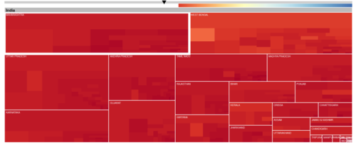
For treemap, let us take a use case of Comparing number of graduates in India before independence and India after independence. In treemap, select Education Level to be Graduates and Age group as Senior Citizens. The following map appears.
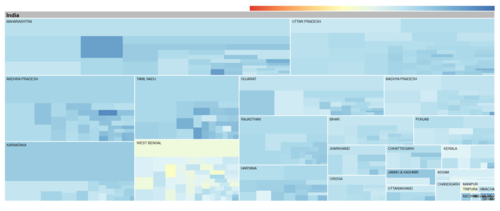
Next, in the treemap, select Education Level as Graduates and Age group as Young Working Population. The following treemap appears.
In the first treemap, number of graduates is extremely low as represented by the color red, while in the second treemap, number of graduates is extremely high compared to the first map. The current population that falls under 65 - 80+ years old belong to British era, while the Young Working population is the current - mostly IT India. The increase in the number of graduates within 20 years shows India is growing.
Micromap
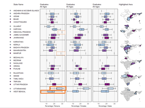
Let us take the same scenario of studying Micromaps for Graduates.
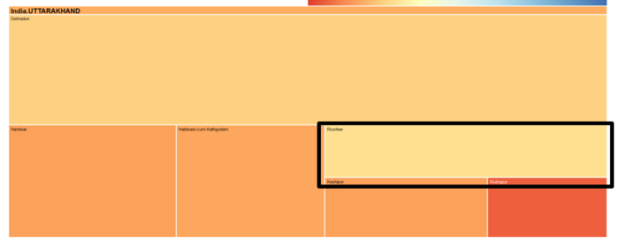
Uttarakhand seems to have high number of graduates. To support this result, when we look at the corresponding Treemap of the state Uttarakhand, the city Roorkee has the highest number of graduates. IIT Roorkee being one of the finest institutes in India supports the hypothesis further.
The result of the stated use case is shown below.
Discussion
- Top 5 populous states: Maharashtra, Uttar Pradesh, Andhra Pradesh, Gujarat, West Bengal.
- Top illiterate cities: Rampur, Amroha, Sambhal in Uttar Pradesh, Bagaha in Bihar with illiterace rate of around 45%.
- Top literate cities: Kochi, Thrissur in Kerala, Darjiling, Khardaga, North Barrackpur in West Bengal with literacy rate of around 90%.
- Most literate state: Kerala.
- Most graduates - especially IT are moving towards the IT triangle in the South - Bangalore, Hyderabad, and Chennai.
- Number of graduates have tremendously increased in 20 years which is a clear representation of India growing!
- For the age group “Teen and Below”, Anantnag & Srinagar in Jammu & Kashmir have the highest primary education rate of around 70%. While Tiruppur, Rajapalayam in Tamil Nadu have the lowest primary education rate of around 25%. Many towns in Andhra Pradesh also have low primary education rate.
- S.A.S Nagar in Punjab, Panchkula in Haryana and Bidhan Nagar in West Bengal have the highest graduates rate (40%) in India.
Future Work
1) For the state-wide view (four map and one bar chart), since four variables are used, the more appropriate data visualisation will be parallel coordinates or heatmap. This can be considered for future work.
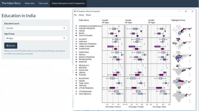
2) Micromap package has a limitation that the micromap cannot be embedded into the Shiny app. However, it can be displayed as pop-up from the Shiny app.
Installation Guide
The installation guide is introduced in detail at: https://wiki.smu.edu.sg/1617t3isss608g1/The_Indian_Story_Application
User Guide
1) Go to CenViz application link - https://mandiluo.shinyapps.io/The_Indian_Story/
2) The tab ‘State-wise’ provides Choropleth visualizations that provides context to data.
3) There are 2 filters - Gender and Education Level. Click on the corresponding filters and click on ‘Search’ button to see the relevant Tmap result.
4) Navigate to the next tab ‘City-level’ that provides a Treemap per state, further drilled down to City level.
5) There are 3 filters – Gender, Age Group and Education Level. Click on the corresponding filters and click on ‘Search’ button to see the relevant Treemap result.
6) The next tab is ‘States-Education-Level-Comparison’ which provides Micromap visulaization. This tab is not interactive owing to the limitation of the Shiny server that does not support the popup functionality used to display Micromap on Shiny. However, a detailed guideline to interact with Micromaps is explained in the Installation Guide.

