Difference between revisions of "ShinyNET Data Prep Report"
Rogers.2016 (talk | contribs) |
|||
| (34 intermediate revisions by 2 users not shown) | |||
| Line 1: | Line 1: | ||
<div style=background:#0B5345 border:#A3BFB1> | <div style=background:#0B5345 border:#A3BFB1> | ||
| − | <font size = 5; color="#FFFFFF">shinyNET</font> | + | <font size = 5; color="#FFFFFF">shinyNET:A web-based flight data visualisation toolkit using R Shiny and ggraph(Group 14)</font> |
</div> | </div> | ||
<!--MAIN HEADER --> | <!--MAIN HEADER --> | ||
| Line 30: | Line 30: | ||
<!--MAIN HEADER--> | <!--MAIN HEADER--> | ||
| − | < | + | =Motivation of the Application= |
| − | < | + | |
| − | </ | + | Airline industry in India is booming. Within the last 20 years, the industry dynamics have changed from monopoly and it is marching towards a perfect competition. 15 years before there was only one Indian airline (Air India) controlled by the government. A common person was not able to afford a flight transit. Now the affordability of a common person in India has increased. Airline is becoming a more common transit that connects different parts of the country. There are 12 domestic commercial airlines in India currently. Some do serve only certain geographic regions.<br /> |
| + | |||
| + | What do we infer from this? From an entrepreneurial perspective, it is not hard for an entrepreneur to start an airline business unlike 20 years before. Some of the questions that can arise for an entrepreneur aiming for an airline business are: <br /> | ||
| + | |||
| + | 1. Which demographic region should I focus on?<br /> | ||
| + | |||
| + | 2. With which airlines should I partner with for increasing geographic coverage?<br /> | ||
| + | |||
| + | 3. What is the air traffic over the hours in a day?<br /> | ||
| + | |||
| + | 4. How can you optimize air traffic?<br /> | ||
| + | |||
| + | To answer all the above questions a complete visualization of the airline network including all the 12 airlines are required. Currently there are no visualization that shows the holistic knowledge of the Indian Airline network.<br /> | ||
| + | |||
| + | Also, the visualization is a combination of geospatial and social network. Geospatial provides the location of the airports and social network provides how each and other airports are connected. Hence, the above entrepreneurial and business factors helped us to take this project and create a visualization for the same. | ||
| + | |||
| + | =Review and critic on past works= | ||
| + | |||
| + | Our dashboard draws it's inspiration from the research done by "National Center for Biological Sciences, Tata Institute of Fundamental Research, Bangalore 560065, India" where they published a paper on the analysis of the airport network of India as a complex weighted network. Although research has been done in this area to analyze the airport network in India, visualization of the network is one thing that is lacking. Most of the past works has been focused on only the airport network but no focus on the airline networks. Airline network are the most important part for an airport and visualizing the traffic dynamics using Geo spatial and graph network will provide new insights for the airline industry. | ||
| + | |||
| + | We choose R-Shiny to achieve our visualization goals because of its powerful, flexible tools and packages that it offers. R with its different network and Geo spatial packages provides a rich environment for a data analyst to perform analysis, combining both network and Geo spatial data. | ||
| + | |||
| + | =Design Framework= | ||
| + | |||
| + | {| class="wikitable" | ||
| + | |- | ||
| + | |<center><b>Design Framework</b></center> | ||
| + | |<center><b>Results</b></center> | ||
| + | |- | ||
| + | |[[File:Airline.png|600px]]<br/> | ||
| + | <center>'''Airline Traffic'''</center> | ||
| + | | | ||
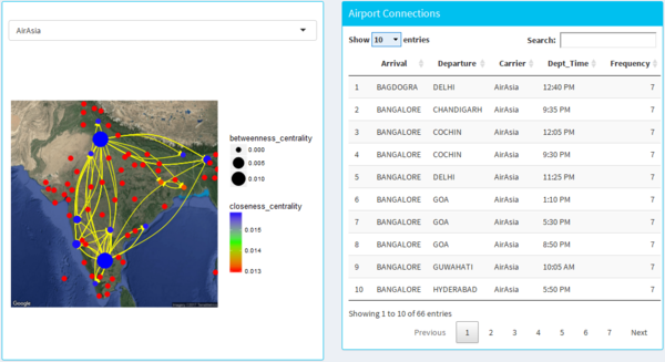
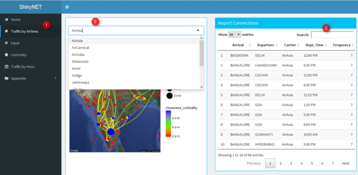
| + | * The dash board design allows the user to select different airline from the drop-down menu. | ||
| + | |||
| + | * It shows the network graph of the airlines connecting different parts of India with the size as the betweeness centrality and the colour as the closeness centrality. | ||
| + | |||
| + | * The lines on the map are directed from the origin to the destination airport with the arrow head. | ||
| + | |||
| + | * The data table on the right-hand side gives user on overall view of the arrival and departure airport of the airline as well as the departure time with frequency representing the no of days it fly’s. | ||
| + | | | ||
| + | |- | ||
| + | |[[File:Facet.png|600px|centre]] | ||
| + | <center>'''Facet''' </center> | ||
| + | | | ||
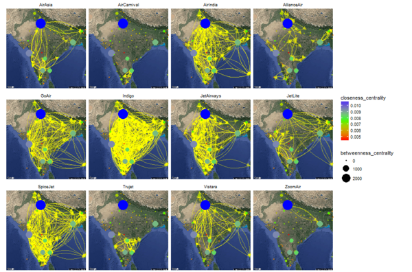
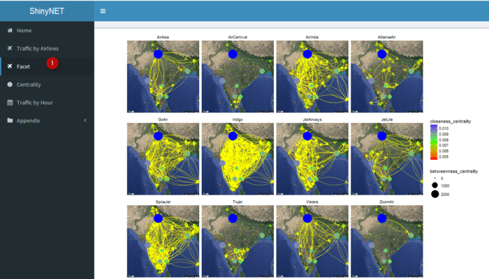
| + | * This design allows the user to easily have an overall view of all the airline carriers in india and lets the user see the big picture of the airline operating in different parts of india. | ||
| + | * It also allows the user to see the network analysis with an overall view. | ||
| + | | | ||
| + | |- | ||
| + | |[[File:Airline Time.png|600px]]<br/> | ||
| + | <center>'''Airline by Time''' </center> | ||
| + | | | ||
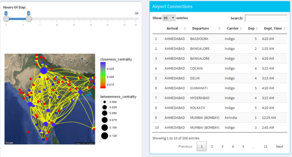
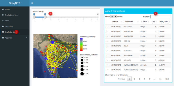
| + | * The design allows the user to navigate the different hours using the slider. | ||
| + | * It allows the user to find out which are the time where traffic network is very high and which are the airlines travelling during that period of time. | ||
| + | |- | ||
| + | |[[File:Airline Tier1.png|600px]]<br/> | ||
| + | <center>'''Airline by Tier'''</center> | ||
| + | | | ||
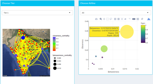
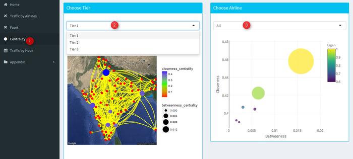
| + | * This design allows the user to explore the network centrality using both the map as well as the bubble plot to locate the cities of interest on the basis of 3 tier (derived from population). | ||
| + | | | ||
| + | |} | ||
| + | |||
| + | =Demonstration= | ||
| + | |||
| + | {| class="wikitable" | ||
| + | |- | ||
| + | |<center><b>Design</b></center> | ||
| + | |<center><b>Results</b></center> | ||
| + | |- | ||
| + | |[[File:Demo Airline.png|700px]]<br/> | ||
| + | <center>'''Airline Traffic'''</center> | ||
| + | | | ||
| + | * Step 1: From the dashboard tab click on Traffic by Airlines. | ||
| + | |||
| + | * Step 2: Then click on the airline. | ||
| + | |||
| + | * Step 3: Search can be done to search for the required airports. | ||
| + | | | ||
| + | |- | ||
| + | |[[File:Demo Facet.png|700px|centre]] | ||
| + | <center>'''Facet''' </center> | ||
| + | | | ||
| + | * Step 1: Click on facet from the dashboard tab to generate the facet by airline. | ||
| + | | | ||
| + | |- | ||
| + | |[[File:Demo Time.png|700px]]<br/> | ||
| + | <center>'''Airline by Time''' </center> | ||
| + | | | ||
| + | * Step 1: From the dashboard tab click on Traffic by hour. | ||
| + | |||
| + | * Step 2: Slide the input to select the desired range of hour to analyze. The hour spreads from 1:00 AM[1] to 12:00(midnight)[24] | ||
| + | |||
| + | * Step 3: Search can be done to search for the required airports. | ||
| + | |- | ||
| + | |[[File:Demo Tier.png|700px]]<br/> | ||
| + | <center>'''Airline by Tier'''</center> | ||
| + | | | ||
| + | * Step 1: From the dashboard tab click on centrality. | ||
| + | |||
| + | * Step 2: Click on the tier to select the cities base on tier. The tier are categorised as per the population. | ||
| + | |||
| + | * Step 3: Choose the desired airline which will help to find out the centrality based on airline and tier. | ||
| + | | | ||
| + | |} | ||
| + | |||
| + | =Discussion= | ||
| + | |||
| + | From the network data, we get these following insights<br /> | ||
| + | |||
| + | * Indigo holds the major market share and the highest connectivity. The connectivity in the above image shows how demanding Indigo flights are as they ease the flight transit.<br /> | ||
| + | |||
| + | * Spice Jet, Jet Airways, Go Air and Air India also have a very high connectivity followed by Indigo. <br /> | ||
| + | |||
| + | * Jet Airways, does not cover much of north east India. But they cover the major metropolitan cities.<br /> | ||
| + | |||
| + | * Tier 1 cities (Delhi, Mumbai, Kolkata, Chennai, Bangalore, Hyderabad) have the highest connectivity.<br /> | ||
| + | |||
| + | * JetLite, Vistara covers only major cities (some tier 1 and other tier 2 cities).<br /> | ||
| + | |||
| + | * Air Asia covers Tier 1 and some major cities. It does not cover central India.<br /> | ||
| + | |||
| + | * Trujet, Zoom Air, Air Carnival, Alliance Air work in specific geographic areas.<br /> | ||
| + | |||
| + | * Zoom Air covers only 3 airports.<br /> | ||
| + | |||
| + | * Air Carnival mostly focusses on Tamil Nadu.<br /> | ||
| + | |||
| + | * Alliance Air, connecting tier2 and tier 3 cities to Metro cities. They have very less flights compared to Indigo but are spread out across many of the geographic regions. Hence, they are very cost efficient.<br /> | ||
| + | |||
| + | * Alliance Air is the only air carrier connecting to Agatti, Lakshadweep. This can provide a competitive advantage to Alliance Air compared to other Air Carriers.<br /> | ||
| + | |||
| + | * By looking at the above facet, Alliance, Air Carnival, Trujet, Zoom Air can partner to compete airlines like Air Asia and Jet Lite.<br /> | ||
| + | |||
| + | This geospatial visualisation can help provide useful information on the following the aspects:<br /> | ||
| + | |||
| + | * It can provide which airlines can partner together to get more value at a minimized cost.<br /> | ||
| + | |||
| + | * The visualisation can help in scheduling the flights for efficient flight transit.<br /> | ||
| + | |||
| + | * Based on network graphs, the visualisation can provide betweeness centrality and closeness centrality. Closeness centrality is a measure how close an airport is compared to the other airports. Betweeness centrality is a measure of how flights are dependent on this airport for source and destination. Hypothetically, the higher the closeness centrality, the higher should be the betweeness centrality in order to make the route planning more efficient. This visualization provides betweeness centrality and closeness centrality of cities at different tier levels to optimize route planning.<br /> | ||
| + | |||
| + | * The visualisation can provide the flight traffic at each and every hour of the day.<br /> | ||
| + | |||
| + | Thus the visualisation provides value to 12 airline carriers. If the scope is expanded globally, then this visualisation will create a huge impact in providing value to 365 and more airline companies. | ||
| + | |||
| + | =Future Work= | ||
| + | |||
| + | * Addition of day filter will help analyst to analyze the airline network as per different their frequency. i.e weekday and weekend. | ||
| + | * Different network measurements such as: eigen, betweeness, closeness, hub, authority and page rank can be incorporated into the dashboard which will help the analyst to do network analysis. | ||
| + | * optimizing the code to reduce the time taken to generate the results. | ||
| + | |||
| + | =Installation Guide= | ||
| + | |||
| + | The packages that are required to be installed are as follows: | ||
| + | library(shiny) | ||
| + | library(ggplot2) | ||
| + | library(tidyverse) | ||
| + | library(ggmap) | ||
| + | library(tidygraph) | ||
| + | library(ggraph) | ||
| + | library(plotly) | ||
| + | library(shinydashboard) | ||
| + | library(DT) | ||
| + | library(ggiraph) | ||
| + | |||
| + | =References= | ||
| + | |||
| + | http://personal.tcu.edu/kylewalker/interactive-flow-visualization-in-r.html | ||
| + | |||
| + | http://konect.uni-koblenz.de/ | ||
| + | |||
| + | http://minimaxir.com/2016/12/interactive-network/ | ||
| + | |||
| + | http://rstudio-pubs-static.s3.amazonaws.com/150541_73e40e5911ef4e2cab6cf018dae10c60.html | ||
| + | |||
| + | https://devpost.com/software/student-network-vis | ||
| + | |||
| + | http://blog.nycdatascience.com/student-works/why-are-airports-important/ | ||
| + | |||
| + | http://www.sscnet.ucla.edu/soc/faculty/mcfarland/soc112/cent-ans.htm | ||
| + | |||
| + | http://curleylab.psych.columbia.edu/netviz/netviz1.html#/52 | ||
| + | |||
| + | https://briatte.github.io/ggnetwork/ | ||
| + | |||
| + | http://www.data-imaginist.com/2017/Introducing-tidygraph/ | ||
| + | http://dgca.nic.in/dom_flt_schedule/flt_index.htm | ||
| − | + | https://medium.com/@infinex/visualisation-of-airport-connectivities-in-r-using-ggmap-ggplot-igraph-d26af3267ca1 | |
| − | |||
| − | |||
| + | https://stackoverflow.com/questions/16713354/using-ggmap-map-of-the-world | ||
| − | + | http://www.milanor.net/blog/maps-in-r-plotting-data-points-on-a-map/ | |
| − | |||
| − | |||
| + | http://techqa.info/programming/question/42582976/plot-a-network-graph-defining-some-fixed-nodes-to-plot-graph-on-a-map | ||
| − | + | https://cran.r-project.org/web/packages/ggCompNet/vignettes/examples-from-paper.html | |
| − | |||
| − | |||
| + | https://stackoverflow.com/questions/35960170/igraph-add-to-geographic-map | ||
| − | + | http://r.prevos.net/create-air-travel-route-maps/ | |
| − | |||
| − | |||
| + | https://rstudio-pubs-static.s3.amazonaws.com/98122_61f7e34c0d62417d98a2fa12f5bbf51e.html | ||
| − | + | https://rud.is/projects/clinton_emails_01.html | |
| − | |||
| − | |||
| + | http://rpubs.com/insight/leaflet | ||
| − | + | https://stackoverflow.com/questions/35143155/leaflet-colours-for-polylines | |
| − | |||
| − | |||
| + | https://stackoverflow.com/questions/32275213/how-do-i-connect-two-coordinates-with-a-line-using-leaflet-in-r | ||
| − | + | https://cran.r-project.org/web/packages/ggiraph/vignettes/shiny_usage.html | |
| − | |||
| − | |||
| + | https://stackoverflow.com/questions/27965931/tooltip-when-you-mouseover-a-ggplot-on-shiny | ||
| − | + | https://www.r-bloggers.com/introduction-to-ggraph-edges/ | |
| − | |||
| − | |||
Latest revision as of 23:47, 6 August 2017
shinyNET:A web-based flight data visualisation toolkit using R Shiny and ggraph(Group 14)
|
|
|
|
|
|
Contents
Motivation of the Application
Airline industry in India is booming. Within the last 20 years, the industry dynamics have changed from monopoly and it is marching towards a perfect competition. 15 years before there was only one Indian airline (Air India) controlled by the government. A common person was not able to afford a flight transit. Now the affordability of a common person in India has increased. Airline is becoming a more common transit that connects different parts of the country. There are 12 domestic commercial airlines in India currently. Some do serve only certain geographic regions.
What do we infer from this? From an entrepreneurial perspective, it is not hard for an entrepreneur to start an airline business unlike 20 years before. Some of the questions that can arise for an entrepreneur aiming for an airline business are:
1. Which demographic region should I focus on?
2. With which airlines should I partner with for increasing geographic coverage?
3. What is the air traffic over the hours in a day?
4. How can you optimize air traffic?
To answer all the above questions a complete visualization of the airline network including all the 12 airlines are required. Currently there are no visualization that shows the holistic knowledge of the Indian Airline network.
Also, the visualization is a combination of geospatial and social network. Geospatial provides the location of the airports and social network provides how each and other airports are connected. Hence, the above entrepreneurial and business factors helped us to take this project and create a visualization for the same.
Review and critic on past works
Our dashboard draws it's inspiration from the research done by "National Center for Biological Sciences, Tata Institute of Fundamental Research, Bangalore 560065, India" where they published a paper on the analysis of the airport network of India as a complex weighted network. Although research has been done in this area to analyze the airport network in India, visualization of the network is one thing that is lacking. Most of the past works has been focused on only the airport network but no focus on the airline networks. Airline network are the most important part for an airport and visualizing the traffic dynamics using Geo spatial and graph network will provide new insights for the airline industry.
We choose R-Shiny to achieve our visualization goals because of its powerful, flexible tools and packages that it offers. R with its different network and Geo spatial packages provides a rich environment for a data analyst to perform analysis, combining both network and Geo spatial data.
Design Framework
Demonstration
Discussion
From the network data, we get these following insights
- Indigo holds the major market share and the highest connectivity. The connectivity in the above image shows how demanding Indigo flights are as they ease the flight transit.
- Spice Jet, Jet Airways, Go Air and Air India also have a very high connectivity followed by Indigo.
- Jet Airways, does not cover much of north east India. But they cover the major metropolitan cities.
- Tier 1 cities (Delhi, Mumbai, Kolkata, Chennai, Bangalore, Hyderabad) have the highest connectivity.
- JetLite, Vistara covers only major cities (some tier 1 and other tier 2 cities).
- Air Asia covers Tier 1 and some major cities. It does not cover central India.
- Trujet, Zoom Air, Air Carnival, Alliance Air work in specific geographic areas.
- Zoom Air covers only 3 airports.
- Air Carnival mostly focusses on Tamil Nadu.
- Alliance Air, connecting tier2 and tier 3 cities to Metro cities. They have very less flights compared to Indigo but are spread out across many of the geographic regions. Hence, they are very cost efficient.
- Alliance Air is the only air carrier connecting to Agatti, Lakshadweep. This can provide a competitive advantage to Alliance Air compared to other Air Carriers.
- By looking at the above facet, Alliance, Air Carnival, Trujet, Zoom Air can partner to compete airlines like Air Asia and Jet Lite.
This geospatial visualisation can help provide useful information on the following the aspects:
- It can provide which airlines can partner together to get more value at a minimized cost.
- The visualisation can help in scheduling the flights for efficient flight transit.
- Based on network graphs, the visualisation can provide betweeness centrality and closeness centrality. Closeness centrality is a measure how close an airport is compared to the other airports. Betweeness centrality is a measure of how flights are dependent on this airport for source and destination. Hypothetically, the higher the closeness centrality, the higher should be the betweeness centrality in order to make the route planning more efficient. This visualization provides betweeness centrality and closeness centrality of cities at different tier levels to optimize route planning.
- The visualisation can provide the flight traffic at each and every hour of the day.
Thus the visualisation provides value to 12 airline carriers. If the scope is expanded globally, then this visualisation will create a huge impact in providing value to 365 and more airline companies.
Future Work
- Addition of day filter will help analyst to analyze the airline network as per different their frequency. i.e weekday and weekend.
- Different network measurements such as: eigen, betweeness, closeness, hub, authority and page rank can be incorporated into the dashboard which will help the analyst to do network analysis.
- optimizing the code to reduce the time taken to generate the results.
Installation Guide
The packages that are required to be installed are as follows: library(shiny) library(ggplot2) library(tidyverse) library(ggmap) library(tidygraph) library(ggraph) library(plotly) library(shinydashboard) library(DT) library(ggiraph)
References
http://personal.tcu.edu/kylewalker/interactive-flow-visualization-in-r.html
http://minimaxir.com/2016/12/interactive-network/
http://rstudio-pubs-static.s3.amazonaws.com/150541_73e40e5911ef4e2cab6cf018dae10c60.html
https://devpost.com/software/student-network-vis
http://blog.nycdatascience.com/student-works/why-are-airports-important/
http://www.sscnet.ucla.edu/soc/faculty/mcfarland/soc112/cent-ans.htm
http://curleylab.psych.columbia.edu/netviz/netviz1.html#/52
https://briatte.github.io/ggnetwork/
http://www.data-imaginist.com/2017/Introducing-tidygraph/
http://dgca.nic.in/dom_flt_schedule/flt_index.htm
https://stackoverflow.com/questions/16713354/using-ggmap-map-of-the-world
http://www.milanor.net/blog/maps-in-r-plotting-data-points-on-a-map/
https://cran.r-project.org/web/packages/ggCompNet/vignettes/examples-from-paper.html
https://stackoverflow.com/questions/35960170/igraph-add-to-geographic-map
http://r.prevos.net/create-air-travel-route-maps/
https://rstudio-pubs-static.s3.amazonaws.com/98122_61f7e34c0d62417d98a2fa12f5bbf51e.html
https://rud.is/projects/clinton_emails_01.html
http://rpubs.com/insight/leaflet
https://stackoverflow.com/questions/35143155/leaflet-colours-for-polylines
https://cran.r-project.org/web/packages/ggiraph/vignettes/shiny_usage.html
https://stackoverflow.com/questions/27965931/tooltip-when-you-mouseover-a-ggplot-on-shiny
