Difference between revisions of "The Indian Story"
| (30 intermediate revisions by 3 users not shown) | |||
| Line 1: | Line 1: | ||
| − | <div style=background:# | + | <div style=background:#001a66 border:#A3BFB1> |
| − | [[File:Banner.png| | + | [[File:Banner.png|600px]] |
| − | <font size = 6; color="#FFFFFF">''Group 9''</font> | + | <font size = 6; color="#FFFFFF">''Group 9-The Indian Story''</font> |
</div> | </div> | ||
{|style="background-color:#1B338F;" width="100%" cellspacing="0" cellpadding="0" valign="top" border="0" | | {|style="background-color:#1B338F;" width="100%" cellspacing="0" cellpadding="0" valign="top" border="0" | | ||
| − | | style="font-size:100%; solid #000000; background:# | + | | style="font-size:100%; solid #000000; background:#b30000; text-align:center;" width="20%" | |
| − | [[ | + | [[The_Indian_Story| <font color="#FFFFFF">Project Proposal</font>]] |
| − | | style="font-size:100%; solid #1B338F; background:# | + | | style="font-size:100%; solid #1B338F; background:#001a66; text-align:center;" width="20%" | |
| − | [[ | + | [[The_Indian_Story_Data_Prep| <font color="#FFFFFF">Data Preparation</font>]] |
| − | | style="font-size:100%; solid #1B338F; background:# | + | | style="font-size:100%; solid #1B338F; background:#001a66; text-align:center;" width="20%" | |
| − | [[ | + | [[The_Indian_Story_Poster| <font color="#FFFFFF">Poster</font>]] |
| − | | style="font-size:100%; solid #1B338F; background:# | + | | style="font-size:100%; solid #1B338F; background:#001a66; text-align:center;" width="20%" | |
| − | [[ | + | [[The_Indian_Story_Application| <font color="#FFFFFF">Application</font>]] |
| + | |||
| + | | style="font-size:100%; solid #1B338F; background:#001a66; text-align:center;" width="20%" | | ||
| + | [[The_Indian_Story_Report| <font color="#FFFFFF">Report</font>]] | ||
|} | |} | ||
<br/> | <br/> | ||
| + | <gallery widths=250px heights = 250px caption= "The Team" mode="packed-hover"> | ||
| + | File:Visual Mandy.jpg|''[[commons:Application Developer |Application Developer]]'' | ||
| + | File:Priya1.jpg|''[[commons:Data Engineer|Data Engineer]]'' | ||
| + | File:Visual Sandy (2).jpg|''[[commons:Visual Evangelist|Visual Evangelist]]'' | ||
| + | </gallery> | ||
| + | |||
| + | |||
== Motivation == | == Motivation == | ||
| + | [[File:changing-maps-of-indian-states-ibnlive.gif|framed|right]] | ||
| − | + | The Indian Story" as the name suggest aims to tell you a vibrant story about India (details of which will be shared in the background later) adorned with interesting facts and pressing issues that this bustling nation faces today. | |
| − | So why India? Well our team consists of one native Indian (Sandhya), A half baked pretend Indian (Priya) and a non-Indian (Mandi). You see we all have the word "Indian" in our descriptions and so we decided on this topic (this is the perfect example of text analytics gone wrong). Jokes apart, we chose the topic because prof essentially said (of course in a much more refined way), "Get a heart. Look at datasets close to you. Things that you can relate to. There are so many problems in the world that needs to be noticed". So we decided to work on a dataset that we feel most connected to and Mandi has graciously agreed to accompany us in this journey of understanding the country a little better. | + | So why India? Well our team consists of one native Indian (Sandhya), A half baked pretend Indian (Priya) and a non-Indian (Mandi). You see we all have the word "Indian" in our descriptions and so we decided on this topic (this is the perfect example of text analytics gone wrong). Jokes apart, we chose the topic because prof essentially said (of course in a much more refined way), "Get a heart. Look at datasets close to you. Things that you can relate to. There are so many problems in the world that needs to be noticed". So we decided to work on a dataset that we feel most connected to and Mandi has graciously agreed to accompany us in this journey of understanding the country a little better. We believe we will have fun! |
To the viewers of our work, we sincerely hope that we are able to bring to you a wonderful story. | To the viewers of our work, we sincerely hope that we are able to bring to you a wonderful story. | ||
| − | == Background== | + | == Background == |
| − | + | India, a country with 29 states and 707 districts as of 2016 carries out annual census survey to track growth of people, and in turn the country as a whole. Since Education forms the most crucial aspect of any country, one of the annual survey in India focuses on collecting data related to Literacy rate, and education level across states by gender and age 7 and above. | |
| − | + | ||
| − | + | The dataset in context is from the Year 2011 and consists of stats of about 525 towns in 30 states and 4 union territories. Total population, gender wise population, Illiterate count by gender, literate count by gender and education level which is further divided into - Below Primary, Primary school, Middle school, Secondary School, Non-technical diploma/certificate, Technical diploma/certificate, and Graduate & above are provided. | |
== Objectives == | == Objectives == | ||
| − | * Explore relations among population and literacy rates in various suburbs of India | + | * Explore relations among population, gender and literacy rates in various suburbs of India. |
| + | * Explore spatial biases and neighborhood differences, and similarities in Literacy rates. | ||
| + | * Build interactive visualizations to present Top Literate states, cities, and towns - these visualizations per age group above 7+ years by gender. | ||
| + | * Further investigate the results of States and Cities to derive insights about the number educational institutions available in each State and City. | ||
| + | * Compare Rural Vs Urban Literacy rates using interactive visualizations. | ||
| + | |||
| + | == Data Source == | ||
| + | Our dataset is obtained from the below websites: | ||
| + | # http://censusindia.gov.in/2011-prov-results/paper2/data_files/India2/Table_2_PR_Cities_1Lakh_and_Above.xls | ||
| + | # http://www.censusindia.gov.in/2011census/C-series/DDWCT-0000C-08.xlsx | ||
| + | [[File: DataDescription.png|800px]] | ||
== Schedule Plan == | == Schedule Plan == | ||
| + | [[File:Timeline.jpeg|800px]] | ||
| + | |||
| + | == References of earlier work done == | ||
| + | |||
| + | The insights found below are a summary of the work done by Kagglers using the Kaggle data set. As mentioned above, the Kaggle Data set is a cleaner and more “rolled” up version of the original data sets from census. | ||
| + | |||
| + | Insights found: | ||
| + | * Sorting and distribution of the populated cities in India. Consequent 10 top most populated cities and the bottom least populated cities. | ||
| + | * Calculating the sex ratio by state. | ||
| + | * Graduate ratio by state. | ||
| + | * Effective literacy rates of male and females. | ||
| + | * Finding correlations between male literacy rates and female literacy rates in cities. | ||
| + | * Correlation between sex-ratio and effective literacy rate to prove hypothesis that poor sex ratio will have lower effective literacy rate. | ||
| + | * Child sex ratio - Overall sex ratio. The difference was used to see if there was any significant improvement in the child sex ratio. This was also represented with bar plots.This analysis is quite unrealistic, as the overall sex ratio would contain child sex ratio and subtracting one from the other doesn’t necessarily mean “improvement”. | ||
| + | |||
| + | Visual aids used: | ||
| + | * Tree Maps | ||
| + | * Bar Plots | ||
| + | * Scatter Plots | ||
| + | * Geographical Maps | ||
| + | |||
| + | == References == | ||
| + | |||
| + | # https://www.kaggle.com/zed9941/top-500-indian-cities | ||
| + | # https://www.kaggle.com/umeshnarayanappa/exploring-top-500-indian-cities | ||
| + | # https://www.kaggle.com/abhikaggle8/india-s-growing-states | ||
| + | # http://sachinverma.net/data-visualisation/ | ||
| + | # https://www.kaggle.com/lakshmypm/educate-females-for-better-sex-ratio | ||
| + | # https://www.kaggle.com/anirudhsekar96/correlation-between-sex-ratio-and-literacy-rate/code | ||
Latest revision as of 20:14, 17 July 2017
- The Team
Contents
Motivation
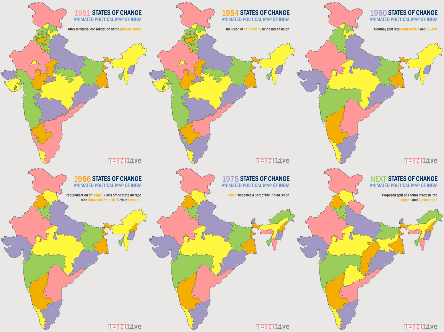
The Indian Story" as the name suggest aims to tell you a vibrant story about India (details of which will be shared in the background later) adorned with interesting facts and pressing issues that this bustling nation faces today.
So why India? Well our team consists of one native Indian (Sandhya), A half baked pretend Indian (Priya) and a non-Indian (Mandi). You see we all have the word "Indian" in our descriptions and so we decided on this topic (this is the perfect example of text analytics gone wrong). Jokes apart, we chose the topic because prof essentially said (of course in a much more refined way), "Get a heart. Look at datasets close to you. Things that you can relate to. There are so many problems in the world that needs to be noticed". So we decided to work on a dataset that we feel most connected to and Mandi has graciously agreed to accompany us in this journey of understanding the country a little better. We believe we will have fun!
To the viewers of our work, we sincerely hope that we are able to bring to you a wonderful story.
Background
India, a country with 29 states and 707 districts as of 2016 carries out annual census survey to track growth of people, and in turn the country as a whole. Since Education forms the most crucial aspect of any country, one of the annual survey in India focuses on collecting data related to Literacy rate, and education level across states by gender and age 7 and above.
The dataset in context is from the Year 2011 and consists of stats of about 525 towns in 30 states and 4 union territories. Total population, gender wise population, Illiterate count by gender, literate count by gender and education level which is further divided into - Below Primary, Primary school, Middle school, Secondary School, Non-technical diploma/certificate, Technical diploma/certificate, and Graduate & above are provided.
Objectives
- Explore relations among population, gender and literacy rates in various suburbs of India.
- Explore spatial biases and neighborhood differences, and similarities in Literacy rates.
- Build interactive visualizations to present Top Literate states, cities, and towns - these visualizations per age group above 7+ years by gender.
- Further investigate the results of States and Cities to derive insights about the number educational institutions available in each State and City.
- Compare Rural Vs Urban Literacy rates using interactive visualizations.
Data Source
Our dataset is obtained from the below websites:
- http://censusindia.gov.in/2011-prov-results/paper2/data_files/India2/Table_2_PR_Cities_1Lakh_and_Above.xls
- http://www.censusindia.gov.in/2011census/C-series/DDWCT-0000C-08.xlsx
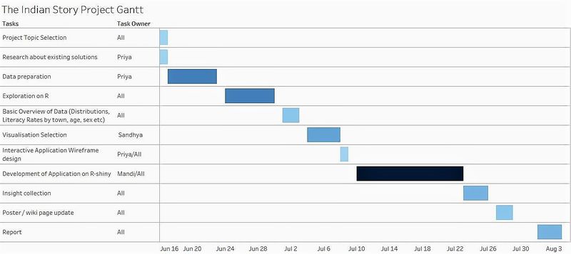
Schedule Plan
References of earlier work done
The insights found below are a summary of the work done by Kagglers using the Kaggle data set. As mentioned above, the Kaggle Data set is a cleaner and more “rolled” up version of the original data sets from census.
Insights found:
- Sorting and distribution of the populated cities in India. Consequent 10 top most populated cities and the bottom least populated cities.
- Calculating the sex ratio by state.
- Graduate ratio by state.
- Effective literacy rates of male and females.
- Finding correlations between male literacy rates and female literacy rates in cities.
- Correlation between sex-ratio and effective literacy rate to prove hypothesis that poor sex ratio will have lower effective literacy rate.
- Child sex ratio - Overall sex ratio. The difference was used to see if there was any significant improvement in the child sex ratio. This was also represented with bar plots.This analysis is quite unrealistic, as the overall sex ratio would contain child sex ratio and subtracting one from the other doesn’t necessarily mean “improvement”.
Visual aids used:
- Tree Maps
- Bar Plots
- Scatter Plots
- Geographical Maps
References
- https://www.kaggle.com/zed9941/top-500-indian-cities
- https://www.kaggle.com/umeshnarayanappa/exploring-top-500-indian-cities
- https://www.kaggle.com/abhikaggle8/india-s-growing-states
- http://sachinverma.net/data-visualisation/
- https://www.kaggle.com/lakshmypm/educate-females-for-better-sex-ratio
- https://www.kaggle.com/anirudhsekar96/correlation-between-sex-ratio-and-literacy-rate/code


