Difference between revisions of "ISSS608 2016-17 T3 Assign ZHANG JIAQI"
| (8 intermediate revisions by 3 users not shown) | |||
| Line 1: | Line 1: | ||
| + | ==Data Preparation== | ||
| + | Most of the visualizations are done by simple drag and drop that are quite obvious if you download the workbook and see the fields yourself. | ||
| + | For the factory responsibility analysis visualizations, below are some explanations. | ||
| + | In Excel, copy each line of ‘wind’ file 17 times. Add a column ‘Factory’, with each factory number repeating 4 times. In column ‘Index’, fill it with 1 to 17 repeatedly. In ‘Path’, repeat 1 to 4 for index 1 to 16, and fill whatever for index 17. | ||
| + | Create a parameter named ‘Angle’ for adjusting the angle of wind blow fan shape, and a parameter named ‘Minute’ for adjusting the time of wind travel. | ||
| + | Use sin, cos, radians to change wind direction into Y and X coordinates. The degree of 270 considered the different starting angle of triangle coordinate, wind direction coordinate, and changing the direction wind ‘blow to’ to ‘blow from’. The 12 miles by 12 miles area is translated into a 200 by 200 map. This can be further translated into 0.62137 grid per minute when wind speed is 1m/s. The coordinates of each factory need to be added to the existing coordinated to get different locations. | ||
| + | Example formulas are shown below. | ||
| + | |||
| + | [[File:Zjqs1.png|600px]] | ||
| + | [[File:Zjqs2.png|600px]] | ||
| + | |||
| + | For each point of time, we want to visualize the composition of chemicals received by eah sensor. Their coordinates can be calculated like this. | ||
| + | |||
| + | [[File:Zjqs3.png|400px]] | ||
| + | [[File:Zjqs4.png|400px]] | ||
| + | |||
| + | To draw the fan shape, we need to be careful about the path, so that tableau can form the polygon properly. | ||
| + | Drag and drop things as the screenshot below shown. | ||
| + | |||
| + | [[File:Zjqs5.png|200px]] | ||
| + | |||
| + | for the pie charts, drag things like this. | ||
| + | |||
| + | [[File:Zjqs6.png|200px]] | ||
| + | |||
| + | Use dual axis to combine fan shapes and pie charts. | ||
| + | |||
| + | [[File:Zjqs6.png|200px]] | ||
==Mini Challenge 2== | ==Mini Challenge 2== | ||
| + | https://public.tableau.com/profile/jiaqi1607#!/vizhome/3_705/Story1?publish=yes | ||
===Q1. Sensor performance=== | ===Q1. Sensor performance=== | ||
Monitor 3 has the most volatile readings which is unexpected. Monitor 1 and 2 are least volatile. Monitor 4 shows an increasing trend. 7 and 8 have normal volatility. | Monitor 3 has the most volatile readings which is unexpected. Monitor 1 and 2 are least volatile. Monitor 4 shows an increasing trend. 7 and 8 have normal volatility. | ||
| Line 54: | Line 83: | ||
[[File:Zjq14.png|600px]] | [[File:Zjq14.png|600px]] | ||
| − | |||
| − | |||
| − | |||
| − | |||
Select month and date to zoom in. Click on hours that are multiple of three to see the wind at that time. Change minutes and degree to see where the chemical can get to. | Select month and date to zoom in. Click on hours that are multiple of three to see the wind at that time. Change minutes and degree to see where the chemical can get to. | ||
| Line 71: | Line 96: | ||
[[File:Zjq18.png|600px]] | [[File:Zjq18.png|600px]] | ||
| + | |||
| + | After checking all high readings, we found that Roadrunner Fitness Electronics and Radiance ColourTek are responsible for the release of AGOC-3A and Chlorodinine. Kasios Office Furniture is responsible for the release of Methylosmolene. Indigo Sol Boards is responsible for the release of Methylosmolene and Appluimonia. | ||
| + | |||
| + | [[File:Zjq19.png|600px]] | ||
| + | |||
| + | ==Feedback== | ||
| + | |||
| + | ===Feedback by Xintian=== | ||
| + | |||
| + | Hi Jiaqi, | ||
| + | |||
| + | After reviewing your report, here are some my comments: | ||
| + | |||
| + | 1) In terms of wind visualization, the zoom-in and zoom-out function can be much better and clearer. | ||
| + | |||
| + | 2) A reference line is needed in the line chart. | ||
| + | |||
| + | Regards, | ||
| + | |||
| + | Xintian | ||
| + | |||
| + | ===Feedback by Qian Hongjun=== | ||
| + | |||
| + | Hi Jiaqi, | ||
| + | |||
| + | I think the visualization you presented is quite good already. My suggestion is that for question2, you can add the readings of different chemicals detected by corresponding sensors in the graph to make it easier for readers to figure out the differences. | ||
| + | |||
| + | Regards, | ||
| + | Hongjun | ||
| + | |||
| + | ===Feedback by HUANG Liwei=== | ||
| + | |||
| + | Hi Jiaqi, | ||
| + | |||
| + | This is very detailed and thorough, the visualisation of wind direction is impressive. Suggest you to use the screenshots with some highlight, which is helpful to make readers focusing on your points. | ||
| + | |||
| + | Thanks, | ||
| + | |||
| + | Liwei | ||
Latest revision as of 01:19, 17 July 2017
Contents
Data Preparation
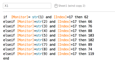
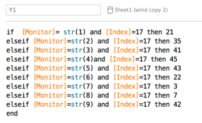
Most of the visualizations are done by simple drag and drop that are quite obvious if you download the workbook and see the fields yourself. For the factory responsibility analysis visualizations, below are some explanations. In Excel, copy each line of ‘wind’ file 17 times. Add a column ‘Factory’, with each factory number repeating 4 times. In column ‘Index’, fill it with 1 to 17 repeatedly. In ‘Path’, repeat 1 to 4 for index 1 to 16, and fill whatever for index 17. Create a parameter named ‘Angle’ for adjusting the angle of wind blow fan shape, and a parameter named ‘Minute’ for adjusting the time of wind travel. Use sin, cos, radians to change wind direction into Y and X coordinates. The degree of 270 considered the different starting angle of triangle coordinate, wind direction coordinate, and changing the direction wind ‘blow to’ to ‘blow from’. The 12 miles by 12 miles area is translated into a 200 by 200 map. This can be further translated into 0.62137 grid per minute when wind speed is 1m/s. The coordinates of each factory need to be added to the existing coordinated to get different locations. Example formulas are shown below.
For each point of time, we want to visualize the composition of chemicals received by eah sensor. Their coordinates can be calculated like this.
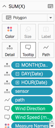
To draw the fan shape, we need to be careful about the path, so that tableau can form the polygon properly. Drag and drop things as the screenshot below shown.
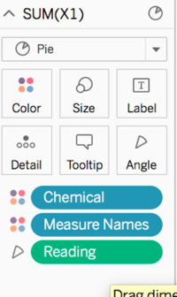
for the pie charts, drag things like this.
Use dual axis to combine fan shapes and pie charts.
Mini Challenge 2
https://public.tableau.com/profile/jiaqi1607#!/vizhome/3_705/Story1?publish=yes
Q1. Sensor performance
Monitor 3 has the most volatile readings which is unexpected. Monitor 1 and 2 are least volatile. Monitor 4 shows an increasing trend. 7 and 8 have normal volatility.
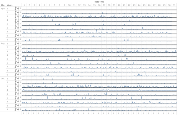
Monitor 4 and 9 show an increasing trend in the reading. This trend can be seen in all four chemicals.
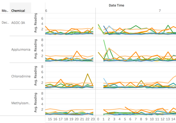
All monitors do not have readings for 0 hour on 2,6 April, 4,7 August, and 2 December. 2 August and 7 December only have readings for certain chemical and certain sensor.
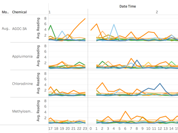
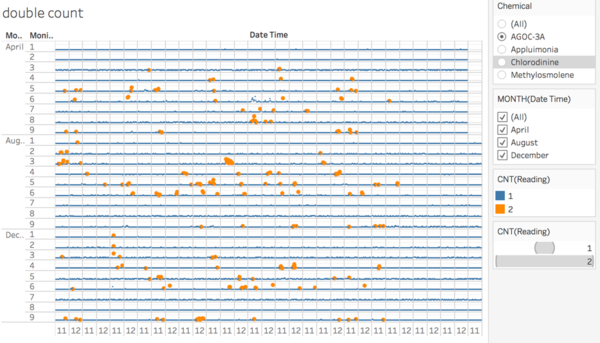
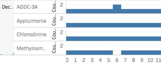
We realized some peaks are caused by double readings in chemical ‘AGOC-3A’, as there is a mistake of recording ‘Methylosmolene’ as ‘AGOC-3A’. Monitor 1 and and 2 do not have double readings in April. Monitor 7 and 8 do not have double readings in August and December.
The pattern of counting ‘AGOC-3A’ twice and ‘Methylosmolene’ 0 time can be seen in all the time marked by the orange points in the picture above.
Q2. Chemicals
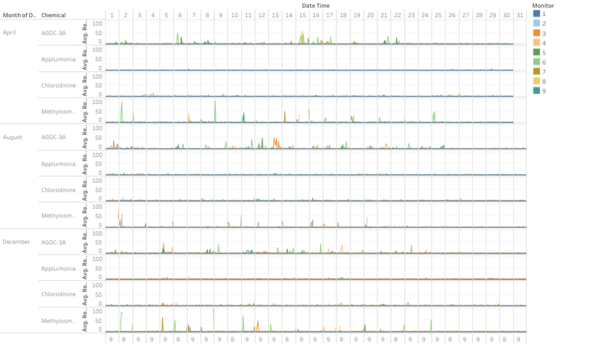
‘AGOC-3A’ and ‘Methylosmolene’ are being detected by sensor group in excess amount. Most of the peaks are captures by sensor 6.
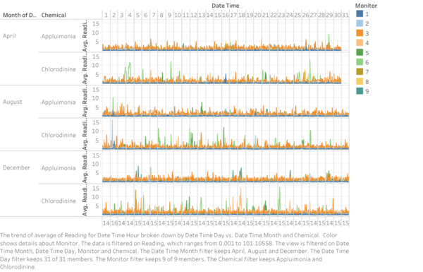
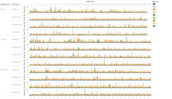
We can filter ‘Appluimonia’ and ‘Chlorodinine’ to see their patterns better.
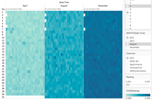
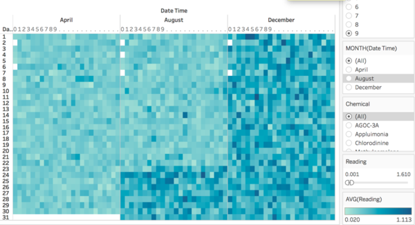
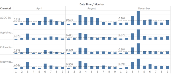
Readings distribution across 9 sensors and 4 chemicals are shown below. There is a growing trend from April to December. Average readings in same month are very similar.
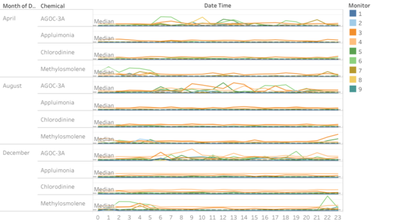
‘AGOC-3A’ has value above median from 5am to around 3pm in August, and until 9pm in December. ‘Methylosmolene’ has opposite pattern during each day. ‘Appluimonia’ and ‘Chlorodinine’ do not show obvious patterns.
Q3. Factories
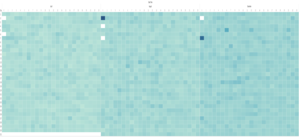
See overall pattern, and spot extreme values.
Filter readings to smaller range to see small changes. High readings for ‘Appluimonia’ and ‘Chlorodinine’ can be seen in the below graph.
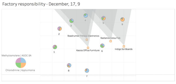
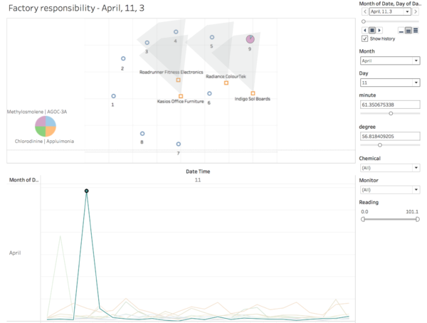
Select month and date to zoom in. Click on hours that are multiple of three to see the wind at that time. Change minutes and degree to see where the chemical can get to.
To determine which factory is responsible for which chemical release, we follow the steps mentioned above. Sensors that show high values and are covered by only one factory and tell us which factory is releasing the high reading chemical. Some sensors are covered by more than one factory. However, by looking at different times, we can more or less know the chemical release of each factory. For example, April 11 3. Sensor 9 detected ‘Methylosmolene’ by Indigo.
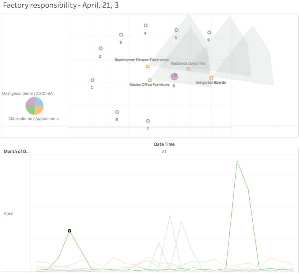
Below graph shows ‘Methylosmolene’ released by Kasios. Because sensor 6 shows a spike and sensor 5 shows nothing.
After checking all high readings, we found that Roadrunner Fitness Electronics and Radiance ColourTek are responsible for the release of AGOC-3A and Chlorodinine. Kasios Office Furniture is responsible for the release of Methylosmolene. Indigo Sol Boards is responsible for the release of Methylosmolene and Appluimonia.
Feedback
Feedback by Xintian
Hi Jiaqi,
After reviewing your report, here are some my comments:
1) In terms of wind visualization, the zoom-in and zoom-out function can be much better and clearer.
2) A reference line is needed in the line chart.
Regards,
Xintian
Feedback by Qian Hongjun
Hi Jiaqi,
I think the visualization you presented is quite good already. My suggestion is that for question2, you can add the readings of different chemicals detected by corresponding sensors in the graph to make it easier for readers to figure out the differences.
Regards, Hongjun
Feedback by HUANG Liwei
Hi Jiaqi,
This is very detailed and thorough, the visualisation of wind direction is impressive. Suggest you to use the screenshots with some highlight, which is helpful to make readers focusing on your points.
Thanks,
Liwei


