Difference between revisions of "Project Timeline"
Jump to navigation
Jump to search
(gantt added group1) |
Yrzhang.2016 (talk | contribs) |
||
| (11 intermediate revisions by 3 users not shown) | |||
| Line 1: | Line 1: | ||
| − | = | + | <div style=background:#2B3856 border:#A3BFB1> |
| − | + | <font size = 5; color="#FFFFFF">Discovering traffic patterns by using network graph visualisations</font> | |
| + | </div> | ||
| + | <!--MAIN HEADER --> | ||
| + | {|style="background-color:#1B338F;" width="100%" cellspacing="0" cellpadding="0" valign="top" border="0" | | ||
| + | | style="font-family:Century Gothic; font-size:100%; solid #000000; background:#2B3856; text-align:center;" width="15%" | | ||
| + | ; | ||
| + | [[Introduction| <font color="#FFFFFF">Introduction</font>]] | ||
| + | | style="font-family:Century Gothic; font-size:100%; solid #1B338F; background:#2B3856; text-align:center;" width="15%" | | ||
| + | ; | ||
| + | [[About| <font color="#FFFFFF">About</font>]] | ||
| − | [[ | + | | style="font-family:Century Gothic; font-size:100%; solid #1B338F; background:#2B3856; text-align:center;" width="18.33%" | |
| + | ; | ||
| + | [[Project Proposal| <font color="#FFFFFF">Project Proposal</font>]] | ||
| + | |||
| + | | style="font-family:Century Gothic; font-size:100%; solid #1B338F; background:#F5F6CE; text-align:center;" width="18.33%" | | ||
| + | ; | ||
| + | [[Project Timeline| <font color="#1C1C1C">Data Preparation</font>]] | ||
| + | |||
| + | | style="font-family:Century Gothic; font-size:100%; solid #1B338F; background:#2B3856; text-align:center;" width="18.33%" | | ||
| + | ; | ||
| + | [[App & Deliverables| <font color="#FFFFFF">App & Deliverables</font>]] | ||
| + | |||
| + | | style="font-family:Century Gothic; font-size:100%; solid #1B338F; background:#2B3856; text-align:center;" width="15%" | | ||
| + | ; | ||
| + | [[Poster| <font color="#FFFFFF">Poster</font>]] | ||
| + | |||
| + | | | ||
| + | |} | ||
| + | <!--MAIN HEADER --> | ||
| + | ==Data Preparation== | ||
| + | A complete step by step guide of how to prepare the nodes and edges table used for this visualisation is available through this markdown document accessed [http://rpubs.com/kishan19/297073 from here.] | ||
| + | |||
| + | The flow chart below illustrates how the various R packages used in building our application interplay with one another. | ||
| + | |||
| + | [[File:Flow_Chart_G1.jpg]] | ||
| + | |||
| + | |||
| + | # The raw data is first split into nodes and edges on excel | ||
| + | # Data cleaning is then done on both files using the package, tidyverse. The edges have the column "cartype" recoded and the timestamp formatted by the package, lubridate which allows us to filter out the hour component of the timestamp. | ||
| + | # The edges are also aggregated into another separate variable which will be used for the main visualization to shorten the loading time. | ||
| + | # On the other hand, the nodes have their coordinates added which is made possible by a software called QGIS. | ||
| + | # The previous step is necessary so that the coordinates of each gate can be plotted onto R with the module, ggnetwork. | ||
| + | # Gate categories were then added to classify the 40 nodes. | ||
| + | # The steps above summarise the basic steps taken in data preparation. Using the variables created above, the basic graph can then be plotted as an object with the package, igraph. | ||
| + | # The package, ggraph then serves as a wrapper for our igraph object, enabling various aesthetics options such as layout, facet, colors and tooltips etc. | ||
| + | # An additional data table is created as well with the package, DT to visualise our raw data so that users can access them easily via our application. | ||
| + | # Lastly, the entire network is made interactive via shiny. | ||
Latest revision as of 16:30, 7 August 2017
Discovering traffic patterns by using network graph visualisations
|
|
|
|
|
|
|
Data Preparation
A complete step by step guide of how to prepare the nodes and edges table used for this visualisation is available through this markdown document accessed from here.
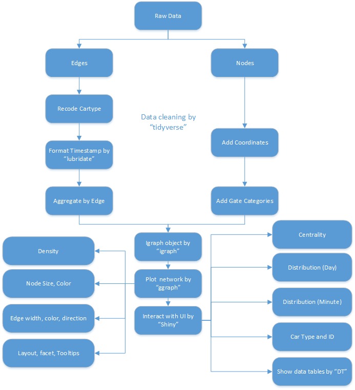
The flow chart below illustrates how the various R packages used in building our application interplay with one another.
- The raw data is first split into nodes and edges on excel
- Data cleaning is then done on both files using the package, tidyverse. The edges have the column "cartype" recoded and the timestamp formatted by the package, lubridate which allows us to filter out the hour component of the timestamp.
- The edges are also aggregated into another separate variable which will be used for the main visualization to shorten the loading time.
- On the other hand, the nodes have their coordinates added which is made possible by a software called QGIS.
- The previous step is necessary so that the coordinates of each gate can be plotted onto R with the module, ggnetwork.
- Gate categories were then added to classify the 40 nodes.
- The steps above summarise the basic steps taken in data preparation. Using the variables created above, the basic graph can then be plotted as an object with the package, igraph.
- The package, ggraph then serves as a wrapper for our igraph object, enabling various aesthetics options such as layout, facet, colors and tooltips etc.
- An additional data table is created as well with the package, DT to visualise our raw data so that users can access them easily via our application.
- Lastly, the entire network is made interactive via shiny.
