Difference between revisions of "VisualizeR Report"
| (25 intermediate revisions by 3 users not shown) | |||
| Line 40: | Line 40: | ||
And it is exactly this appeal that made us choose the field and work towards creating an application that can help visualize the various aspects of crowdfunding in great detail. | And it is exactly this appeal that made us choose the field and work towards creating an application that can help visualize the various aspects of crowdfunding in great detail. | ||
| − | |||
| − | |||
<br/> | <br/> | ||
<br/> | <br/> | ||
| Line 56: | Line 54: | ||
However, as a field of visualization, the data has relatively been left untapped; most visualizations that exist simply show the accuracy of these prediction algorithms. | However, as a field of visualization, the data has relatively been left untapped; most visualizations that exist simply show the accuracy of these prediction algorithms. | ||
With this in view, it seems quite plausible for us to create an application that would help the project creators as well as the crowd funding platforms to gain insights about the investments or viewing activity that takes place for specific projects from demographies of their interest. | With this in view, it seems quite plausible for us to create an application that would help the project creators as well as the crowd funding platforms to gain insights about the investments or viewing activity that takes place for specific projects from demographies of their interest. | ||
| − | |||
<br/> | <br/> | ||
<br/> | <br/> | ||
| Line 62: | Line 59: | ||
=Design framework= | =Design framework= | ||
| − | Through this project and application of R and its tools, we have tried to set a platform to explore the datasets gathered by the crowdfunding apps for understanding and visualizing patterns between the viewers and investors. The application sets the tone for performing exploratory data analysis (via choropleths and heatmaps and calendar maps) by way of communicating the age group that contributes most or the states that contribute highly on crowd funding projects. The application helps us find specific segments of users who show interest on specific category of project (Health/Environmental/ Technological/ Sports/Politics, etc.) that the app launches/publishes. It helps unleash the user behavior through sunburst charts for various regions/states and help us find the regions that indulge in cautious investing or impulsive funding. Usage of clustering algorithms (k means and parallel coordinates visualization) demonstrated in | + | Through this project and application of R and its tools, we have tried to set a platform to explore the datasets gathered by the crowdfunding apps for understanding and visualizing patterns between the viewers and investors. The application sets the tone for performing exploratory data analysis (via choropleths and heatmaps and calendar maps) by way of communicating the age group that contributes most or the states that contribute highly on crowd funding projects. The application helps us find specific segments of users who show interest on specific category of project (Health/Environmental/ Technological/ Sports/Politics, etc.) that the app launches/publishes. It helps unleash the user behavior through sunburst charts for various regions/states and help us find the regions that indulge in cautious investing or impulsive funding. Usage of clustering algorithms (k means and parallel coordinates visualization) demonstrated in this application help us segment the users in ways or methods that matter to individual users or corporations for their ongoing as well as upcoming projects. Both researchers of crowdfunding as well as people interested in starting their own campaigns can benefit from such tools as they can utilize these visualizations to make better sense of the data. Because of this emerging domain, the visualizations explored would just be the beginning of what can be an ever-increasing domain of research and analysis for this growing field. |
| − | <br/> | + | <br/><br/> |
| − | <br/> | ||
'''DESIGN WORKFLOW''' | '''DESIGN WORKFLOW''' | ||
| − | For this analysis, we have made use of a dataset that was publicly available for Bootloader app, an app that collects information on the viewing and funding activity of the users on crowdfunding sites. | + | For this analysis, we have made use of a dataset that was publicly available for a Bootloader app, an app that collects information on the viewing and funding activity of the users on crowdfunding sites. |
| − | The dataset consists of 50000 observations of 10466 distinct Users/Visitors across 5 category of projects (Environment, Games, Sports, Fashion, Technology) | + | The dataset consists of 50000 observations of 10466 distinct Users/Visitors who viewed and/or funded across 5 category of projects (Environment, Games, Sports, Fashion, Technology) |
The dataset consists of US demography with the information on the location(latitude,longitude) of the visitors. | The dataset consists of US demography with the information on the location(latitude,longitude) of the visitors. | ||
| + | |||
| + | [http://data-viz-challenge.localytics.com/ Link to know more about the context of the data ] | ||
| + | |||
| + | |||
<br/> | <br/> | ||
<br/> | <br/> | ||
| Line 115: | Line 115: | ||
<br/> | <br/> | ||
| − | [[File:Cfraedadsbar.JPG|800px]] | + | [[File:Cfraedadsbar.JPG|center|800px]] |
<br/> | <br/> | ||
[[File:CF_ase_Age_1.png|center|800px]] | [[File:CF_ase_Age_1.png|center|800px]] | ||
| + | <br/> | ||
[[File:CF_ase_Age_2.png|center|800px]] | [[File:CF_ase_Age_2.png|center|800px]] | ||
<br/> | <br/> | ||
| + | |||
| + | Upon going through the exploratory data analysis, we found out that the dataset had a large number of observations from 4 states (CO,GA,IN,OR). And it was decided to categorize these 4 into Tier 1 states and the remaining 46 US states into Tier 2 states. | ||
| + | |||
| + | Post segregation, it was noticed that Tier 1 states had a high proportion if iOS users as compared to Android users. | ||
| + | [[File:Device_Tier1States.PNG|center|800px]] | ||
| + | <br/> | ||
| + | [[File:Device_Tier2states.PNG|center|800px]] | ||
| + | <br/> | ||
| + | |||
| + | A similar difference was seen in the marital status of the visitors where in Tier 1 states had a high proportion of married to single status as compared to Tier 2 states which had a relatively equal proportion. | ||
==Analytics Dashboard== | ==Analytics Dashboard== | ||
| Line 127: | Line 138: | ||
# A calendar map to understand the pattern of the funding received at what day of the month and at which hour. | # A calendar map to understand the pattern of the funding received at what day of the month and at which hour. | ||
# Bar chart to understand the proportion of the funded categories by each state | # Bar chart to understand the proportion of the funded categories by each state | ||
| − | + | <br/> | |
| − | |||
[[File:Cfradashds.JPG|1000px|center]] | [[File:Cfradashds.JPG|1000px|center]] | ||
| + | <br/> | ||
'''Hover and Click''' | '''Hover and Click''' | ||
Hover on the different state on the choropleth map will show the name of that state and the amount of USD funded come from that state. Meanwhile, the calendar heatmap would change and only focus that state. When click on the state, bar charts below would change to showing a more detailed breakdown to the funded amount contribution from different cities by category and different age groups by device. | Hover on the different state on the choropleth map will show the name of that state and the amount of USD funded come from that state. Meanwhile, the calendar heatmap would change and only focus that state. When click on the state, bar charts below would change to showing a more detailed breakdown to the funded amount contribution from different cities by category and different age groups by device. | ||
| + | |||
[[File:Cfrachroplcalendar.JPG|800px|center]] | [[File:Cfrachroplcalendar.JPG|800px|center]] | ||
| + | <br/> | ||
==User Behavior Diagram== | ==User Behavior Diagram== | ||
| Line 167: | Line 180: | ||
=Demonstration= | =Demonstration= | ||
| − | == | + | ==Data Exploratory== |
| − | + | The line chart is to show the changes of variables over time. | |
[[File:CF_ase_Line_chart.png|center|800px]]<br/> | [[File:CF_ase_Line_chart.png|center|800px]]<br/> | ||
| + | |||
| + | Here when select all the four selections, there comes up a more comparative result. | ||
[[File:CF ase line chart.jpeg|center|800px]]<br/> | [[File:CF ase line chart.jpeg|center|800px]]<br/> | ||
| − | == | + | ==Analytics Dashboard== |
| + | |||
| + | For one of the tier 1 state, the Indiana state (IN) is having more iOS users. | ||
| + | [[File:CF ase dashboard insight1.jpeg|800px|center]]<br/> | ||
| − | |||
| − | |||
As a comparison with the previous dashboard, Colorado state (CO) is having more 18-24 age group with less number of city shown. | As a comparison with the previous dashboard, Colorado state (CO) is having more 18-24 age group with less number of city shown. | ||
| − | [[File:CF ase dashboard ins2.jpeg|800px|center]] | + | [[File:CF ase dashboard ins2.jpeg|800px|center]]<br/> |
| − | + | ==Sunburst== | |
| − | == | ||
Here is a very simple example interacting with the sunburst charts. Hover on one part of the rings, you can see the counts and the percentage of that behavior. For the male users aged 25-34 in North East, they particularly interested in the sports projects and more likely to fund the sports projects after viewing them compared to the projects of other categories.<br/> | Here is a very simple example interacting with the sunburst charts. Hover on one part of the rings, you can see the counts and the percentage of that behavior. For the male users aged 25-34 in North East, they particularly interested in the sports projects and more likely to fund the sports projects after viewing them compared to the projects of other categories.<br/> | ||
| Line 188: | Line 203: | ||
[[File:Cfvrsundemo.JPG|center|800px]] | [[File:Cfvrsundemo.JPG|center|800px]] | ||
| − | Though interpreting the sunburst chart is fairly straight forward, | + | Though interpreting the sunburst chart is fairly straight forward, it should be noted that sessions are defined as gaps in action. The interval of time between two activities of a user is not reflected in the sunburst. |
| − | + | <br/> | |
| − | + | <br/> | |
| − | + | As sunburst diagram shown below, there are patterns for each age groups. For example, environment is increasing as life stage increases. While sports is decreasing for viewing interest, as life stage increases. | |
<br/> | <br/> | ||
| + | [[File:CF_ase_sunburst_ins2.png|center|800px]] | ||
<br/> | <br/> | ||
=Discussion= | =Discussion= | ||
| − | With an inclusion of a Data Exploratory Tab to allow users to visually explore the distribution of the variables and their relationship with one another, it is hoped that users can gain | + | With an inclusion of a Data Exploratory Tab to allow users to visually explore the distribution of the variables and their relationship with one another, it is hoped that users can gain basic insights about our data. |
Through the Analytics Dashboard, users can have further insights into where the app users located, when they interacted with the app and their contribution to the projects. | Through the Analytics Dashboard, users can have further insights into where the app users located, when they interacted with the app and their contribution to the projects. | ||
| Line 220: | Line 236: | ||
=Installation guide= | =Installation guide= | ||
| − | No installation is required, you can access the application in the following link: [https://ericprabowoc.shinyapps.io/ | + | No installation is required, you can access the application in the following link: [https://ericprabowoc.shinyapps.io/visualizer_2/ the visualizeR app] |
To run the application in RStudio: | To run the application in RStudio: | ||
| Line 234: | Line 250: | ||
=User Guide= | =User Guide= | ||
| − | + | ||
| + | <ol> | ||
| + | <li>Open “https://ericprabowoc.shinyapps.io/visualizer/”</li> | ||
| + | <li>Open <b>Data View</b> tab to see how the data is structured</li> | ||
| + | <li>Open <b>Data Exploratory</b> tab to see distribution, time-series line, and categorical variable distribution</li> | ||
| + | |||
| + | LINE PLOT | ||
| + | <ul> | ||
| + | <li>Go to <b>Line Plot</b> tab to see time-series data changes from each line</li> | ||
| + | <li>There is an option to hide the line charts by clicking show checkboxes</li> | ||
| + | [[File:CF_ase_ug7.PNG|center|200px]] | ||
| + | <li>Dropdown list provide options to pick which type of <b>category and event</b> want to be shown on the line</li> | ||
| + | [[File:CF_ase_ug6.png|center|400px]] | ||
| + | </ul> | ||
| + | |||
| + | BAR PLOT | ||
| + | <ul> | ||
| + | <li>Go to <b>Categorical Vars Plot</b> tab to see a distribution of the categorical variable data</li> | ||
| + | [[File:CF_ase_ug4.PNG|center|400px]] | ||
| + | <li>Pick a categorical variable distribution to be shown on the chart</li> | ||
| + | [[File:CF_ase_ug5.PNG|center|400px]] | ||
| + | <li>Pick data from different tiers to be shown (All, Tier 1, or Tier 2)</li> | ||
| + | <li>Note: <b>Tier 1</b> is only showing amount of fund within a state above <u>USD4000</u>, <b>Tier 2</b> is only showing total amount of fund within a state equal to and below <u>USD4000</u></li> | ||
| + | </ul> | ||
| + | |||
| + | <li>Open <b>Analytics Dashboard</b> to see more based on findings under <b>Data Exploratory</b> tab</li> | ||
| + | <ul> | ||
| + | <li>Pick the calculations you want to see on the dashboard under <b>Choropleth Calculation</b></li> | ||
| + | [[File:CF_ase_ug2.PNG|center|300px]] | ||
| + | <li>Pick US State tiers you want to see under radio button <b>Tier Selection</b></li> | ||
| + | [[File:CF_ase_ug3.PNG|center|300px]] | ||
| + | </ul> | ||
| + | |||
| + | <li>Open User Behavior Diagram to see how each user is behaving towards different type of projects posted on crowdfunding application</li> | ||
| + | <ul> | ||
| + | <li>Filter the data by 6 different type of demography: Region, Division, State, Gender, Marital Status, Device</li> | ||
| + | [[File:CF_ase_ug8.PNG|center|750px]] | ||
| + | <li>To remove filter, empty/delete the box using backspace using keyboard</li> | ||
| + | [[File:CF_ase_ug1.PNG|center|750px]] | ||
| + | </ul> | ||
| + | </ol> | ||
| + | |||
| + | <br/> | ||
| + | <br/> | ||
=References= | =References= | ||
Latest revision as of 14:30, 7 August 2017
|
|
|
|
|
|
Contents
Motivation of the application
Crowdfunding - the practice of using small amounts of capital from a relatively large number of individuals to fund a project or venture typically through the Internet – has risen almost exponentially to prominence.
This sort of crowd sourcing or the alternative finance as its also known, makes use of the easy accessibility of vast networks of friends, family and colleagues through social media websites like Facebook, Twitter and LinkedIn to get the word out about a new business or campaign and attract investors.
Mobile Application-mediated crowdfunding, especially, is an emerging paradigm used by individuals to solicit funds from other individuals to realize projects. Crowdfunding platforms, such as RocketHub, Kickstarter, and IndieGoGo have been providing opportunities for anyone with Internet access to pitch an idea to their social network and beyond and to gather funding to realize their work. This form of crowd sourcing has grown so fast that there are more than 700 crowdfunding websites in the US alone, and they are experiencing an exponential growth in popularity. Kickstarter.com, which started in 2009, now has more than $9,000,000 pledged per month. And considering the outlook for technology, this field will continue to expand given that it secures the right rules and regulations for functioning.
A crowdfunding campaign can vary across various markets sectors and domains, across technology, businesses, nonprofit orgs, political, charity, commercial, or even financing for a startup. With the sort of rise in online platforms allowing people to easily create campaigns, crowdfunding has emerged as an area that is ripe for research. The prominence has been so massive that the US government has even recently recognized crowdfunding as a key to economic growth because it allows more individuals to engage as producers and consumers in the economy without the backing of HNIs or institutions.
Now its hard to shy away from such boom and clearly demands extensive research work to be carried out; The field sets the tone for professionals and researchers in several areas to hinge onto the fundamental aspects of crowdfunding and help develop applications or software tools that helps and promotes the entire ecosystem around it.
And it is exactly this appeal that made us choose the field and work towards creating an application that can help visualize the various aspects of crowdfunding in great detail.
Review and critic on past works
Despite the growing popularity of crowdfunding, there is little scholarly research in this domain. The growing prominence and the impact that it is seen bringing into the economy of the world suggests that there is a need for a lot more research and ground work to make the ecosystem efficient, transparent and thereby also have basis for fair and legal implemntation and monitoring of crowdfunding associated entities.
Economists have tried to study consumer behavior and how consumers continually make choices among products and services. They examine advantages of crowdfunding such as practicing menu pricing and extracting a larger share of the consumer surplus, and disadvantages of crowdfunding such as constraining the choices of prices to attract a large number of funders. Management scholars have found how crowdfunding eliminates the effects of distance from funders whom creators did not previously know. Crowdfunding has also largely featured literature that focused more on predicting the success/failure of campaigns.
However, as a field of visualization, the data has relatively been left untapped; most visualizations that exist simply show the accuracy of these prediction algorithms.
With this in view, it seems quite plausible for us to create an application that would help the project creators as well as the crowd funding platforms to gain insights about the investments or viewing activity that takes place for specific projects from demographies of their interest.
Design framework
Through this project and application of R and its tools, we have tried to set a platform to explore the datasets gathered by the crowdfunding apps for understanding and visualizing patterns between the viewers and investors. The application sets the tone for performing exploratory data analysis (via choropleths and heatmaps and calendar maps) by way of communicating the age group that contributes most or the states that contribute highly on crowd funding projects. The application helps us find specific segments of users who show interest on specific category of project (Health/Environmental/ Technological/ Sports/Politics, etc.) that the app launches/publishes. It helps unleash the user behavior through sunburst charts for various regions/states and help us find the regions that indulge in cautious investing or impulsive funding. Usage of clustering algorithms (k means and parallel coordinates visualization) demonstrated in this application help us segment the users in ways or methods that matter to individual users or corporations for their ongoing as well as upcoming projects. Both researchers of crowdfunding as well as people interested in starting their own campaigns can benefit from such tools as they can utilize these visualizations to make better sense of the data. Because of this emerging domain, the visualizations explored would just be the beginning of what can be an ever-increasing domain of research and analysis for this growing field.
DESIGN WORKFLOW
For this analysis, we have made use of a dataset that was publicly available for a Bootloader app, an app that collects information on the viewing and funding activity of the users on crowdfunding sites. The dataset consists of 50000 observations of 10466 distinct Users/Visitors who viewed and/or funded across 5 category of projects (Environment, Games, Sports, Fashion, Technology) The dataset consists of US demography with the information on the location(latitude,longitude) of the visitors.
Link to know more about the context of the data
Data View
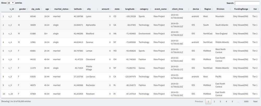
An overview of the data set is included for the user to have a basic understanding of our data.
The columns can be arranged and there's a search function for the user to search specific information.
Data Exploratory
A Data Exploratory tab is included for the user to play around the relationships between different variables.
Tab Panel
We divided the Data Exploration into three parts.
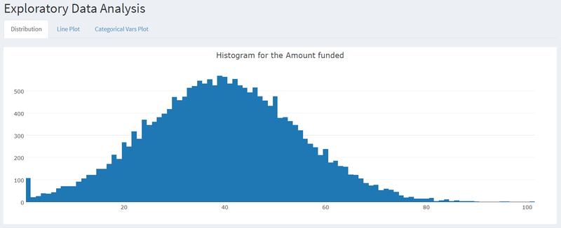
- The first one is a distribution of the total amount of money funded per user.
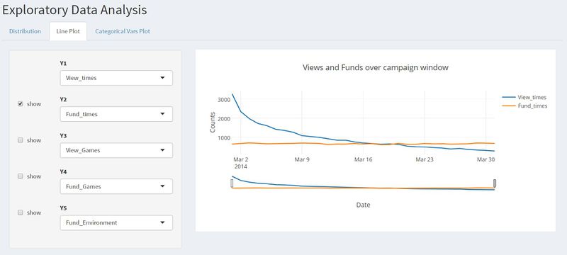
- The second one is the line plot that allows the user to select up to four different numeric variables to see their changes over days in one month.
- The third one is a bar chart for different categorical variables selected.
USD Amount Distribution
Distribution tab explains the distribution of USD amounts from users, specifically for funding activity. As the graph shown below, the distribution is highly skewed for 0 amount due to view activities providing null dollar in the data.
Selection and Checkbox
We include a selection panel for the user to select different variables and a checkbox to decide whether to include them in the chart.
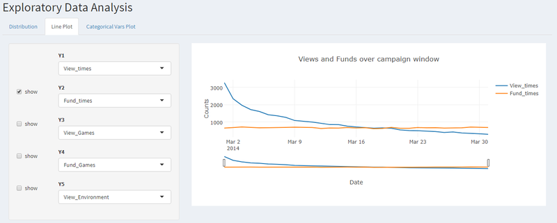
A line plot is chosen because our data are time-based and it is useful to drive insights about how the variables change over time.
Bar Chart
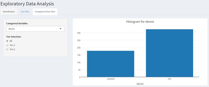
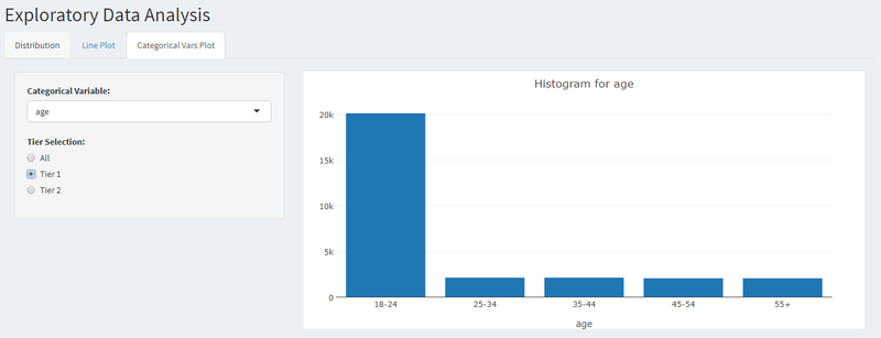
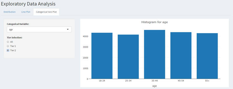
Third part of exploratory tab explains distribution and total number of each categorical variable. The variables are further divided into 2 tier, showing high (Tier 1) and low (Tier 2) contributing US states.
Upon going through the exploratory data analysis, we found out that the dataset had a large number of observations from 4 states (CO,GA,IN,OR). And it was decided to categorize these 4 into Tier 1 states and the remaining 46 US states into Tier 2 states.
Post segregation, it was noticed that Tier 1 states had a high proportion if iOS users as compared to Android users.
A similar difference was seen in the marital status of the visitors where in Tier 1 states had a high proportion of married to single status as compared to Tier 2 states which had a relatively equal proportion.
Analytics Dashboard
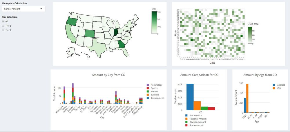
The crowdfunding dashboard is largely split into 4 areas
- A chloropleth map representing USA with states color intensity proportional to the amount coming from that particular state.
- A calendar map to understand the pattern of the funding received at what day of the month and at which hour.
- Bar chart to understand the proportion of the funded categories by each state
Hover and Click
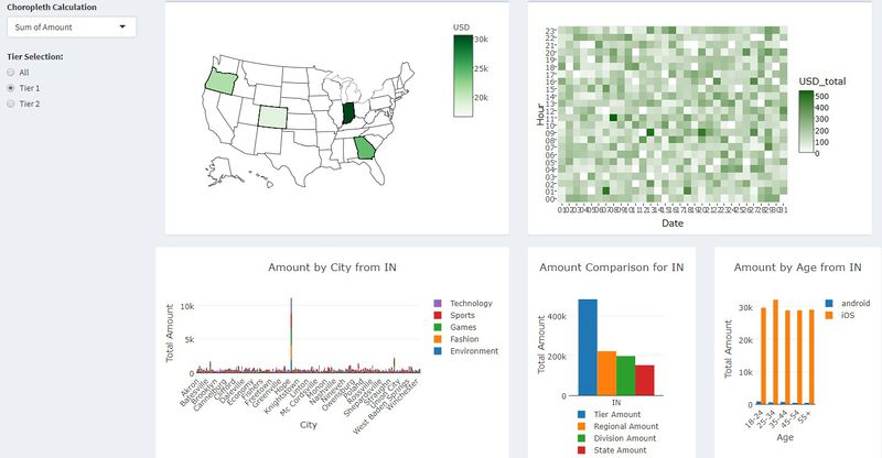
Hover on the different state on the choropleth map will show the name of that state and the amount of USD funded come from that state. Meanwhile, the calendar heatmap would change and only focus that state. When click on the state, bar charts below would change to showing a more detailed breakdown to the funded amount contribution from different cities by category and different age groups by device.
User Behavior Diagram
Since our data capture the when and whether a user views or funds a project and which category that project belongs to, one user ID has multiple rows with different activities, but the demographic characteristics are the same. It would be more insightful to undercover the sequence of their behavior.
Most of us are aware now that web analytics or clickstream analysis is largely tackled by sunburst visualizations to answer the following:
- What is the journey most users take towards viewing or funding on the app ?
- What users do after viewing certain projects ?
- What paths end with a churn ?
Sunburst Visualization today can be termed the Unsupervised Clickstream Clustering for User Behavior Analysis. It helps us segment users by way of their navigation through the mobile apps or websites thus revealing their interests and decision making. The sunburst is one definite way to find any users who are interested only in one specific category. For eg. If the user is seen viewing tech after viewing games instead of ending his session, you can sort of conclude that he does keep his options and interest open in other projects. The user does not bind himself to just one category. The Sunburst is the optimal way to display multiple paths. The round Sunburst lets the most common paths shine, and behavioral anomalies stand out as spikes. Built as a dynamic report, it lets you select a path or step in the path, to get more detailed information.
To do so, data manipulation is needed to construct a new user behavior sequence table to output a sunburst chart. The sequence order is defined according to the time the user performed that action. After that, a data frame that only captures the sequences and the counts of different sequences is constructed.
Selection Panel
However, one sunburst chart that captures all the user behavior sequences across the whole U.S. would not give informative insights as it would become too general and cannot segment the users. Therefore, we include the availability that user can select the filters performed on the data set to focus on the users of a certain location, gender, marital status and the device they used.
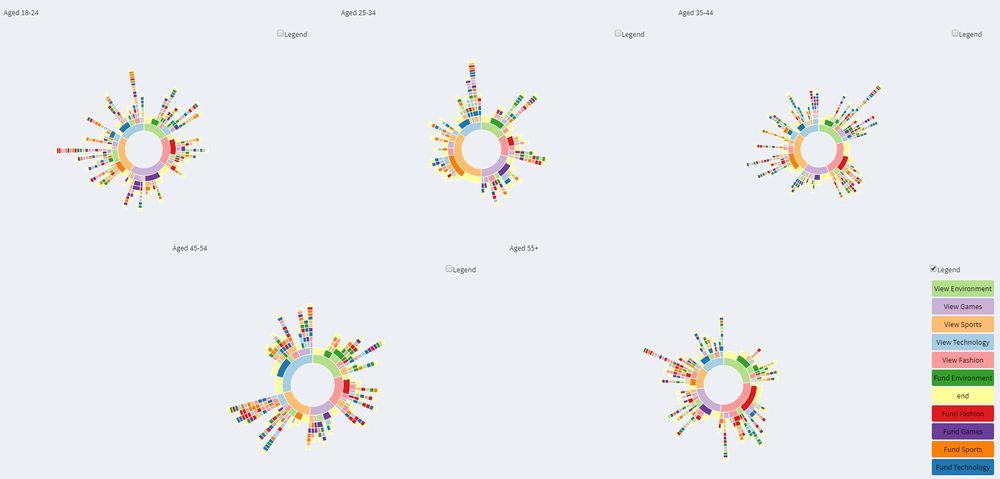
Meanwhile, we incorporated five sunburst charts to compare the behavior sequences of different age groups.
Demonstration
Data Exploratory
The line chart is to show the changes of variables over time.
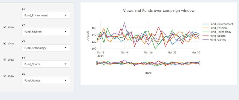
Here when select all the four selections, there comes up a more comparative result.
Analytics Dashboard
For one of the tier 1 state, the Indiana state (IN) is having more iOS users.
As a comparison with the previous dashboard, Colorado state (CO) is having more 18-24 age group with less number of city shown.
Sunburst
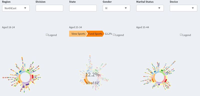
Here is a very simple example interacting with the sunburst charts. Hover on one part of the rings, you can see the counts and the percentage of that behavior. For the male users aged 25-34 in North East, they particularly interested in the sports projects and more likely to fund the sports projects after viewing them compared to the projects of other categories.
Though interpreting the sunburst chart is fairly straight forward, it should be noted that sessions are defined as gaps in action. The interval of time between two activities of a user is not reflected in the sunburst.
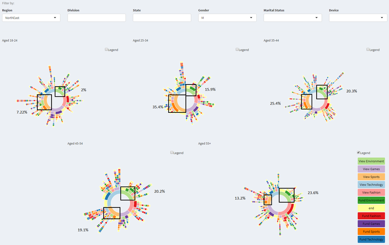
As sunburst diagram shown below, there are patterns for each age groups. For example, environment is increasing as life stage increases. While sports is decreasing for viewing interest, as life stage increases.
Discussion
With an inclusion of a Data Exploratory Tab to allow users to visually explore the distribution of the variables and their relationship with one another, it is hoped that users can gain basic insights about our data.
Through the Analytics Dashboard, users can have further insights into where the app users located, when they interacted with the app and their contribution to the projects.
The sunburst charts divided into age groups can help the user find the pattern of behaviors from different segments of the app-users and decide which specific group to target.
We hope that users will be inspired to perform deeper data-driven and visual analysis with the help of the dashboard.
Future Work
- First, we plan to collect more data and do a deeper analysis. We would ideally want the data to have IDs for each of the projects to reveal patterns of viewing and funding for specific projects coming from the creators. Any information about the creators of the project (viz. the rating or expertise of the creator)
- Second, we would like to consider how one project leads up to other projects or innovations and how many of them turn into mega projects or companies at record pace. It would be good to find if investors also play the role of creators at any point in time and how varied or similar is the project scope from the ones they have invested in the past.
- Third, we would like perform time series analysis to find any cyclical patterns to understand linking of investments with the financial calendar of the investors.
- In sum, the application has set a good foundation for us to perform data analytics on this area of research and it can be further strengthened and made robust with the right sort of data.
Installation guide
No installation is required, you can access the application in the following link: the visualizeR app
To run the application in RStudio: Post the setup of Rstudio (https://www.rstudio.com/products/rstudio/download/), the end user of this application will have to avail the following packages and library for the functioning of this application:
- Shinydashboard: to visualize the menus and overall visualisation flow
- Plotly: visualising interactive charts for dashboard
- Tidyverse(lubridate, dplyr,readr): data cleaning packages
- sunburstR: visualising user behaviour on viewing and funding projects in details
- DT: provide interactive tabular view for data, with sort and search functions
- Shiny: provide controls and interactive buttons for charts
- jsonlite: convert json source flat files to data frame format in R
User Guide
- Open “https://ericprabowoc.shinyapps.io/visualizer/”
- Open Data View tab to see how the data is structured
- Open Data Exploratory tab to see distribution, time-series line, and categorical variable distribution LINE PLOT
- Go to Line Plot tab to see time-series data changes from each line
- There is an option to hide the line charts by clicking show checkboxes
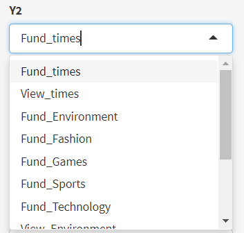
- Dropdown list provide options to pick which type of category and event want to be shown on the line
- Go to Categorical Vars Plot tab to see a distribution of the categorical variable data
- Pick a categorical variable distribution to be shown on the chart
- Pick data from different tiers to be shown (All, Tier 1, or Tier 2)
- Note: Tier 1 is only showing amount of fund within a state above USD4000, Tier 2 is only showing total amount of fund within a state equal to and below USD4000
- Open Analytics Dashboard to see more based on findings under Data Exploratory tab
- Pick the calculations you want to see on the dashboard under Choropleth Calculation
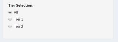
- Pick US State tiers you want to see under radio button Tier Selection
- Open User Behavior Diagram to see how each user is behaving towards different type of projects posted on crowdfunding application
- Filter the data by 6 different type of demography: Region, Division, State, Gender, Marital Status, Device
- To remove filter, empty/delete the box using backspace using keyboard
BAR PLOT

