Difference between revisions of "ISSS608 2016-17T3 Group15 Report"
Ghchua.2016 (talk | contribs) |
Ghchua.2016 (talk | contribs) |
||
| Line 67: | Line 67: | ||
HIV/Aids: http://www.who.int/gho/hiv/en/<br/> | HIV/Aids: http://www.who.int/gho/hiv/en/<br/> | ||
<font size="3"><font color="#00000"> | <font size="3"><font color="#00000"> | ||
| − | ||[[Image:Pandemic_History.png|500px]] | + | ||Figure xx - A time perspective of deadliest pandemic outbreaks in history[[Image:Pandemic_History.png|500px]] |
|} | |} | ||
| − | |||
Why does the experts believe that the next Pandemic is a matter of when and not if (see Figure xx)?<br/> | Why does the experts believe that the next Pandemic is a matter of when and not if (see Figure xx)?<br/> | ||
Revision as of 13:02, 6 August 2017
|
|
|
|
|
PandemViz: An interactive analytics tool for understanding pandemic outbreaks through data visualisation
By Chua Gim Hong, Huang Liwei and Ngo Siew Hui
Contents
Abstract
A pandemic is an epidemic or outbreak of infectious disease that spreads rapidly not only to many people, but across countries. The unprecedented mobility of people and food over the last 30 years has seen a steady increase in the frequency and diversity of disease outbreaks. No country is immune to this growing global threat. Scientists are predicting that it is not a matter of if, but when the next pandemic will happen. Singapore, as a small city state, with the highest population density in the world and one of the highest air passenger traffic, is particularly vulnerable.
There are reasons to remain optimistic, as Singapore’s SMART Nation initiatives and modern healthcare systems’ electronic records have open up new possibilities in the fight against potential infectious disease outbreaks in the country. Data will be increasingly ubiquitous as the world, including Singapore, continues to make significant advancement in the digitalisation age. Insights from the data have the potential to offer a critical line of preparedness needed through early identification, rapid effective response, and containment of disease outbreaks. To leverage on this increasing availability of data, we will need appropriate and affordable data exploratory, visualisation and analysis tool.
In view of this, our project aims to develop an interactive visual analytics tool, PandemViz, using R Shiny and R data visualization packages such as calendar heatmap and trellis plot. PandemViz will be useful for understanding pandemic outbreaks through data visualisation. In our development, R programming will be used to analyse a synthetic dataset (i.e. computer- and human-generated data) relating to a major disease outbreak that spanned several cities across the world in 2009. In an actual disease outbreak scenario, PandemViz can potentially be used by health officials to analyse the hospitalisation data to understand the spread of the pandemic across countries so as to mount effective responses as part of overall efforts to contain the pandemic.
This presentation consists of four main sections. First, the motivation and objectives of the project will be discussed. This is followed by a detailed discussion on the principles and concepts of key visualisation methods used. After which, the R packages used to develop the application and the user-interface designed will be discussed. Using the synthetic dataset, we will demonstrate how the functions of our tools can be used to detect the patterns and attribute distributions that characterize a pandemic spread. The efficacy of each of these visual analytics techniques will be discussed in detail. The presentation will conclude with a sharing of valuable insights gained through working on the project and potential application areas of our visualisation tool. We will also suggest possibilities for future works by combining hospital records with other data sources.
[VAST Challenge 2010 - Characterisation of Pandemic Spread]
Motivation of the application
There are various perspectives that motivates our application:
| 1. Epidemiological. Figure xx shows the outbreaks of pandemic in history and the staggering number of deaths caused by pandemics throughout history, not to mention the millions of suffers who survived the ordeal. (Reference: https://www.good.is/infographics/infographic-the-deadliest-disease-outbreaks-in-history). A pandemic is an epidemic or outbreak of infectious disease that spreads rapidly not only to many people, but across geographical areas. Many pandemic experts, believe that a pandemic would occur sometime in the next two generations. |
Figure xx – Outbreak of Pandemic in History.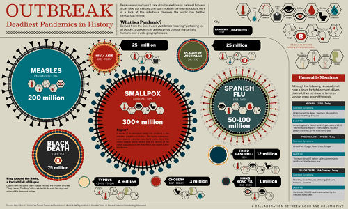
|
|
The enemy is microscopic, but the effect is devastating. In some cases, a part or whole of a city was wipe out (see Figure xx). Epidemiologists are bracing themselves for what has been called the next "Big One" - a disease that could kill tens of millions of people. |
Figure xx - A time perspective of deadliest pandemic outbreaks in history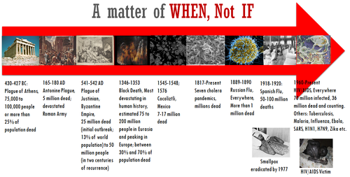
|
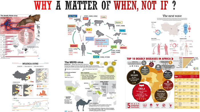
Why does the experts believe that the next Pandemic is a matter of when and not if (see Figure xx)?
Figure xx - A time perspective of deadliest pandemic outbreaks in history
 Reference:
Animal Pathogen: https://www.pinterest.com/pin/488218415827641787/
The Deadly Ebola virus: http://iacld.ir/en/index.php?option=com_content&view=article&id=829&Itemid=346
The MERS virus: https://www.yahoo.com/news/korea-reports-seven-mers-cases-one-suspect-flies-033321726.html
The next wave: https://s-media-cache-ak0.pinimg.com/736x/a7/61/9e/a7619eed12d93d40bab45dc102b42c8b--bird-flu-morning-post.jpg
Top 10 deadly disease in Africa: https://ask.naij.com/health/top-10-deadly-diseases-in-africa-i23506.html
Influenza A (H7N9):
In the history and science of contagious diseases, human beings have put mankind at risk by encroaching on wildlife habitats. About 60 percent of our new pathogens come from the bodies of animals. When we encroach into wildlife habitat or when we disrupt it in ways that brings people and animals into close contact, their microbes start to spill over to our bodies. (Reference: 'Pandemic' Asks: Is A Disease That Will Kill Tens of Millions Coming? http://www.npr.org/sections/health-shots/2016/02/22/467637849/pandemic-asks-is-a-disease-that-will-kill-tens-of-millions-coming) Another reason is the unprecedented mobility of people and food over the last 30 years has seen a steady increase in the frequency and diversity of disease outbreaks.
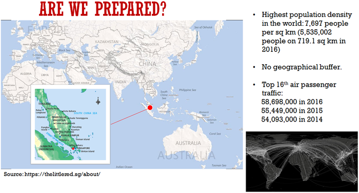
2. National Security. Are we prepared for the next Pandemic? Singapore, as a small city state, with world’s highest population density and one of the highest air passenger traffic, is particularly vulnerable. International travel is a significant risk factor in the spread of disease. Air travel shapes our epidemics in such a powerful way that scientists can actually predict where and when an epidemic will strike next just by measuring the number of direct flights between infected and uninfected cities.
Figure xx – Are We Prepared Against This National Security Threat?
3. Visual Analytics. We are motivated by “Democratising Data and Analytics With Visual Analytics”, which consist of two key factors, through the experience and observations of Prof Kam:
The first is about Data Accessibility. Although there has been improvement in recent years in breaking down data accessibility barrier at both the public and organization, they still exist. Many of these data are stored or distributed in a format which is not easily understood or can readily be used by casual users.
The second is about Analysis tools. Another barrier to data democratisation is the availability of appropriate tools to help analyze the data. These tools are needed to allow those without a data analysis background to easily extract meaning from the data.
Leveraging National Initiatives & Health Systems
There are reasons to remain optimistic, as Singapore’s SMART Nation initiatives and modern healthcare systems’ electronic records have open up new possibilities to de-mock-cratise data in the fight against potential infectious disease outbreaks in the country. Data will be increasingly ubiquitous as the world, including Singapore, continues to make significant advancement in the digitalisation age. Insights from the data have the potential to offer a critical line of preparedness needed through early identification, rapid effective response, and containment of disease outbreaks. To leverage on this increasing availability of data, we will need appropriate and affordable data exploratory, visualisation and analysis tool.
Why R? Our team has chosen R Programming Language because of its strong package ecosystem and charting benefits:
1. R is not only free, but open-source. (Reference: Applications Of R Programming In R-eal World https://elearningindustry.com/applications-r-programming-r-eal-world, By Vaishnavi Agrawal, February 25, 2016.)
2. Integrates with other languages (C/C++, Java, Python) (Reference: R (programming language) https://en.wikipedia.org/wiki/R_(programming_language)#cite_note-33)
3. Works on Windows, Macintosh, Linux and Unix platforms. (Reference: Statistical Consulting Group UCLA, Academic Technology Services, Technical Report Series, 2006 January 30, revised 2007 February 27, Report Number 1, Comment Number 1, R Relative to Statistical Packages: Comment 1 on Technical Report Number 1 (Version 1.0), Strategically using General Purpose Statistics Packages: A Look at Stata, SAS and SPSS http://www.burns-stat.com/pages/Tutor/R_relative_statpack.pdf)
4. Enables to communicate with many data sources: ODBC-compliant databases (Excel, Access) and other statistical packages (SAS, Stata, SPSS, Minitab).
5. Explicitly records actions of analysis and make it easy to reproduce and update report, which means it can quickly try many ideas and factual issues
6. A core set of packages is included with installation of R, with more than 11,000 additional packages (as of July 2017) available at Comprehensive R Archive Network (CRAN), Bioconductor, Omegahat, GitHub, and other repositories. (Reference: R (programming language) https://en.wikipedia.org/wiki/R_(programming_language)#cite_note-33)
7. The capabilities of R are extended through user-created packages, which allow specialized statistical techniques, graphical devices (such as the ggplot2 package developed by Hadley Wickham), import/export capabilities, reporting tools (knitr, Sweave), etc. These packages are developed primarily in R, and sometimes in Java, C, C++, and Fortran. A core set of packages is included with the installation of R, with more than 11,000 additional packages (as of July 2017) available at the Comprehensive R Archive Network (CRAN), Bioconductor, Omegahat, GitHub, and other repositories. (Reference: R (programming language) https://en.wikipedia.org/wiki/R_(programming_language)#cite_note-33)
8. Shiny, an R-based tool for producing interactive, web-ready data visualizations. Shiny is an R package that makes it easy to build interactive web applications (apps) straight from R. It is an R package and web application framework, which can build interactive web applications quickly in the same environment. Shiny also has a comprehensive list of widgets to implement interactive features such as selection button and input slider. It also allows any User-Interface interactions like click, hover, brush for users to perform deeper exploration of the data. (Reference: Why use Shiny? https://www.lynda.com/RStudio-tutorials/Why-use-Shiny/452087/490039-4.html
Limitations of R
Reference: Why R? The pros and cons of the R language http://www.infoworld.com/article/2940864/application-development/r-programming-language-statistical-data-analysis.html By Paul Krill, Editor at Large, InfoWorld | Jun 30, 2015
“The basic principle of R emanates from programming languages built in the 1960s. R's shortcomings are in security and memory management. Memory management, speed, and efficiency are probably the biggest challenges R faces. The design of the language can sometimes pose problems in working with very large data sets. Data has to be stored in physical memory. But as computers have gotten more memory, this has become less of an issue.”
“Next, capabilities such as security were not built into the R language. Also, R cannot be embedded in a Web browser i.e. cannot use it for Web-like or Internet-like apps. It was basically impossible to use R as back-end server to do calculations because of its lack of security over the Web. The security issue, however, has been lessened by developments such as the use of virtual containers on the Amazon Web Services cloud platform, Peng says.”
“However, the benefits of R outweigh the limitations. Strides have been -- and are still being -- made to make progress on those fronts.”
Review and critic on past works
The scenario, which is also applicable to our project, was major epidemic outbreak that spanned 11 cities across the world in 2009. Disease tended to move fast and be fairly difficult to combat. The past work that we review aims to analyse the illness across these countries to help understand the spread of the disease.
The dataset comprises 22 Excel csv files, 11 csv files each for patient admission and death, with date ranging from 16th April to 29th June 2009:
• There is a total of 14M Data Records for admission and 350K Data Records for death.
• The records span 11 Cities in different countries.
• The fields include Admission/Death Records with Patient IDs, Symptoms, Date and Patient ID of Gender and Age.
Figure xx: 92 out of 1,294 syndrome categories made up 97% of values
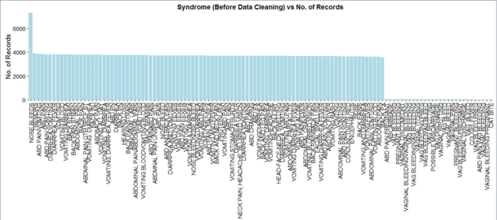
In our initial data exploration and analysis, we found that 92 out of 1,294 syndrome categories made up 97% of values. This was not highlighted in the VAST Challenge 2010 winner’s report. What this means is that although the dataset is large, with 1,294 syndrome categories, we need to focus only on the 92 of them and group them relevantly. This is an example of what we mean by democratising data analytics by making data and tools accessible. Data has to be stored or distributed in a format which is easily understood or can readily be used by casual users. This synthetic dataset shows the difficulty if data is messy with plenty of inconsistent category name and spelling errors, had it not for 92 categories which made up the vast majority of values. There has to be availability of appropriate tools to help analyze the data - tools to allow those without a data analysis background to easily extract meaning from the data.
Design framework
A detail description of the design principles used and data visualisation elements built (Refer to Section 3: Interface of this paper [1].
Demonstration
Sample test cases
Discussion
What has the audience learned from your work? What new insights or practices has your system enabled? A full blown user study is not expected, but informal observations of use that help evaluate your system are encouraged.
Future Work
A description of how your system could be extended or refined.
Installation guide
including hardware configuration and software integrationn. Sample Installation Guide
User Guide
Step-by-step guide on how to use the data visualisation functions designed.
References
