Difference between revisions of "ISSS608 2016-17 T3 Assign ERIC PRABOWO CUNDOMANIK"
| (13 intermediate revisions by the same user not shown) | |||
| Line 10: | Line 10: | ||
| style="font-family:Century Gothic; font-size:100%; solid #1B338F; background:#008f00; text-align:center;" width="25%" | | | style="font-family:Century Gothic; font-size:100%; solid #1B338F; background:#008f00; text-align:center;" width="25%" | | ||
; | ; | ||
| − | [[ISSS608_2016- | + | [[ISSS608_2016-17_T3_Assign_ERIC_PRABOWO_CUNDOMANIK| <font color="#FFFFFF">Solutions and Answers</font>]] |
| style="font-family:Century Gothic; font-size:100%; solid #1B338F; background:#008f00; text-align:center;" width="25%" | | | style="font-family:Century Gothic; font-size:100%; solid #1B338F; background:#008f00; text-align:center;" width="25%" | | ||
| Line 20: | Line 20: | ||
<!--spacing--> | <!--spacing--> | ||
| − | =Comments and Feedback | + | =Comments and Feedback= |
===1=== | ===1=== | ||
| Line 29: | Line 29: | ||
Another is the Sensor Reading Pattern, though you stated a great finding regarding the lack of reading for Appluimonia when there is a spike from AGOC-3A, the packed information on one screen makes it hard to observe the finding. The value on the columns and rows are too small to comprehend and the dimensions won't properly fit in one screen altogether. | Another is the Sensor Reading Pattern, though you stated a great finding regarding the lack of reading for Appluimonia when there is a spike from AGOC-3A, the packed information on one screen makes it hard to observe the finding. The value on the columns and rows are too small to comprehend and the dimensions won't properly fit in one screen altogether. | ||
| + | <hr/> | ||
===2=== | ===2=== | ||
| − | |||
Hi Eric, | Hi Eric, | ||
| Line 43: | Line 43: | ||
Debasish Behera | Debasish Behera | ||
| + | <hr/> | ||
===3=== | ===3=== | ||
| − | |||
<!--spacing--> | <!--spacing--> | ||
| Line 72: | Line 72: | ||
=Tableau Dashboard Overview= | =Tableau Dashboard Overview= | ||
| − | Link: https://public.tableau.com/profile/eric.prabowo#!/vizhome/ | + | <b>Link</b>: https://public.tableau.com/profile/eric.prabowo#!/vizhome/MiniChallenge2-FactoryPollution-EricPrabowo/STORYLekagulWildlifePreserveArea |
<!--spacing--> | <!--spacing--> | ||
| Line 82: | Line 82: | ||
=====Sensor 4===== | =====Sensor 4===== | ||
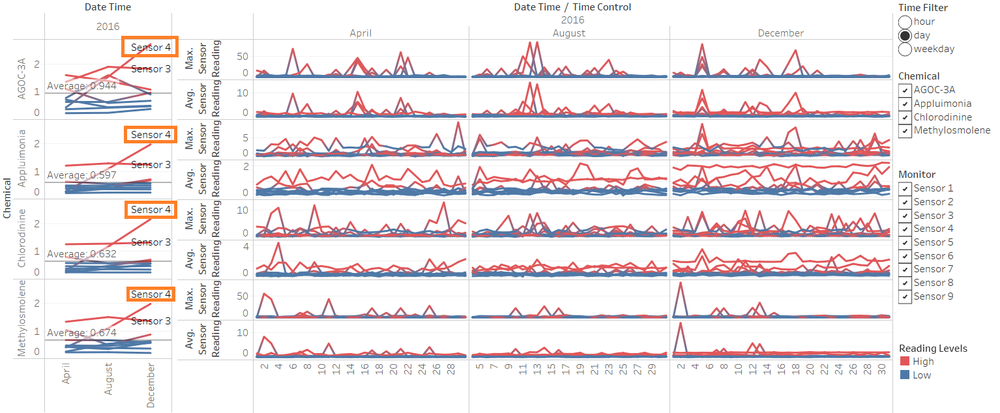
| − | Sensor performance and operation are overall good, except for sensor 4 which shows an unusual pattern compared to sensor 3 and 5, which is nearby. Sensor 4 have a problem on detecting the amount of chemical pollution, where it is increasing in August and December compared to April. Probably the measurement sensor is not performing well from the unusual behaviour. | + | Sensor performance and operation are overall good, except for sensor 4 which shows an unusual pattern compared to sensor 3 and 5, which is nearby. Sensor 4 have a problem on detecting the amount of chemical pollution, where it is increasing in August and December compared to April. Probably the measurement sensor is not performing well from the unusual behaviour. Line charts high and low measurements are based on monthly average. If it is <b>above 3 months average</b>, then reading level shows <b>high</b>. |
[[File:q1-eric prabowo.png|center|1000px]] | [[File:q1-eric prabowo.png|center|1000px]] | ||
| Line 88: | Line 88: | ||
<hr/> | <hr/> | ||
=====Sensor 3===== | =====Sensor 3===== | ||
| − | Sensor 3 shows unusual measurement of chemical pollution detected. Overall average of measurement is higher for sensor 3 within 3 months of data, for all chemicals detected. This indicates measurement problem of the sensor 3, where measurement unit calculation is inaccurate. Conversion of the data should provide a more accurate result. | + | Sensor 3 shows unusual measurement of chemical pollution detected. Overall average of measurement is higher for sensor 3 within 3 months of data, for all chemicals detected. This indicates measurement problem of the sensor 3, where measurement unit calculation is inaccurate. Conversion of the data should provide a more accurate result .Line charts high and low measurements are based on monthly average. If it is <b>above 3 months average</b>, then reading level shows <b>high</b>. |
[[File:q1 1-eric prabowo.png|center|1000px]] | [[File:q1 1-eric prabowo.png|center|1000px]] | ||
<center><b>Sensor 3 unusual behaviour of measurement (shown as outlier)</b></center> | <center><b>Sensor 3 unusual behaviour of measurement (shown as outlier)</b></center> | ||
| + | |||
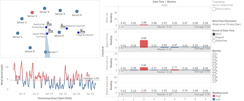
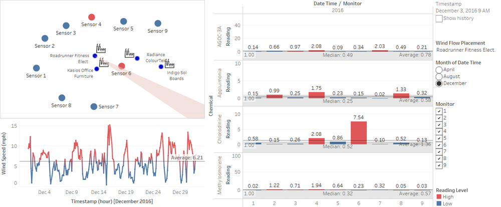
| + | In details, the data also given a prove that wind direction does not match the amount of chemicals detected on the sensors as shown in the image below. As a result, the amount of Appluimonia and Chlorodinine is probably not the real detected amount of chemicals. | ||
| + | |||
| + | [[File:q1 2-eric prabowo.png|center|1000px]] | ||
| + | <center><b>Dashboard showing wind direction and Sensor 3 readings unrelated</b></center> | ||
<hr/> | <hr/> | ||
| + | |||
=====Sensor 9===== | =====Sensor 9===== | ||
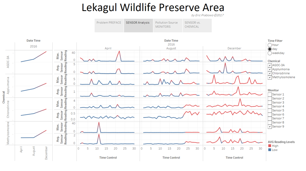
| − | Sensor 9 shows unusual measurement of chemical starting 23rd of August / last quarter of August, and the whole December. This pattern might show | + | Sensor 9 shows unusual measurement of chemical starting 23rd of August / last quarter of August, and the whole December. This pattern might show either broken sensor or higher production indication from Sensor 9 for certain chemicals reading. |
[[File:q2 3-eric prabowo.png|center|1000px]] | [[File:q2 3-eric prabowo.png|center|1000px]] | ||
<center><b>Sensor 9 have got a different measurement on Appluimonia, Chlorodinine, and Methylosmolene starting on the last quarter of August and the whole December.</b></center> | <center><b>Sensor 9 have got a different measurement on Appluimonia, Chlorodinine, and Methylosmolene starting on the last quarter of August and the whole December.</b></center> | ||
| − | + | <hr/> | |
| − | |||
| − | |||
| − | |||
=====Sensor 7===== | =====Sensor 7===== | ||
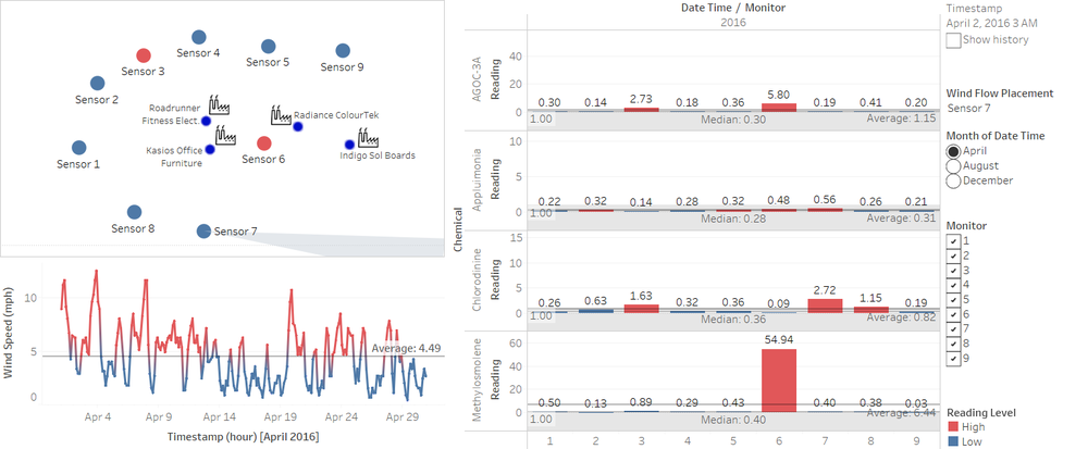
The dashboard data also shows that sensor 7 is not performing well, as Chlorodinine is showing up on the sensor, while the wind direction is not showing indication of direction from any factories. | The dashboard data also shows that sensor 7 is not performing well, as Chlorodinine is showing up on the sensor, while the wind direction is not showing indication of direction from any factories. | ||
| Line 110: | Line 113: | ||
<hr/> | <hr/> | ||
=====Sensor Reading Pattern===== | =====Sensor Reading Pattern===== | ||
| − | When readings on AGOC-3A is intense, sensors cannot read both AGOC-3A and Appluimonia at the same time altogether. So, when it comes to high intensity reading of AGOC-3A, Appluimonia data is not actually recorded by the sensors, as shown in image below. There is also an indication of blank data every second (2nd), fourth (4th), sixth (6th), seventh (7th) day of the month at exactly 12am, indicating sensor maintenance or restart, where it is not capturing data. | + | When readings on AGOC-3A is intense, sensors <b>cannot read both AGOC-3A and Appluimonia at the same time</b> altogether. So, when it comes to high intensity reading of AGOC-3A, Appluimonia data is not actually recorded by the sensors, as shown in image below. There is also an indication of blank data every <b>second (2nd), fourth (4th), sixth (6th), seventh (7th)</b> day of the month at exactly 12am, indicating sensor maintenance or restart, where it is not capturing data. |
[[File:q2 5-eric prabowo.png|center|1000px]] | [[File:q2 5-eric prabowo.png|center|1000px]] | ||
| Line 121: | Line 124: | ||
=====Chemical Hourly Release Pattern===== | =====Chemical Hourly Release Pattern===== | ||
| − | On hourly filtered data, the chemicals detected have patterns of releases. These indicates production hour of certain chemicals detected. | + | On hourly filtered data, the chemicals detected have patterns of releases. These indicates production hour of certain chemicals detected. |
| − | [[File:q2-eric prabowo.png|center| | + | [[File:q2-eric prabowo.png|center|1000px]] |
<center><b>Hourly filtered sensor data – showing chemical release patterns by hour of the day<i>[updated]</i></b></center> | <center><b>Hourly filtered sensor data – showing chemical release patterns by hour of the day<i>[updated]</i></b></center> | ||
| + | Baseline for these measurements of high and low is the overall data average, as shown on the left hand side of the monthly summation of the chemical readings. Combination of line and area charts are measured by each sensor’s independent range (not uniform range height). Line charts high and low measurements are based on monthly average. If it is <b>above 3 months average</b>, then reading level shows <b>high</b>. | ||
| + | <br/><br/> | ||
As shown on the line chart above, the pattern shows production time that uses <b>AGOC-3A</b> is <b>05:00-20:00</b> in August. Production pattern is shown by aggregated daily data within 3 months on the similar hour of the day. This production pattern time gap is increasing in August and December. In August, production time is <b>05:00-23:00</b>. In December, AGOC-3A production time is <b>06:00-23:00</b>, however there is an additional peak of AGOC-3A waste at <b>04:00</b>. Second pattern shown on the data is that, Methylosmolene is being released by production starting from 9pm to 6am in the morning. This shows production patterns of Methylosmolene is done in midnight hours. | As shown on the line chart above, the pattern shows production time that uses <b>AGOC-3A</b> is <b>05:00-20:00</b> in August. Production pattern is shown by aggregated daily data within 3 months on the similar hour of the day. This production pattern time gap is increasing in August and December. In August, production time is <b>05:00-23:00</b>. In December, AGOC-3A production time is <b>06:00-23:00</b>, however there is an additional peak of AGOC-3A waste at <b>04:00</b>. Second pattern shown on the data is that, Methylosmolene is being released by production starting from 9pm to 6am in the morning. This shows production patterns of Methylosmolene is done in midnight hours. | ||
<hr/> | <hr/> | ||
| Line 136: | Line 141: | ||
<hr/> | <hr/> | ||
=====Chemical Monthly Release Pattern===== | =====Chemical Monthly Release Pattern===== | ||
| − | Chemicals reading pattern for AGOC-3A shows there are monthly indication of lower production at the very beginning of the month, and no production at the end of the month. This chemical pattern shows production behaviour of companies using AGOC-3A, where production tend to increase in the middle of the month, and stopped at about day 25th of every month. Except for December, production stops early at | + | Chemicals reading pattern for AGOC-3A shows there are monthly indication of lower production at the very beginning of the month, and no production at the end of the month. This chemical pattern shows production behaviour of companies using AGOC-3A, where production tend to increase in the middle of the month, and stopped at about day 25th of every month. Except for December, production stops early at 24th December. Line charts high and low measurements are based on monthly average. If it is <b>above 3 months average</b>, then reading level shows <b>high</b>. |
| + | <br/><br/> | ||
| + | Production patterns also shows different amount of productions each months from the chemical releases. The productions are increasing as it reaches near middle of the month, and decreases as it reaches end of month. | ||
| + | - April: 2, 6, 15-17, 21-22 | ||
| + | - August: 1,6,8,9,11,12,14,16,18 (more days with high amounts detected higher production in August) | ||
| + | - December: 1,2,5,8,9,11,13,14,16,19,23 (more occurences with less higher amounts detected) | ||
[[File:q2 4-eric prabowo.png|center|1000px]] | [[File:q2 4-eric prabowo.png|center|1000px]] | ||
| Line 147: | Line 157: | ||
Companies responsible for the chemical wastes are: | Companies responsible for the chemical wastes are: | ||
* <u>Kasios</u>: <b>AGOC-3A</b> | * <u>Kasios</u>: <b>AGOC-3A</b> | ||
| − | * <u>Radiance ColourTek</u>: <b>AGOC-3A</b>, <b> | + | * <u>Radiance ColourTek</u>: <b>AGOC-3A</b>, <b>Appluimonia</b> |
* <u>Roadrunner Fitness Elect</u>: <b>Methylosmolene</b>, <b>Chlorodinine</b>, <b>AGOC-3A</b> | * <u>Roadrunner Fitness Elect</u>: <b>Methylosmolene</b>, <b>Chlorodinine</b>, <b>AGOC-3A</b> | ||
* <u>Indigo</u>: <b>Methylosmolene</b>, <b>Appluimonia</b> | * <u>Indigo</u>: <b>Methylosmolene</b>, <b>Appluimonia</b> | ||
| Line 161: | Line 171: | ||
[[File:q3 5-eric prabowo.png|center|1000px]] | [[File:q3 5-eric prabowo.png|center|1000px]] | ||
| − | <center><b>Sensor 8 and wind direction indicates Radiance - | + | <center><b>Sensor 8 and wind direction indicates Radiance - Appluimonia detected at 12PM</b></center> |
<hr/> | <hr/> | ||
| + | |||
=====Roadrunner Fitness Elect.===== | =====Roadrunner Fitness Elect.===== | ||
[[File:q3 2-eric prabowo.png|center|1000px]] | [[File:q3 2-eric prabowo.png|center|1000px]] | ||
| Line 179: | Line 190: | ||
[[File:q3 7-eric prabowo.png|center|1000px]] | [[File:q3 7-eric prabowo.png|center|1000px]] | ||
<center><b>Sensor 9 detected Appluimonia coming from the wind direction of Indigo Sol Boards at 12 PM</b></center> | <center><b>Sensor 9 detected Appluimonia coming from the wind direction of Indigo Sol Boards at 12 PM</b></center> | ||
| − | |||
| − | |||
| − | |||
| − | |||
| − | |||
Latest revision as of 11:26, 17 July 2017
|
|
|
|
|
Contents
Comments and Feedback
1
Feedback from Josef Exconde
For the first graph presented, though it is a neat idea to use color to show whether the reading is High or Low, I find that there is some problem to this approach, 1.) We don't have a baseline unto which is really a high reading and which is low, we don't know the acceptable value of each reading and if we assume that 0 is the acceptable value then everything should be high, so even if it is a nice representation we can't seem to make the most out of it for this viz, and secondly having 9 lines in a facet or a pane is difficult by itself, having 9 lines with the same color scheme it makes it harder to differentiate one sensor over the other. If I want to single out a reading for each sensor I would need to manipulate the filter. Personally I would suggest either having a label for each line or using color to differentiate them.
Another is the Sensor Reading Pattern, though you stated a great finding regarding the lack of reading for Appluimonia when there is a spike from AGOC-3A, the packed information on one screen makes it hard to observe the finding. The value on the columns and rows are too small to comprehend and the dimensions won't properly fit in one screen altogether.
2
Hi Eric,
Well done on your work.
Few of my comments that you can look into are as follows:
- instead of using bar graph you can may be use line chart for question 3
- For question 2 you can make the days as your x axis and chemicals as your y axis
Thanks & Regards
Debasish Behera
3
Hi Eric
Thank you for considering my critics valuable :D
Here are a few points from my end:
- Question 1 - Sensor Analysis Chart/Dashboard on Tableau Public can be improved by finding a way to segregate the sensors (aside from the filter mechanism). Besides, the Avg line should have been imposed on the same graph rather than using a new facet/row for showing the average reading reference.
- Question 1 - Low/High segregation as pointed out by Joseph may not be the best approach for finding the faulty sensors.
- Question 2 - A line chart may not be the best way of pointing out the patterns/differences in the chemicals. Perhaps a calendar or heatmap visualization could be better in communicating the differences in the chemical's pattern.
- Question 3 - The dashboard for question 3 looks fairly nice and tidy
Overall, the analysis looks good barring few visualizations that may seem ambiguous to the end user on a first glance. However, if we can explain those visualizations precisely, then it will further strengthen the analysis and report for Mitch and other environmentalists.
Once again, thank you for giving me the opportunity to provide feedback.
Cheers
Asmit
Tableau Dashboard Overview
Question Answers
Question 1
Characterize the sensors’ performance and operation. Are they all working properly at all times? Can you detect any unexpected behaviours of the sensors through analysing the readings they capture? Limit your response to no more than 9 images and 1000 words.
Sensor 4
Sensor performance and operation are overall good, except for sensor 4 which shows an unusual pattern compared to sensor 3 and 5, which is nearby. Sensor 4 have a problem on detecting the amount of chemical pollution, where it is increasing in August and December compared to April. Probably the measurement sensor is not performing well from the unusual behaviour. Line charts high and low measurements are based on monthly average. If it is above 3 months average, then reading level shows high.
Sensor 3
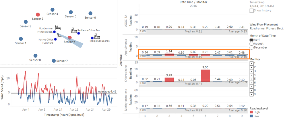
Sensor 3 shows unusual measurement of chemical pollution detected. Overall average of measurement is higher for sensor 3 within 3 months of data, for all chemicals detected. This indicates measurement problem of the sensor 3, where measurement unit calculation is inaccurate. Conversion of the data should provide a more accurate result .Line charts high and low measurements are based on monthly average. If it is above 3 months average, then reading level shows high.
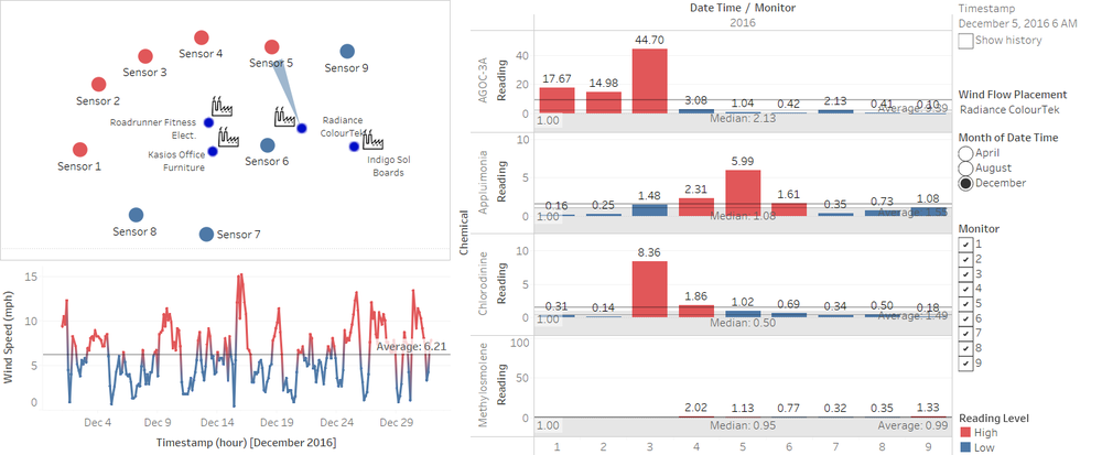
In details, the data also given a prove that wind direction does not match the amount of chemicals detected on the sensors as shown in the image below. As a result, the amount of Appluimonia and Chlorodinine is probably not the real detected amount of chemicals.
Sensor 9
Sensor 9 shows unusual measurement of chemical starting 23rd of August / last quarter of August, and the whole December. This pattern might show either broken sensor or higher production indication from Sensor 9 for certain chemicals reading.
Sensor 7
The dashboard data also shows that sensor 7 is not performing well, as Chlorodinine is showing up on the sensor, while the wind direction is not showing indication of direction from any factories.
Sensor Reading Pattern
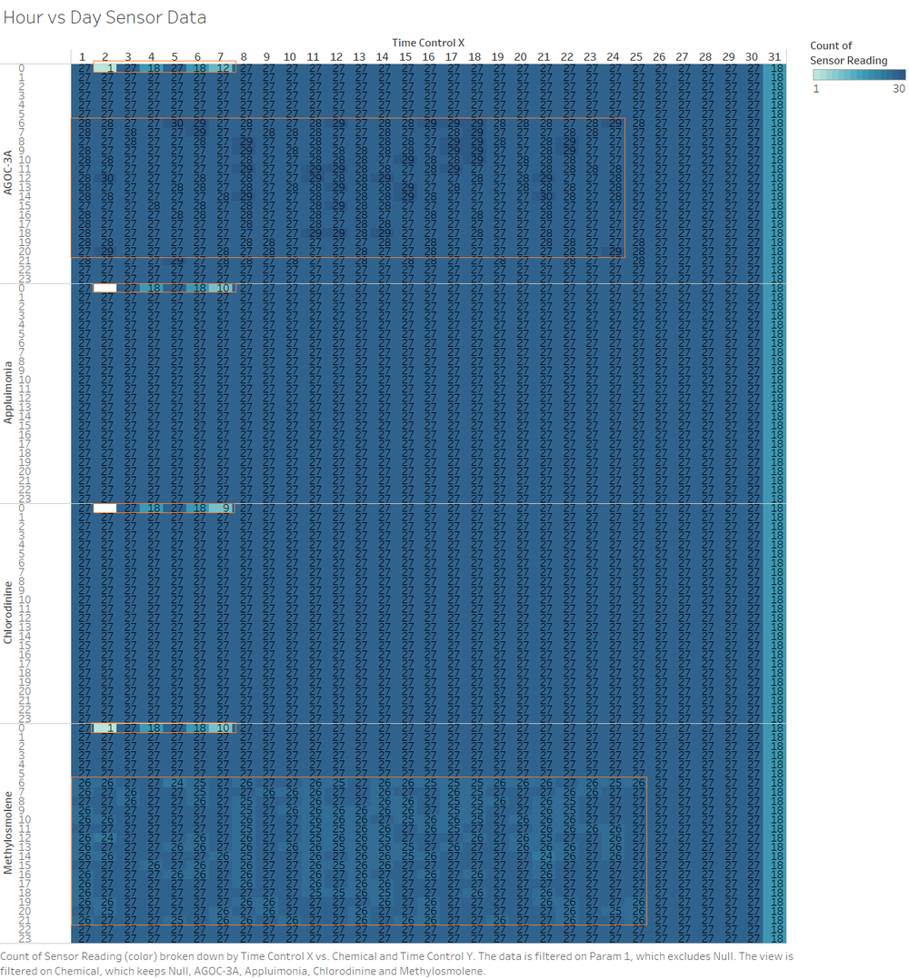
When readings on AGOC-3A is intense, sensors cannot read both AGOC-3A and Appluimonia at the same time altogether. So, when it comes to high intensity reading of AGOC-3A, Appluimonia data is not actually recorded by the sensors, as shown in image below. There is also an indication of blank data every second (2nd), fourth (4th), sixth (6th), seventh (7th) day of the month at exactly 12am, indicating sensor maintenance or restart, where it is not capturing data.
Question 2
Which chemicals are being detected by the sensor group? What patterns of chemical releases do you see, as being reported in the data?
Chemical Hourly Release Pattern
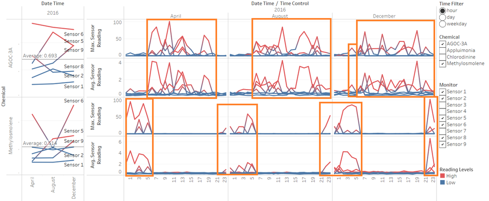
On hourly filtered data, the chemicals detected have patterns of releases. These indicates production hour of certain chemicals detected.
Baseline for these measurements of high and low is the overall data average, as shown on the left hand side of the monthly summation of the chemical readings. Combination of line and area charts are measured by each sensor’s independent range (not uniform range height). Line charts high and low measurements are based on monthly average. If it is above 3 months average, then reading level shows high.
As shown on the line chart above, the pattern shows production time that uses AGOC-3A is 05:00-20:00 in August. Production pattern is shown by aggregated daily data within 3 months on the similar hour of the day. This production pattern time gap is increasing in August and December. In August, production time is 05:00-23:00. In December, AGOC-3A production time is 06:00-23:00, however there is an additional peak of AGOC-3A waste at 04:00. Second pattern shown on the data is that, Methylosmolene is being released by production starting from 9pm to 6am in the morning. This shows production patterns of Methylosmolene is done in midnight hours.
Chemical Significant Readings
On the Dashboard Monitor, Appluimonia shows significant read from most of all sensors. This shows indication that the chemical pollution is not coming from the factories. Instead, it might come from surrounding areas.
Chemical Monthly Release Pattern
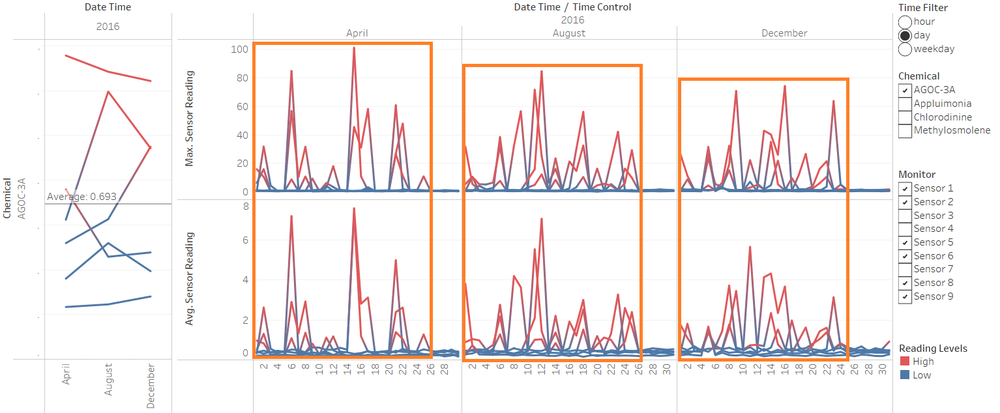
Chemicals reading pattern for AGOC-3A shows there are monthly indication of lower production at the very beginning of the month, and no production at the end of the month. This chemical pattern shows production behaviour of companies using AGOC-3A, where production tend to increase in the middle of the month, and stopped at about day 25th of every month. Except for December, production stops early at 24th December. Line charts high and low measurements are based on monthly average. If it is above 3 months average, then reading level shows high.
Production patterns also shows different amount of productions each months from the chemical releases. The productions are increasing as it reaches near middle of the month, and decreases as it reaches end of month.
- April: 2, 6, 15-17, 21-22
- August: 1,6,8,9,11,12,14,16,18 (more days with high amounts detected higher production in August)
- December: 1,2,5,8,9,11,13,14,16,19,23 (more occurences with less higher amounts detected)
Question 3
Which factories are responsible for which chemical releases? Carefully describe how you determined this using all the data you have available. For the factories you identified, describe any observed patterns of operation revealed in the data.
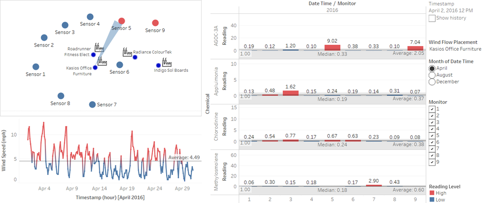
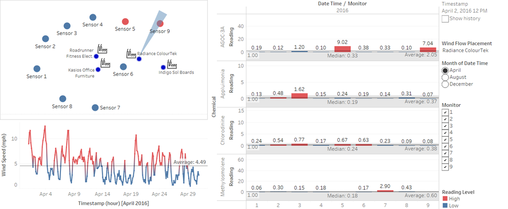
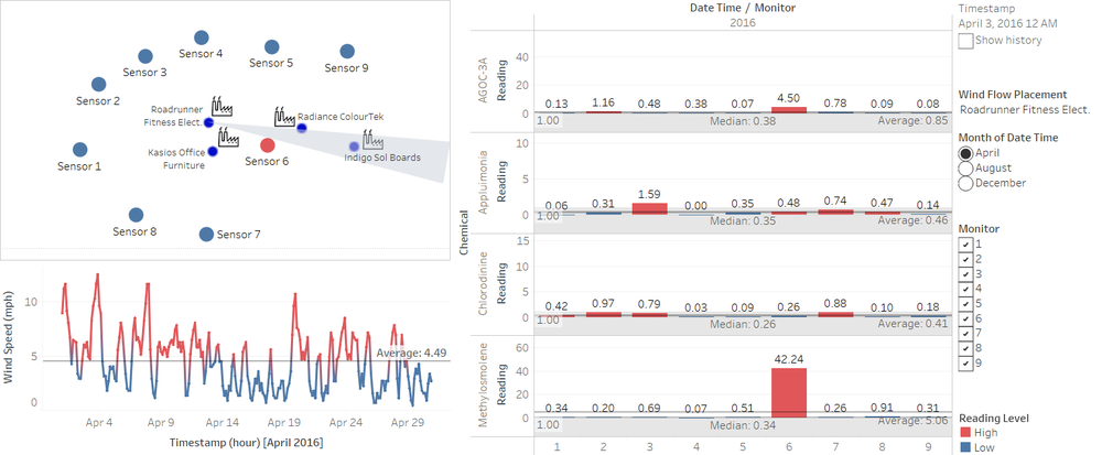
Companies responsible for the chemical wastes are:
- Kasios: AGOC-3A
- Radiance ColourTek: AGOC-3A, Appluimonia
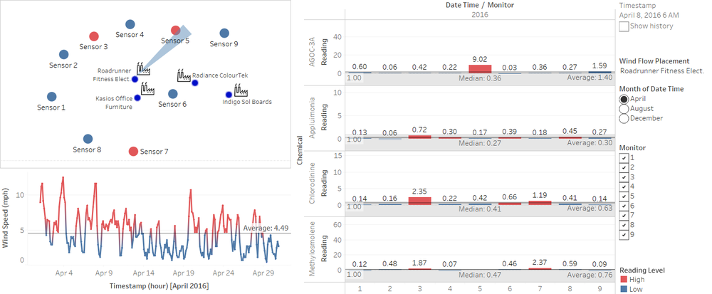
- Roadrunner Fitness Elect: Methylosmolene, Chlorodinine, AGOC-3A
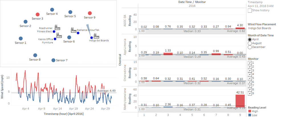
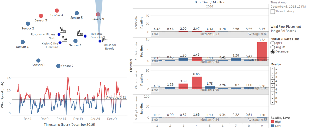
- Indigo: Methylosmolene, Appluimonia
