Difference between revisions of "ISSS608 2016-17 T3 Assign LIU XINTIAN Questions & Solutions"
| (43 intermediate revisions by 2 users not shown) | |||
| Line 9: | Line 9: | ||
[[ISSS608_2016-17_T3_Assign LIU XINTIAN| <font color="#FFFFFF">Overview</font>]] | [[ISSS608_2016-17_T3_Assign LIU XINTIAN| <font color="#FFFFFF">Overview</font>]] | ||
| − | | style="font-family:Century Gothic; font-size:100%; solid #1B338F; background:#2B3856; text-align:center;" width=" | + | | style="font-family:Century Gothic; font-size:100%; solid #1B338F; background:#2B3856; text-align:center;" width="25%" | |
; | ; | ||
[[ISSS608_2016-17_T3_Assign LIU XINTIANLIU XINTIAN_Data Preparation| <font color="#FFFFFF">Data Preparation</font>]] | [[ISSS608_2016-17_T3_Assign LIU XINTIANLIU XINTIAN_Data Preparation| <font color="#FFFFFF">Data Preparation</font>]] | ||
| − | | style="font-family:Century Gothic; font-size:100%; solid #000000; background:#2B3856; text-align:center;" width=" | + | | style="font-family:Century Gothic; font-size:100%; solid #000000; background:#2B3856; text-align:center;" width="25%" | |
; | ; | ||
[[ISSS608_2016-17_T3_Assign LIU XINTIAN_Questions & Solutions| <font color="#FFFFFF">Questions & Solutions</font>]] | [[ISSS608_2016-17_T3_Assign LIU XINTIAN_Questions & Solutions| <font color="#FFFFFF">Questions & Solutions</font>]] | ||
| − | | style="font-family:Century Gothic; font-size:100%; solid #1B338F; background:#2B3856; text-align:center;" width=" | + | | style="font-family:Century Gothic; font-size:100%; solid #1B338F; background:#2B3856; text-align:center;" width="25%" | |
| − | |||
| − | |||
| − | |||
| − | |||
; | ; | ||
[[ISSS608_2016-17_T3_Assign LIU XINTIAN_Feedback| <font color="#FFFFFF">Feedback</font>]] | [[ISSS608_2016-17_T3_Assign LIU XINTIAN_Feedback| <font color="#FFFFFF">Feedback</font>]] | ||
| − | | style="font-family:Century Gothic; font-size:100%; solid #1B338F; background:#2B3856; text-align:center;" width=" | + | | style="font-family:Century Gothic; font-size:100%; solid #1B338F; background:#2B3856; text-align:center;" width="25%" | |
; | ; | ||
| Line 33: | Line 29: | ||
==Question 1== | ==Question 1== | ||
| − | Characterize the sensors’ performance and operation. | + | ''Characterize the sensors’ performance and operation.'' |
| − | == Checking | + | |
| + | ''Are they all working properly at all times? Can you detect any unexpected behaviours of the sensors through analysing the readings they capture?'' | ||
| + | |||
| + | === Checking Monitors Working Improperly === | ||
[[File:LXT_Q1_1.png|300px|right]] | [[File:LXT_Q1_1.png|300px|right]] | ||
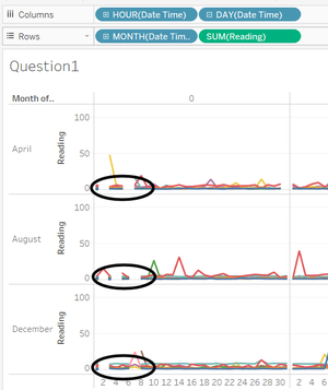
The line chart on the right shows the reading of four chemicals changed by day in the same hour in three months. Each line represents a sensor. In this way, we can find that there are some missing values at 0:00am in the beginning of these three months. This means '''all''' the sensors are not working properly at these specific times. '''The table below shows the missing value of each sensor, which means they are not working at 0:00am on these days or the sensors may be in maintenance period or some other conditions that cannot work.''' (work = “Y”, Not work = “N”) | The line chart on the right shows the reading of four chemicals changed by day in the same hour in three months. Each line represents a sensor. In this way, we can find that there are some missing values at 0:00am in the beginning of these three months. This means '''all''' the sensors are not working properly at these specific times. '''The table below shows the missing value of each sensor, which means they are not working at 0:00am on these days or the sensors may be in maintenance period or some other conditions that cannot work.''' (work = “Y”, Not work = “N”) | ||
| Line 40: | Line 39: | ||
[[File:LXT_Q1_2.png|600px]] | [[File:LXT_Q1_2.png|600px]] | ||
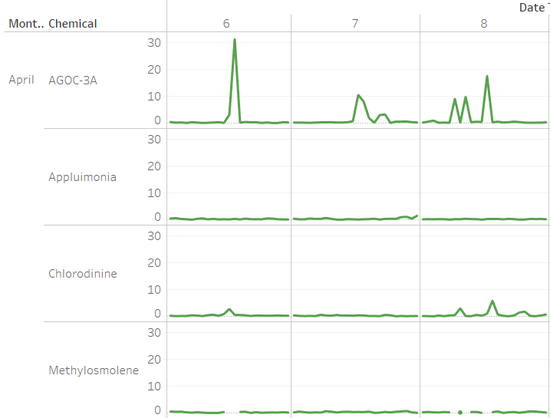
| − | Now, let us see the readings of each chemical. All the sensors have a strange thing in detecting “Methylosmolene”. '''If “AGOC-3A” has a extremly high value, at the same time, the sensor cannot detect the reading of “Methylosmolene”.''' The graph below is an example of monitor 5, but this phenomenon appears in every sensor in the same condition. | + | Now, let us see the readings of each chemical ''(graph Q1_3)''. All the sensors have a strange thing in detecting “Methylosmolene”. '''If “AGOC-3A” has a extremly high value, at the same time, the sensor cannot detect the reading of “Methylosmolene”.''' The graph below is an example of monitor 5, but this phenomenon appears in every sensor in the same condition. |
| − | [[File: | + | [[File:LXT_Q1_4.png|650px|right|Q1_4]] |
| + | [[File:LXT_Q1_3.png|550px|Q1_3]] | ||
Then, we need to find out why this phenomenon happens. Why these values are extremely high? Is there any possible that at some specific hours, the monitor shows more than one reading? | Then, we need to find out why this phenomenon happens. Why these values are extremely high? Is there any possible that at some specific hours, the monitor shows more than one reading? | ||
| + | |||
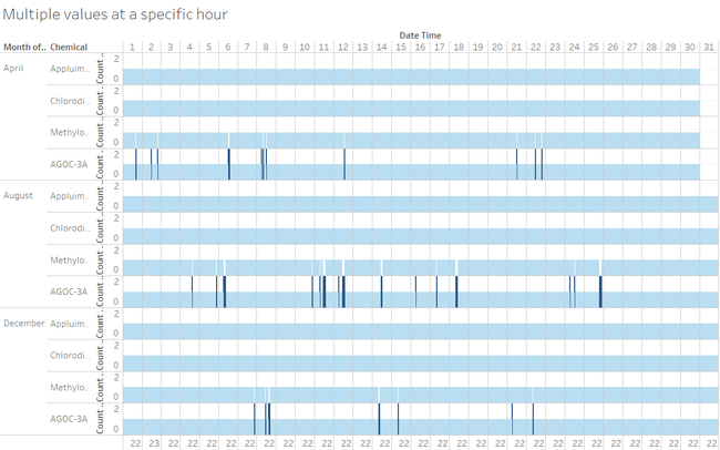
| + | The bar chart above ''(graph Q1_4)'' shows the count of monitor 5 readings in any specific hours. If we lock it into entire view, we can easily find that the range of “CNT(reading)” is 0-2. What’s more, the condition of “CNT(reading)=2” only appears in one chemical---Appluimonia and “CNT(reading)=0” only appears in the other chemical---Methylosmolene. '''The overlap and the gap are exactly corresponding, which means, monitors wrongly record some value of “Methylosmolene” to “Appluimonia”. These wrong values cannot revise by only changing the chemical name because the value is not right.''' | ||
| + | |||
| + | Also, '''heat map''' is good for us to find the missing value of reading, which might be caused by improperly working sensor. It gives us the hour that chemicals released much visually. This is also in the interactive dashboard and everyday can be clicked to see the information of the wind speed and direction. | ||
| + | |||
| + | [[File:LXT_5.png|700px]] | ||
| + | |||
| + | The table below shows the information of wrong records of different sensor in three months. (Have wrong records = “×”, Don’t have wrong records = “√”) | ||
| + | |||
| + | [[File:LXT_Q1_5.png|600px]] | ||
| + | |||
| + | '''Monitor 1 and 2 don’t have wrong records in April, and monitor 7 and 8 don’t have wrong records in August and December. The others have wrong records in all months.''' | ||
| + | |||
| + | === Checking Unexpected Behaviours === | ||
| + | |||
| + | A reference line (median with quartiles) is added to show the unexpected readings. We can find that there are '''''four kinds''''' of unexpected readings in the line chart. | ||
| + | |||
| + | First, the readings that '''extremely high''' (nearly have a hundredfold value than the others). This phenomenon which caused by wrongly record we have analysed above. | ||
| + | |||
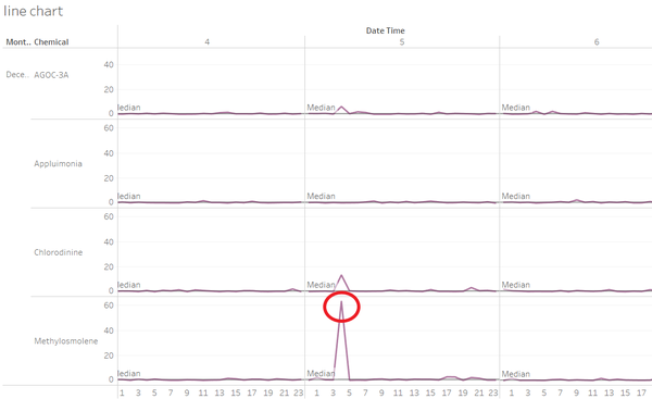
| + | Second, besides the readings in the first condition, there are also have some '''high values''' (nearly a hundredfold than others). Let’s show the line chart (''graph Q1_6'') of monitor 7 in Dec 5th, 4:00 to be an example. | ||
| + | |||
| + | [[File:LXT_Q1_6.png|600px|Q1_6]] | ||
| + | |||
| + | Third, '''after filter the readings in a small range''' and excluding the extremely high value readings, we can also find there are readings that out of the range of quartiles (or have ten times around than the others). Let’s show the line chart (''graph Q1_7'') of monitor 2 in April 10th and April 11th to be an example. | ||
| + | |||
| + | [[File:LXT_Q1_7.png|600px|Q1_7]] | ||
| + | |||
| + | Last but not least, the whole line fluctuates frequently and changes a lot (''graph Q1_8''). In the example below, monitor 3 is '''more volatile''' than the others. | ||
| + | |||
| + | [[File:LXT_Q1_8.png|600px|Q1_8]] | ||
| + | |||
| + | ==Question 2== | ||
| + | |||
| + | ''Now turn your attention to the chemicals themselves.'' | ||
| + | |||
| + | ''Which chemicals are being detected by the sensor group? What patterns of chemical releases do you see, as being reported in the data?'' | ||
| + | |||
| + | === Chemicals VS Sensor group === | ||
| + | |||
| + | In the bar chart (''graph Q2_1'') of monitors and chemical in the whole three months, we can find that '''monitor 1, 2, 8 and 9 have little reading than the others. Monitor 3 and Monitor 4 detect more readings of 4 kings of chemicals than others. Monitor 5, 6 and 7 detect more “AGOC-3A” than the other chemicals they detect.''' | ||
| + | |||
| + | [[File:LXT_Q2_1.png|600px|Q2_1]] | ||
| + | |||
| + | === Released Patterns === | ||
| + | |||
| + | • The chemical readings detected by '''monitor 4''' are released '''increasingly by month''' (''graph Q2_2''). The chemical readings detected by '''monitor 3''' is '''most volatile''' by day in every month. | ||
| + | |||
| + | [[File:LXT_Q2_2.png|600px|Q2_2]] | ||
| + | |||
| + | • The graph below (''graph Q2_3'') shows the readings of these 5 monitors by month. We can find that in April, monitor 3 has the biggest reading of 4 kinds of chemicals, while monitor 6 has the biggest reading of “AGOC-3A”; In December, monitor 4 has the biggest reading of 4 kinds of chemicals. | ||
| + | |||
| + | [[File:LXT_Q2_3.png|600px|Q2_3]] | ||
| + | |||
| + | • This graph shows all hours’ wind pattern in three months. We assumed the wind blows 10 minutes and the wind range is 60 degrees. We can easily find that sensor 1 and sensor 8 is seldom overlapped by any wind pattern, which means the volatility is small in these two sensors. | ||
| + | |||
| + | [[File:LXT_6.png|600px]] | ||
| + | |||
| + | • If we only care about the pattern in 24 hours in one day, we can find that “Agoc-3A” is released most at 10:00 to 16:00, “Methylosmolene” is released most at 19:00 to next day 4:00. (''graph Q2_4'') | ||
| + | |||
| + | [[File:LXT_Q2_4.png|600px|Q2_4]] | ||
| + | |||
| + | ==Question 3== | ||
| + | |||
| + | ''Which factories are responsible for which chemical releases? Carefully describe how you determined this using all the data you have available.'' | ||
| + | |||
| + | ''For the factories you identified, describe any observed patterns of operation revealed in the data.'' | ||
| + | |||
| + | ===Basic Concepts and Interactive Dashboard=== | ||
| + | |||
| + | We need a visualized graph to show the wind direction, wind speed and the location of nine sensors and four factories. The graph below (''graph Q3_1'') is a '''visualized graph of wind speed and direction at every specific time'''. The radius of this fan shape is related to wind speed and the direction from the centre (factory location) of the so-called circle is the wind direction. The overlap means multiple factories pollution. '''The minutes that wind blows and the degree of the wind range can be filtered in this application'''. For example, this is 0:00am on Apr 1st, if the wind angle range is 60 degrees and if the wind blows for 8.9 minutes, monitor 9 can detect the pollutants from Radiance Colour Tek and Indigo Sol Boards, while monitor 4 can detect the pollutants from Roaddrunner but not Kasios Office Furniture. | ||
| + | |||
| + | [[File:LXT_Q3_1.png|600px|Q3_1]] | ||
| + | |||
| + | We need to link this application to the line chart and heatmap in an interactive dashboard so that we can use this application to check every unnormal values. | ||
| + | |||
| + | At first, there are some concepts of wind need to be mentioned. | ||
| + | |||
| + | • We have the wind speed and wind direction every 3 hours, but the sensor reading updates every hour. | ||
| + | |||
| + | • The wind can '''both carry and blow away''' the pollutants, which is '''determined by the wind speed and minutes'''. For example, in this graph (''graph Q3_2''), monitor 4, 5 and 9 are in the overlap of wind. As normal, the readings at 6:00am, Apr 1st should be high, but in fact, they are not. This is caused by '''fast wind speed'''. | ||
| + | |||
| + | [[File:LXT_Q3_2.png|600px|Q3_2]] | ||
| + | |||
| + | • The wind is constant, if the wind blows through the sensor, it also means that the wind will take away the pollutants. | ||
| + | |||
| + | ===Factories and Chemicals=== | ||
| + | |||
| + | Now, let us find the relationship between factories and chemicals. | ||
| + | |||
| + | '''“AGOC-3A” is released by “Radiance Colour Tex”.''' In the graph below (''graph Q3_3''), We can find that at 3:00, Apr 11th, monitor 9 has a high value of “AGOC-3A” and monitor 5 has a low value of it. Around one hour later, monitor 3, 4, 5 and 9 is overlapped, but the reading of monitor 5 increases while monitor 9 decreases which means “AGOC-3A” is not moving to monitor 9 but 5. So, “AGOC-3A” is released by “Radiance Colour Tex”. | ||
| + | |||
| + | [[File:LXT_Q3_3.png|600px|Q3_3]] | ||
| + | |||
| + | '''“Appluimonia” is released from “Indigo Sol Boards”.''' In the graph below (''graph Q3_4''), We can find in this specific time, the wind speed is properly and the wind from four factories overlap the monitor 3, 4, 5 and 9, but only monitor 9 have a high value of “Appluimonia”, which means this pollutant is come from “Indigh Sol Boards”. | ||
| + | |||
| + | [[File:LXT_Q3_4.png|600px|Q3_4]] | ||
| + | |||
| + | '''“Chlorodinine” is mainly released by “Kasio Office Furniture” and “Roadrunner Fitness Electronics”.''' After comparing a lot of specific times, the results are same. In the graph (''graph Q3_5''), monitor 5 is overlapped by the wind from these two companies. The reading of other monitors are not increase. So, Chlorodinine is mainly released by “Kasio Office Furniture” and “Roadrunner Fitness Electronics”. | ||
| + | |||
| + | [[File:LXT_Q3_5.png|600px|Q3_5]] | ||
| + | |||
| + | '''“Methylosmolene” is released by “Kasio Office Furniture” and “Roadrunner Fitness Electronics”.''' | ||
| + | |||
| + | [[File:LXT_Q3_6.png|600px|Q3_6]] | ||
| + | |||
| + | '''''Conclusion: Here are the mainly pollutants that each factory release.''''' | ||
| + | |||
| + | Roadrunner Fitness Electronics ===> Chlorodinine & Methylosmolene | ||
| + | |||
| + | Kasio Office Furniture ===> Chlorodinine & Methylosmolene | ||
| + | |||
| + | Indigo Sol Boards ===> Appluimonia | ||
| + | |||
| + | Radiance Colour Tex ===> AGOC-3A | ||
| + | |||
| + | ==Public Server== | ||
| + | |||
| + | https://public.tableau.com/profile/liu.xintian#!/vizhome/MC2_5/Dashboard1?publish=yes | ||
| + | |||
| + | ==Feedback== | ||
| + | |||
| + | ===Feedback from Qian Hongjun=== | ||
| + | Hi Xintian | ||
| + | |||
| + | I like your visualization and it is quite impressive. So why not share your application made for visualizing the chemicals or wind to Tableau Public for others to manupulate the graph and get fun from it? | ||
| + | |||
| + | Regards | ||
| + | Hongjun | ||
Latest revision as of 23:54, 16 July 2017
|
|
|
|
|
|
Contents
Question 1
Characterize the sensors’ performance and operation.
Are they all working properly at all times? Can you detect any unexpected behaviours of the sensors through analysing the readings they capture?
Checking Monitors Working Improperly
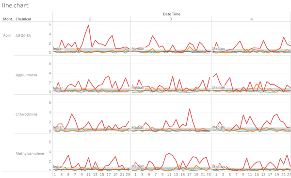
The line chart on the right shows the reading of four chemicals changed by day in the same hour in three months. Each line represents a sensor. In this way, we can find that there are some missing values at 0:00am in the beginning of these three months. This means all the sensors are not working properly at these specific times. The table below shows the missing value of each sensor, which means they are not working at 0:00am on these days or the sensors may be in maintenance period or some other conditions that cannot work. (work = “Y”, Not work = “N”)
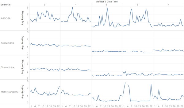
Now, let us see the readings of each chemical (graph Q1_3). All the sensors have a strange thing in detecting “Methylosmolene”. If “AGOC-3A” has a extremly high value, at the same time, the sensor cannot detect the reading of “Methylosmolene”. The graph below is an example of monitor 5, but this phenomenon appears in every sensor in the same condition.
Then, we need to find out why this phenomenon happens. Why these values are extremely high? Is there any possible that at some specific hours, the monitor shows more than one reading?
The bar chart above (graph Q1_4) shows the count of monitor 5 readings in any specific hours. If we lock it into entire view, we can easily find that the range of “CNT(reading)” is 0-2. What’s more, the condition of “CNT(reading)=2” only appears in one chemical---Appluimonia and “CNT(reading)=0” only appears in the other chemical---Methylosmolene. The overlap and the gap are exactly corresponding, which means, monitors wrongly record some value of “Methylosmolene” to “Appluimonia”. These wrong values cannot revise by only changing the chemical name because the value is not right.
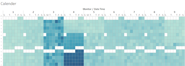
Also, heat map is good for us to find the missing value of reading, which might be caused by improperly working sensor. It gives us the hour that chemicals released much visually. This is also in the interactive dashboard and everyday can be clicked to see the information of the wind speed and direction.
The table below shows the information of wrong records of different sensor in three months. (Have wrong records = “×”, Don’t have wrong records = “√”)
Monitor 1 and 2 don’t have wrong records in April, and monitor 7 and 8 don’t have wrong records in August and December. The others have wrong records in all months.
Checking Unexpected Behaviours
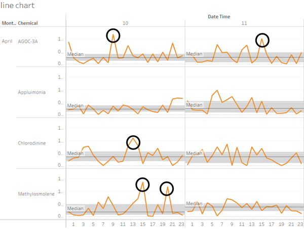
A reference line (median with quartiles) is added to show the unexpected readings. We can find that there are four kinds of unexpected readings in the line chart.
First, the readings that extremely high (nearly have a hundredfold value than the others). This phenomenon which caused by wrongly record we have analysed above.
Second, besides the readings in the first condition, there are also have some high values (nearly a hundredfold than others). Let’s show the line chart (graph Q1_6) of monitor 7 in Dec 5th, 4:00 to be an example.
Third, after filter the readings in a small range and excluding the extremely high value readings, we can also find there are readings that out of the range of quartiles (or have ten times around than the others). Let’s show the line chart (graph Q1_7) of monitor 2 in April 10th and April 11th to be an example.
Last but not least, the whole line fluctuates frequently and changes a lot (graph Q1_8). In the example below, monitor 3 is more volatile than the others.
Question 2
Now turn your attention to the chemicals themselves.
Which chemicals are being detected by the sensor group? What patterns of chemical releases do you see, as being reported in the data?
Chemicals VS Sensor group
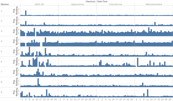
In the bar chart (graph Q2_1) of monitors and chemical in the whole three months, we can find that monitor 1, 2, 8 and 9 have little reading than the others. Monitor 3 and Monitor 4 detect more readings of 4 kings of chemicals than others. Monitor 5, 6 and 7 detect more “AGOC-3A” than the other chemicals they detect.
Released Patterns
• The chemical readings detected by monitor 4 are released increasingly by month (graph Q2_2). The chemical readings detected by monitor 3 is most volatile by day in every month.
• The graph below (graph Q2_3) shows the readings of these 5 monitors by month. We can find that in April, monitor 3 has the biggest reading of 4 kinds of chemicals, while monitor 6 has the biggest reading of “AGOC-3A”; In December, monitor 4 has the biggest reading of 4 kinds of chemicals.
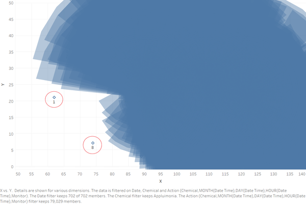
• This graph shows all hours’ wind pattern in three months. We assumed the wind blows 10 minutes and the wind range is 60 degrees. We can easily find that sensor 1 and sensor 8 is seldom overlapped by any wind pattern, which means the volatility is small in these two sensors.
• If we only care about the pattern in 24 hours in one day, we can find that “Agoc-3A” is released most at 10:00 to 16:00, “Methylosmolene” is released most at 19:00 to next day 4:00. (graph Q2_4)
Question 3
Which factories are responsible for which chemical releases? Carefully describe how you determined this using all the data you have available.
For the factories you identified, describe any observed patterns of operation revealed in the data.
Basic Concepts and Interactive Dashboard
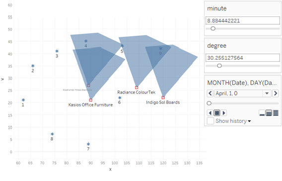
We need a visualized graph to show the wind direction, wind speed and the location of nine sensors and four factories. The graph below (graph Q3_1) is a visualized graph of wind speed and direction at every specific time. The radius of this fan shape is related to wind speed and the direction from the centre (factory location) of the so-called circle is the wind direction. The overlap means multiple factories pollution. The minutes that wind blows and the degree of the wind range can be filtered in this application. For example, this is 0:00am on Apr 1st, if the wind angle range is 60 degrees and if the wind blows for 8.9 minutes, monitor 9 can detect the pollutants from Radiance Colour Tek and Indigo Sol Boards, while monitor 4 can detect the pollutants from Roaddrunner but not Kasios Office Furniture.
We need to link this application to the line chart and heatmap in an interactive dashboard so that we can use this application to check every unnormal values.
At first, there are some concepts of wind need to be mentioned.
• We have the wind speed and wind direction every 3 hours, but the sensor reading updates every hour.
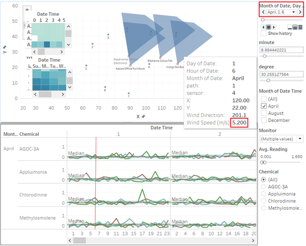
• The wind can both carry and blow away the pollutants, which is determined by the wind speed and minutes. For example, in this graph (graph Q3_2), monitor 4, 5 and 9 are in the overlap of wind. As normal, the readings at 6:00am, Apr 1st should be high, but in fact, they are not. This is caused by fast wind speed.
• The wind is constant, if the wind blows through the sensor, it also means that the wind will take away the pollutants.
Factories and Chemicals
Now, let us find the relationship between factories and chemicals.
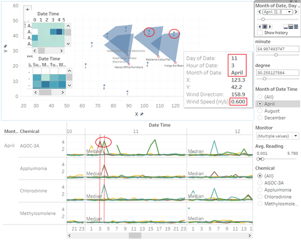
“AGOC-3A” is released by “Radiance Colour Tex”. In the graph below (graph Q3_3), We can find that at 3:00, Apr 11th, monitor 9 has a high value of “AGOC-3A” and monitor 5 has a low value of it. Around one hour later, monitor 3, 4, 5 and 9 is overlapped, but the reading of monitor 5 increases while monitor 9 decreases which means “AGOC-3A” is not moving to monitor 9 but 5. So, “AGOC-3A” is released by “Radiance Colour Tex”.
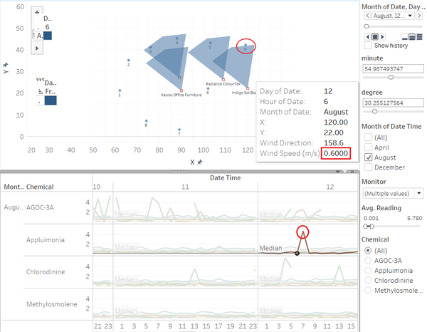
“Appluimonia” is released from “Indigo Sol Boards”. In the graph below (graph Q3_4), We can find in this specific time, the wind speed is properly and the wind from four factories overlap the monitor 3, 4, 5 and 9, but only monitor 9 have a high value of “Appluimonia”, which means this pollutant is come from “Indigh Sol Boards”.
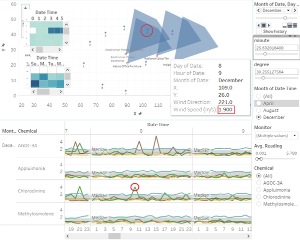
“Chlorodinine” is mainly released by “Kasio Office Furniture” and “Roadrunner Fitness Electronics”. After comparing a lot of specific times, the results are same. In the graph (graph Q3_5), monitor 5 is overlapped by the wind from these two companies. The reading of other monitors are not increase. So, Chlorodinine is mainly released by “Kasio Office Furniture” and “Roadrunner Fitness Electronics”.
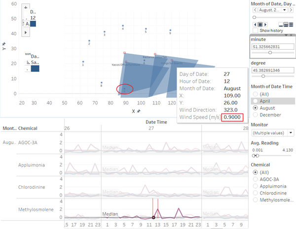
“Methylosmolene” is released by “Kasio Office Furniture” and “Roadrunner Fitness Electronics”.
Conclusion: Here are the mainly pollutants that each factory release.
Roadrunner Fitness Electronics ===> Chlorodinine & Methylosmolene
Kasio Office Furniture ===> Chlorodinine & Methylosmolene
Indigo Sol Boards ===> Appluimonia
Radiance Colour Tex ===> AGOC-3A
Public Server
https://public.tableau.com/profile/liu.xintian#!/vizhome/MC2_5/Dashboard1?publish=yes
Feedback
Feedback from Qian Hongjun
Hi Xintian
I like your visualization and it is quite impressive. So why not share your application made for visualizing the chemicals or wind to Tableau Public for others to manupulate the graph and get fun from it?
Regards Hongjun

