Difference between revisions of "ISSS608 2016-17 T3 SANDEEP Question 2"
(→Answer) |
|||
| Line 32: | Line 32: | ||
<table width=90%> | <table width=90%> | ||
<tr> | <tr> | ||
| − | <td>[[File: | + | <td>[[File:Challa 1yr.jpg|460 px|left]]</td> |
</tr> | </tr> | ||
</table> | </table> | ||
| Line 38: | Line 38: | ||
<table width=90%> | <table width=90%> | ||
<tr> | <tr> | ||
| − | <td>[[File: | + | <td>[[File:Challa Visitor Time Spent.jpeg|900 px|left]]</td> |
</tr> | </tr> | ||
</table> | </table> | ||
| Line 44: | Line 44: | ||
<table width=90%> | <table width=90%> | ||
<tr> | <tr> | ||
| − | <td>[[File: | + | <td>[[File:Chord.png|480 px|left]]</td> |
</tr> | </tr> | ||
</table> | </table> | ||
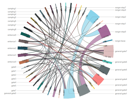
Given Chord diagram shows the movement of visitors between different locations over a period of one year. | Given Chord diagram shows the movement of visitors between different locations over a period of one year. | ||
Revision as of 03:33, 8 July 2017
|
|
|
|
|
Question
Patterns of Life analyses may also depend on understanding what patterns appear over longer periods of time (in this case, over multiple days). Describe up to six patterns of life that occur over multiple days (including across the entire data set) by vehicles traveling through and within the park. Characterize the patterns by describing the kinds of vehicles participating, their spatial activities (where do they go?), their temporal activities (when does the pattern happen?), and provide a hypothesis of what the pattern represents (for example, many vehicles showing up at the same location each Saturday at the same time may suggest some activity occurring there each Saturday). Please limit your answer to six images and 500 words.
Answer
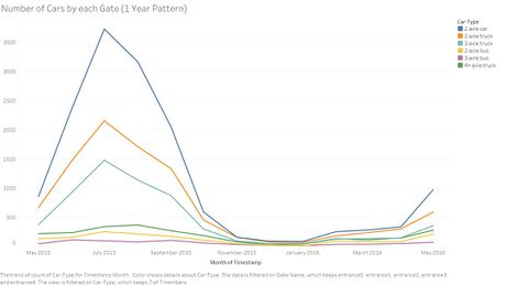
The visualisation clearly indicates that the July is the month with heavy traffic and among different vehicles, 2 axle car is in the peak during July.
This visualisation reveals that certain campings are preferred more by the visitors during certain period of the year and there we can also see that some of the campings are rarely visited by the visitors. Campings 7 & 8 follow the kind of same trend over the year, camping 1 is the least visited with almost no activity during the whole year. Camping 4 has marked the peak time spend in January, followed by a dip in February and again a peak in march.
Given Chord diagram shows the movement of visitors between different locations over a period of one year.


