Talk:Lesson12
Putting it all together - The Devil is in the Details
Doing the lesson critics towards the end of this course is a good time for reflection on what we have learned from this course.
A business dashboard is a very common "wishlist" of senior executives & managers, yet; it is difficult to do it well. The 2 readings of
- The Vicious Cycle of Data Impoverishment
- Why most Dashboard Fails
Both articles have summed up why most of the companies failed to launch meaningful dashboard. For instance, company restricts themselves to those function within the software, instead of figuring out exactly what is needed. Also, it tends to show a part of the full story, without providing further analysis to it. From the working experience, we do know that it is dangerous to make any decision based on half-truths.
Hence, this week lesson of "Analytical Dashboard Design" is an important chapter that has helped, to sum up on what is needed to create a useful dashboard. Combining the learning experience from the class, project, and assignments; below are the key takeaway on designing a dashboard;
1. Who is reading the dashboard, and what is it for?
- Often, it is common to jump into work/ design without clearly identifying the audiences of the dashboard, and questioning the purpose/ objective of it. This often frequent when we are doing our project, where we need a constant reminder on, "wait- what is the purpose of this graph again?".
- Only with a clear objective, then we are able to design our wire frame properly. The layout of the dashboard, as simple as it sounds - it is not simple. We need to consider the user behaviors (how users interact with the dashboard) carefully. And this often meant that we will create multiple drafts of it.
2. The choice of the graph matters
- Often, after we have determined the KPI that we want to measure, we tend to jump into bar charts, cross tables, or pie chart. With this course, I have broadened my horizon in a way that there are many different ways to present and analyze the data.
- In fact, 2 of my favorite charts are trellis plot - that is able to display more than 2 variables neatly in a single chart, and also; a bullet chart. During the preparation of the project, I was proposing use the traditional way of both bar (as revenue), and line (as the target) in 2 axis charts. This was indeed the most common and often used chart that I have been using at work. Thus, when fellow team-mate shared about the bullet chart, I was quite surprised with it. It is definitely not easy to read at the first glance, but once you learned it, you will love how a single chart is able to summarize so much information over it - without taking much space. Of course, later on; when prof explained it in class; it has made the appreciation much easier for acceptance.
3. The devil is in the details - OCD is not an illness.
- Often, we may think that little details are not important, for example- displaying the data as - 1000000 vs 1,000 vs 1000K, vs 1M did make a whole world of difference. font size of small or big also make a big difference.
- "To change or not to change" - This is a common argument between a developer vs a business user, and thus; as a business analyst - we need to be the middleman and convince for the better usability option. This is often also the time where I appreciate my MITB education, to be the bridge between both
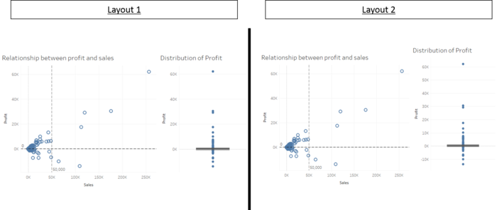
- Do not cheat yourself, it is obvious when the 2 graphs are not aligned, and it is ugly - and it is a thin line between a professional dashboard vs unprofessional dashboard;
--Hanying.ong.2015 (talk) 16:06, 30 November 2016 (SGT)
