ISSS608 2016-17 T1 Assign2 Nguyen Tien Duong Application
Application URLs
Application
 Tag (milestone):
 https://rawgit.com/Zendom88/wiki_adoption/v2.0/index.html
 Dev master (updating on fly):
 https://rawgit.com/Zendom88/wiki_adoption/master/index.html
Source code
https://github.com/Zendom88/wiki_adoption
UI Abstract
Milestone
- 22 Sep 16: Done first SIT version for Parallel Set, deploy to GitHub
- 23 Sep 16: Add Data source to enable switching between 2 types: [1,2,3,4,5] or [1,3,5] scoring.
- 25 Sep 16: Debug navigation. Deploy v1.0.1
(take the main revamp, worked on localhost)
- 16 Oct 16: Deploy v.2.0
User guide
Get a first overview
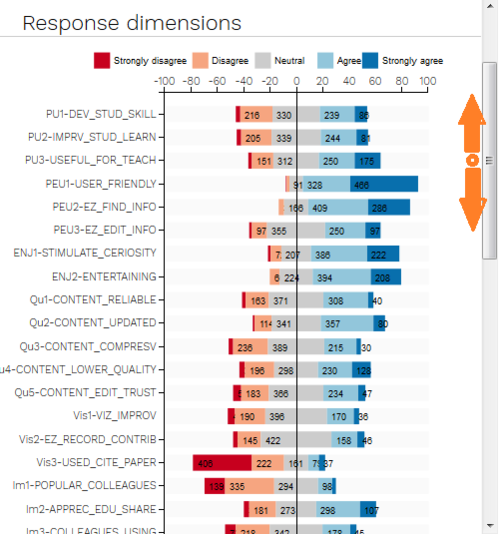
When user arrive to landing page, he can quickly grab an overall information and the sense of survey data by looking at divergent bar chart.
The panel was made to be able to scroll up and down while the right side stay remain. This ability enable user to conduct the comparison or any analyze without manually put side by side or memorize the graph (human is weak at memorizing graph in detail).
To maintain the simplicity and enable users with difficulty with color, the color plate is selected to be:
"dark red", "light red", "grey", "light blue" and "dark blue"
Interact with dimension selection
Dimension selection can be done interactively via clicking mouse to variable name that listed on the left hand side panel including Profile Dimensions and Response Dimensions.
When mouse is clicked on any dimension, the dimension is selected and highlighted.
Only at least 2 dimensions are selected in order to refresh the graph.
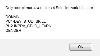
Only upto 4 dimensions are allowed to be selected. When more than 4 dimensions are selected, the system will notify to guide user.
Interact with parallel set
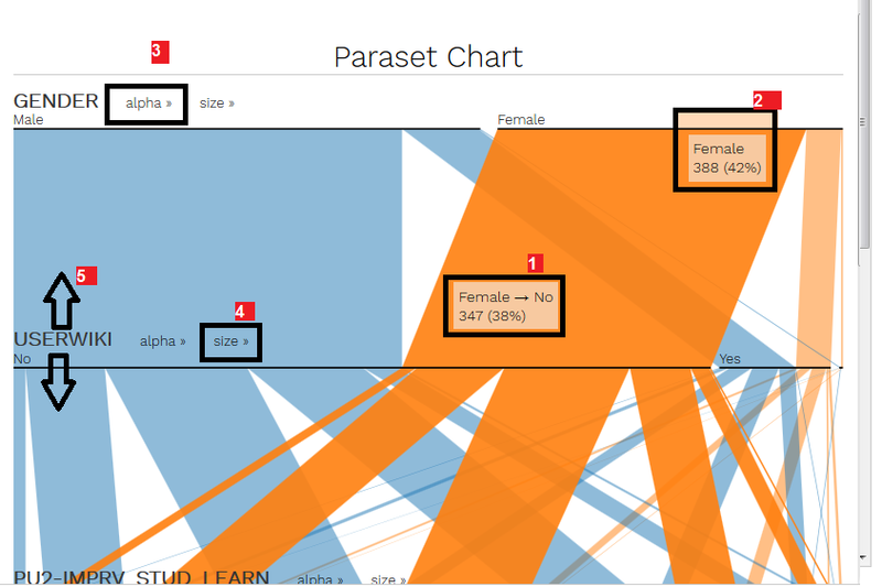
Parallel set is the heart of graphs. It is customized to highly interactive and usable for discovering the relationship of dimensions.
In this graph, user is able to:
- [1]. Mouse over to dimension to see statistical data related with the dimension.
- [2]. Mouse over to the flow connecting 2 dimensions, to reveal the part of data that come from dimension 1 to dimension 2. That is truly helpful to see the relationship of this two variables where any other graph are failed to show (divergent bar chart, normal bar chart only, pie chart... are all only showing the variable statistic by itself).
- [3], [4]: sorting by size and alphabetical. This is used to find answer for "which is the dominant/main flow"
- [5], [6]: manual moving: further interaction is allowed user to drag and drop to manually re-arrange all part of the chart: dimension order, variable order.
Interact with bar chart (Frequency)
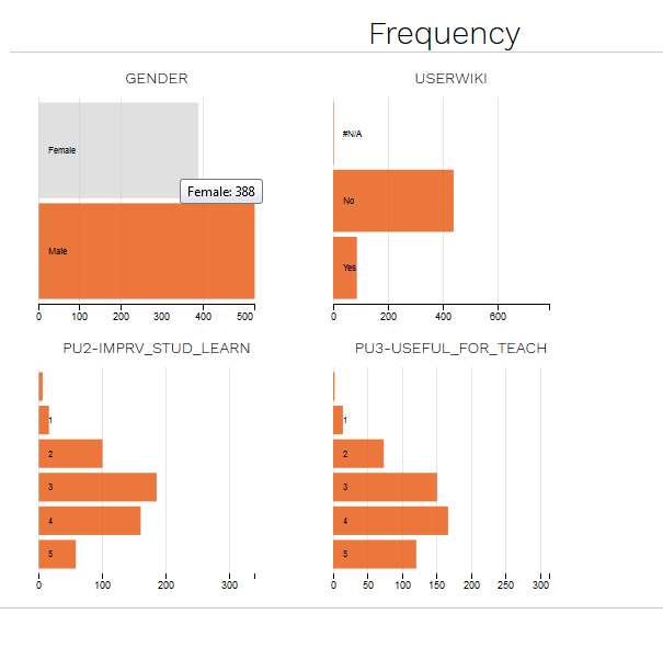
Bar chart is provided to enable user to take the closest look into each size of any dimension and how it can be distribute over selected dimensions.
For example, the figure above showing that "Female" has been de-selected from dataset, the graph size down to all statistic count that related to "non female" data (which, in this case equivalent to "Male" only data, since there is no missing data for gender)


