ISSS608 2016-17 T1 Assign1 Ong Han Ying
Contents
Abstract
As of Oct 2015 [1] [[1]], over 80% of Singapore’s resident population lived in public housing of Singapore. In all, there are mainly 2 methods to buy a flat in Singapore, either buying a new flat, or a resale flat. Resales flats are highly sought after, due to availability at any locations, and purchases are allowed from the open market anytime. As such, prices of resales flat are highly subjected to the changes in the demand & supply in the resales market. In this analysis, we will create infographics that highlights the key trends between Q1 & 2 of 2015 and 2016 in the resales market in Singapore – to help the buyers to make related decisions.
Problem and Motivation
Due to the nature of an open market of the sales & purchases resales flats, the changes in the prices are closely monitored by various stakeholders. For instance, it is common for the news to be reporting the monthly changes in resales flat's price. [2][[2]] The stakeholders include policy makers, buyers, sellers,housing agents and so on.
This is because resales flats are traded in the open market. Therefore, prices are sensitive to the economic changes, and hence; it has to be closely monitored. Each of the stakeholders have different interests in mind, and thus; will observe and react to the trend differently.
In this analysis, we will focus the analysis for the buyers who are keen to purchase a re-sales flat in the re-sales flat market. For a buyer of a resales flat, one tends to have 3 distinct dilemmas in mind, as below;
- Location - which region/town should one live in?
- Size of the property - what size of the property should I buy?
- Price - What is the fair price that one should pay for the property?
This analysis will provide insights to the re-sales flat markets, by providing solutions to the analytical questions, in the next section.
Analytical Questions
In all, this analysis will provide the answer to the following questions;
- What are the shares of the resale public housing supply in 2015?
- What are the distribution of the resales public housing prices in 2015?
- With reference to the findings, compare the patterns of the first-half of 2016 with the pattern of 2015.
Results : Infographic
In all, 3 versions of infographic are created for 3 distinct group of readers (subjected to the choice and the focus of the readers);
- High-Level Overview on the Trends of Resales Flat Market in Q1 & 2 OF 2015 & 2016
- A Further Breakdown into the Type and Prices of Resales Flat
- An overview of supply and price distribution of re-sales flat in 2015 only
- In all, for reader who are keen in the geographical distribution of the re-sales flats, version 1 will be suitable.
- For reader who are keen in the room type and the breakdown of by re-sales price, version 2 will be suitable.
- For reader who are keen only in the trend of 2015 only, version 3 will be suitable.
Version 1 : High Level Overview of General Trend in the Re-sales Flat Market
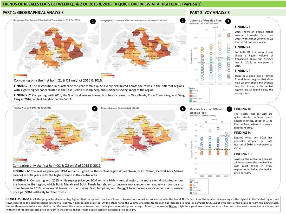
This is a general overview at a high-level, and it is meant for buyers who want to have a quick overview on the general geographical distribution of the resales flats in Singapore, in term of volume of transactions, and the resales price per sqm.
- To have a larger view of the file, please click [[3]], and click on the image again, to have a zoom out view.
Version 2 : A Further Breakdown into the Type and Prices of Resales Flats
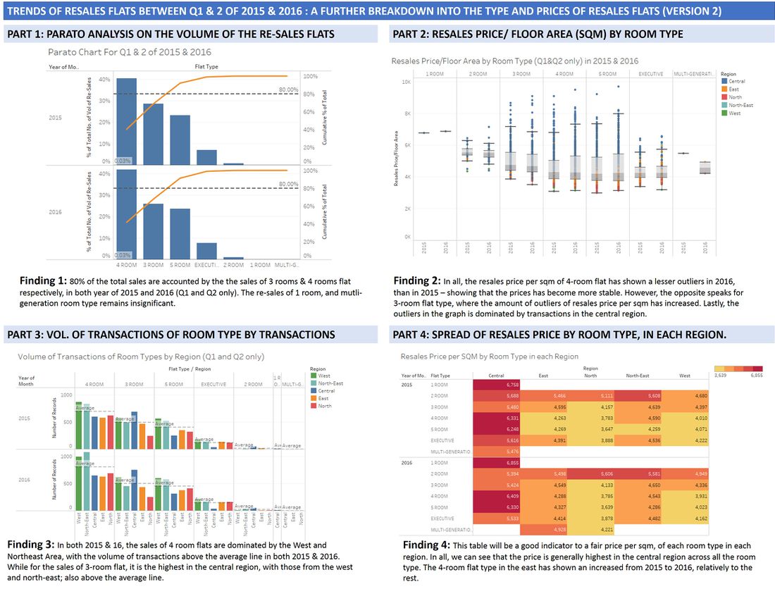
This is an analysis with further breakdown into the room-types of the flats,which in general; is another key factors to the decision making of the buyers.
Version 3 : An overview of supply and price distribution of re-sales flat in 2015 only
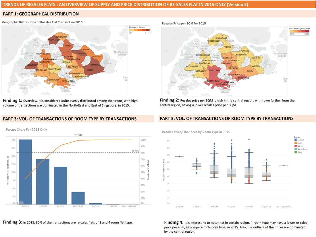
This is an analysis that focus on the trends of re-sales market, in the year of 2015 only.
Conclusion
In all, we can see that re-sales price is relatively stable in the first quarter of 2015 and 2016, with the highest price per sqm found in the central region. Also, there is a high volume of transactions in the East and North East region, in Tampines and Bedok (Despite a drop in 2016 for Bedok), and also; in Jurong West. From the analysis,
- if the buyer is price sensitive; one should opt for flats in the North Region, where it shows price being stable (no significant change in 15 & 16), and lower, as compare to the rest of the region.
- if the buyer is looking for a specific room-size, one should note that 3-room & 4-room flat are highly sought after, and avoid the central region; with high prices per sqm.
- if the buyer is a speculator, then one can observe that Bishan being in the Central Region, has a relatively lower price per sqm as compare to others in the central region, and the volume of transactions is low in the region.
Approaches
In this analysis, a recent information is definitely more valuable that those of the past. Therefore, readers will only be keen on the insights based on the latest data, 2016. Nevertheless, While the readers might only be interested in the insights of 2016 only, however; a comparison with similar variables in the same period of 2015 will help the readers to identify any distinct patterns over the years. In this analysis, we will only focus on Q1 & Q2 of both year of 2015 and 2016. However, there might also be readers who are keen in the trends of the market in 2015 only.
Hence, all the analysis conducted in this will be a comparison between Q1 & Q2 of the year 2015 and 2016 only.
In all, 3 infographics are generated to cater to the 2 distinct needs of the potential buyers of re-sales flat;
- Buyers that want to have an overall general trend first, prior to deciding whether to buy a re-sales flat or not.
- Buyers whom have already decided to buy a re-sales flat, and deciding on the exact location, size, and fair price of the property.
- Buyers who are keen in the trends in 2015 (whole year) only.
For the first case, we identify that the following trends are essential to the buyers, between the year of 15 & 16,
- The geographical distribution of the volume of transaction - where it will compare the volume of transactions among the different towns.
- The geographical distribution of the resales price / sqm - where it will compare the relative retail price per sqm among the different towns.
- YOY growth in term of both volume of transactions & resales price/ sqm across the region - where it will compare the changes among the regions.
For the second case, we will take a closer look at the volume of transactions at the room-type level, and the re-sales price per sqm changes, in each of the regions. From the first case, we can see that the trends are similar in the towns in each of the regions. Therefore, we will compare the room-types with the region, in this analysis. The analysis we will examine include;
- Pareto Analysis on the Volume of Re-sales Flats
- Identify Outliers and the Spread of Prices, by Room Type
- Total volume of transactions by Room Types in each region
- Re-sales Price per SQM by room type, in each region.
For the third case, will will identify important graph from version 1 & 2, and applied it to have an overview of 2015's trend.
Version 1: High Level Overview of General Trend in the Re-sales Flat Market
In all, the graphs are placed in a layout such that it helps the reader to read the graphs easily such that
- Horizontal - all the graphs are related to the same topic, by showing in the order of - 15 (graph 1) , 16 (graph2), and then; comparing both (graph 3)
- Vertical - It helps the readers to identify that there are 2 parts to the analysis,(i) Geographical Analysis, and (ii) YoY Analysis.
Geographical Maps
A geographical map is chosen to shows the distribution so that it is easy for the readers to relate to the location, and the proximity and the distance among the town. Also, it will be clearer to identify (if any) trends that are located to the geographical location of the towns.
In all, graph 1 and 2 are related to show the changes over the distribution in the volume of transactions between the year, while graph 3 and 4 are related to show the changes in the distribution of the prices per sqm between the year.
As such, graph 1 and 2 will have the same color scheme, while graph 3 and 4 will also have the same color scheme; but different from that of graph 1 and 2. This is done on purpose so that readers will not get confused over the different indicators between the 2 set of graphs.
Graph of 1 and 2
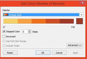
The color scheme chosen are "Orange-Gold", with dark intensity of Gold color to be used, to highlight the geographical area with highest volume of transaction. This color scheme is chosen as it is similar to that color of the "ground", and hence; easier for the reader to relate to.
This color scheme is chosen to help to reader to be able to highlight the distinct changes in gradient of color (if any) between graph 1 and 2, so as to highlight any change(s)(if any).
Graph of 4 and 5
The color scheme chosen are "Red-Gold", with dark intensity of Gold color to be used, to highlight the geographical area with resales price per sqm. This color scheme is chosen as it is similar as "red" is often depict as "danger" or important to be "highlighted". As such, higher resales price per sqm will be deem as expensive, and hence; "red" will catch the attention of the reader more easily.
This color scheme is chosen to help to reader to be able to highlight the distinct changes in gradient of color (if any) between graph 4 and 5, so as to highlight any change(s)(if any).
Circle Views of Bar Graph
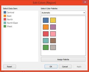
While the distributions are shown via the geographical maps, readers will be keen to know the rate of changes on YoY (Year on Year). Here, we use different color scheme to depict the different region - so as to highlight the distinct changes in the region. Also, a bar graph with circle is able to show the changes between the Quarter of the year of 2015 & 2016.
Both graph 3 and 6 will be using the same color scheme so that it is easier for comparison.
Version 2 : A Further Breakdown into the Type and Prices of Resales Flats
In all, the color scheme used in this version 2 of the diagrams follow the same as per those found in version 1, as much as possible. This is to help to maintain consistency across the charts.
Pareto Chart
This analysis is accounted so that we are able to analyze based on the 80-20 rule - which in this analysis; we can conclude that 80% of the transactions focused mainly from the transactions of 3 & 4-room flats. As such, the analysis later can focus many based on the the 3 & 4 rooms flats, since this is where the supply is mainly available/found.
Box and Whisker Plot
This graph is selected to show the spread of the price, and also; to identify the outliers. The points are colored by the region, so that we able to see which are the region(s) that contribute to most of the outliers points. This graph also also the reader to identify the average / the range of price that is expected, based on the room-type & the region of flat.
Bar Graph Segment by Region & Room Type
An average line is added to the graph, so that we are able to make reference and comparison easily. Also, the color of the bar follows the color of the region, so that it allows one to relate to the same color scheme - throughout this analysis.
Cross Table
A cross table is used for the reader to make reference on the average re-sales price per sqm of room-type per region easily. The color scheme is the same as that of graph 4 & 5 in Version 1; so that the reader is able to relate to the intensity of the price easily.
Dataset
About the Dataset
The sources of the data are;
Data Preparation
2 major data preparation work are completed, as follow;
- computer resales price per sqm : this is to ensure that price comparison is fair throughout the analysis
- join the table to add in the field of "Region" to the main dataset : This is to enable the analysis to be conducted at a higher level (region), instead of at the town level (especially for version 2).
Tools Utilised
The tools are that used are (1) Tableau 10, (2) Microsoft PowerPoint 2016 and (3) Microsoft Excel 2016.
