ISSS608 2016 17 T1 Project Team 3 Report
|
|
|
|
|
Contents
Motivation
University ranking is always one consideration for to-be applicants. There is a certain prestige in having a better ranking, and universities generally work towards having better standing. According to Kaggle, "Ranking universities is a difficult, political, and controversial practice."
Through this visual analytics project, we look to analyse the world distribution of these universities, its attributes, rankings over time, and seek to draw insights from them.
This would also help parents, to-be applicants in their research for making informed decision in selecting their dream universities to pursue their higher education. 3 different sets of available university rankings are used in this visualizations. This would serve as an one stop-shop for them, instead of them scurrying about different websites and resources.
Review and Critic on Past Works
(Alvin)
In the paper by Gratzl, Lex, Gehlenborg, Pfister and Streit, an open source application called LineUp was utilized as an interactive technique for multiple attributes analysis. In this tool users are able to create the rankings of the universities based on their own assessment of the weightage of each attribute to the overall ranking. While this is an interesting way,
Design Framework
Overview
For this project, we focused on the visualization of the rankings and attributes of three data sources, using a variety of visualization tools namely, Tableau, QlikSense, and d3.js. Individual data source exploration is done through Tableau, and QlikSense to gain insights into each dataset. Tableau is utilized in the creation of topographical visualizations and dashboards. QlikSense also offers dynamic visualizations and support for D3.js extensions.
D3.js offers dynamicity and is an interactive platform for easy access of the visual representations in browser format. The focus is on ensuring all interactive features are available across 3 data sets in D3.js, for ease of comparisons.
Data Source & Data Preparation
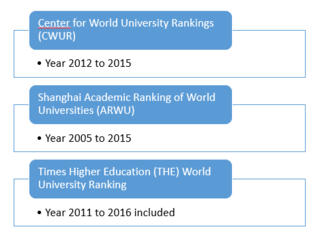
These three datasets provide similar, yet individualistic insight in the overall score of each university and its world rank, with multi-year records. Other time-variant attributes of the university are also available.
The Shanghai data does not have the country information available, and hence, time is spent in ensuring that the country information is available. The regions information is also populated for all three datasets as they were not available in the raw dataset.
Data cleaning is conducted to ensure consistency within the data set, especially in the changing names of universities. Ranking is changed to numeric, and recoded where necessary. The CWUR, Shanghai and Times data are prepared in the CSV format, to be read in and parsed in d3.js.
Data from 3 datasets are combined (by university) where needed, for the needful visualization, for comparison.
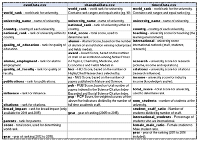
The diagram on the left also depicts the data dictionaries of the 3 datasets.
Their attributes show us the parameters measured, and the respective ranking the universities across the years.
The Table on the left put together the similar indicators from the three ranking systems under each of the criteria (measures). This provides a common baseline when making comparison between these measures from the three data sources.
Design Principles Used
World university rankings are lists of higher education institutions ordered using a combination of indicators. Rankings in the form of numbers and scores are rather hard to comprehend. There is a need to represent data in a more understandable visual format. In this project, we have adopted Shneiderman’s famous mantra as our design guidelines for our visual data analysis. The Mantra, “Overview first, zoom and filter, then details-on demand”, describes how data should be presented so that it is most effective for users.
Overview First
Overview provides a general context for understanding the dataset; it paints a “picture” of the whole data entity that the information visualization represents. It’s the first thing a viewer sees in the dashboard, and guides him / her to other parts of the visualisation for further exploration.
For example, choropleth map is used a way to visualize the number of universities over a geographical area. This can show variations across the displayed location at an overview glance.
Zoom and filter
Zooming and filtering both involve reducing the complexity of the data representation by removing extraneous information from view. This involves zooming and filtering the data using the interactive features: filtering, highlighting, drill-down, range selector, etc. For example, zooming may be drilling down from all global to country-specific ranking data while filtering may be excluding information in a specific year range.
Details-on-demand
The details-on-demand can be useful for relating the detailed information by a simple action, such as a mouse-over for a tool-tip details. It should allow user to go all the way to dug to the minute details.
Tools Used & Data Visualisation Elements
Tableau, QlikSense and D3.js are used for visualization, while JMP is used during data preparation.
Tableau Visualisation
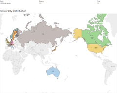
Choropleth Map
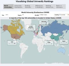
Consistently across 3 datasets, the use of Choropleth Map allows one to look easily where the universities are. Filtering by year, region, country and rank is also possible. This is the commonality across visualizations of the 3 datasets, and a powerful visualization.
From the CWUR system, it shows that a majority of top 100 universities globally are located in United States.
CWUR Ranking System
From the CWUR data source, there are 8 key indicators that affecting the ranking system. The indicators are namely Quality of Education, Alumni Employment, Quality of Faculty, Publications, Influence, Citations, Broad Impact and Patents. It is important to understand the relationship between these heterogeneous attributes that will affect the rankings of universities.
Thus the choice of visualisation objects are important for the visualization of multi-attribute (multivariate) rankings analysis.In this section, three dashboards will be presented for discussing on why the Visualisation Objects were selected. In addition, a Story Board was created in the Tableau Visualisation to enhance the user interaction experience. The story board contains a sequence of dashboards that linked together to convey information, provide context, demonstrate how one visual analysis relate to another.
Ranking Overview Dashboard
Heat Map
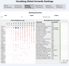
Heatmap is generically used for visual representation that uses variations in color / size to encode a quantitative variable. The Heat Map on the left hand side is used to reveal the number of universities by ranking category, for each country. The count of universities was encoded as color as well as size in the Heat Map matrix. At this level, the purpose to use Heat Map is to provide a rough approximation of magnitude in terms of counts of university in each country. As seen in the Heat Map, the top ranked 20 Universities for year 2015 are located in USA and UK. Even though China has many Universities in the ranking list, however its median in the world rank is at about 750, with its best ranking is at 56 (lower whisker in boxplot)
The Table view on the right hand side gives the details-on-demand view when the user zoom in to a selected country, or a selected rank category in the Heat Map.
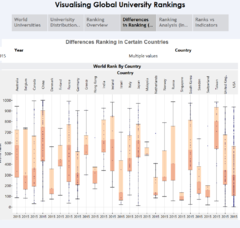
Differences Ranking in Certain Countries
Box and Whisker Plot
This statistical graph is used to show the distribution of rankings among all universities in each country. In a box and whisker plot: the ends of the box are the upper and lower quartiles, so the box spans the interquartile range. The median is marked by a vertical line inside the box. Each dot in the boxplot indicates one university within the country. For example, the Boxplot reveals that USA has many universities with its median ranking for USA is at 300, and Singapore has two universities, with NTU at its upper whisker ranking #135, and NUS at its lower whisker of ranking 65.
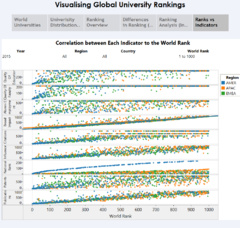
Relationship between Ranking vs Indicators
Scatter Plot for Indicators Analysis
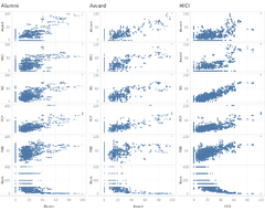
A Scatter Plot displays the correlation between a pair of variables. Given a set of 8 indicators (variables), there are 8 pairs of indicators vs World Rank for the universities. These scatter plots were organized into a matrix, making it easy to look at all pairwise correlations. The lower the ranking number means a better score in that indicator. Some interesting observations can be seen in the above dashboard:
- Among all Indicators, Broad Impact shows a linear relationship between Broad Impact indicator vs World Rank
- Among all indicators, Quality of Education and Quality of Faculty scored fairly well as compared to others. The highest rank score is less than 250 for Quality of Faculty, whereas that for Quality of Education is less than 400.
- Alumni Employment, Citations, Influence, Patents have scattered patterns in their rankings relationship vs the World Rank
SHANGHAI ARWU
The strength of the SHANGHAI ARWU dataset is in its 11 years record, which holds the most number of years of records among the 3 datasets. However, there have been some missing data in some of the attributes and it does not make any sense to make any value replacement as this would further distort the view of ranking. The results are taken as is, with the knowledge there could be missing data which could not be representative of the university's standing. Nonetheless, we tap on the strength and seek to gain insight from its time-series information.
Overview
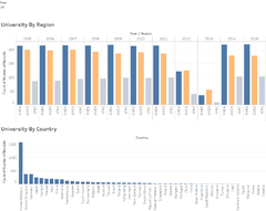
As with the approach of "Overview First", choropleth map, bar chart, circle view, side by side circle view are used in providing a quick overview of the spread of universities and the corresponding rankings.
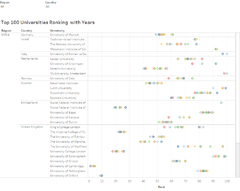
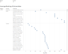
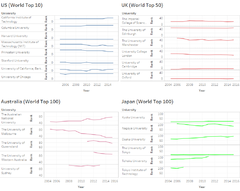
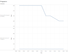
Line Graph Top overseas locations are selected for this visualizations, namely, US, UK, AU and JP. They are popular overseas countries where Singapore residents go for further studies. Through this visualization, one would be able to see how these countries rank, and what some of the top universities are. Filtering is important here, as one wants to see the key top ranking universities.
TIMES Ranking System
Introduction of the 4 dashboards.
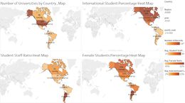
Dashboard 1 - Heatmap of World Universities
Heat Map
This Dashboard allows users to efficiently identify the distributions of the world universities by regions, countries, ranks and year. The four heatmaps in this dashboard depicts the distribution of world universities by the number of universities, the average international students percentage, average student to staff ratio and the average female students percentage in each country. The greater the colour intensity, the greater the value in each heatmap. Users could also filter the dashboard by the three regions, America (AMEA), Europe & Middle East (EMEA) and Asia & Pacific (APAC) and zoom into the distributions by regions.
If the users are interested in reading the distributions by individual country, they could key the name into the country filter to look at the distribution by the country/countries of their interest. Additionally users could set the distributions in a certain world rank range (such as top 100) using the filter on the right.
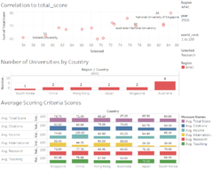
Dashboard 2 - Scoring Criteria Analysis
Correlation Plot
This Dashboard allows users to review the correlation of the criteria used in the scoring of the total score for the world ranks in the Times Higher Education Study. Users could toggle between regions, year and world ranks. The Y-axis of the correlation plot is fixed at Total Score and users could alternate between different criteria by using the filter "Selected" to change the criteria.
While users could also review the average value of the total score and each individual scoring criteria by countries and regions.
Qlik Sense Visualisation
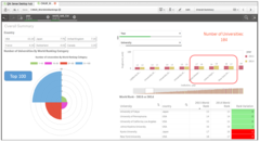
Ranking Summary for Top 100 Universities(CWUR)
The use of Area Chart, Bar Chart and Table allows one to compare the World Rank based on selection by Year, Country.
As seen in the Bar Chart, there are some variations in ranking, when comparing 2014 vs 2015.
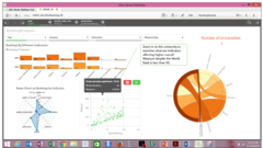
Indicators Analysis (for Top 100 Rank)
The use of Radar Chart, Scatter Plot and Chord Diagram allows one to analyse and comparing the multi-attribute rankings for different Universities.
Zooming in to the selected University in Paris, its ranking is less than 50, however it seems it did not fare well in two of its measure indicators (patent and citations), with relatively high ranking compared to other indicators.
d3.js
- Multi-Attributes Relationship
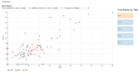
Scatter Plot (Tab: Indicator Analysis)
Line Graph (Tab: Comparison Analysis)
Parallel Coordinates Plot (Tab: Parallel)
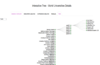
Tree Plot (Tab: Tree)
1) Which are the top universities?
Allows users to have an initial look at the Top 50 universities as listed in the three sources.
2)What are the parameters used and the correlation amongst them?
Provides users an appreciation of the parameters used and the correlation among each other and to the world rank.
3) How do they compare?
Users could use this tool to do a quick comparison between the universities they are interested in.
4) What are the strengths and weaknesses?
Once users have shortlisted their universities of interest, they could use this parallel plot to review its strengths and weaknesses.
5) Summary
Users could use this collapsible tree to look at a summary of the attributes of the universities by the region, country and by year.
Demo & Use Cases
Use Case #1 - University Management's Perspective
Use Case #2 - Prospective Student's Perspective
Discussion
Future Work
LC
- Inclusion of distribution of university on the choropleth map in D3 in ranking overview
- Inclusion of choice in choosing the country and university in indicator analysis for granularity view.
- Inclusion of a highlight feature for the selected node/university as its attribute moves through time in indicator analysis
Guides
Installation Guide
To run and use the application, please follow the following steps.
(1) Download the compressed package from the link provided below.
(Work in Progress)
(2) After unzipping the package, launch the ‘index.html’ file.
(Note: Mozilla Firefox is the preferred browser).
User Guide
After the ‘index.html’ file is launched using Mozilla Firefox, 5 tabs will present itself. One can toggle each tab to navigate through different visualizatons. Work In Progress


