ISSS608 2016 17 T1 Project Team 3 Report
|
|
|
|
|
Contents
Motivation
University ranking is always one consideration for to-be applicants. There is a certain prestige in having a better ranking, and universities generally work towards having better standing. According to Kaggle, "Ranking universities is a difficult, political, and controversial practice."
Through this visual analytics project, we look to analyse the world distribution of these universities, its attributes, rankings over time, and seek to draw insights from them.
This would also help parents, to-be applicants in their research for making informed decision in selecting their dream universities to pursue their higher education. 3 different sets of available university rankings are used in this visualizations. This would serve as an one stop-shop for them, instead of them scurrying about different websites and resources.
Review and Critic on Past Works
(Alvin)
In the paper by Gratzl, Lex, Gehlenborg, Pfister and Streit, an open source application called LineUp was utilized as an interactive technique for multiple attributes analysis. In this tool users are able to create the rankings of the universities based on their own assessment of the weightage of each attribute to the overall ranking. While this is an interesting way,
Design Framework
Overview
For this project, we focused on the visualization of the rankings and attributes of the three data sources, using a variety of visualization tools namely, Tableau, QlikSense, and d3.js. Individual data source exploration is done through Tableau, and QlikSense to gain insights into each dataset. Tableau is utilized in the creation of topographical visualizations and dashboards. QlikSense also offers dynamic visualizations and support for D3.js extensions.
D3.js offers dynamicity and is an interactive platform for easy access of the visual representations in browser format. The focus is on ensuring all interactive features are available across 3 data sets in D3.js, for ease of comparisons.
Data Source & Data Preparation
These three datasets provide similar, yet individualistic insight in the overall score of each university and its world rank, with multi-year records. Other time-variant attributes of the university are also available.
The Shanghai data does not have the country information available, and hence, time is spent in ensuring that the country information is available. The regions information is also populated for all three datasets as they were not available in the raw dataset.
Data cleaning is conducted to ensure consistency within the data set, especially in the changing names of universities. Ranking is changed to numeric, and recoded where necessary. The CWUR, Shanghai and Times data are prepared in the CSV format, to be read in and parsed in d3.js.
Data from 3 datasets are combined (by university) where needed, for the needful visualization, for comparison.
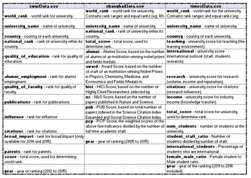
The diagram on the left also depicts the data dictionaries of the 3 datasets.
Their attributes show us the parameters measured, and the respective ranking the universities across the years.
Design Principles Used
Tools Used & Data Visualisation Elements
Tableau Visualisation
- CWUR
Lichin
- SHANGHAI
Christine
- TIMES
Alvin
Qlik Sense Visualisation
d3.js
- Multi-Attributes Relationship
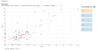
Scatter Plot (Tab: Indicator Analysis)
Line Graph (Tab: Comparison Analysis)
Parallel Coordinates Plot (Tab: Parallel)
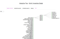
Tree Plot (Tab: Tree)
1) Which are the top universities?
Allows users to have an initial look at the Top 50 universities as listed in the three sources.
2)What are the parameters used and the correlation amongst them?
Provides users an appreciation of the parameters used and the correlation among each other and to the world rank.
3) How do they compare?
Users could use this tool to do a quick comparison between the universities they are interested in.
4) What are the strengths and weaknesses?
Once users have shortlisted their universities of interest, they could use this parallel plot to review its strengths and weaknesses.
5) Summary
Users could use this collapsible tree to look at a summary of the attributes of the universities by the region, country and by year.
Demo & Use Cases
Use Case #1 - University Management's Perspective
Use Case #2 - Prospective Student's Perspective
Discussion
Future Work
LC
- Inclusion of distribution of university on the choropleth map in D3 in ranking overview
- Inclusion of choice in choosing the country and university in indicator analysis for granularity view.
- Inclusion of a highlight feature for the selected node/university as its attribute moves through time in indicator analysis
Guides
Installation Guide
To run and use the application, please follow the following steps.
(1) Download the compressed package from the link provided below.
(Work in Progress)
(2) After unzipping the package, launch the ‘index.html’ file.
(Note: Mozilla Firefox is the preferred browser).
User Guide
After the ‘index.html’ file is launched using Mozilla Firefox, 5 tabs will present itself. One can toggle each tab to navigate through different visualizatons. Work In Progress


