ISSS608 2016-17 T1 Assign2 Li Dan
The Data
- Data Source: US Stocks Fundamentals (XBRL).
- 7- year time series
- 1,907,883 observations
- 9619 US listed companies
- 8529 unique indicators
This data is all about companies’ fundamentals which are extracted from the financial reports such as balance sheet and income statement, indicating the company’s health and growth
The Objective
It is aimed to build an interactive application which enables stock investors to compare key indicators across companies and industries. This could help them to better understand the well-being of companies’ business and prospects, and pick promising stock portfolios to invest.
Tools Used
- JMP
- Tableau
- High D
Get the Data Ready
Step1: data blending
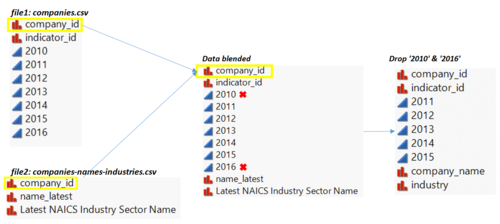
The dataset contains 9000+ companies, making it hard for user to explore. Plus, it is not meaningful to compare indicators across all the companies because the data scale of these indicators may differ from industry to industry. Thus, additional dataset is downloaded from US Stocks Fundamentals API to categorize the companies into industries. The picture below shows existing columns in 3 files separately. The ‘data blended’ is joined by ‘company_id’ from 3 files. it further includes company names and industry sectors for each company id in file1. In addition, the column ‘2010’ & ’2016’ are dropped because of the large amount of missing values, see the picture below.
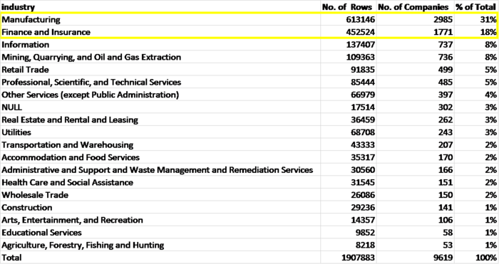
After joining the table, it is observed in the following table that, among 9616 companies, more than 30%(2985/9616) of the companies are from manufacturing industry; while 18 % (1771/9616) of them are from finance and insurance industry.
Step 2: select indicators
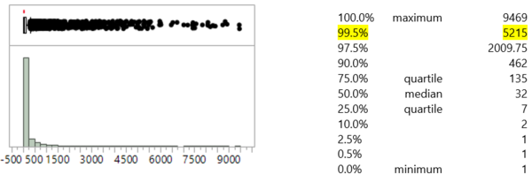
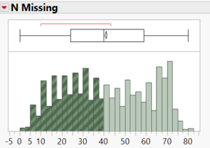
One challenge of this dataset is that we have 8500+ indicators across 9600+ companies, with each company having 198 indicators on average and each indicator averagely occurs 224 times among all companies. Such high dimension making the dataset hard to be visualized and explored. With the intention of dimension deduction, the distribution of distribution of the indicators examined as shown in the picture followed. It is found that the frequency that the 8529 indicators occur is highly right skewed with a skewness value of 6.74. Notably, only around 43 (0.5%*8529) indicators occur more than 5215 times, signifying that there exist many indicators with very low frequency. This make those indicators incomparable across the 9600+ companies and they are thus can be dropped.
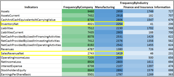
Another thing cannot be ignored is that, based on financial domain knowledge, the 8500+ indicators all have their own level of significance and measure the performance of a company in different dimensions such as the ability to pay current and long term debt and the ability to collect cash. Particularly in our case, the focus is more on the profitability and returns on shares as an investment because it is intended to screen stocks for investors. With this concern to select indicators with high frequency and high significance in terms of measuring return on buying shares, the following 16 indicators are selected. Note that, even with low frequency, ‘inventoryNet’ and ‘SalesRevenueNet’ are reminded to calculate the acid-ratio and net profit margin mainly for manufacturing industry.
See below for remarks of these indicators
Step 3: select companies
In the former step, 16 indicators are selected for further analysis. If the 5 columns of year are stacked, each company should have 80 cells to display the indicators across 5 years. But the 9619 companies nearly half of the companies only have half of the indicators, making the comparison of indicators across companies. Thus companies with more than half missing values of 16 indicators are dropped while the other 5165 companies are remained.
Step 4: Plotting preparation
- Data structure manipulation
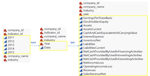
As it is intended to visualize the data using parallel coordinates, the 5 columns of ‘year’ are stacked, with each row representing 1 year of data. The column ‘Data’ is then splitted by the ‘indicator_id’ into 16 different columns. See the screenshot below.
- Excluding outliers
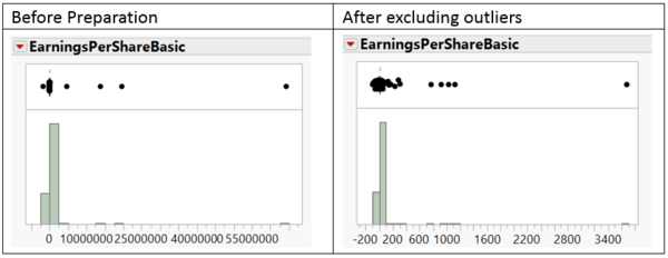
By checking the distribution of all the 16 indicators selected, it is observed that the indicator ‘EarningsPerShareBasic”(EPS) has a number of excursions as seen in its distribution below. Based on the current EPS ranking info at screener/stocks.php?list=highest_eps_stocks, it is possible to have an EPS of 15,000, but an EPS of 64 million has never occurred in the history of financial markets.Besides, it is also impossible to have an EPS of -1.7 million as the no company holds such a high share price to drop. To identify and remove the abnormal value of EPS, the rows with EPS from the minimum to -100 and from 100 to the maximum value are filtered to be checked. By checking 48 filtered rows manually, it is found they are all inconsistent with the EPS shown in annual reports or financial info website . The EPS values of 48 filtered rows are set to NULL to exclude the outliers as well as remain the info for other columns.
- Adding calculated fields
To create parallel coordinates with tableau, one challenge is that the data range of the selected indicators are significantly different. For example, the range of ‘EarningsPerShare’, as processed before, is from -100 to 100 while the range of ‘Assets’ is from -17 to 3270 billion. To encounter this problem, 12 of the indicators are standardized to a scale of [0,1] using the formula (X- Col Minimum(X)) / (Col Maximum( X )-Col Minimum( X)). In addition, 5 ratios are calculated for investors to gain a more comprehensive understanding of the company. Their formula and function are shown as follow.
The Dashboard
After getting the data is prepared, it has the following attributes.
- 25777 rows
- 37 columns including 12 standardized indictors and 5 calculated ratios
- 5165 companies across 18 industries
Check the link for the tableau app
The parallel coordinates plot is created using 12 standardized indicators, giving an overview of how the 12 indicators changes across companies and industries; while the boxplots are available to interactively check the original value and location of those indicators. The filters are applied to all the graphs. And the lines and dots are internally linked. If one selected, others would be highlighted automatically.
At the first glance, the distributions of those 12 indicators are well concentrated because of extreme values, as indicated from the small ‘boxes’ and long tails. The ‘Assets’ for example, the 5-year maximum value is 3.2 trillion hold by Federal National Mortgage, nearly 10 thousand times of the median which is at 169 million.
On the contrary of the common sense that investing banks are making tons of money though financing activities, JPMorgan Chase Co, over the 5 years, has been losing an average amount of 8.8 million dollars. Though with fact that they lost money in financing, investing and operating activities, they still able to get a net income of 5.6 billion, ranking Top 5 among all the companies.
Another interesting findings is that companies in manufacturing industry, compared with finance and insurance industry, performed better by conducting financial activities. As the hinge and whisker of manufacturing industry are higher than that of finance and insurance industry
Conclusion
About Fundamental analysis
When it comes to selecting stock portfolios to invest, there no “right way” or even no right portfolios to invest. But by focusing on certain fundamental metrics to be compared across companies and industries, investors would be more confident on predicting the stock movement of companies and be in the path of cashing the stock investment.
About the Dataset
- high occurrence of outliers for the 16 indicators selected, especially EPS
- data for all indicators shifted 1 year for companies like Nicholas Financial Inc, check annual report at [1]
- accuracy of the API needs to be improved because of above problems
About The Tools
- Limitation on Tableau
- hard to construct boxplots for different columns that can align horizontally
- doesn’t support flexible multiple axis for parallel coordinates plot
- filtering becomes extremely slow the dashboard is hosted in Tableau Public because of the data size
- Limitation on High D
-support parallel coordinates plot that has different axis for each variable, but doesn’t support to display the only filtered info, without other info shaded
- Limitation on JMP
- Hard to construct dashboards
