Difference between revisions of "ISSS608 2016 17T1 Group14 Report"
| Line 113: | Line 113: | ||
<br> From this graph, it can be seen that Chelsea and Liverpool has a better performance in terms of Points after 10 matches this season compared to last season while West Ham, Leicester, and Swansea has a worse performance. | <br> From this graph, it can be seen that Chelsea and Liverpool has a better performance in terms of Points after 10 matches this season compared to last season while West Ham, Leicester, and Swansea has a worse performance. | ||
<br><br> | <br><br> | ||
| − | [[File:Parset Southampton.png| | + | [[File:Parset Southampton.png|750px]] |
| + | <br><br> | ||
In parallel sets, each line-set represents the dimension chosen to be visualized. The width of the line indicates the number of observations for that dimension. The color of the line is used to show and compare the distribution between different categories. | In parallel sets, each line-set represents the dimension chosen to be visualized. The width of the line indicates the number of observations for that dimension. The color of the line is used to show and compare the distribution between different categories. | ||
| + | <br> | ||
| + | From the graph, it can be seen that Southampton has an interesting | ||
<br> | <br> | ||
The visualization of Full Time Results for the top 4 Leagues in Europe (England, Spain, Italy, Germany) can be seen below. | The visualization of Full Time Results for the top 4 Leagues in Europe (England, Spain, Italy, Germany) can be seen below. | ||
Revision as of 23:58, 27 November 2016
Contents
Motivation
Nowadays, with the rapid development of technology, people are becoming more reluctant to do outdoor activities such as sport. There are many types of sports that can be done. One of the most popular sports worldwide is football. Football can be considered as the most favourite sport in the world, especially in Europe. The motivation of this project is to discover interesting findings about the top 4 leagues in Europe. (England, Spain, Italy, Germany).
Background
Football is one of the most popular sports in the world, especially in Europe. In order to provide useful findings and insights, data visualization is used to answer these questions:
- How is the performance of the teams in top 4 leagues in Europe in the first 10 matches last season (2015/2016) compared to this season (2016/2017)?
- How is the composition of Half Time Result and Full Time Result of the team in the selected league?
Data Sources
There are few sources used for this project. The first dataset is obtained from http://www.football-data.co.uk/data.php. Data from top 4 leagues in Europe is combined from this source.
The dataset consist of the following fields:
All data is in csv format, ready for use within standard spreadsheet applications.
Key to results data:
- Div = League Division
- Date = Match Date (dd/mm/yy)
- HomeTeam = Home Team
- AwayTeam = Away Team
- FTHG = Full Time Home Team Goals
- FTAG = Full Time Away Team Goals
- FTR = Full Time Result (H=Home Win, D=Draw, A=Away Win)
- HTHG = Half Time Home Team Goals
- HTAG = Half Time Away Team Goals
- HTR = Half Time Result (H=Home Win, D=Draw, A=Away Win)
Match Statistics (where available)
- Attendance = Crowd Attendance
- Referee = Match Referee
- HS = Home Team Shots
- AS = Away Team Shots
- HST = Home Team Shots on Target
- AST = Away Team Shots on Target
- HHW = Home Team Hit Woodwork
- AHW = Away Team Hit Woodwork
- HC = Home Team Corners
- AC = Away Team Corners
- HF = Home Team Fouls Committed
- AF = Away Team Fouls Committed
- HO = Home Team Offsides
- AO = Away Team Offsides
- HY = Home Team Yellow Cards
- AY = Away Team Yellow Cards
- HR = Home Team Red Cards
- AR = Away Team Red Cards
- HBP = Home Team Bookings Points (10 = yellow, 25 = red)
- ABP = Away Team Bookings Points (10 = yellow, 25 = red)
The second dataset is used to compare the team's performance this season and last season. Data from various sources is compiled for this dataset.
https://www.premierleague.com/tables
http://www.legaseriea.it/en/serie-a-tim/league-table
http://www.laliga.es/en/laliga-santander
http://www.bundesliga.com/en/stats/table/
Approaches
Slopegraph: data visualization technique that allows us to visualize data in a way that makes easy quite a number of observations and comparisons.
Slopegraph is used to visualize and compare the changes of different attributes that indicates how the performance of the teams last season compared to this season.
Parallel Sets: a visualization application for categorical data, like census and survey data, inventory, and many other kinds of data that can be summed up in a cross-tabulation.
Parallel sets is used to compare different attributes of categorical data in one graph.
Challenges
There are few challenges faced during the project:
- Combining the data from various sources and different formats into one dataset
- Unfamiliarity of using d3.js
- Finding interesting patterns or insights from the visualizations
Applications
Parallel Sets
Installation Guides
- For the Parallel Sets chart, download all the related file in the provided link
- Save all the files in a same folder. Do not rename any file.
- Open the "index.html" with Firefox browser to view the Parallel Sets Chart.
Tableau Public Link
User Guides
- Open the Tableau Public link to view the graph.
- Use filters for different combinations.
Results and Insights
The visualization results can be seen below.
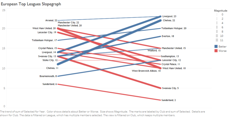
The slopegraph compares the team’s performance last season compared to this season. Blue color indicates that a team has better performance this season than last season on the selected attribute, while red color indicates worse performance. Thickness of the line shows the magnitude of change.
From this graph, it can be seen that Chelsea and Liverpool has a better performance in terms of Points after 10 matches this season compared to last season while West Ham, Leicester, and Swansea has a worse performance.
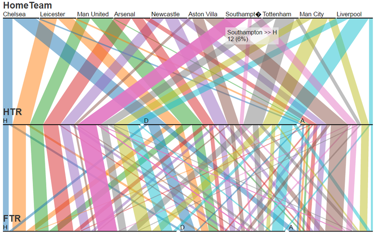
In parallel sets, each line-set represents the dimension chosen to be visualized. The width of the line indicates the number of observations for that dimension. The color of the line is used to show and compare the distribution between different categories.
From the graph, it can be seen that Southampton has an interesting
The visualization of Full Time Results for the top 4 Leagues in Europe (England, Spain, Italy, Germany) can be seen below.
The visualization of Full Time Results for Barclays Premier League 2015/2016 season.
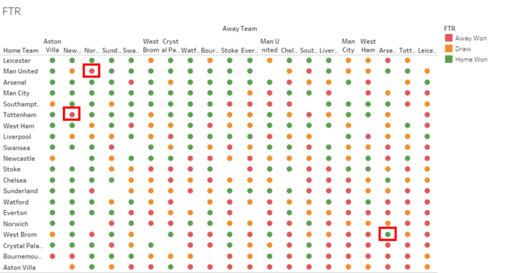
In this graph, the home team is sorted descendingly by their total home points and the away team is sorted ascendingly by total away points. This design is intended to reveal a pattern. The pattern will most likely show green colors on the upper left part and red colors on the lower right part. However, there are a few unexpected results as highlighted.
- The first unexpected result is Man United vs Norwich, Man United is the second best in terms of total home points and Norwich is the third worst in terms of total away points. However, Norwich managed to get an away win against Man United.
- The second unexpected result is Tottenham vs Newcastle, Newcastle only has two away wins in the entire 2015/2016 season. One of them was against Tottenham who has a relatively good home record (6th best home record).
- The third unexpected result is West Brom vs Arsenal, West Brom is the fourth worst in terms of total home points while Arsenal is the third best in total away points. However, West Brom managed to get a home win against Arsenal.
The visualization of Full Time Results for La Liga 2015/2016 season.
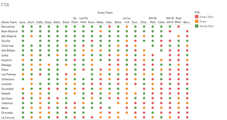
From this graph, the pattern most likely shows green colors on the upper left part and red colors on the lower right part. Therefore, no "unexpected" results found.
The visualization of Full Time Results for Bundesliga 2015/2016 season.
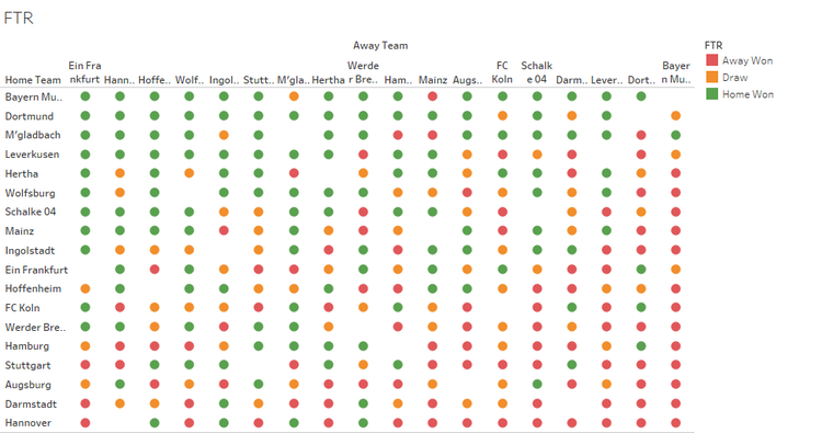
Same as the previous graph, the pattern most likely shows green colors on the upper left part and red colors on the lower right part and therefore, no "unexpected" results found from Bundesliga full time results.
The visualization of Full Time Results for Serie A 2015/2016 season.
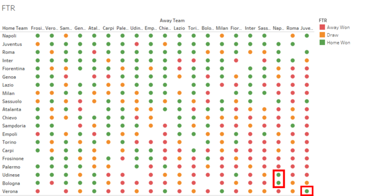
There are few unexpected results in Serie A 2015/2016 season.
- First unexpected result is Verona vs Juventus. Verona has the worst home record while Juventus has the best away record in Serie A. However, Verona managed to get a home win against Juventus.
- Second and third unexpected result in Serie A last season is related to Napoli. Napoli has the third best away record. However, they got two away losses against two teams which has the second and third worst home record (Bologna and Udinese).
Future Work
- Visualize football data from other continents (Asia, America,Africa)
- Include more seasons in the visualization
- Explore other data visualization techniques like parallel coordinates or radar chart.
References
http://www.storytellingwithdata.com/blog/2014/03/more-on-slopegraphs
http://dataremixed.com/2013/12/slopegraphs-in-tableau/
https://eagereyes.org/parallel-sets