Difference between revisions of "ISSS608 2016-17 T1 Assign1 Abhinav Ghildiyal"
| Line 52: | Line 52: | ||
[[File:D1.jpg|720px|frameless|left]] | [[File:D1.jpg|720px|frameless|left]] | ||
| − | <br> But we need the share of resale public housing supply in 2015, so I have used the filter operation on Quarter and then selected Q1, Q2, Q3 and Q4 of year 2015.<br | + | <br clear=all> But we need the share of resale public housing supply in 2015, so I have used the filter operation on Quarter and then selected Q1, Q2, Q3 and Q4 of year 2015.<br clear=all> |
Revision as of 14:46, 29 August 2016
Contents
Abstract
Singapore has a land mass of 719.1 square km with over 6 million people, and this is the reason why Singapore is one of the worlds most expensive housing market. Singapore residential property falls into 2 categories : Public housing (HDB flats) and Private Housing (Condominiums, Landed property and Executive Condominiums). In this write up we will discuss over the resale pricing of the Public Housing and we will try to analyse the price variation over the years based on different underlying factors such as flat type, month, flat model etc.
Problem and Motivation
This write-up will be a help for buyers/sellers to observe, analyse and decide the following concerns:
- When to buy/sell the property?
- Which flat type to buy/sell?
- Which flat model to buy/sell?
Tools Used
Tableau
JMP Pro
MS Excel
Approach
I have taken the data from the data.gov.sg website (the government`s one stop portal to its publicly-available data sets from 70 public agencies) and used different visualsing tools to make the infograhics and deduce the concerns mentioned above. The first step here is to determine whether there is any significant difference between the means of the different flat types, because here I am using the sample of flat type and the number of resale application to analyse the variation.
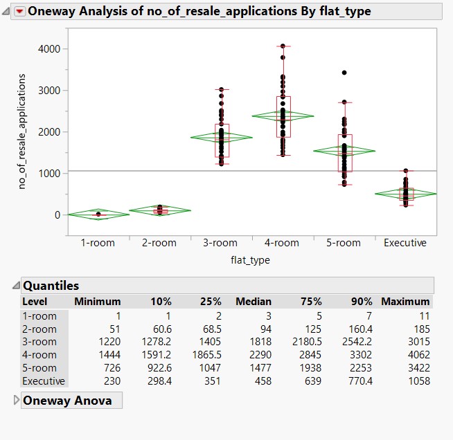
Notice that the flat_types do not spread uniformly across the horizontal axis. The dot plot of flat_types = 4 - room indicates that there are many more no_of_resale_applications than the other 5 flat_types, whereas the dot plot of flat_types = 1 – room indicates that it has the lowest no_of_resale_applications.
Mean Comparison using ALL Pair,Tukey HSD test
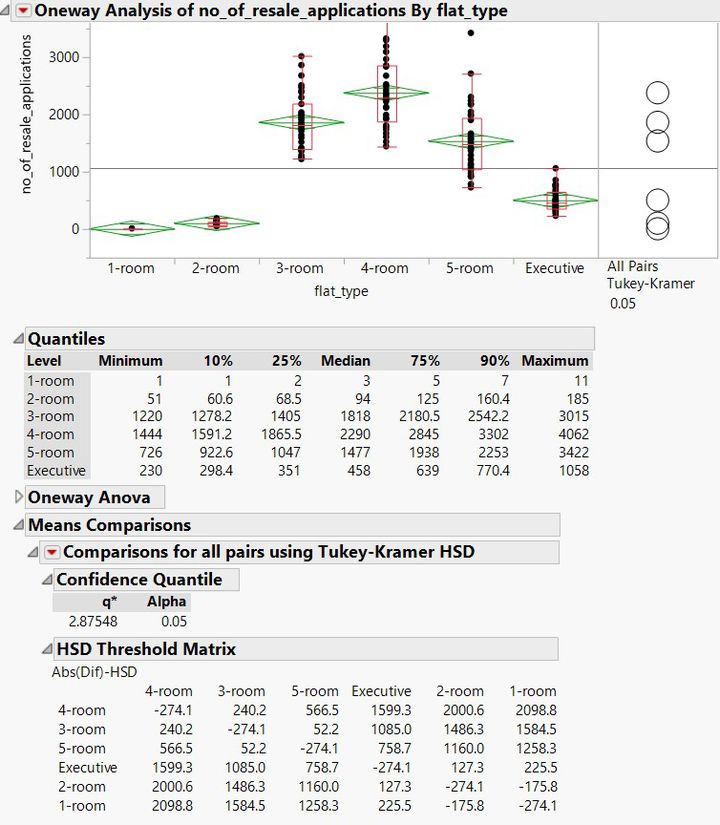
Now if we do the mean comparison using the ALL Pair, Tukey HSD to test the difference in the mean of different flat types, by examining how the comparison circles interacts, it is quite prominent that there is the significant difference in the means of all the flat_types.
To showcase the share of resale public housing supply in 2015, I have used number-of-resale-applications-registered-by-flat-types data set from Data.gov.sg website. This data set has the count of no_of_resale_application by flat_types and quarter.
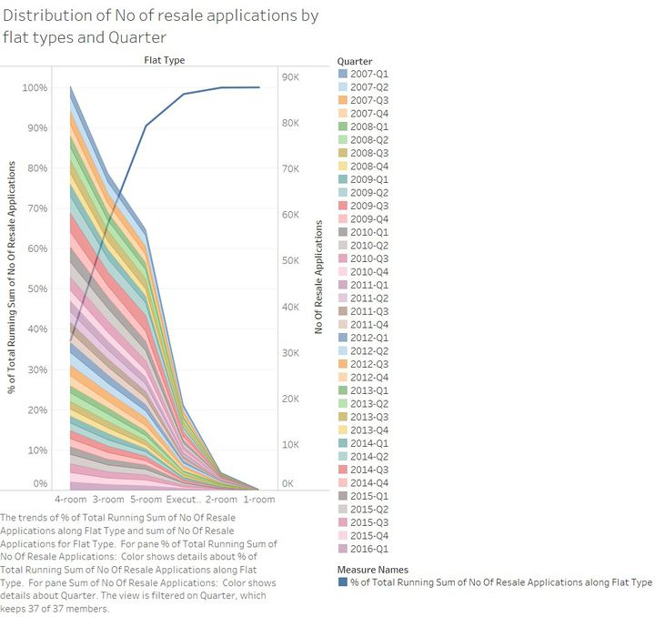
Using Tableau, I created the distribution of no_of_resale_applications by flat_type and quarter, below is the distribution view.
But we need the share of resale public housing supply in 2015, so I have used the filter operation on Quarter and then selected Q1, Q2, Q3 and Q4 of year 2015.


