Difference between revisions of "ISSS608 2016 17T1 Group4 Report"
Klkuar.2016 (talk | contribs) |
|||
| Line 80: | Line 80: | ||
[[File:Screenshot - word cloud illustrated.jpg]] | [[File:Screenshot - word cloud illustrated.jpg]] | ||
| − | + | <br/> | |
| − | |||
| − | |||
== Network Graphs == | == Network Graphs == | ||
The association of #Tags and @User-mentions in tweets can be visualized using three perspectives in this application. <br/> | The association of #Tags and @User-mentions in tweets can be visualized using three perspectives in this application. <br/> | ||
Revision as of 11:48, 29 November 2016
| PROPOSAL | POSTER | APPLICATION | REPORT |
Contents
Motivation of the application
There is huge amount of data in the social networks in the present times. More communication and expression of views are happening within the network than ever before. These networks define an important societal element. Twitter is one such prominent directed network, where information can be posted as tweets; short but influential messages. When key events occur, this is probably the first place one gets to see the buzz, the trends, status and the direction. For stakeholders, this information is key.
Tweets are voluminous and text rich. Mining this information, defining the business use case and the insights required is a challenge. The US 2016 Elections took the attention of the world during this time. This project analyses tweets for top US elections #tags. On the day of 2016 US presidential election, Twitter proved to be the largest source of breaking news with 40 million tweets.
Objective
Using Visual Analytics techniques and applications, we want to answer these question.
- What were the key ideas in the tweets, namely #tags that were most mentioned?
- To which users, @mentions in the twitter network, did these #tags relate to? In the given tweets, compare and analyse the association between the #tags and the @mentions.
Review and critic on past works
There are a number of free Twitter analytics and visualization tools available online. In particular interest of analyzing social networks, they provide options such as analyzing one's Twitter network, visualizing the followers on a map, statistics on user mentions, communication between users. However, availability of a interactive custom application to understand the association between #tags and @mentions is uncommon. It is more important to see the connections between #tags, which represent all elements within the subject of interest. When there is a key political event for instance, the influences on the social networks can cause high impact to change directions. It will be of great value to identify prominent users or influencers towards whom key issues are directed towards. An interactive visual application with elements such as network graphs, can best help see this.
Data
Downloaded 19K tweets from www.followthehashtag.com for popular US elections 2016 hashtags. Apart from the actual tweet content, the data had other attributes such as, associated #tag, @mentions, frequency of retweets, media mentions and location.
With some study, the key attributes for Visual analysis were identified.
- #tags
- @mentions
- tweet content
Design framework
Word Cloud
Word Cloud is famously described as “the mullets of the Internet“. However, it can be useful when trying to reveal repeated themes or words. Furthermore, it is engaging and the results can be understood quickly. For our application, we have incorporated filters so that users are able to explore the Word Cloud as it is being generated thus, allowing them to decide the visualization that best suit their requirements.
- Minimum Frequency: words with frequency less than the selected number is not displayed.
- Maximum Words: maximum number of words to be contained within the Word Cloud. While we have set the upper limit to be 1,000, it is not recommended to have more than 100 words as the Word Cloud may get too cluttered.
- Rotation: This is for users to customise the layout of the Word Cloud. From a readability perspective, it is preferred to have all words in horizontal format (i.e. rotation = 0).
Network Graph
Network Graph Visualizations are used to represent real world networks such as air or land transport networks, layout of optic fiber connections, social networks and many more. Network visualization is a very useful technique to represent large scale Social Networks. A good network visualization should enable easy interpretation and understanding of the connectivity and relationships between the network elements. The key points to address when designing network graphs are-
- What are the nodes to be represented in the graph and what do they signify.
- Identify the properties to be assigned to the nodes by varying color or node size, for instance degree or betweenness.
- What should a Edge connecting any two nodes in the graph represent.
- The algorithm for the graph layout.
We used forceNetwork graphs from NetworkD3 package to create interactive network graph visualizations. NetworkD3 package makes use of htmlWidgets framework to display javascript objects in R, and this is supported in RStudio. ForceNetwork is used to have more control over the appearance of the forced directed network and to plot complicated networks.
Demonstration
Our application is designed to analyse and explore the association of #tag with @user-mention. To showcase the functionalities of the application, we selected US Election as a theme for demonstration.
Word Cloud
How to use the application:
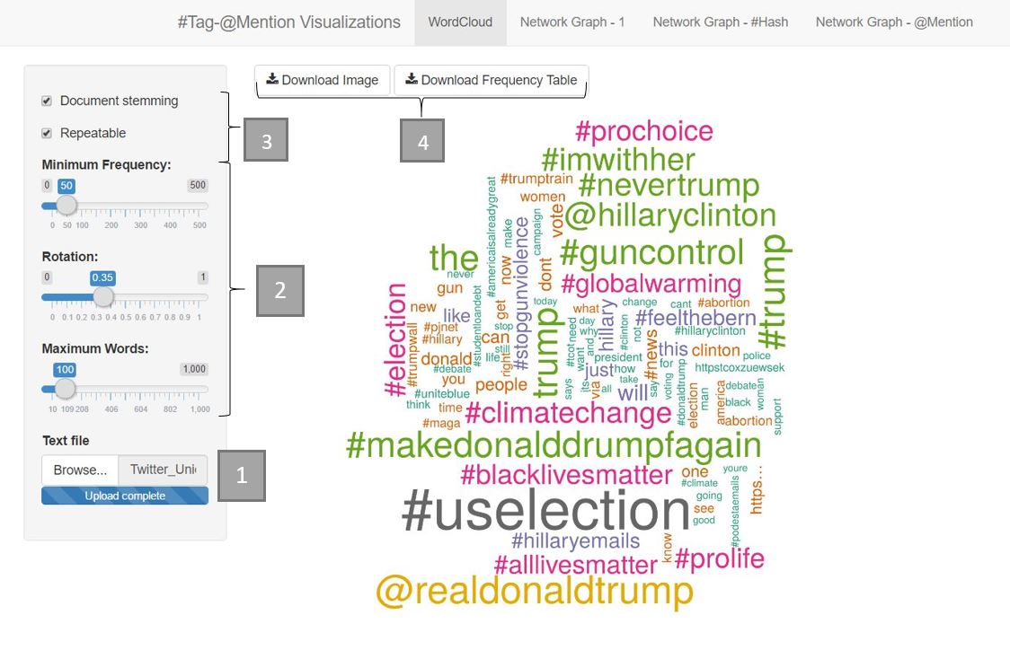
1. Upload text file using the Text File upload widget at the sidebar. Note: The maximum file size supported is 5MB and must be a text file.
2. Customise image to be displayed using filters e.g. maximum number of words, minimum frequency and rotation. In this case, we set Minimum Frequency: 50, Maximum Words: 100, Rotation: 0.35
3. The default setting is to have "Document Stemming" and "Repeatable" checked. To remove, simply uncheck the box.
- "Document stemming" is to reduce the words to their root form. E.g. 'elections' become 'election'. Frequencies of 'elections' and 'election' are added together for the word cloud generation.
- "Repeatable" allows changes made to the word cloud via the filters to be added/removed from the initial plot generated by R.
4. Download the word cloud image and its frequency table by clicking on the 'Download Image" and "Download Frequency Table" buttons respectively. The downloaded image is in PNG format and table is in CSV format.
Network Graphs
The association of #Tags and @User-mentions in tweets can be visualized using three perspectives in this application.
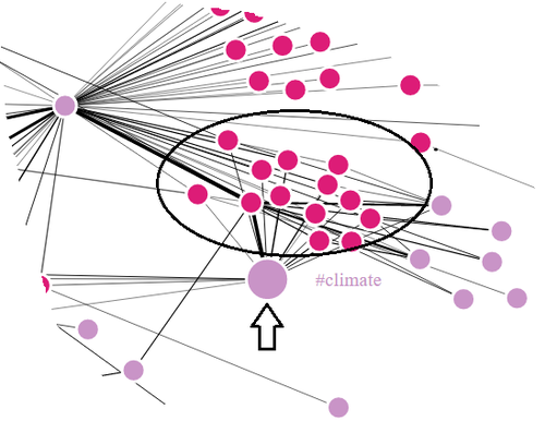
First perspective visualizes the entire network and renders the opportunity to explore the networked association as a whole. #Tags and @Unser-mentions are differentiated by the colour of the nodes. The network graph can be zoomed in/out to identify & explore a specific network pattern in more detail. As an example, we see #climate being associated with multiple @user-mentions which are in turn associated with some more #Tags.
Adjusting the node repletion and Link distance features will further help in revealing the patterns of interest.
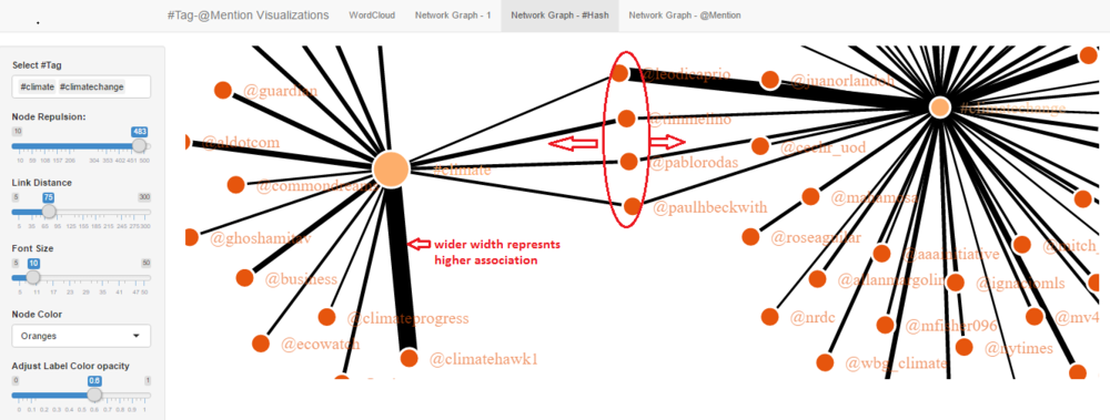
Second perspective provides the option to filter out specific #Tags and narrow down the network pattern to explore the association in more depth. Width of the link represents the strength of the association between #tag and @user-mention. Nodes connected with the wider link indicates that the nodes (#tag & @user-mention) are being associated more frequently together than other combination of nodes. Including multiple #tags in filter can help revel the common @user-mentions who are being associated with the selected #tags. Adjusting the colour opacity controls the opacity of node labels. User can try out different colour palettes for nodes.

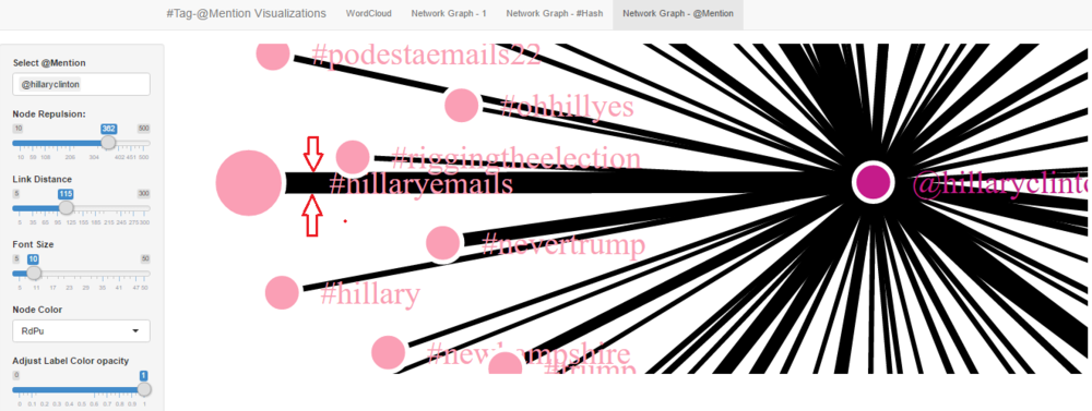
Third perspective provides the option to filter out specific @User-mentions and narrow down the network pattern to explore the association in more depth. Adjusting the node repletion and Link distance will help to structure of the network representation and will further in exploration of association. Width of the link represents the strength of the association between #tag and @user-mention. Nodes connected with the wider link indicates that the nodes (#tag & @user-mention) are being associated more frequently together than other combination of nodes. Including multiple #tags in filter can help revel the common @user-mentions who are being associated with the selected #tags. Adjusting the colour opacity controls the opacity of node labels. User can try out different colour palettes for nodes.

Discussion
What has the audience learned from your work? What new insights or practices has your system enabled? A full blown user study is not expected, but informal observations of use that help evaluate your system are encouraged.
Future Work
- Font colours of Word Cloud could be of one single colour to minimise distractions.
- Intensity of the font colour in Word Cloud could complement the font size, which represents the frequency of the word
- Enable display of Network Graph once a user clicks on a #tag or @mention in the Word Cloud
- Improve on Word Cloud's Minimum Frequency filter to allow user to enter the frequency range, rather than using a slider that has hard-coded limits (currently at 500)
- Displaying the tweet messages when a node is selected


