Difference between revisions of "ISSS608 2016-17 T1 Assign2 Ye Jiatao"
| Line 51: | Line 51: | ||
</gallery> | </gallery> | ||
| − | From the chart above, we can know that female instructor and Professor are more willing to use Wikipedia comparing to their counterparts, while female lecturer almost never register in Wikipedia. | + | From the chart above, we can know that female instructor and Professor are more willing to use Wikipedia comparing to their counterparts, while female lecturer almost never register in Wikipedia.<br /> |
| + | [[File:2-8.jpg|600px|thumbnail|center|Position vs Domain (UserWiki)]]<br /> | ||
| + | From the trellis plot above, we can get that the penetration rate of Wiki is high in terms of Health Science & Professor and Science & Lecturer. In addition, we can also get a rough understanding about which area still have high potential to expand the use of Wikipedia for teaching. | ||
| + | <br /> | ||
| + | <gallery perrow = 2 heights = 350px widths = 400p> | ||
| + | File:2-9.jpg|Use of wiki vs Position/Gender/PhD | ||
| + | File:2-10.jpg|Use of wiki vs Domain/Gender/PhD | ||
| + | </gallery> | ||
| + | <br /> | ||
| + | The objective of these 2 plots above is the same as Mosaic plot built using jmp. | ||
| + | [[File:2-11.jpg|600px|thumbnail|center|Use of wiki by Age group/Working Experience]] | ||
| + | From the distribution of use of wiki, we can get that the main wiki user are teachers from 40 to 5, while it seems there is a negative correlation between teaching experience and use of wiki. | ||
=== Usefulness of Wikipedia === | === Usefulness of Wikipedia === | ||
| + | In the step, we want to explore the usefulness of wiki in terms of different domains and user segments. | ||
| + | |||
| + | [[File:2-12.jpg|600px|thumbnail|center|Survey Question about Wiki]] | ||
| + | The plot above shows the result of a series of Likert Scale Questions which we are interesting in.The answer of each qustion is Likert scale (1-5) ranging from strongly disagree / never (1) to strongly agree / always (5). The grey circle above each bar show the average point of each answer. As a result, we can that most of users agree with that wiki is user-friendly and it is easy to find information in wiki. On ther other hand, we can realize the use of wiki is not well considered among colleagues. | ||
| + | |||
| + | [[File:2-13.jpg|600px|thumbnail|center|Average Point of Survey Question]] | ||
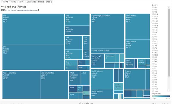
| + | The tree map above can show the average point for each question in the survey in terms of different domain and user groups. The layers been used here include "Domain", "Position", "Gender". We can see the distribution of each question by manipulate the filter, where the filter set to "Question". | ||
=== Relationship between social image and behavioral intention === | === Relationship between social image and behavioral intention === | ||
Revision as of 20:38, 25 September 2016
Contents
Abstract
Wikipedia is a multilingual, web-based, free-content encyclopedia project supported by the Wikimedia Foundation and based on a model of openly editable content. Anyone can share their knowledge and insight through Wikipedia, which also make it a very useful tool for education purpose. Teachers can design educational activities, sharing teaching materialist and searching specific information using Wikipedia. In this project, we will use data visualization to explore the wikiHE4 data set and try to deliver some useful insight to our readers. The theme of this case focus on the popularity and usefulness of Wikipedia among different user groups.
Problems
In this project, we will mainly answer several questions relating to the theme mentioned above.
- What is the popularity of Wikipedia among different user groups?
- What about the different user groups' attitude toward usefulness of Wikipedia?
- Is there a strong relationship between social image and behavioral intention?
Data-set
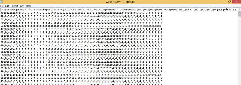
The Data set WikiHE4 is from UCI which extracted from a survey of faculty members from two Spanish universities on teaching uses of Wikipedia. The data-set mainly consists of 2 parts: the first part is about demographic information in terms of each participant, the second part is the result of a series of Likert Scale Questions regarding to a wide range of user experience of Wikipedia. The raw data-set is .csv format as showed below.
Approaches
Data Preparation
Before using the data to perform visualization task, we need to carefully clean and reshape the data into appropriate format. In this case, we cannot directly use the original data-set in tableau, because most of the dimensions are related to Likert Scale Questions. In addition, to make our visualization more friendly to readers, we also need to map the raw data with original meaning using data dictionary. The detailed data preparation processes as below.
- Using excel to separate the .csv data into corresponding columns.
- Mapping the demographic variables with readable value using data dictionary.
- Combining variables "UOC_POSITON" and "OTHERSTATUS" to derive a new variable "POSITON", which indicate each participant's occupational title.
- Giving each row one unique ID.
- Delete 5 rows whose value of "POSITON" are unknown.
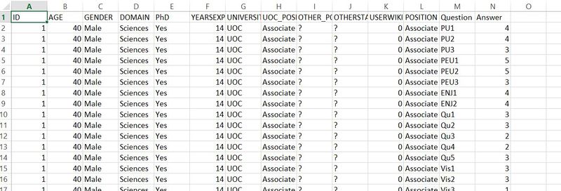
- Using excel tableau add-in to reshape data-set, which separate one row into multiple rows according to Likert Scale Questions.
Popularity of Wikipedia
In this step, we want to get some insights about using condition of Wikipedia among different user group. There is a wide range of demographic dimensions in the data-set which can be used in users segmentation. Firstly, we use JMP to explore the data. From the mosaic plot below, we can have a better understanding how Wikipedia be used in different domain and different users.
From the first chart above, we can get that the Wikipedia is more popular used among non-PhD users in different domain except from Engineering & Architecture. In addition, we also can draw the conclusion that male teacher have more open mind toward using Wikipedia in various domain.
From the chart above, we can know that female instructor and Professor are more willing to use Wikipedia comparing to their counterparts, while female lecturer almost never register in Wikipedia.
From the trellis plot above, we can get that the penetration rate of Wiki is high in terms of Health Science & Professor and Science & Lecturer. In addition, we can also get a rough understanding about which area still have high potential to expand the use of Wikipedia for teaching.
The objective of these 2 plots above is the same as Mosaic plot built using jmp.
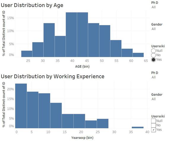
From the distribution of use of wiki, we can get that the main wiki user are teachers from 40 to 5, while it seems there is a negative correlation between teaching experience and use of wiki.
Usefulness of Wikipedia
In the step, we want to explore the usefulness of wiki in terms of different domains and user segments.
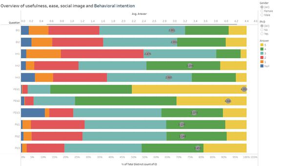
The plot above shows the result of a series of Likert Scale Questions which we are interesting in.The answer of each qustion is Likert scale (1-5) ranging from strongly disagree / never (1) to strongly agree / always (5). The grey circle above each bar show the average point of each answer. As a result, we can that most of users agree with that wiki is user-friendly and it is easy to find information in wiki. On ther other hand, we can realize the use of wiki is not well considered among colleagues.
The tree map above can show the average point for each question in the survey in terms of different domain and user groups. The layers been used here include "Domain", "Position", "Gender". We can see the distribution of each question by manipulate the filter, where the filter set to "Question".
Relationship between social image and behavioral intention
Tool Utilized
Tool used: Tableau, JMP, Parallel Set.
Chart used: Tree-plot, mosaic plot, Trellis, stack bar, parallel set, bar chart.
