Difference between revisions of "ISSS608 2016-17 T1 Assign3 Meenakshi"
(→Task 3) |
|||
| (42 intermediate revisions by the same user not shown) | |||
| Line 21: | Line 21: | ||
=Tools Used= | =Tools Used= | ||
Tableau version 10.0<br/> | Tableau version 10.0<br/> | ||
| − | JMP<br/> | + | JMP Pro 12.2<br/> |
Gephi 0.9.1<br/> | Gephi 0.9.1<br/> | ||
=Approach= | =Approach= | ||
<p> | <p> | ||
| − | == Data Cleaning and Preparation == | + | === Data Cleaning and Preparation === |
| − | + | Most analysis is required to be done using the communication data, hence we look at it first. There are three csv files with communication data for Friday, Saturday and Sunday. | |
| − | + | # Open the three csv files in JMP. Using the Table concatenate function, join all the records and save as JMP table. It contains 4,153,329 records.<br/> | |
| − | + | Examine the variables and data types - | |
| − | + | # The data has four columns. Timestamp of communication, from visitor Id, To visitor Id, location from where message was sent. | |
| − | + | # Change data type of from column- Numeric continuous to Numeric nominal. | |
| − | + | # The To column contains Ids for external communication as string "external", recode this value to 100. Then change the data type to numeric nominal. | |
| − | + | # In movement data for Sunday, two records had missing values for X,Y co-ordinates. These were excluded from analysis. | |
| − | |||
| − | |||
| − | |||
| − | |||
| − | |||
| − | |||
| − | |||
| − | |||
| − | |||
| − | |||
| − | |||
| − | |||
| − | |||
| − | # | ||
| − | |||
| − | |||
| − | |||
| − | # | ||
| − | |||
| − | # | ||
| − | |||
| − | |||
| − | |||
| − | |||
| − | |||
<gallery> | <gallery> | ||
| − | File: | + | File:CommdataFields.JPG |
</gallery> | </gallery> | ||
| − | + | The three days communication data table is now ready for Visual analysis using Tableau. The JMP table is exported as csv file. | |
| − | + | ||
| + | === Analysis with Tableau and Gephi === | ||
| + | ====Task 1==== | ||
| + | On importing the communication data to Tableau, the Timestamp feild could not be read accurately. The months and days were interchanged. By changing the system time format to 24 Hrs and exporting a new csv file from JMP the problem was fixed. | ||
| + | Looking at the following visualizations for the various user IDs' we can isolate the High volume communication IDs' | ||
<gallery> | <gallery> | ||
| − | File: | + | File:HighVolIDssent.jpg |
| + | File:HighVolIDsReceived.jpg | ||
</gallery> | </gallery> | ||
| + | |||
| + | =====Observations===== | ||
| + | #IDs' 1278894 and 839736 stand out for the maximum number of messages sent during the three days. With further analysis, we found that these ID's are in touch with all the park visitors. Hence they must be park services staff who are communicating information on the park events at various intervals. They also receive messages from most of the park visitors. This could be questions from visitors regarding rides or events at the park or any other required assistance during their visit. | ||
| + | # Messages to ID 100 represents external communication. This stands out to be the third highest ID for number of messages received. Park visitors are quite active in sharing their experience and park event updates to people or media outside the park. | ||
| + | |||
<gallery> | <gallery> | ||
| − | File: | + | File:ParkServiceId1278894Comm.jpg |
| + | File:ParkServiceId839736Comm.jpg | ||
</gallery> | </gallery> | ||
| − | + | ||
| − | + | These graphs show that the IDs' 1278894 and 839736 send messages only from the Entry corridor, but receive messages from all locations at the park. From this pattern, we hypothesize that they must indeed be park services staff. | |
| + | |||
| + | ==== Task 2 ==== | ||
| + | Identifying communication patterns<br> | ||
| + | |||
<gallery> | <gallery> | ||
| − | File: | + | File:PatternID1278894.jpg |
| + | File:PatternID839736.jpg | ||
</gallery> | </gallery> | ||
| − | *The | + | |
| − | + | *Pattern for ID 1278894 | |
| + | This Park service staff sends out messages every alternate hour starting from 12 PM to 21 PM. Burst of messages are sent every 5 mns. | ||
| + | The staff also receives messages every hour between 12 PM to 22 PM from the park visitors. It is possible that these are messages sent out regarding park events or Fun games and visitors are responding back to them. For instance the Dino Fun world website mentions about THE CINDYSAURUS TRIVIA GAME, messages could be related to this game<br> | ||
| + | *Pattern for ID 839736 | ||
| + | There were two peaks in the communication pattern for staff ID 839736. The peaks are on Sunday 8th June between 12 PM and 12:30 PM. The messages are sent from Entry corridor. The peak of messages received were also between 12 PM and 12:30 PM from Wet Land.Then there is a drop and another relative peak happens between 2:45 to 3 PM.<br> | ||
| + | |||
<gallery> | <gallery> | ||
| − | File: | + | File:ExternCommPeak.jpg |
| + | File:ExternCommWetLand.jpg | ||
</gallery> | </gallery> | ||
| + | |||
| + | *External Communication | ||
| + | While looking at the external communication over three days, we see that on average less than 50 messages per minute are sent out by park visitors. But there was a peak of messages sent observed on Sunday, 8th of June between 11.45 PM to 12 PM. By filtering on location ,we can also note that most of these messages were sent from Wet Land. | ||
| + | |||
| + | *Communication at Coaster Alley. | ||
<gallery> | <gallery> | ||
| − | File: | + | File:CoasterAlleyCommunication.jpg |
</gallery> | </gallery> | ||
| + | When analyzing the communication pattern at minute level over the 3 days and filtering my location, one notable pattern was seen in messages exchanged from Coaster Alley. | ||
| + | Two peaks were seen one at 11 AM second at 4 PM. This was seen on both Friday and Saturday. However the second peak at 4 PM was missing on Sunday. Considering that Scott's shows are happening at Creighton pavilion situated at Coaster Alley, we can relate these peaks to communication before the show time. The park is hosting two Scott's Soccer Showcase shows every day during this event.<br> | ||
| + | The question for investigation is on the missing peak at 4 PM on Sunday. Is this related to the vandalism that happened and was Scott's second show cancelled due to this.<br> | ||
| + | |||
| + | *Communication over three days at park | ||
<gallery> | <gallery> | ||
| − | File: | + | File:3DaysCommPattern.jpg |
| − | + | File:3DaysLocationwiseComm.jpg | |
| − | |||
| − | |||
| − | |||
| − | |||
| − | File: | ||
</gallery> | </gallery> | ||
| + | When excluding the two park services IDs, who accounted for High volume communication, we could still see that Wet land and Tundra Land were popular in general. We can also understand the hours at which each of the locations are most visited by people.<br> | ||
| + | ====Task 3==== | ||
| + | Based on the communication patterns analysed so far this is the hypothesis - | ||
| + | |||
| + | * There is a peak in external communication on Sunday at 12 PM and the communication from Wet land also spikes between 12 PM to 12:15 PM. This is unlike the pattern on Friday and Saturday. | ||
| + | * There is a peak in communication for park service staff ID 839736 around the same time, clearly talking to all the visitors. | ||
| + | * Scott's shows are happening at Creighton pavilion which has entrance situated at Wet Land. | ||
| + | * We also saw the missing communication spike from coaster alley at 4 PM on Sunday, could be the second show on Sunday was cancelled. | ||
| + | * On analysing the check-in data timestamp, there are no check-ins to creighton pavilion on Sunday post 12 PM. | ||
| + | * Connecting the dots. These patterns lead us to suspect that the vandalism could have happened just before 12 PM on Sunday around 11.30 - 11.45 PM. | ||
| − | + | Proceeding from here, we start filtering the IDs to be investigated based on certain criteria- | |
| − | + | * Using JMP filter all Communication records on Sunday between 11 Am to 12 PM. | |
| − | + | * We have already understood the pattern for the IDs 1278894, 839736 and external ID. These records can be excluded. We expect the crime suspects to not actively communicate with external network. | |
| − | We | + | * Since the communication spikes are happening at Wet Land and Coaster Alley, we further include records only for these two locations. |
| − | * | + | * We consider Ids which sent atleast 10 communication messages during this hour. |
| − | * | + | * With these filters we end up with 82 unique Ids. All these tasks are performed with JMP table functions. |
| − | + | * Next step is to analyse the communication network of these IDs using Gephi. We identify suspicious groups and who is talking to whom. | |
| + | ===== Analyzing the network with Gephi ===== | ||
| − | |||
| − | |||
| − | |||
| − | |||
| − | |||
| − | |||
| − | |||
| − | |||
| − | |||
| − | |||
| − | |||
| − | |||
| − | |||
<gallery> | <gallery> | ||
| − | File: | + | File:Gephi_network_IDsDinoSun.png |
| + | File:Gephi_networkIDsDinoSun_preview.png | ||
</gallery> | </gallery> | ||
| − | |||
| − | + | We prepare the Node and Edge files as required by Gephi. The files have to be in csv format with fields as shown - | |
| − | |||
| − | |||
| − | The | ||
| − | |||
| − | |||
<gallery> | <gallery> | ||
| − | File: | + | File:GephiNodes.JPG |
| − | + | File:GephiEdges.JPG | |
| − | |||
| − | |||
| − | |||
| − | |||
| − | |||
| − | |||
| − | File: | ||
| − | |||
| − | |||
| − | |||
| − | |||
</gallery> | </gallery> | ||
| + | The overview network graph in Gephi is visible once the node and edges files are loaded. To adjust the layout run the Force Atlas algorithm. This organizes the nodes into groups, based on who are communicating with each other. When the algorithm completes we clearly see nodes being grouped.<br> | ||
| + | For analysing the network use the statistical parameters generated from the Avg Path Length option in Gephi. It generates the Betweenness centrality, Closeness centrality and Eccentricity. | ||
| + | For better interpretation of the network graph, <big>color the nodes based on Betweenness centrality</big>, this is a measure of how often the node appears on the network within the group. This should help identify active group members. The nodes are <big>sized based on In-Degree</big>. We expect that Ids who are involved in crime should be receiving more messages at this point in time. | ||
| + | This formatting helps further investigation and guides us which IDs need to be focused. | ||
| + | Analysing the network graph in Gephi, there are nodes of smaller size and less members in the group. There are 2 Ids talking to each other or upto 4 to 5 members within the group.<br> | ||
| + | The bigger nodes that also have high Betweenness centrality are a large group and active. Some of the IDs in this group include - ID 1038892, 1041478,1309055, 668872,1041478, 1742503,1350376 . They are a group of more than ten members actively communicating with each other. With further analysis on the movement and check-in data of these IDs, it is possible to narrow down on the crime suspects. | ||
| + | |||
| + | ====Tableau Dashboard==== | ||
| + | The communication patterns analysed are available in Tableau public. | ||
| + | [https://public.tableau.com/views/DinoFunWorldCommunicationPatternDashBoard/HighVolComm?:embed=y&:display_count=yes Communication Pattern DashBoard] | ||
| − | =References= | + | === References === |
| − | [ | + | [http://hcil2.cs.umd.edu/newvarepository/VAST%20Challenge%202015/challenges/Mini-Challenge%202/ Vast Challenge 2015 submissions]<br> |
| − | [ | + | [https://gephi.org/tutorials/gephi-tutorial-quick_start.pdf/ Gephi tutorial]<br> |
| − | + | [https://github.com/gephi/gephi Gephi guide] | |
| − | |||
Latest revision as of 21:27, 28 October 2016
Contents
Abstract
DinoFun World is a typical modest-sized amusement park, sitting on about 215 hectares and hosting thousands of visitors each day. It has a small town feel, but it is well known for its exciting rides and events.
One event last year was a weekend tribute to Scott Jones, internationally renowned football (“soccer,” in US terminology) star. Scott Jones is from a town nearby DinoFun World. He was a classic hometown hero, with thousands of fans who cheered his success as if he were a beloved family member. To celebrate his years of stardom in international play, DinoFun World declared “Scott Jones Weekend”, where Scott was scheduled to appear in two stage shows each on Friday, Saturday, and Sunday to talk about his life and career. In addition, a show of memorabilia related to his illustrious career would be displayed in the park’s Pavilion. However, the event did not go as planned. Scott’s weekend was marred by crime and mayhem perpetrated by a poor, misguided and disgruntled figure from Scott’s past.
While the crimes were rapidly solved, park officials and law enforcement figures are interested in understanding just what happened during that weekend to better prepare themselves for future events. They are interested in understanding how people move and communicate in the park, as well as how patterns changes and evolve over time, and what can be understood about motivations for changing patterns.
Problem and motivation
The in-app communication data over the three days of the Scott Jones celebration includes communications between the paying park visitors, as well as communications between the visitors and park services. The data also contains records indicating if and when the user sent a text to an external party.
Using visual analytics we need to analyze the available data and solve the below tasks.
- Identify those IDs that stand out for their large volumes of communication. For each of these IDs
- Characterize the communication patterns you see.
- Based on these patterns, what do you hypothesize about these IDs? Note: Please limit your response to no more than 4 images and 300 words.
- Describe up to 10 communications patterns in the data. Characterize who is communicating, with whom, when and where. If you have more than 10 patterns to report, please prioritize those patterns that are most likely to relate to the crime. Note: Please limit your response to no more than 10 images and 1000 words.
- From this data, can you hypothesize when the vandalism was discovered? Describe your rationale. Note: Please limit your response to no more than 3 images and 300 words.
Tools Used
Tableau version 10.0
JMP Pro 12.2
Gephi 0.9.1
Approach
Data Cleaning and Preparation
Most analysis is required to be done using the communication data, hence we look at it first. There are three csv files with communication data for Friday, Saturday and Sunday.
- Open the three csv files in JMP. Using the Table concatenate function, join all the records and save as JMP table. It contains 4,153,329 records.
Examine the variables and data types -
- The data has four columns. Timestamp of communication, from visitor Id, To visitor Id, location from where message was sent.
- Change data type of from column- Numeric continuous to Numeric nominal.
- The To column contains Ids for external communication as string "external", recode this value to 100. Then change the data type to numeric nominal.
- In movement data for Sunday, two records had missing values for X,Y co-ordinates. These were excluded from analysis.
The three days communication data table is now ready for Visual analysis using Tableau. The JMP table is exported as csv file.
Analysis with Tableau and Gephi
Task 1
On importing the communication data to Tableau, the Timestamp feild could not be read accurately. The months and days were interchanged. By changing the system time format to 24 Hrs and exporting a new csv file from JMP the problem was fixed. Looking at the following visualizations for the various user IDs' we can isolate the High volume communication IDs'
Observations
- IDs' 1278894 and 839736 stand out for the maximum number of messages sent during the three days. With further analysis, we found that these ID's are in touch with all the park visitors. Hence they must be park services staff who are communicating information on the park events at various intervals. They also receive messages from most of the park visitors. This could be questions from visitors regarding rides or events at the park or any other required assistance during their visit.
- Messages to ID 100 represents external communication. This stands out to be the third highest ID for number of messages received. Park visitors are quite active in sharing their experience and park event updates to people or media outside the park.
These graphs show that the IDs' 1278894 and 839736 send messages only from the Entry corridor, but receive messages from all locations at the park. From this pattern, we hypothesize that they must indeed be park services staff.
Task 2
Identifying communication patterns
- Pattern for ID 1278894
This Park service staff sends out messages every alternate hour starting from 12 PM to 21 PM. Burst of messages are sent every 5 mns.
The staff also receives messages every hour between 12 PM to 22 PM from the park visitors. It is possible that these are messages sent out regarding park events or Fun games and visitors are responding back to them. For instance the Dino Fun world website mentions about THE CINDYSAURUS TRIVIA GAME, messages could be related to this game
- Pattern for ID 839736
There were two peaks in the communication pattern for staff ID 839736. The peaks are on Sunday 8th June between 12 PM and 12:30 PM. The messages are sent from Entry corridor. The peak of messages received were also between 12 PM and 12:30 PM from Wet Land.Then there is a drop and another relative peak happens between 2:45 to 3 PM.
- External Communication
While looking at the external communication over three days, we see that on average less than 50 messages per minute are sent out by park visitors. But there was a peak of messages sent observed on Sunday, 8th of June between 11.45 PM to 12 PM. By filtering on location ,we can also note that most of these messages were sent from Wet Land.
- Communication at Coaster Alley.
When analyzing the communication pattern at minute level over the 3 days and filtering my location, one notable pattern was seen in messages exchanged from Coaster Alley.
Two peaks were seen one at 11 AM second at 4 PM. This was seen on both Friday and Saturday. However the second peak at 4 PM was missing on Sunday. Considering that Scott's shows are happening at Creighton pavilion situated at Coaster Alley, we can relate these peaks to communication before the show time. The park is hosting two Scott's Soccer Showcase shows every day during this event.
The question for investigation is on the missing peak at 4 PM on Sunday. Is this related to the vandalism that happened and was Scott's second show cancelled due to this.
- Communication over three days at park
When excluding the two park services IDs, who accounted for High volume communication, we could still see that Wet land and Tundra Land were popular in general. We can also understand the hours at which each of the locations are most visited by people.
Task 3
Based on the communication patterns analysed so far this is the hypothesis -
- There is a peak in external communication on Sunday at 12 PM and the communication from Wet land also spikes between 12 PM to 12:15 PM. This is unlike the pattern on Friday and Saturday.
- There is a peak in communication for park service staff ID 839736 around the same time, clearly talking to all the visitors.
- Scott's shows are happening at Creighton pavilion which has entrance situated at Wet Land.
- We also saw the missing communication spike from coaster alley at 4 PM on Sunday, could be the second show on Sunday was cancelled.
- On analysing the check-in data timestamp, there are no check-ins to creighton pavilion on Sunday post 12 PM.
- Connecting the dots. These patterns lead us to suspect that the vandalism could have happened just before 12 PM on Sunday around 11.30 - 11.45 PM.
Proceeding from here, we start filtering the IDs to be investigated based on certain criteria-
- Using JMP filter all Communication records on Sunday between 11 Am to 12 PM.
- We have already understood the pattern for the IDs 1278894, 839736 and external ID. These records can be excluded. We expect the crime suspects to not actively communicate with external network.
- Since the communication spikes are happening at Wet Land and Coaster Alley, we further include records only for these two locations.
- We consider Ids which sent atleast 10 communication messages during this hour.
- With these filters we end up with 82 unique Ids. All these tasks are performed with JMP table functions.
- Next step is to analyse the communication network of these IDs using Gephi. We identify suspicious groups and who is talking to whom.
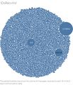
Analyzing the network with Gephi
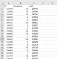
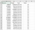
We prepare the Node and Edge files as required by Gephi. The files have to be in csv format with fields as shown -
The overview network graph in Gephi is visible once the node and edges files are loaded. To adjust the layout run the Force Atlas algorithm. This organizes the nodes into groups, based on who are communicating with each other. When the algorithm completes we clearly see nodes being grouped.
For analysing the network use the statistical parameters generated from the Avg Path Length option in Gephi. It generates the Betweenness centrality, Closeness centrality and Eccentricity.
For better interpretation of the network graph, color the nodes based on Betweenness centrality, this is a measure of how often the node appears on the network within the group. This should help identify active group members. The nodes are sized based on In-Degree. We expect that Ids who are involved in crime should be receiving more messages at this point in time.
This formatting helps further investigation and guides us which IDs need to be focused.
Analysing the network graph in Gephi, there are nodes of smaller size and less members in the group. There are 2 Ids talking to each other or upto 4 to 5 members within the group.
The bigger nodes that also have high Betweenness centrality are a large group and active. Some of the IDs in this group include - ID 1038892, 1041478,1309055, 668872,1041478, 1742503,1350376 . They are a group of more than ten members actively communicating with each other. With further analysis on the movement and check-in data of these IDs, it is possible to narrow down on the crime suspects.
Tableau Dashboard
The communication patterns analysed are available in Tableau public. Communication Pattern DashBoard

