Difference between revisions of "ISSS608 2016-17 T1 Assign3 Meenakshi"
| Line 35: | Line 35: | ||
# In movement data for Sunday, two records had missing values for X,Y co-ordinates. These were excluded from analysis. | # In movement data for Sunday, two records had missing values for X,Y co-ordinates. These were excluded from analysis. | ||
<gallery> | <gallery> | ||
| − | File: | + | File:CommdataFields.jpg |
| − | |||
</gallery> | </gallery> | ||
The three days communication data table is now ready for Visual analysis using Tableau. The JMP table is exported as csv file. | The three days communication data table is now ready for Visual analysis using Tableau. The JMP table is exported as csv file. | ||
| Line 44: | Line 43: | ||
On importing the communication data to Tableau, the Timestamp feild could not be read accurately. The months and days were interchanged. By changing the system time format to 24 Hrs and importing a new csv file from JMP the problem was fixed. | On importing the communication data to Tableau, the Timestamp feild could not be read accurately. The months and days were interchanged. By changing the system time format to 24 Hrs and importing a new csv file from JMP the problem was fixed. | ||
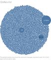
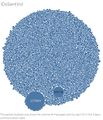
Looking at the following visualizations for the various user IDs' we can isolate the High volume communication IDs' | Looking at the following visualizations for the various user IDs' we can isolate the High volume communication IDs' | ||
| − | + | <gallery> | |
| + | <gallery> | ||
| + | File:HighVolIDsReceived.jpg | ||
| + | File:HighVolIDssent.jpg | ||
| + | </gallery> | ||
| + | </gallery> | ||
=== Techniques === | === Techniques === | ||
Revision as of 22:53, 27 October 2016
Contents
Abstract
DinoFun World is a typical modest-sized amusement park, sitting on about 215 hectares and hosting thousands of visitors each day. It has a small town feel, but it is well known for its exciting rides and events.
One event last year was a weekend tribute to Scott Jones, internationally renowned football (“soccer,” in US terminology) star. Scott Jones is from a town nearby DinoFun World. He was a classic hometown hero, with thousands of fans who cheered his success as if he were a beloved family member. To celebrate his years of stardom in international play, DinoFun World declared “Scott Jones Weekend”, where Scott was scheduled to appear in two stage shows each on Friday, Saturday, and Sunday to talk about his life and career. In addition, a show of memorabilia related to his illustrious career would be displayed in the park’s Pavilion. However, the event did not go as planned. Scott’s weekend was marred by crime and mayhem perpetrated by a poor, misguided and disgruntled figure from Scott’s past.
While the crimes were rapidly solved, park officials and law enforcement figures are interested in understanding just what happened during that weekend to better prepare themselves for future events. They are interested in understanding how people move and communicate in the park, as well as how patterns changes and evolve over time, and what can be understood about motivations for changing patterns.
Problem and motivation
The in-app communication data over the three days of the Scott Jones celebration includes communications between the paying park visitors, as well as communications between the visitors and park services. The data also contains records indicating if and when the user sent a text to an external party.
Using visual analytics we need to analyze the available data and solve the below tasks.
- Identify those IDs that stand out for their large volumes of communication. For each of these IDs
- Characterize the communication patterns you see.
- Based on these patterns, what do you hypothesize about these IDs? Note: Please limit your response to no more than 4 images and 300 words.
- Describe up to 10 communications patterns in the data. Characterize who is communicating, with whom, when and where. If you have more than 10 patterns to report, please prioritize those patterns that are most likely to relate to the crime. Note: Please limit your response to no more than 10 images and 1000 words.
- From this data, can you hypothesize when the vandalism was discovered? Describe your rationale. Note: Please limit your response to no more than 3 images and 300 words.
Tools Used
Tableau version 10.0
JMP
Gephi 0.9.1
Approach
Data Cleaning and Preparation
Most analysis is required to be done using the communication data, hence we look at it first. There are three csv files with communication data for Friday, Saturday and Sunday.
- Open the three csv files in JMP. Using the Table concatenate function, join all the records and save as JMP table. It contains 4,153,329 records.
Examine the variables and data types -
- The data has four columns. Timestamp of communication, from visitor Id, To visitor Id, location from where message was sent.
- Change data type of from column- Numeric continuous to Numeric nominal.
- The To column contains Ids for external communication as string "external", recode this value to 100. Then change the data type to numeric nominal.
- In movement data for Sunday, two records had missing values for X,Y co-ordinates. These were excluded from analysis.
- CommdataFields.jpg
The three days communication data table is now ready for Visual analysis using Tableau. The JMP table is exported as csv file.
Analysis with Tableau
Task 1
On importing the communication data to Tableau, the Timestamp feild could not be read accurately. The months and days were interchanged. By changing the system time format to 24 Hrs and importing a new csv file from JMP the problem was fixed. Looking at the following visualizations for the various user IDs' we can isolate the High volume communication IDs'
</gallery>
Techniques
In this assignment we intend to visualize the survey data, where Likert scale questions are used. A quantitative value is assigned to the
opinions expressed by respondents on a 5 point scale from Strongly agree = 5 to neutral = 3 to strongly disagree = 1.
We need to choose a technique which would best express the overall response across various categories and be able to read the association between parameters. Parallel co-ordinates would be more useful when we have high dimensional data.
- Stacked bars with some measure value indicator would help us compare response between parameters and hence some inference on the association can be made
- The Divergent bar charts, can best express the sentiment of the survey respondents as a measure towards positive and negative sentiment.
Hence above two techniques are used in my approach.
Visual analysis journey and Results
The Published tableau workbook is in the link below.
Wikipedia dashboard
DivergentBar Charts
This is an interactive dashboard with filters and useful to explore the answers we are looking for.
Who are the survey respondents
Most faculty members are Adjunct faculty and are not registered users in wikipedia. The survey had almost equal number of PhD and non-PhD holders
Quality
- Quality of content influences the perceived usefulness and enjoyment more than its influence on ease of use. We see that Quality is an important factor determining the usefulness.
- Social image - It is interesting to note that colleague's perception of quality is influencing how quality is being perceived by faculty.
Sharing attitude
- In the initial investigation, the assumption that social profile influences the sharing attitude is not necessarily true.However the job relevance and the university considering to promote the use of open collaborative environment seems to be influencing the sharing attitude.
This can be visualized as shown
Since different color bars have different widths for profile and sharing attitude, we infer that they are not well associated or influencing one another.
Use behavior and intention
- The usage of wikipedia by faculty in the future, does not seem to be affected by their sharing attitude. But more influenced by perceived usefulness, Social Image and Quality.
- The current usage of wikipedia for teaching and student learning is not significantly influenced by quality as expected in the initial investigation.
The "association of parameters" interface in the dashboard is useful to learn the relationship between other factors. The influence of certain factors on the use of wikipedia and the possible answers for faculty practices can be visualized with this dash board.
Visualize sentiment
With the trellis plot in JMP we can see the responses in all, However it is not very useful for drawing clear inferences on the sentiment unlike divergent bar charts.
As mentioned the Divergent bar charts are a good option here. For instance, we see that most respondents' opinions lie between neutral to agree when it comes to quality of content.
Majority faculty agrees that it is important to share content on open platforms and that students be familiar with such platforms.
We can see a positive attitude when it comes to future use of wikipedia in the academic world.
References
Data Source
www.datarevelations.com
Citation
Meseguer, A., Aibar, E., Lladós, J., Minguillón, J., Lerga, M. (2015). “Factors that influence the teaching use of Wikipedia in Higher Educationâ€. JASIST, Journal of the Association for Information Science and Technology. ISSN: 2330-1635. doi: 10.1002/asi.23488.


