Difference between revisions of "ISSS608 2016-17 T1 Assign2 Meenakshi"
| Line 84: | Line 84: | ||
File:TableauImport.PNG | File:TableauImport.PNG | ||
</gallery> | </gallery> | ||
| − | + | ||
=== Techniques === | === Techniques === | ||
| + | In this assignment we intend to visualize the survey data, where Likert scale questions are used. A quantitative value is assigned for the | ||
| + | opinions expressed by respondents on a 5 point scale from Strongly agree = 5 to neutral = 3 to strongly disagree = 1.<br/> | ||
| + | We need to choose a technique which would best express the overall response across various categories and be able to read the association between parameters. Parallel co-ordinates would be more useful when we have high dimensional data unlike Likert scales.<br/> | ||
| + | * Stacked bars with some measure value indicator would help us compare response between parameters and hence some inference on the association can be made | ||
| + | * The Divergent bar charts, can best express the sentiment of the survey respondents as a measure towards positive and negative sentiment. | ||
| + | Hence above two techniques are used in my approach.<br/> | ||
=Visual analysis journey and Results= | =Visual analysis journey and Results= | ||
Revision as of 20:25, 16 October 2016
Contents
Abstract
The new open collaborative environment and open education content has had a great impact on student learning and teaching practices
in the universities across globe. Wikipedia stands out to be the primary technology platform that is enabling learning and knowledge sharing. In this study we are trying to understand the teaching use of wikipedia from a dataSurvey of faculty members from two Spanish universities.
Problem and motivation
The objective is to analyse the multivariate survey data using appropriate visualisation tools and techniques.-
The results would enable us understand the main attributes that influence the teaching uses of wikipedia.
This will give us insights on how the open learning platform is being received and how are the practices going to be in the academic
world in the future.
Tools Used
Tableau version 10.0
JMP
Approach
Following the recommended Visual Analytics Application Design Process, we approach the problem is 3 steps
Identify theme of interest
The focus is on Visualizing factors that influence the use of Wikipedia as a platform for teaching and learning in the academic world.
What do faculty members consider important in order to use and promote wikipedia.
Define questions for investigation
The wiki4HE survey data, contains information about the faculty members basic profile. Survey questions are defined based on these factors:
From the survey question under each of these categories we can understand the meaning of these attributes
- Perceived Usefulness and Ease of Use
- Perceived Enjoyment
- Quality
- Visibility
- SocialImage
- Sharing Attitude
- Use Behavior
- Profile 2.0
- Job relevance
- Use Behavior
- Behavioral Intention
- Incentives
- Experience
The associations to be studied
- Who are the poeple taking the survey? Some demogrpahics on the survey participants
- Do faculty members from various departments differ in their opinion on the perceived usefulness and Quality.
- Is Quality the key factor considered by most faculty members. Does it influence the perceived usefulness and ease of use
- Is the Use behavior and Behavioral intention defined by quality
- Does the faculty Social profile influence the sharing attitude
- How important is the Job relevance for the use of wikipedia. Does it also affect the sharing attitude
- Does the Social Image- colleague's perception, influence the perceived usefulness and behavior intention
- How does visibility affect the use behavior and behavioral intention
As we progress with data explorations, some questions may have to be re defined.
Analysis
Data Preparation and cleaning
- The JMP tool is used for this task. The wiki4HE csv file is loaded in JMP to check the data types and get a preview/summary of the data.
- The data types for some of the variables needs to be redefined. Such as - Changing Gender and Phd to categorical data.
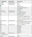
- The raw data has some missing values and '?' mark fields in the table. Referring to the data dictionary, appropriate values are recoded using JMP. Through this process we can make sense of some of the '?' fields. Recoding also aids interpreting data during analysis.The steps are summarized in table below-
- Add a ID column to represent individual survey respondenst with a unique ID wiki4HE_Clean xls file.
- Add a category column to the individual questions in a new sheet in the the wiki4HE_Clean xls file.
- The data table in JMP is now ready to check for missing values. Check the distribution of all parameters to understand more.
It is seen that the response is missing for some of the questions, however we consider the %Total of responses for each scale during our analysis. Hence these missing values can be ignored in the table.
- The cleaned data from JMP is saved as csv/xls file types to be ready to use for the visual analysis.
- Visual analysis - Import the cleaned data to tableau to analyse survey data.
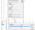
The Qns category sheet and the wiki4HE_Clean xls are joined by QuestionID and imported to Tableau. We need the Question Ids to be rows instead of columns to visualise the Likert scale data. The Pivot function in tableau achieves this. </gallery>
Techniques
In this assignment we intend to visualize the survey data, where Likert scale questions are used. A quantitative value is assigned for the
opinions expressed by respondents on a 5 point scale from Strongly agree = 5 to neutral = 3 to strongly disagree = 1.
We need to choose a technique which would best express the overall response across various categories and be able to read the association between parameters. Parallel co-ordinates would be more useful when we have high dimensional data unlike Likert scales.
- Stacked bars with some measure value indicator would help us compare response between parameters and hence some inference on the association can be made
- The Divergent bar charts, can best express the sentiment of the survey respondents as a measure towards positive and negative sentiment.
Hence above two techniques are used in my approach.
Visual analysis journey and Results
The Published tableau workbook is in the link below
Wikipeida dashboard
DivergentBar Charts
- Quality of content influences the perceived usefulness and perceived enjoyment more than the ease of use. Quality is an important factor determining the usefulness.
- Social image - Colleagues perception of quality is influencing how quality is being perceived by faculty.
- In the initial investigation, the assumption that social profile influences the sharing attitude is not necessarily true.However the job relevance and the university considering to promote the use of open collaborative environment seems to be influencing the sharing attitude.
- The behavioral intention - It does not seem to be affected by the sharing attitude. But more influenced by perceived usefulness, Social Image and Quality.
- Use behavior - The quality does not influence the Use behavior significantly as expected in the initial investigation. The behavioral intention seems to be more closely associated to use behavior.
The "association of parameters" interface in the dashboard can be used to check for relationship between other factors. The influence of important factors influencing the use of wikipedia and the possible answers for faculty practices can be visualized with this dash board.


