Difference between revisions of "ISSS608 2016-17 T1 Assign2 Aditya Hariharan"
Adityah.2016 (talk | contribs) |
Adityah.2016 (talk | contribs) |
||
| Line 29: | Line 29: | ||
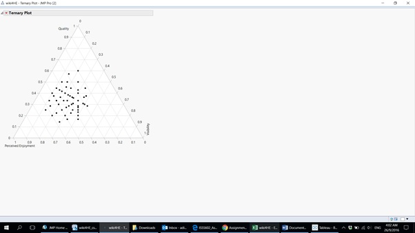
The first inference made is from the ternary plot below which shows the relationship between the perceived quality, perceived visibility and ease of use experienced by the academia within the university. | The first inference made is from the ternary plot below which shows the relationship between the perceived quality, perceived visibility and ease of use experienced by the academia within the university. | ||
| − | [[File:Image 2 5.jpg|thumbnail]] | + | [[File:Image 2 5.jpg|720px|thumbnail|center]] |
| + | |||
| + | What we can see from this that the distribution of data is quite highly correlated with most of the data points falling somewhere towards the middle. However a trend that is visible is that there is only one data point whose ease of use score is 1. Thus it can be inferred that everyone within this sample finds wikipedia to be easy to use. | ||
| + | |||
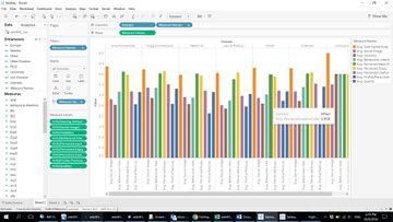
| + | Next a bar graph is constructed by the average of means for every question and is classified domain wise to check how people are using wiki in each domain. | ||
| + | |||
| + | [[File:Image 2 6.jpg|360px|thumbnail|center]] | ||
Revision as of 18:15, 26 September 2016
Overview
Data is a precious thing and will last longer than the systems themselves.
~ Tim Berners-Lee
The purpose of this assignment is to find and gain certain useful insights with respect to a survey taken among the academia at a university about the usage of wikipedia and various questions regarding its relevance, usefulness and effectiveness as an open platform for learning and discovery. Wikipedia, as we all know, has grown into a worldwide open source of knowledge and information and this analysis seeks to find out what a sample set of academics think about the platform.
Data Set
The Dataset used for the analysis was taken from an online repository https://archive.ics.uci.edu/ml/datasets/wiki4HE which contained information regarding an ongoing research on university faculty perceptions and practices of using Wikipedia as a teaching resource.
wiki4HE dataset
Theme
The purpose of this analysis is to check for various insights related to the dataset chosen and to answer certain questions related to the answers given by the different age, domain and gender demographics within the sample data
Data Preparation
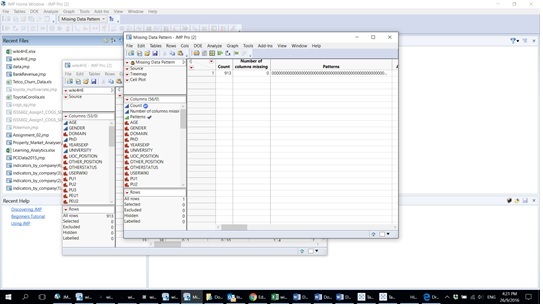
The first step in the data preparation process after loading data from the given excel file is to check for any missing data patterns within the data set
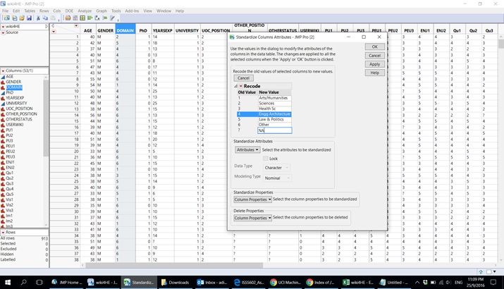
Next we recode various columns in the data for a better understanding according to the meta data provided.
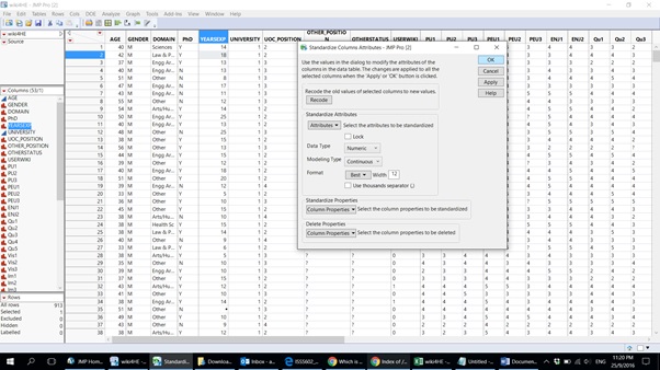
There are certain columns whose data types must be changed for logical purposes. For example 'years of experience' is changed to continuous data while question columns can be changed from categorical to continuous.
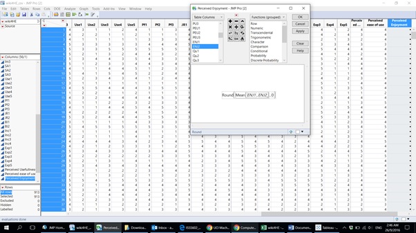
Mean values have been taken for certain question types as new columns but only for question types with questions of similar meanings for whom taking a mean value would be logical.
Data Exploration and Analysis
The first inference made is from the ternary plot below which shows the relationship between the perceived quality, perceived visibility and ease of use experienced by the academia within the university.
What we can see from this that the distribution of data is quite highly correlated with most of the data points falling somewhere towards the middle. However a trend that is visible is that there is only one data point whose ease of use score is 1. Thus it can be inferred that everyone within this sample finds wikipedia to be easy to use.
Next a bar graph is constructed by the average of means for every question and is classified domain wise to check how people are using wiki in each domain.
