Difference between revisions of "ISSS608 2016-17 T1 Assign2 Li Nanxun"
| (33 intermediate revisions by the same user not shown) | |||
| Line 3: | Line 3: | ||
<br/> | <br/> | ||
There is a rough relationship between the academic level (Observed via PhD and Position) of university faculty and how they think about Wikipedia: the more profound in domain, the lower the scores. In fact, the most important factor that affects the scores is whether the user is registered or not. This is largely due to the usage factors related with behaviour and habit like contribution, Wiki usage. The detailed reasons may be that they cannot use some of the functions unless they are registered users(behaviour scores), and once they registered, which should means they think Wikipedia is good and want to contribute to Wiki(subjective positive view of Wiki), and after their contribution, the quality scores should also increase. | There is a rough relationship between the academic level (Observed via PhD and Position) of university faculty and how they think about Wikipedia: the more profound in domain, the lower the scores. In fact, the most important factor that affects the scores is whether the user is registered or not. This is largely due to the usage factors related with behaviour and habit like contribution, Wiki usage. The detailed reasons may be that they cannot use some of the functions unless they are registered users(behaviour scores), and once they registered, which should means they think Wikipedia is good and want to contribute to Wiki(subjective positive view of Wiki), and after their contribution, the quality scores should also increase. | ||
| − | |||
| − | |||
| − | |||
| − | |||
| − | |||
<br/> | <br/> | ||
| Line 39: | Line 34: | ||
<br/> | <br/> | ||
Type of chart used: Treemap, Slopegraph, Box Plot. | Type of chart used: Treemap, Slopegraph, Box Plot. | ||
| + | =Interactive Data Visualization= | ||
| + | Here is the link to | ||
| + | [https://public.tableau.com/shared/KQMSPRQ3H?:display_count=yes Tableau Public Display] | ||
| + | . You can view my effort and explore the data yourself! | ||
=Tools Utilized= | =Tools Utilized= | ||
| − | |||
In this report, Tools used are: | In this report, Tools used are: | ||
* Tableau 10.0 (for data analysis) | * Tableau 10.0 (for data analysis) | ||
| Line 50: | Line 48: | ||
=Data Preparation= | =Data Preparation= | ||
<br/> | <br/> | ||
| − | |||
| − | + | '''Import Data into Excel''' | |
| − | After | + | After downloading the data, we can notice that it cannot be viewed correctly in Excel, so we need to make some changes in the original file before loading it into Excel and checking its patterns. |
| − | |||
| − | |||
| − | |||
| − | |||
| − | |||
| − | |||
| − | |||
| − | |||
| − | |||
| − | |||
| − | |||
| + | After checking the original data via Notepad, we can find all the pieces of data are split by “;”. The split sign seems cannot be recognized automatically by Excel. The solution for this is to replace all the “;” with tab: enter a tab and copy it somewhere else, open the Replace function by “Ctrl” + “H”, “Find what” “;” , “Replace with” the tab you just copy and “Replace all”, save the document and open it in Excel. And you can find everything is in good order now. | ||
<br/> | <br/> | ||
| − | + | '''Create New Score Factors''' | |
| − | |||
| − | |||
| − | |||
| − | |||
| − | + | In order to compare the section scores, we need to create new columns to calculate each section (i.e. PU=average(Pu1,Pu2,Pu3)) and Total Average. The way to do this is for each section: | |
| − | + | 1. Create a new column. Name the column as per the section in the first row. | |
| + | 2. Use average function to calculate the section score. | ||
| − | + | Of course we can do this in Tableau or JMP, but it is much more time-consuming due to the function writing workload. | |
<br/> | <br/> | ||
| − | + | '''Correct Wrong Column Names''' | |
| − | |||
| − | |||
| − | |||
| − | + | The OTHERSTATUS and OTHER_POSITION are misplaced. We need to modify the names by changing the two title columns. | |
<br/> | <br/> | ||
| − | |||
| − | |||
| − | |||
| − | |||
| − | |||
| − | |||
| − | |||
| − | |||
| − | |||
| − | + | '''Missing Data''' | |
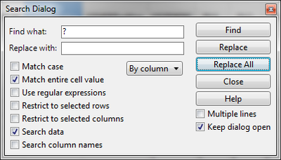
| − | + | When checking the data, we can find a lot of “?”, which mean missing values. We can use JMP to replace all the “?” with blank: | |
| − | + | [[File:ISSS608 Assignment2 Missing values.png|400px]] | |
| − | |||
| − | |||
| − | |||
| − | |||
| − | |||
| − | |||
| − | |||
| − | |||
| − | |||
| − | [[File: | ||
| − | |||
| − | |||
| − | |||
| − | |||
| − | |||
| − | |||
| − | |||
| − | |||
| − | |||
| − | |||
| − | |||
| − | |||
<br/> | <br/> | ||
| − | + | After that we should delete all the rows with missing values. But before doing that, we should treat the position first, since there are a lot of reasonable missing values in the columns related to position. | |
| − | |||
| − | |||
<br/> | <br/> | ||
| − | |||
| − | + | '''Create Position''' | |
| − | |||
| − | |||
| − | + | I consider the positions should have no matter with which university they are in, so I recognize their positions as the higher one in the “UOC_POSITION” and “OTHER_POSITON”. | |
| − | + | According to the data description, higher position means smaller number. Then we can create a new column “Position” with formula as followed. | |
| − | + | [[File:ISSS608 Assignment2 Position.png|400px]] | |
| − | |||
| − | |||
| − | |||
| − | |||
| − | |||
| − | |||
| − | |||
| − | |||
| − | |||
| − | [[File: | ||
<br/> | <br/> | ||
| − | + | Then clear the formula for the new column, delete Column “University”, “UOC_POSITION”, “OTHERSTATUS” and “OTHER_POSITION”, we don’t need these columns in this analysis anymore. | |
| − | |||
| − | |||
| − | |||
| − | |||
| − | |||
| − | |||
| − | |||
| − | |||
| − | |||
<br/> | <br/> | ||
| − | |||
| − | |||
| − | |||
| − | |||
| − | |||
| − | |||
| − | |||
| − | |||
| − | |||
| − | |||
| − | |||
| − | |||
| − | |||
| − | |||
| − | |||
| − | + | '''Change Labels''' | |
| − | + | According to the data description, the data creator used numbers to represent a lot of category variables (i.e. for PhD, 1 means Yes, 0 means No). So we should change the category variables back to their original means so that the following analysis can be easier and user friendly. | |
| − | + | Here is how to do it: “Cols” “Utilities” “Recode”. And the picture is the example about how to revise one of the columns. | |
| − | |||
| − | + | [[File:ISSS608 Assignment2 Recode.png|400px]] | |
| − | |||
<br/> | <br/> | ||
| − | |||
| − | |||
| − | |||
| − | |||
| − | |||
| − | |||
| − | |||
| − | |||
| − | |||
| − | |||
| − | |||
| − | + | '''Delete Rows With Missing Data''' | |
| − | + | OK, now it is time to get rid of missing values. For the missing value shown in the score sections, I decided to directly delete the entire rows which have at least one missing value. | |
| − | + | [[File:ISSS608 Assignment2 Delete Missing Data.png|700px]] | |
| − | |||
| − | |||
| − | |||
| − | [[File: | ||
| − | |||
| − | |||
| − | |||
| − | |||
| − | |||
| − | |||
<br/> | <br/> | ||
| + | And now, the data preparation is done. Export the file as .xlsx format for further analysis with other data analytics software. | ||
| − | == | + | =Data Analysis= |
| − | + | With the questions kept in mind, let's explore the data now! | |
| − | |||
| − | |||
| − | |||
| − | + | Because we want to see the relationships among more than 3 different category dimensions, one of the best way to start with should be Treemap. Treemap can let us have the feeling about the data. Mosaic Plot and Parallel Set are also good choices for this scenario, but they are not supported in Tableau, so I didn't include them. | |
| + | ==Treemap== | ||
| − | |||
| − | + | ===Gender-Domain-PhD=== | |
| + | In order to explore score patterns among different domains with academic level representing variable involved as well as to keep the Treemap readable (4-or-more-layer hierarchy looks bad), I designed a Treemap and its structure is Gender – Domain- PhD, size as Number of Records, and colour as Avg.Total Average. | ||
| − | + | [[File:ISSS608 Assignment2 Treemap1.2.png|800px]] | |
| − | + | * According to the split in the treemap, we can find that, no matter the domain or the gender except the Health Science domain, those who are PhDs gave lower total average score to Wikipedia, which means for those who have achieved the highest degree in academic, they are not quit admire Wikipedia as much as others. The possible explanation for this is because they are more profound in the domain, so they have the ability to find the weakness of Wiki blogs contributed by other people. | |
| + | * The biggest difference pair is the Male Health Science section, which is the special exception in the previous observation. And the difference between the pairs in Female section are smaller than the respective pairs in Male section. | ||
| − | + | ===Gender–Position–Registered=== | |
| + | In order to check the registered user distribution among different Positions to see what kind of university faculty has higher Wikipedia registration percentage. Its structure is Gender–Position-Registered (Usewiki means Registered), size as Number of Records, and colour as Avg.Total Average. | ||
| − | [[File: | + | [[File:ISSS608 Assignment2 Treemap2.2.png|800px]] |
| − | |||
| − | |||
| − | * The | + | * We can find similar pattern shown in the previous treemap: no matter the domain or the gender, those who are registered users gave higher total average score to Wikipedia. The possible explanation for this is that the registered users should like to use Wikipedia or otherwise, and they have contributed to Wikipedia in their domains, so the quality of Wikipedia pages is high. |
| + | * The sections’ average scores also have relationships with positions. And according to the meaning behind the positions, it seems the higher the position the lower the score. Potential reason is the same as the previous one, since the positions also can show their mastery of domain knowledge. | ||
| + | * No professor is registered user. And the registration rate is low, even the highest is less than 22%(Man Associate 21%, Man Lecture 21%). | ||
| − | + | ==Slopegraph== | |
| − | + | Because we have distinguished one important factor that affects the scores largely (Userwiki, which means the faculty is registered Wikipedia users or not.), and with the unsolved problem, how does the academic level affect the scores, kept in mind, I decided to use Slopegraphs to see how the scores change if the key factors change. That will give us a deep and detailed vision. | |
| − | == | + | ===Slopegraph: How scores change from Userwiki=No to =Yes=== |
| − | |||
| − | |||
| − | |||
| − | + | [[File:ISSS608 Assignment2 Slopegraph1.2.png|400px]] | |
| − | + | '''Main Findings''' | |
| + | * The highest scores are shown in Item section SA (Sharing Attitude), which is not so related with Wikipedia, but their themselves value system. Luckily, they all think it is important to share via other media other than journals and books. | ||
| + | * The only one obvious decreasing line in the graph is the Avg. Peu1, which means Wiki is not User friendly for those who are registered users!!! So that may because the Wikipage is so hard to edit!!!! Since this is the main function used only by registered users!!!Anyway, the Peu1 score is still very high. | ||
| + | * And for the items on the bottom (Pf1, User1, Vis3, Use2, Exp4), most of them are about the using the wiki functions, which need registration, so the reason is quite straight. But For Vis3, which means the user cited Wikipage in academic papers, also increased a lot with Userwiki changed from No to Yes | ||
| − | |||
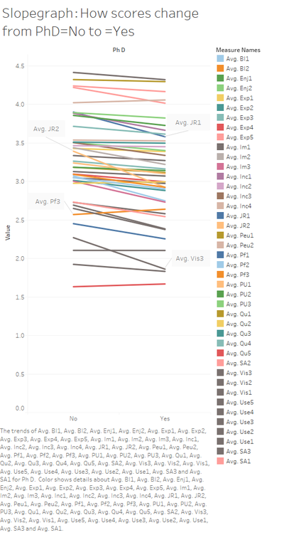
| − | + | ===Slopegraph: How scores change from PhD=No to =Yes=== | |
| − | + | [[File:ISSS608 Assignment2 Slopegraph2.2.png|400px]] | |
| − | + | '''Main Findings''' | |
| + | * The obvious drops are in JR and Vis3, JR is Job relevance, which means for PhDs, they have less job relevance with Wikipages. And of course, for those PhDs, they cannot cite much Wikipage thing, since the quality is not assured. | ||
| + | * But Pf3, which means publishing academic content in open platform, is increasing lightly, which is good. | ||
| + | * When selecting the quality scores from Qu1 to Qu5, we can find a slightly drop when PhD turns from No to Yes. Except Qu4, the drop in the other 4 scores means bad, which is consistent with our assumption. But the drop is too small to draw a solid conclusion here. | ||
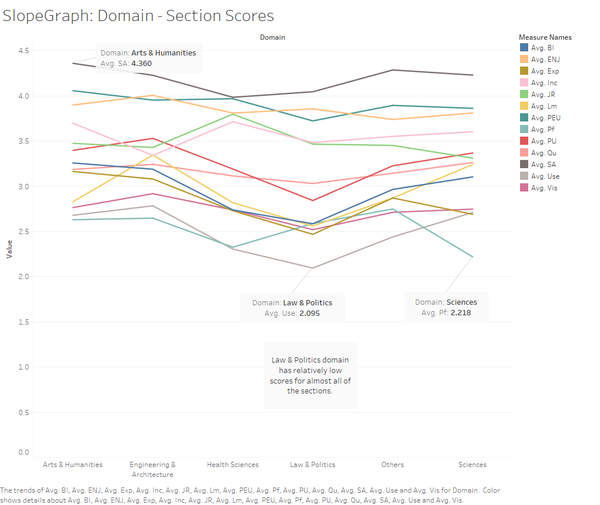
| − | + | ===SlopeGraph: Domain – Section Scores=== | |
| + | The graph is to find out the domain performance differences and features. In order to have a better view of the changes, I used slopegraph. Although the line slope only can show the changes among neighbour domains, but we still can generate some interesting insights from it. | ||
| − | [[File: | + | [[File:ISSS608 Assignment2 Slopegraph3.2.png|600px]] |
| − | |||
| − | |||
| − | + | '''Main Findings''' | |
| + | * Law & Politics domain has relatively low scores for almost all of the sections. This may due to the domain features that it is hard to learn and write, the quality can hardly be improved by people from other domains. | ||
| + | * The Use and Pf scores are the lowest. Use means User behaviour and Pf means user participation in open platform. That means Wikipedia still have space to improve unless it can get those profound users well-involved. | ||
| + | * The highest Score is the SA part, and we have discussed about it. | ||
<br/> | <br/> | ||
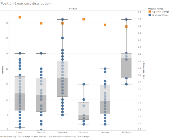
| + | ==Position- Experience distribution== | ||
| + | In order to have an exact numeric view of the relationship among Position, Experience and scores, I added this Box plot chart to show the distribution as well as enhance the previous observation about Position and scores. | ||
| − | + | [[File:ISSS608 Assignment2 Distribution.png|600px]] | |
| − | |||
| − | |||
| − | |||
| − | |||
| − | |||
| − | |||
| − | |||
| − | |||
| − | |||
| − | |||
| − | |||
| − | |||
| − | |||
| − | |||
| − | |||
| − | |||
| − | |||
| − | |||
| − | |||
| − | + | * By using the duel axis, we can find a rough relationship that the shorter the experience, the higher the position, the lower the scores, which is consistent with our observation in the previous Treemap. | |
| + | * And the differences are really not obvious. | ||
| − | + | =Conclusion= | |
| − | |||
| − | |||
| − | |||
| − | |||
| − | |||
| − | == | ||
| − | |||
| − | |||
| − | |||
| − | |||
<br/> | <br/> | ||
| + | Our assumption is roughly true-- higher academic level means lower scores for Wikipedia. Some of the reasons are quality concerns but not obvious, while other Wikipedia usage behaviour (I.e. contribution, job relevance) can tell much of that. | ||
| + | Contribution from the sample university faculty is low, although they believe that sharing is important. | ||
| − | |||
| − | |||
| − | |||
| − | + | Interesting findings are: | |
| − | + | * The highest scores are shown in Item section SA (Sharing Attitude), which is not so related with Wikipedia, but their themselves value system. Luckily, most of university faculty think it is important to share via other media other than journals and books. However, the scores related with online material contribution( Exp4, Pf1 and Pf3)are all relatively low. | |
| − | + | * There is only one obvious decreasing line (Avg. Peu1)in the graph, which means Wikipedia user friendliness for those who are registered users is not as good as for unregistered users!!! So that may because the Wikipage is so hard to edit, since this is the main function used only by registered users. Anyway, the Peu1 score is still very high. | |
| − | + | * Law & Politics domain has relatively low scores for almost all of the score sections. This may due to the domain features that it is hard to learn and write, the quality can hardly be improved by people from other domains. | |
| − | |||
| − | |||
| − | |||
| − | |||
| − | |||
| − | |||
| − | |||
| − | |||
| − | |||
| − | |||
| − | |||
| − | |||
| − | |||
| − | |||
| − | |||
| − | |||
| − | |||
| − | |||
| − | |||
| − | |||
<br/> | <br/> | ||
| − | = | + | =Recommendation= |
| − | + | * Improve the Wikipedia user friendliness to those registered users especially the Wiki page editing UX, so that profound but busy university faculty won't be scared away. | |
| − | + | * Wikipedia should keep enhancing relationship with well-known universities by developing tools for faculty so that there will be more touching points with university and more attractive for faculty to actively participate in Wiki. And if possible, Wiki can used the high quality materials developed by faculty and students. | |
| − | |||
| − | |||
| − | |||
| − | |||
| − | |||
| − | |||
| − | |||
| − | |||
| − | |||
| − | |||
| − | |||
| − | |||
| − | |||
| − | |||
| − | |||
| − | |||
| − | |||
| − | |||
| − | |||
| − | |||
| − | |||
| − | |||
| − | |||
| − | |||
| − | |||
| − | |||
| − | |||
| − | |||
| − | |||
| − | |||
| − | |||
| − | |||
| − | |||
| − | |||
| − | |||
| − | |||
| − | |||
| − | |||
| − | |||
| − | |||
| − | |||
| − | |||
| − | |||
| − | |||
| − | |||
<br/> | <br/> | ||
| − | |||
| − | |||
| − | |||
| − | |||
| − | |||
| − | |||
| − | |||
| − | |||
| − | |||
| − | |||
| − | |||
| − | |||
| − | |||
| − | |||
| − | |||
| − | |||
| − | |||
| − | |||
| − | |||
| − | |||
| − | |||
| − | |||
| − | |||
| − | |||
| − | |||
| − | |||
| − | |||
| − | |||
| − | |||
| − | |||
| − | |||
| − | |||
| − | |||
| − | |||
| − | |||
| − | |||
| − | |||
| − | |||
| − | |||
| − | |||
| − | |||
| − | |||
| − | |||
| − | |||
| − | |||
| − | |||
| − | |||
| − | |||
| − | |||
| − | |||
| − | |||
| − | |||
| − | |||
| − | |||
| − | |||
| − | |||
| − | |||
| − | |||
| − | |||
| − | |||
| − | |||
| − | |||
| − | |||
| − | |||
| − | |||
| − | |||
| − | |||
| − | |||
| − | |||
| − | |||
| − | |||
| − | |||
| − | |||
| − | |||
| − | |||
| − | |||
| − | |||
| − | |||
| − | |||
| − | |||
| − | |||
| − | |||
| − | |||
| − | |||
| − | |||
| − | |||
| − | |||
| − | |||
| − | |||
| − | |||
| − | |||
| − | |||
| − | |||
| − | |||
| − | |||
| − | |||
| − | |||
| − | |||
| − | |||
| − | |||
| − | |||
| − | |||
| − | |||
| − | |||
| − | |||
| − | |||
| − | |||
| − | |||
| − | |||
| − | |||
| − | |||
| − | |||
| − | |||
| − | |||
| − | |||
| − | |||
| − | |||
| − | |||
| − | |||
| − | |||
| − | |||
| − | |||
| − | |||
=Data Dictionary= | =Data Dictionary= | ||
<br/> | <br/> | ||
Latest revision as of 16:31, 26 September 2016
Contents
Abstract
There is a rough relationship between the academic level (Observed via PhD and Position) of university faculty and how they think about Wikipedia: the more profound in domain, the lower the scores. In fact, the most important factor that affects the scores is whether the user is registered or not. This is largely due to the usage factors related with behaviour and habit like contribution, Wiki usage. The detailed reasons may be that they cannot use some of the functions unless they are registered users(behaviour scores), and once they registered, which should means they think Wikipedia is good and want to contribute to Wiki(subjective positive view of Wiki), and after their contribution, the quality scores should also increase.
Motivation and Problems
Wikipedia, as the best free online encyclopedia in the world, has helped so many people a lot and enjoys a high reputation. From a student perspective, the quality of the wiki pages is quite good. But because it is an open platform that everyone can edit, the academic accuracy and quality may be a concern for viewers since they don’t have the specialized domain knowledge to distinguish the mistakes or incorrect description. So let’s look at the survey data from university faculty to find out how do they think about Wikipedia in their domains so as to make Wikipedia greater.
Problems addressed:
- Is the academic quality of Wikipages an existing concern?
- What’s the pattern of the scores given by the university faculties? What are the factors involved (i.e. position, experience, PhD or not)?
- How to make Wikipedia better (Recommendations)?
Approaches
The data was obtained from https://archive.ics.uci.edu/ml/datasets/wiki4HE
It contained the following information that can be utilized:
- Age - Showing year and month of which the flat was resold.
- Gender - Male or Female.
- Yearsexp - The length of university teaching experience.
- PhD - Is the faculty PhD or not?
- Domain - The academic domains of the faculty.
- Position - the academic position of faculty (i.e. Professor, Associate Professor).
From the above data, extra fields were derived
- Position - created by summarizing the position info.
- Total average- Derived by averaging all the scores, since higher score means better in all categories, we can leverage this factor as the overview score of Wikipedia.
Type of chart used: Treemap, Slopegraph, Box Plot.
Interactive Data Visualization
Here is the link to Tableau Public Display . You can view my effort and explore the data yourself!
Tools Utilized
In this report, Tools used are:
- Tableau 10.0 (for data analysis)
- JMP 12.0 (for data preparation)
- Excel 2016 (for data preparation)
Data Preparation
Import Data into Excel
After downloading the data, we can notice that it cannot be viewed correctly in Excel, so we need to make some changes in the original file before loading it into Excel and checking its patterns.
After checking the original data via Notepad, we can find all the pieces of data are split by “;”. The split sign seems cannot be recognized automatically by Excel. The solution for this is to replace all the “;” with tab: enter a tab and copy it somewhere else, open the Replace function by “Ctrl” + “H”, “Find what” “;” , “Replace with” the tab you just copy and “Replace all”, save the document and open it in Excel. And you can find everything is in good order now.
Create New Score Factors
In order to compare the section scores, we need to create new columns to calculate each section (i.e. PU=average(Pu1,Pu2,Pu3)) and Total Average. The way to do this is for each section:
 1.  Create a new column. Name the column as per the section in the first row.
 2.  Use average function to calculate the section score.
Of course we can do this in Tableau or JMP, but it is much more time-consuming due to the function writing workload.
Correct Wrong Column Names
The OTHERSTATUS and OTHER_POSITION are misplaced. We need to modify the names by changing the two title columns.
Missing Data
When checking the data, we can find a lot of “?”, which mean missing values. We can use JMP to replace all the “?” with blank:
After that we should delete all the rows with missing values. But before doing that, we should treat the position first, since there are a lot of reasonable missing values in the columns related to position.
Create Position
I consider the positions should have no matter with which university they are in, so I recognize their positions as the higher one in the “UOC_POSITION” and “OTHER_POSITON”.
According to the data description, higher position means smaller number. Then we can create a new column “Position” with formula as followed.
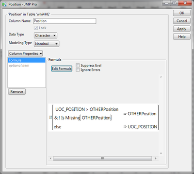
Then clear the formula for the new column, delete Column “University”, “UOC_POSITION”, “OTHERSTATUS” and “OTHER_POSITION”, we don’t need these columns in this analysis anymore.
Change Labels
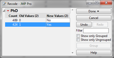
According to the data description, the data creator used numbers to represent a lot of category variables (i.e. for PhD, 1 means Yes, 0 means No). So we should change the category variables back to their original means so that the following analysis can be easier and user friendly.
Here is how to do it: “Cols” “Utilities” “Recode”. And the picture is the example about how to revise one of the columns.
Delete Rows With Missing Data
OK, now it is time to get rid of missing values. For the missing value shown in the score sections, I decided to directly delete the entire rows which have at least one missing value.
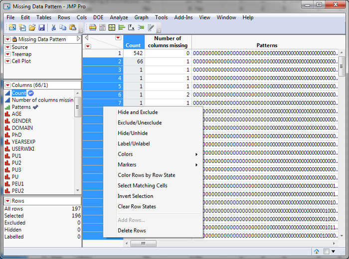
And now, the data preparation is done. Export the file as .xlsx format for further analysis with other data analytics software.
Data Analysis
With the questions kept in mind, let's explore the data now!
Because we want to see the relationships among more than 3 different category dimensions, one of the best way to start with should be Treemap. Treemap can let us have the feeling about the data. Mosaic Plot and Parallel Set are also good choices for this scenario, but they are not supported in Tableau, so I didn't include them.
Treemap
Gender-Domain-PhD
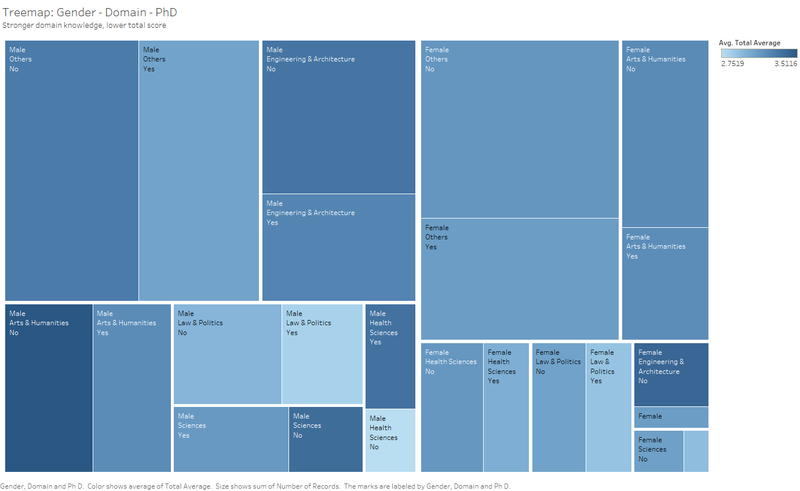
In order to explore score patterns among different domains with academic level representing variable involved as well as to keep the Treemap readable (4-or-more-layer hierarchy looks bad), I designed a Treemap and its structure is Gender – Domain- PhD, size as Number of Records, and colour as Avg.Total Average.
- According to the split in the treemap, we can find that, no matter the domain or the gender except the Health Science domain, those who are PhDs gave lower total average score to Wikipedia, which means for those who have achieved the highest degree in academic, they are not quit admire Wikipedia as much as others. The possible explanation for this is because they are more profound in the domain, so they have the ability to find the weakness of Wiki blogs contributed by other people.
- The biggest difference pair is the Male Health Science section, which is the special exception in the previous observation. And the difference between the pairs in Female section are smaller than the respective pairs in Male section.
Gender–Position–Registered
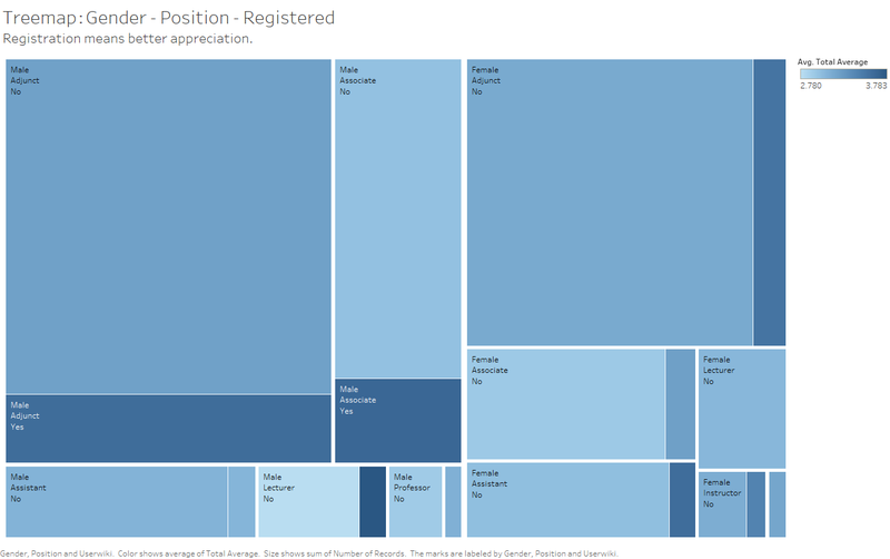
In order to check the registered user distribution among different Positions to see what kind of university faculty has higher Wikipedia registration percentage. Its structure is Gender–Position-Registered (Usewiki means Registered), size as Number of Records, and colour as Avg.Total Average.
- We can find similar pattern shown in the previous treemap: no matter the domain or the gender, those who are registered users gave higher total average score to Wikipedia. The possible explanation for this is that the registered users should like to use Wikipedia or otherwise, and they have contributed to Wikipedia in their domains, so the quality of Wikipedia pages is high.
- The sections’ average scores also have relationships with positions. And according to the meaning behind the positions, it seems the higher the position the lower the score. Potential reason is the same as the previous one, since the positions also can show their mastery of domain knowledge.
- No professor is registered user. And the registration rate is low, even the highest is less than 22%(Man Associate 21%, Man Lecture 21%).
Slopegraph
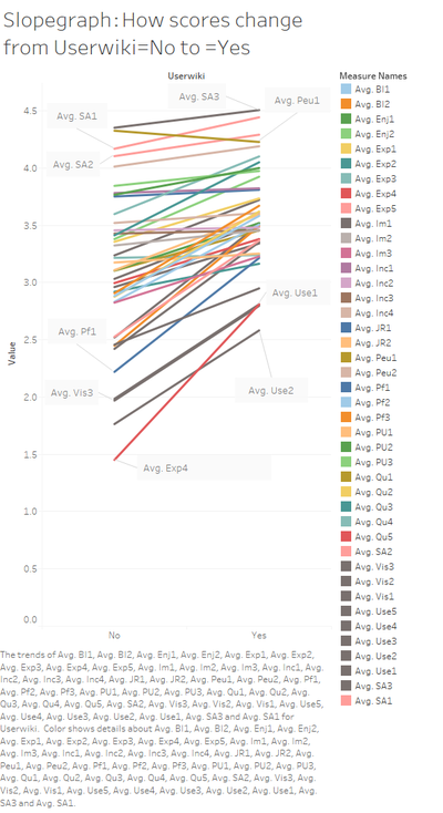
Because we have distinguished one important factor that affects the scores largely (Userwiki, which means the faculty is registered Wikipedia users or not.), and with the unsolved problem, how does the academic level affect the scores, kept in mind, I decided to use Slopegraphs to see how the scores change if the key factors change. That will give us a deep and detailed vision.
Slopegraph: How scores change from Userwiki=No to =Yes
Main Findings
- The highest scores are shown in Item section SA (Sharing Attitude), which is not so related with Wikipedia, but their themselves value system. Luckily, they all think it is important to share via other media other than journals and books.
- The only one obvious decreasing line in the graph is the Avg. Peu1, which means Wiki is not User friendly for those who are registered users!!! So that may because the Wikipage is so hard to edit!!!! Since this is the main function used only by registered users!!!Anyway, the Peu1 score is still very high.
- And for the items on the bottom (Pf1, User1, Vis3, Use2, Exp4), most of them are about the using the wiki functions, which need registration, so the reason is quite straight. But For Vis3, which means the user cited Wikipage in academic papers, also increased a lot with Userwiki changed from No to Yes
Slopegraph: How scores change from PhD=No to =Yes
Main Findings
- The obvious drops are in JR and Vis3, JR is Job relevance, which means for PhDs, they have less job relevance with Wikipages. And of course, for those PhDs, they cannot cite much Wikipage thing, since the quality is not assured.
- But Pf3, which means publishing academic content in open platform, is increasing lightly, which is good.
- When selecting the quality scores from Qu1 to Qu5, we can find a slightly drop when PhD turns from No to Yes. Except Qu4, the drop in the other 4 scores means bad, which is consistent with our assumption. But the drop is too small to draw a solid conclusion here.
SlopeGraph: Domain – Section Scores
The graph is to find out the domain performance differences and features. In order to have a better view of the changes, I used slopegraph. Although the line slope only can show the changes among neighbour domains, but we still can generate some interesting insights from it.
Main Findings
- Law & Politics domain has relatively low scores for almost all of the sections. This may due to the domain features that it is hard to learn and write, the quality can hardly be improved by people from other domains.
- The Use and Pf scores are the lowest. Use means User behaviour and Pf means user participation in open platform. That means Wikipedia still have space to improve unless it can get those profound users well-involved.
- The highest Score is the SA part, and we have discussed about it.
Position- Experience distribution
In order to have an exact numeric view of the relationship among Position, Experience and scores, I added this Box plot chart to show the distribution as well as enhance the previous observation about Position and scores.
- By using the duel axis, we can find a rough relationship that the shorter the experience, the higher the position, the lower the scores, which is consistent with our observation in the previous Treemap.
- And the differences are really not obvious.
Conclusion
Our assumption is roughly true-- higher academic level means lower scores for Wikipedia. Some of the reasons are quality concerns but not obvious, while other Wikipedia usage behaviour (I.e. contribution, job relevance) can tell much of that.
Contribution from the sample university faculty is low, although they believe that sharing is important.
Interesting findings are:
- The highest scores are shown in Item section SA (Sharing Attitude), which is not so related with Wikipedia, but their themselves value system. Luckily, most of university faculty think it is important to share via other media other than journals and books. However, the scores related with online material contribution( Exp4, Pf1 and Pf3)are all relatively low.
- There is only one obvious decreasing line (Avg. Peu1)in the graph, which means Wikipedia user friendliness for those who are registered users is not as good as for unregistered users!!! So that may because the Wikipage is so hard to edit, since this is the main function used only by registered users. Anyway, the Peu1 score is still very high.
- Law & Politics domain has relatively low scores for almost all of the score sections. This may due to the domain features that it is hard to learn and write, the quality can hardly be improved by people from other domains.
Recommendation
- Improve the Wikipedia user friendliness to those registered users especially the Wiki page editing UX, so that profound but busy university faculty won't be scared away.
- Wikipedia should keep enhancing relationship with well-known universities by developing tools for faculty so that there will be more touching points with university and more attractive for faculty to actively participate in Wiki. And if possible, Wiki can used the high quality materials developed by faculty and students.
Data Dictionary
- AGE: numeric
- GENDER: 0=Male; 1=Female
- DOMAIN: 1=Arts & Humanities; 2=Sciences; 3=Health Sciences; * 4=Engineering & Architecture; 5=Law & Politics
- PhD: 0=No; 1=Yes
- YEARSEXP (years of university teaching experience): numeric
- UNIVERSITY: 1=UOC; 2=UPF
- UOC_POSITION (academic position of UOC members): 1=Professor; 2=Associate; 3=Assistant; 4=Lecturer; 5=Instructor; 6=Adjunct
- OTHER (main job in another university for part-time members): 1=Yes; 2=No
- OTHER_POSITION (work as part-time in another university and UPF members): 1=Professor; 2=Associate; 3=Assistant; 4=Lecturer; 5=Instructor; 6=Adjunct
- USERWIKI (Wikipedia registered user): 0=No; 1=Yes
The following survey items are Likert scale (1-5) ranging from strongly disagree / never (1) to strongly agree / always (5)
Perceived Usefulness
- PU1: The use of Wikipedia makes it easier for students to develop new skills
- PU2: The use of Wikipedia improves students' learning
- PU3: Wikipedia is useful for teaching
Perceived Ease of Use
- PEU1: Wikipedia is user-friendly
- PEU2: It is easy to find in Wikipedia the information you seek
- PEU3: It is easy to add or edit information in Wikipedia
Perceived Enjoyment
- ENJ1: The use of Wikipedia stimulates curiosity
- ENJ2: The use of Wikipedia is entertaining
Quality
- QU1: Articles in Wikipedia are reliable
- QU2: Articles in Wikipedia are updated
- QU3: Articles in Wikipedia are comprehensive
- QU4: In my area of expertise, Wikipedia has a lower quality than other educational resources
- QU5: I trust in the editing system of Wikipedia
Visibility
- VIS1: Wikipedia improves visibility of students' work
- VIS2: It is easy to have a record of the contributions made in Wikipedia
- VIS3: I cite Wikipedia in my academic papers
Social Image
- IM1: The use of Wikipedia is well considered among colleagues
- IM2: In academia, sharing open educational resources is appreciated
- IM3: My colleagues use Wikipedia
Sharing attitude
- SA1: It is important to share academic content in open platforms
- SA2: It is important to publish research results in other media than academic journals or books
- SA3: It is important that students become familiar with online collaborative environments
Use behaviour
- USE1: I use Wikipedia to develop my teaching materials
- USE2: I use Wikipedia as a platform to develop educational activities with students
- USE3: I recommend my students to use Wikipedia
- USE4: I recommend my colleagues to use Wikipedia
- USE5: I agree my students use Wikipedia in my courses
Profile 2.0
- PF1: I contribute to blogs
- PF2: I actively participate in social networks
- PF3: I publish academic content in open platforms
Job relevance
- JR1: My university promotes the use of open collaborative environments in the Internet
- JR2: My university considers the use of open collaborative environments in the Internet as a teaching merit
Behavioral intention
- BI1: In the future I will recommend the use of Wikipedia to my colleagues and students
- BI2: In the future I will use Wikipedia in my teaching activity
Incentives
- INC1: To design educational activities using Wikipedia, it would be helpful: a best practices guide
- INC2: To design educational activities using Wikipedia, it would be helpful: getting instruction from a colleague
- INC3: To design educational activities using Wikipedia, it would be helpful: getting specific training
- INC4: To design educational activities using Wikipedia, it would be helpfull: greater institutional recognition
Experience
- EXP1: I consult Wikipedia for issues related to my field of expertise
- EXP2: I consult Wikipedia for other academic related issues
- EXP3: I consult Wikipedia for personal issues
- EXP4: I contribute to Wikipedia (editions, revisions, articles improvement...)
- EXP5: I use wikis to work with my students
