 Project A - The Non-Conventional Sales Dashboard for Company A
Background Surveying
objective: Identify similar projects, and area(s) where we can learnt from these previous experiences:
- Note: All the images can be found in the same website link provided.
Previous School Works
| Sample & Source |
Feature |
Learning Factors
|
|
1. Demand Forecasting Application
|
|
- Neat Layout
- Filters are neatly displayed at the left side of the bar
- Instruction on how to use is clearly stated
|
|
2. Job Analysis
|
- Gif File: Click on it if it were not moving
- Click Here
|
Positive
- Interactivity among the graphs: (1) allow multiple selections of categories (2) Allow multiple selection of Time
Room for Improvement
- "Year Quarter reset" - not display neated, look like junk charts. (The no. were not clearly defined)
- Radarchart: "For display" only - missing information on how to interpret
Overall Learning Points
- Do not have junkcharts, and every chart display need to have a purpose & meaning to it.
- Interactivity : Multiple selections can be neatly done and organized as per sample.
|
|
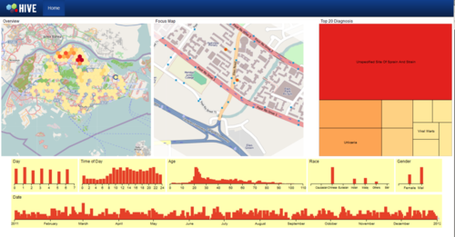
3. Comphrensive Dashboard
|
|
Positive
- Good views of Maps: using an overview of a geographical map, with a focus view of a greographical map
- Good practice of analysis: From an "overview", to a detailed analysis (from geographical map, to the details that can be found in the barcharts)
- Assumed that all the graphical charts are inter-linked, with interactivity; it makes it easy to analysis using this dashboard
Room for Improvement
- Red and yellow are glaring to the eyes (Not user-friendly).
|
|
4. Comphrensive Dashboard- Coffee Chain Inc Application
|
|
Positive
- Similar business context on sales analysis : and how a geographical map can interact with the sales analysis (by other graphic charts)
- Minor but significant - "reset" button
- Provide use-case for report (to demo on how the dashboard can be interpreted)
Room for Improvement
- Any bar charts should have a reference line for comparisons (Will be good if the reference line can be adjusted
- It is not "idiot-proof" - reference to the report is required on what each of the graphic chart is about (perhaps too complicated) or the order / arrangement of the charts can be improved.
Learning Points
- Do a "limus test" on user-interface, especially for those without any prior business context to it. (If they can accept and interpret it, we are then sure that the bosses should be able to do so too)
- Reference Lines are essential/ any form of comparsions - either to the sales target, average performance etc.
- Layout of the graphic should follow the throught process of the reader. When required, perhaps; have to hide those graphics (via interactivity) so that the reader can focus on the graph that he/she is interpreting. (Quite impossible to be analyzing 6 graphics at the same time!)
|
|
5. Sunburst Diagram
|
|
- Simple and neat layout with sunburst diagram as the graphic to display the main results
- Interaction across element, and allow highlighting of bars (Timeline bar) to filter the data
|
|
6. Geographical Diagram
|
|
- Good example on how to improve the
- Interaction across element, and allow highlighting of bars (Timeline bar) to filter the data, such that
- Display of the data on the map
- Upon a click, it will display the location in depth
- A tooltip will provide more details to the location, then
- A price trend/ graph is displayed to show the price of the selected zoom
|
From the World Wide Web
Sample :
- Sales Dashboard with geographical analysis : https://www.pinterest.com/pin/372250725423557371/
- Geographical Dashboard on Sales : http://qonnections.geoqlik.com/geoqlik/proxy/qvajaxzfc/opendoc.htm?document=1%20-%20Sales%20Management_11.8.qvw&host=QVS%40aslw0026&anonymous=true
- Sales Dashboard 2: http://techknomatic.com/portfolio-posts/sales-dashboard/
- Qlikmap's feature : http://www.qlikmaps.com/#
- geographical map on distribution : https://interactive.twitter.com/premierleague/#?mode=team&teamId=all&country=TGO
From Company A
(Data has been masked, only the wireframe remains)
Strength:
- Clear indicators on KPI based on different aspect of the business
Weakness
- No benchmarking of performance with target and external opportunities
- Many tables are used instead graphics.
- Layout is not clean
Technical Challenges
Database Hosting
Data Preparation
Crazy Ideas
District Number mapping:
- District Number of Singapore : https://www.ura.gov.sg/realEstateIIWeb/resources/misc/list_of_postal_districts.htm
- District Number (by geographical Map) : http://www.propertyhub.com.sg/singapore-district-guide.html
Reference
 Project A - The Non-Conventional Sales Dashboard for Company A


