Talk:Lesson07
Contents
Have we been looking at the wrong map our whole lives?
During class today, it came to my surprise that the world map used by classrooms, news platforms, governments, almost everyone (including Google) are actually 'wrong'.
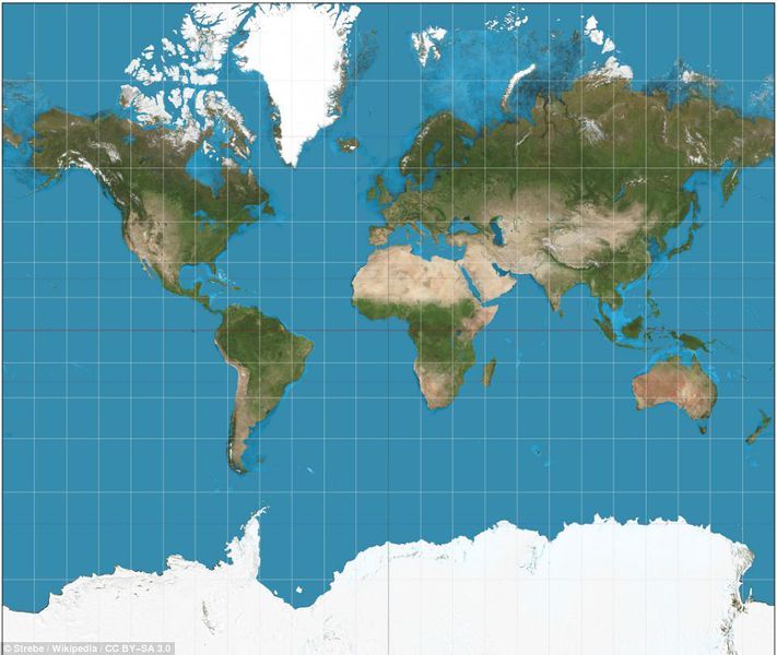
'Wrong' in the sense that we have always taken the sizes of continents and countries on the flat map literally. Like Thomas mentioned in class, Africa when compared to North America is supposed to be much bigger (As shown in first image below).
But what do we usually see on our flat maps?
From what we can see above, the usual flatmap we use actually depicts Africa much smaller than North America. Sadly this is inaccurate visually so why do we still use it?
The problem is, there is not a perfectly accurate map we can display on flat surfaces. The earth is a sphere, but maps are flat. This means that when maps are created, we have to somehow flatten the sphere. This flattening must create some distortion. This distortion could affect the relative angles, shapes of countries, or sizes, or all of these. While we can't avoid distortion, we can flatten the sphere in different ways, based on the "projection" we choose, and depending on what we're going to use the map for.
The Mercator Projection
One of the most commonly used projections is the Mercator projection. The Mercator was incredibly useful for ocean navigation because it keeps angles accurate, making it easier for sailors to navigate the ocean. The downside is that it distorts how large things are. Which results in how Africa looks smaller than North America when it isn't. After all, what was most important back then was your directions and not the size of the continent.
That said, many maps found online, like Google Maps use a variation of Mercator known as "Web Mercator".
Since the common map is inaccurate in land mass
Wouldn't the size of the continent change some of the perspectives we want to get across with the visualization? If so, what kind of projection of the Earth do we use if we want to do a geographical data visualization on a continent level? What do you guys think?
- Tee Yu Xuan
Considerations in Developing Choropleth Maps
Choropleth maps can be seen regularly on either newspapers or online news sites. These maps illustrate attribute values on a geographical map using different colours to show patterns across different regions. They provided great insights for everyone with just a single glance but, the danger arises when the map can be easily distorted even by visual analytic experts.
In one of the readings (Take Care of your Choropleth Maps), the author has identified that one of the choropleth maps published on a Guardian data blog had big mistakes. Because of these mistakes, the visual display of the map can easily mislead people into deriving a different conclusion on the data. As such, it is important to ensure that one take the following into consideration when developing a choropleth map:
- Perform a thorough exploratory analysis on the data
- Before one can even start considering about the charts to generate and help readers explore the data, thorough data analysis must be performed on the dataset given. This includes identifying whether the data are categorical/continuous, testing whether the distribution of data is uniform or normal and if there are any extreme outliers in the data itself.
- In our previous classes, we have explored the use of JMP to help us identify the distribution of values on a boxplot. All of these are useful tools and techniques that we should apply in the initial stage of data analysis. In this stage, we should only focus on understanding the data itself and this applies to all process of generating charts, not only in the generation of a choropleth map.
- Identify the data to be displayed and how it can be displayed
- With a thorough understanding of the data, we move on to identify the variables that we want to display and how it should be displayed. The rationale is that we do not want to show our data on a chart that is not meant for that purpose. For example, we do not want to display categorical data using a box-plot.
- On a choropleth map, only 2 types of data can be shown – totals/absolute values or derived values (ratios). Typically, use of ratios will provide a more accurate map as compared to the use of absolute values. Absolute values can only be used when the mapping area are similar in size. If it varies, misleading maps can be generated.
- Define an appropriate number of classes
- The number of classes we have defines the number of colours we may have on a choropleth map and this affects the visual display of the final choropleth map. As such, it is important to consider the number of classes you want in the choropleth map to avoid distorting the original data.
- Define an appropriate class limit
- Different class limits will produce different patterns on a choropleth map. One should not mess around with the class limit and how one defines their class limits rely greatly on the exploratory analysis. As such, it is important for any visual analyst to perform a thorough analysis on their data as this forms the foundation of generating accurate charts.
- On choosing an appropriate number of classes and class limit, multiple methods can be used and these were covered during our lesson. As such, I will not further elaborate on them.
- Define colour patterns appropriately
- On a choropleth map, colours convey a strong message to the readers. If the colours were not used appropriately, a wrong message may be conveyed to the readers. As such, it is important to choose the colours correctly and ensure the colours are of equidistant to prevent distortion on the map.
These are some of the key considerations one can take when developing a choropleth map and of course, they are non-exhaustive. If there are other key considerations that I might have missed out, please comment below and we can further explore on it to create a nice and accurate choropleth map.
-- Gwendoline Tan Wan Xin
Labeling and text hierarchy in cartography
Through this article, it gives me a deeper insight as to the importance of text and labeling methods that we face everyday when we use common applications like Google Maps. The task of map lettering includes selecting the right fonts and font styles, as well as the placement of labels and text on the map.
The intellectual hierarchy is the ranking of the map feature in the order of their importance, e.g. the capital cities are emphasized over small cities. Also, the visual hierarchy is employed to segregate the different categories of cities and labels.
- Alson Tan
GIS (Geographic Information System)
GIS Definition
According to National Geographic Society, 'A geographic information system (GIS) is a computer system for capturing, storing, checking, and displaying data related to positions on Earth’s surface'. With GIS, analysts may compare locations of different things to identify potential relationships.
GIS Data Layer
Locations could be expressed in the form of: latitude & longitude, address or ZIP code. Other information reflected along with the location may include, population, income and education level etc. The process of compiling information from different sources is called, 'data capture'. Geographic data can be downloaded from sources including, remote-sensing or GPS or digitized or scanned from paper maps & photos.
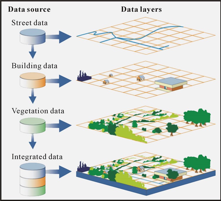
GIS data compiled from different sources are stored in GIS data layers. GIS provides users with a blank map of an area. Users may choose and add their base map of interest like, OpenStreetMap. On top of which, users may add information stored in different layers (each resembling a transparency containing information about the area). Adding or removing those layers helps to view the relevant information needed to answer questions that have a spatial dimension. Breakdown of a GIS Map into multiple data layers:
GIS Map
Popular GIS applications used to construct GIS maps include, ArcGIS & QGIS. Both of which allow users to create interactive queries, analyze geographical information and present analysis results.
Some of the essential elements of a GIS Map include:
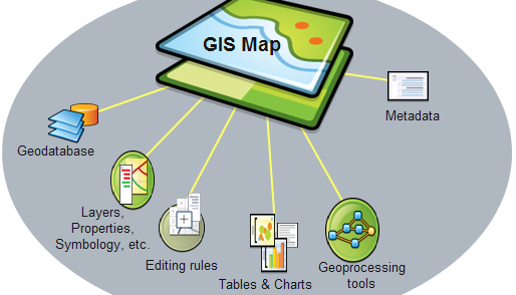
For more details on GIS Map components
- Zheng Xiye
Cluster Analysis
When visualizing and analyzing geographical data, the choice of the level of aggregation is important. In the cases that the data allows for specific analysis (i.e. providing GPS coordinates that allows for the identification of the exact location), the concept of clustering might come in handy.
Cluster analysis classifies the data objects based on information found in the data that describes them and their respective relationships. This is done such that the objects in each cluster are similar to one another and each cluster is different from one another. Ideally, the homogeneity within a group and the difference between groups are both high for a better clustering to occur.
There are different methods that you can employ in grouping a set of objects into a set of clusters. There are also many different types of clusters. If you are interested, the link below would bring you to a chapter of a book I found online that introduces the concept of "Cluster Analysis: Basic Concepts and Algorithms".
http://www-users.cs.umn.edu/~kumar/dmbook/ch8.pdf
- Rachel Tay
Using D3.js with Maps - Dorling Cartogram
While looking for methods to display a map element in our VA project effectively, I came across this website which suggested ways of displaying maps through D3.js.
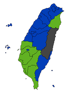
One problem he highlighted for one type of visualisation was that the geometrical size of a certain region can affect what users learn from the map that is produced as sometimes it brings incorrect information. For example, in his example of political parties in Taiwan, readers might think that the blue party is larger than other parties, but it’s actually just the area that these counties cover that is bigger, not the population in these counties.
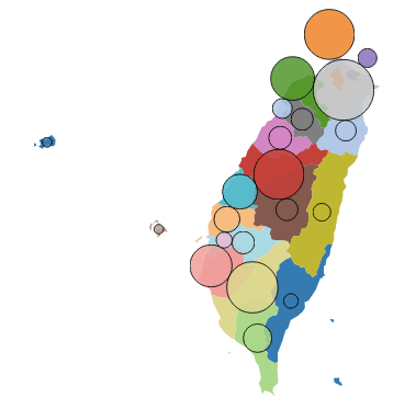
Hence, he suggested using cartograms as they distort the shape of regions to encode data. He further specified to use a Dorling cartograms that distorts the shape of the region into non-overlapping circles. I found the resulting visualisation useful in seeing how the size of a population in a region can be much bigger than the region's land area. This would be especially useful in seeing which areas of a country are more populated than others at a glance, such as the coastal areas of Australia compared to its middle, or the southern parts of Russia as compared to its territories in the north.
- Cornelia Tisandinia Larasati

