IS428 2016-17 Term1 Assign2 Li Weiqiao
Contents
Abstract
Safety should be a priority for everyone in the workplace. According to the WSHI report in 2014, overall number of report injuries increased compared to 2013.
Accessing the data set from Workplace Safety and Health Institution, this report is going to dive into several parts to study about injury frequent rate by time and industry category and factors that affect injury rate which to provide a better understanding about workplace safety. Measures can be effectively brought out to protect working people from accidents and injuries.
Theme of Interest
Final Questions:
• Is there any pattern that injury rate has gone up by certain month or weekday?
• Which industry has a higher injury rate in workplace?
• Is there any correlation between injury and workers' gender?
• Is there any correlation between injury and company's SSCI index?
• Is there any correlation between injury and workers' length of service?
• Is there any correlation between injury and workers' age?
Findings
1. Frequency of injury by time
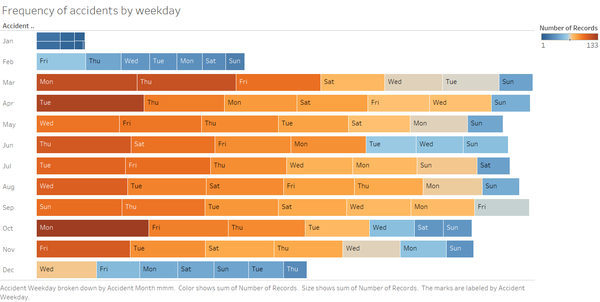
From the tree map by weekday , there is no certain pattern about a certain day in a week that has a higher probability to get injury in work place. But from the left row category which is month, we can tell that from November to January there are less injuries. After research , this is probably because less working people work during the winter break.
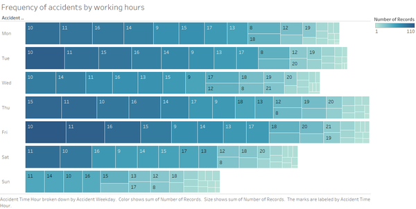
From the tree map by working hours, we can interestingly find that there is a high possibility to get injury at 10a.m. to 12a.m.. Governments can formulate and push for a protection policy or program for all organizations and companies to protect people in the workplace.
2. More Dangerous Industry
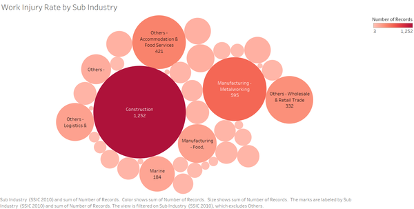
From the bubble chart, we can cleary see that construction is a higher risk industry for working people. And there are also some industries like manufacturing, logistics or marine that has more injury cases. To industry that has more injury case, we can formulate more protection program and provide safety facilities.
3. Factors that affect injury rate
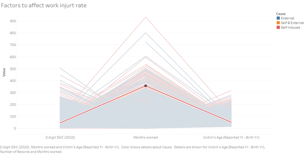
There are several factors that may affect injury rate like workers' age, workers' gender and length of service.
Evolving Questions
1. How s the workplace safety changing during these years? Why is it going to change ?(if there is any slope)
Which is impossible to answer becuase of limited data in 2014.
->>>>>> Can we find any patterns that occurs in month, weekdays or working hours ?
2.
What causes these accidents ?
->>>>>>>>>>>>>>> is there any relationship betwee cause and workers' gender ?
3. Is there any measures effective to protect workers from injury ?why its not effective?
>>>>>>>>>>by looking at high-risk industry and high-risk working hours
4. Which industry or sector has the highest workplace injurt rate? Why ?
>>>>>>>>>> Which industry/sector/company has the most frequent accident injury rate ?
5. questions which are not visualized :
How s the compensation ? like no.of mc. Days
Is there any delay from injury happening date and report date?
What kind of accident is the most common one?
How often does the workplace injury happen?
Intermediate Visualization
1. intermediate patter of injury rate
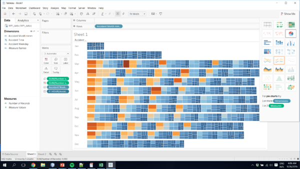
At first , I want to show the injury rate by month, weekdays and working hours in one treemap. After visualizing like that, i found that it is not clear and hard to see labels and find patterns. So I split them into two treemaps which clearly to find the patterns of injury rate.
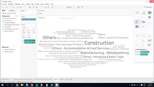
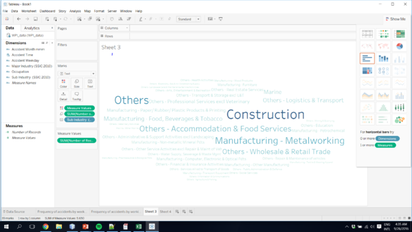
Because of the size of the work(sub-industry) can represent the number of records, I firstly visualize like that. But because all words have same color, it is hard for human to differentiate from words. So i put number of records as a mark of color which emphasize which industry has more injury case in the workplace.
I put color and size as marks of number of records, I still feel it is a bit messy to read. So I change to the bubble chart. And in the bubble chart, I can put labels on it also.
Tools Utilized
- Excel 2013 for data preparation
- Tableau for visualization
