IS428 2016-17 Term1 Assign2 Lee Wai Tong Arnold
Link to visualization here.
Contents
Abstract
Everyone deserves to be able to work in a safe environment. As such, it is important to look at workplace injuries data to better understand the causes of injuries and introduce appropriate policies to improve safety measures. Using data visualization, we can identify patterns and trends. This allows us to gain insights and act accordingly. For example, the data can tell us if most of the injuries are from a certain company. This can mean that that company has flawed safety measures and need urgent rectification.
Theme of Interest
The theme that I shall be working on is reason for workplace injuries and which group is most vulnerable. In so doing, I aim to offer recommendations to reduce the number of incidents.
Identifying and using appropriate attributes
- Accident Month mmm
- Victim's age
- Employer's name
- Occupation
- Major injury indicator
- Body parts injured
- Nature of injury
- Cause
- Months worked
Blog
First, I begin by examining the raw data (csv) to understand the types of data available and consider the kinds of questions I could form. However, during my examination, I noticed that some of the data are not proper. For example, there are spelling mistakes and some data contains spelling errors. I needed to review all these raw data and ensure that they are accurate and in proper form before making my analysis. This helps to improve the accuracy of my analysis thereafter. After which, I put the data file into Tableau to begin some initial exploration.
Out of curiosity, I wanted to know the demographics of all the accidents. Hence, I had some of these questions:
Q1. What is the distribution of accidents across the months?
Q2. What is the distribution of accidents across ages?
Q3. The most common injury
Finding 1
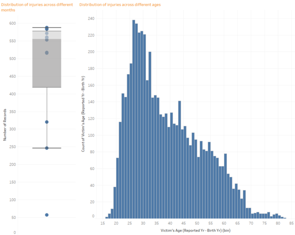
There are considerably less number of accidents in the months between December to February. Using a box-and-whisker plot, these months did not fall within the quartiles and were considerably lower than the remaining months. This could mean that there may be less workers working during that period or less accident-prone activities are done during the holiday period.
Finding 2
The age group from 26-30 had the highest number of accidents. Using a histogram, it is easy to see that 26-30 age group peaks the number of accidents, followed by the higher ages. However, it is difficult to say if this age group is most accident prone since we do not have the demographics of the full population. Another possibility is that older workers may be more experienced and hence less prone to accidents.
Finding 3
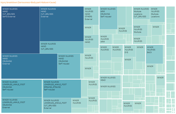
Using a treemap, I added data on body parts, cause and nature of injury. From this, it is clear that most injuries were inflicted on the hand in the form of cuts and bruises. Furthermore, most of the accidents were due to external causes. Given that self-induced accidents are significantly less, it is more likely that these accidents are because of lapses in safety protocols as opposed to untrained staff. However, this pattern does not hold true for other areas of injuries since most lower leg injuries were self-induced. Next, I grouped the data based on the major injury indicator filter. There, I deduced that most injuries reported were minor injuries. Noting that it is difficult to be free from injuries, I have decided to focus attention on major injuries, highlight common accidents and thus create better awareness in terms of safety in that area.
Q4. What kind of major injuries are most common?
Q5. Is there a particular type of occupation that is more prone to major injuries?
Finding 4
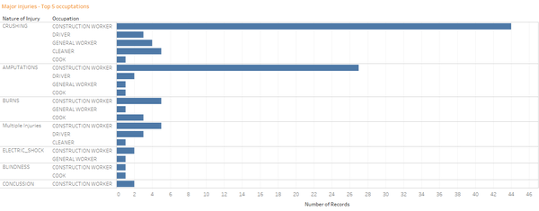
Crushing is the most common major injury, which is more than twice the number of the second most common, amputations.
Finding 5
Construction workers is the most major accident prone occupation. Construction worker accidents are more than 10 times the next most accident prone occupation, driver. Breaking down further, construction workers consistently rank first in all natures of injuries.
Q6. Are these construction workers from the same company?
Q7. What is the most common body part that gets injured for construction workers? What is the main cause?
Finding 6
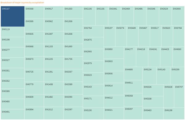
Using a treemap, it is easy to see which companies stand out with higher than average number of accidents. From this, I observed that most companies only have just 1 major injury and the highest is 2. This suggests that it is unlikely that a particular company has poor safety standards which resulted in the injuries.
Finding 7
Following from finding 5, when adding body parts to the data, hand amputations are the most common injury for construction workers. The main cause is by external causes.
Q8. How experienced are these group of construction workers?
Finding 8
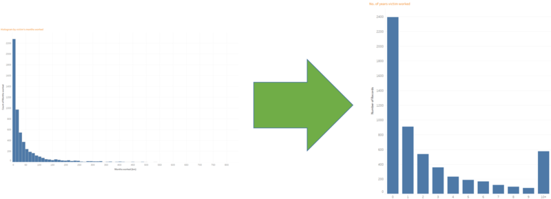
Initially, I started off by charting a histogram. This will tell me how the injuries are generally spread over victim's with different years of experience. However, as some victims have worked for very long period of time, the visualization had a lot of empty spaces in between and makes it difficult to see. As such, I changed to a bar chart. I displayed experience years up till 10 years and grouped the remaining together. This was a better visualization given that not many victims have more than 10 years work experience. Analyzing the chart, a more interesting pattern can be observed. Most victims come from lower years of experience and the number of victims fall as the number of work experience increases. This finding may suggests that the less experienced workers may be less aware of safety hazards and thus take inadequate safety measures. However, more information is needed to confirm this hypothesis given that we do not have data on the company's employee demographics as we do not know the proportion of victims to total number of employees.
Findings & Recommendations
Construction workers contribute most of the injuries in 2014 and far exceeds any other occupation. This finding remains consistent when I filtered down to major and minor injuries. As such, I focused my attention on construction workers with the aim to reduce the overall number of injuries. However, since minor injuries are usually not severe, I shall only be focusing on major injuries.
First, my aim is to identify the group of people who are more prone to major injuries. Through the visualizations, I found out that construction workers are the most vulnerable group. This helped me narrow my scope as I looked further. The data also showed that less experienced workers are more prone to major injuries. Workers with 2 years or less experience have significantly higher number of major injuries as compared to workers who worked longer. This can be due to lack of awareness of potential safety hazards amongst newer workers. As such, a recommendation can be to pair workers with less than 2 years’ experience with experienced workers so that the latter may look out for the former and potentially help to reduce the number of major injuries.
Next, I wanted to find out more about the kinds of major injuries sustained for construction workers. I found out that most injuries were hand amputations and the cause is mostly due to external factors. This suggests that victims may not have sufficient situational awareness when they go about their work and other workers may also not pay sufficient attention to their surroundings. As such, companies may wish to educate their workers to have better situational awareness or perhaps deploy more managers on the ground to oversee and look out for worker safety.
Visualization
The link to the webpage visualization can be accessed from here.
Below are screenshots of the visualization.
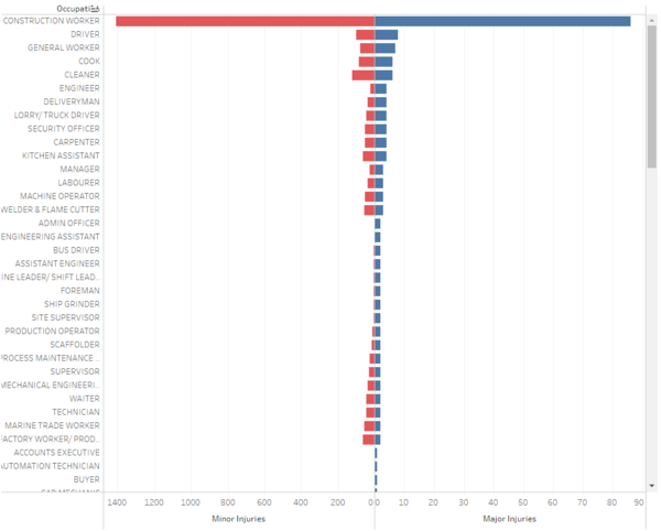
The first visualization is a divergent bar chart. This helps to visualize the spread of injuries across the different occupations. As opposed to trellis plot, divergent bar chart allows comparison of both major and minor injuries and viewing both collectively at the same time. However due to the difficulties in filtering the data with other charts properly, I was not able to put it aside with other charts to offer more insights.
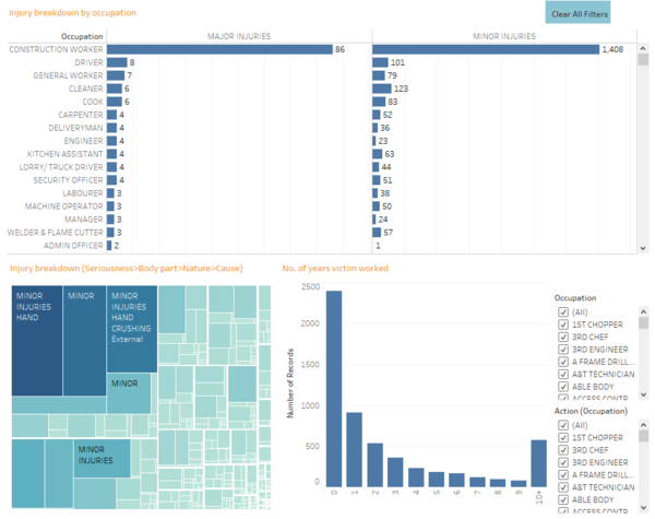
On the other visualization, I used the trellis plot to show the breakdown of occupations against major and minor injuries. This time, I am able to link actions and filters to other infographics to gain better insights. Linking it to a treemap, when I select an occupation/seriousness of injury, I can view the breakdown of the injuries by their body part, nature and cause. This offers more insights and tells viewers the type of injuries each occupation is more common and susceptible to. On the other side, using a bar chart, I am able to view the years of experience the victim has. If more victims have little years of experience, it can mean that inexperience is a factor for the injuries.
Tools Utilized
- Excel 2013 for data preparation
- Tableau for visualization
