IS428 2016-17 Term1 Assign1 Rachel Tay
Contents
Abstract
It is undeniable that urban planning is essential in Singapore given the limited land available and growing population. Categorising the market into the five planning regions, it is evident that there is an oversupply of private residential units, and 2 planning areas that are relatively expensive given their planning region. In light of these trends, I proposed 3 policy recommendations. Firstly, ample demand has to be hyped to match the oversupply in the market, especially in the North. Secondly, the unit price per square metre in Yishun should be reviewed as it is priced relatively more expensive than the units in the same planning region. Lastly, the employment of expansionary measures should be considered to boost the sluggish demand.
Problem and Motivation
Due to the vast lack of land in Singapore, urban planning has always been a key discussion topic. The authorities have invested a lot of resources and effect into ensuring that there is sufficient land resource to support the every progress and development of the nation. With this in mind, I would like to explore the current status of the private residential properties market, in terms of its supply and price, and answer determine if there is an oversupply in the market and if the private housing unit prices in each region are affordable in relative terms.
To standardise the property types that are classified under private housing, all landed and non-landed properties, excluding Executive Condominiums were considered to be private residential properties in my analysis.
Tools Utilised
1. Excel 2015 for data organisation purposes.
2. Tableau for data visualisation purposes.
3. REALIS and data.gov database for data.
Private Properties Supply
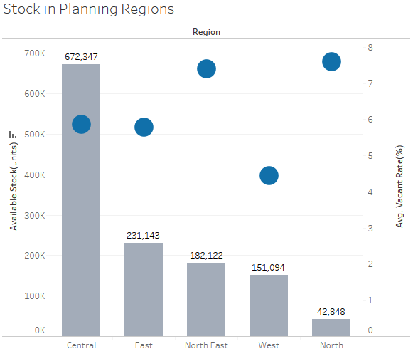
In economic terms, supply is depicted as the total amount of a specific good available. Hence, I used stock as the attribute that reflects the supply of private properties in Singapore as stock is defined to represent the “completed units or space, whether occupied or unoccupied, that is available for physical occupation” by the data dictionary in the REALIS database. I plotted the following graph with this information.
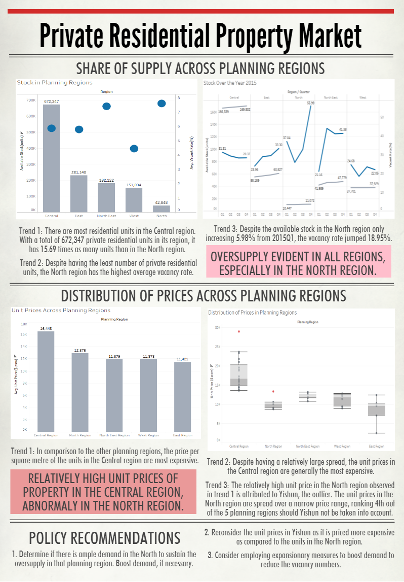
The bar chart generated above shows the total number of private residential units and its respective average vacancy rate across the 5 different regions. Seeing that the values represented in the chart are discrete measures, they were displayed as points for the vacancy rate and in bars for the available stock. Keeping in mind that a bar graph is a useful encoder for quantitative values, I chose to represent the available stock with a bar chart as it allows for easy comparison of their bar lengths and the relative magnitudes of the number of units across the planning regions. I chose to represent the vacancy rates with points as they can encode the values using location alone and should I use bar charts again, overlapping the bars would come across as confusing as their respective axes are different. On top of all these visual considerations, as I am using roughly the same axes and the same measures, I standardised the colours used for each measure for easy comparison and reading.
With this chart, I derived 2 conclusions:
Trend 1: There are most residential units in the Central region. With a total of 672,347 private residential units in its region, it has 15.69 times as many units than in the North region.
Trend 2: Despite having the least number of private residential units, the North region has the highest average vacancy rate.
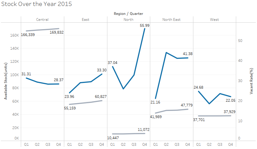
In light of the 2 trends observed previously, I was interested in seeing if the trends were consistent throughout the year or if it were consequences of abnormal incidents. Hence, I decided to take the time variable into account when generating the following graph.
When tasked to encode the time-series data, it would have been difficult to follow the chronological sequence of the values depicted in the graph should I only mark it with points alone. Hence, I depicted the points through line graphs on a dual axis.
With this chart, I have my third trend.
Trend 3: Despite the available stock in the North region only increasing a mere 5.98% from 2015Q1, the vacancy rate jumped 18.95%. A possible rationale for this trend could pertain to the over supply of stock in the region; an increase in the number of residential units would only increase the number of vacant units, and hence vacancy rate.
Private Properties Price
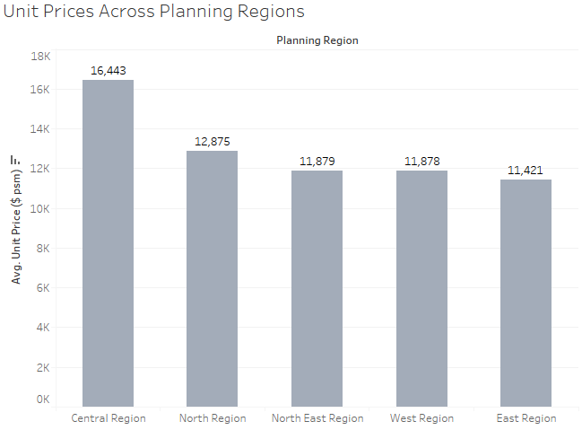
I plotted the unit prices per square metre across the various planning regions so as to grasp the relative weights between the different regions. I have chosen to extract out the unit price per square metre to represent the prices in my analysis as I believe that a more quality analysis can be formed when normalised values are used instead of absolute ones. With this information, I have once again visualised it using a bar chart as I believe that it would allow me the immediate recognition of the prices in each planning region.
With this, I found out the following trend.
Trend 1: In comparison to the other planning regions, the price per square metre of the units in the Central region are the most expensive.
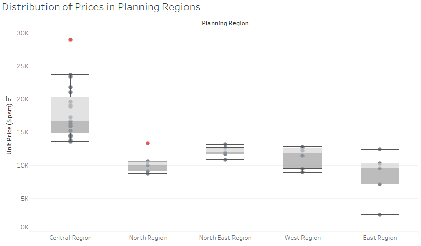
In light of this information, I zoomed in and took the effort to detail the unit prices in each planning area in hopes to find the general distribution of the prices. Since box-and-whisker plots are non-parametric in nature, I chose this visualisation method to grasp a general understanding of the distribution of the prices across the different planning areas in each region.
In a box-and-whisker plot, the spacing between the various portions of the box depicts the degree of dispersion and skewness of the data. With this, I was able to derive the following trends.
Trend 2: Despite having a relatively large spread, the unit prices in the Central region are generally the most expensive.
Trend 3: There are 2 outliers observed in this boxplot. To make these points easier to spot, I have dosed them in bright orange for a higher visual impact. In the column of Central region, the planning area with the abnormally high unit price belongs to Orchard. This, in my opinion, is expected as Orchard is considered a prime location in Singapore, hence it follows that a residential unit would be expensive. However, the other outlier, Yishun, which resides in the North region requires some investigation. After zooming into the planning areas, it should be noted that the relatively higher unit price in the North region is primarily attributed to the Yishun outlier. Generally, the unit prices in the North region are spread over a narrow price range, where in fact, they rank 4th out of the 5 planning regions should they be ranked in terms of median unit prices.
Policy Recommendations
1. Look into the demand for the private residential units in the North region before establishing the number of units that should be developed. The increasing number of vacant units represent the trend of an increasing oversupply of private residential units in the North region. Given the inflexible nature of supply in this context, I would recommend that the new projects due in the year 2016 be cut down to ensure efficient use of space and resources. An alternative would to to boost demand in the North region, be it through marketing or other measures to see the reduce the waste (in terms of vacancy rate).
2. The unit prices in Yishun should be reviewed as it is priced more expensive as compared to the units in the North region. Given that it is a heartland area, it would be in the people’s interest, and hence the government's interest, for the prices to be affordable, especially relative to the neighbouring areas.
3. The government could consider employing expansionary measures in order to boost demand in the private residential properties market. The existence of vacancy units depict that there is an oversupply of private residential units in the market.
