IS428 2016-17 Term1 Assign1 Gwendoline Tan Wan Xin
Contents
- 1 Abstract
- 2 Problem and Motivation
- 3 Approaches
- 4 Tools Utilized
- 5 Infographic
- 6 Results
- 6.1 Chart 1 - Office Space Selling At A Lower Price
- 6.2 Chart 2 - Location, Little Role To Play In Price Determination
- 6.3 Chart 3 - More Office Spaces Planned To Be Released Islandwide
- 6.4 Chart 4 - More Commercial Space Openings In Each Area
- 6.5 Chart 5 - Office Spaces Renting Out At A Cheaper Rate
- 6.6 Chart 6 - Investors Worry, Vacancy Rates Show No Signs Of Decreasing
- 7 Conclusion
Abstract
With the introduction of cooling measures in the private residential property market, more property investors are turning into the commercial property market. However, as more people buy and develop commercial properties, the market is getting unfavorable in 2015. An analysis was conducted to identify possible issues in the market. This is important to prevent investors from leaving Singapore, as they continue to lose profits. The analysis shows that supply of property spaces is high but demand for it was low. Vacancy rates across all property types show no signs of decreasing. Although office spaces were cheaper, the vacancy rate remained similar as those in retail/shop spaces. Three policies were then, identified in an attempt to alleviate the situation in 2015.
Problem and Motivation
The Singapore Government has been introducing cooling measures in the private residential market to prevent a real estate bubble burst. As such, many property investors have changed their attention towards commercial property. With majority of investors rushing to invest in the commercial property market, its investment potential remains questionable. In a worst case scenario, property investors may decide to leave Singapore if they feel that they can’t make enough money. This becomes a problem for the government as Singapore relies on local/foreign investments to attract large corporations to its shore. In order to prevent this situation from occurring, it is important to closely analyse the commercial property market situation in 2015. This would allow the government to introduce new policies or make improvements now, so that property investors will continue to stay in Singapore.
The analysis will identify:
- existing/planned supply of private commercial property types
- distribution of sales/rental prices of commercial property types across different regions in Singapore
This analysis hopes to address ways to ensure that land areas in Singapore are used efficiently and that investors will continue to remain in Singapore, despite the economic gloom.
Approaches
To analyze the commercial property market, data from REALIS database will be used. REALIS is a large database, provided by URA and it provide lots of data for analysis. However, downloading all the data will be too time-consuming. As the problem focus is on the commercial property market, I will only look at data related to this segment of the market. Assuming that the commercial property data has been downloaded, this section will detail the approach taken to examine and analyse data.
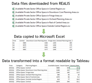
- The data downloaded is split into multiple csv files and it is not ‘analysis-friendly’. As such, a new excel file is created to consolidate all the data in each csv file for analysis to be carried out in Tableau. An example of the data cleaning process is shown on the right.
- The consolidated data is imported into Tableau. Using the drag and drop features in Tableau, a chart is then generated.
- Based on the chart findings, questions start to surface as to why the pattern or trend is happening. Possible reasons such as prices or location which might play a factor in the derivation of the pattern were identified.
- Filters were then further employed to analyse the data into greater detail. If required, more data is then collected to be used for analysis in order to identify a probable solution for the trend that is happening.
- The entire process of chart generation, identifying trends and finding reasons repeats until possible reasons about the trend happening has been identified.
Tools Utilized
The following tools are used during the project:
- Microsoft Excel – Data cleaning and transformation so that it can be imported into Tableau for analysis
- Tableau – Chart generation and analysis
- Microsoft PowerPoint – Creation of analytical infographic
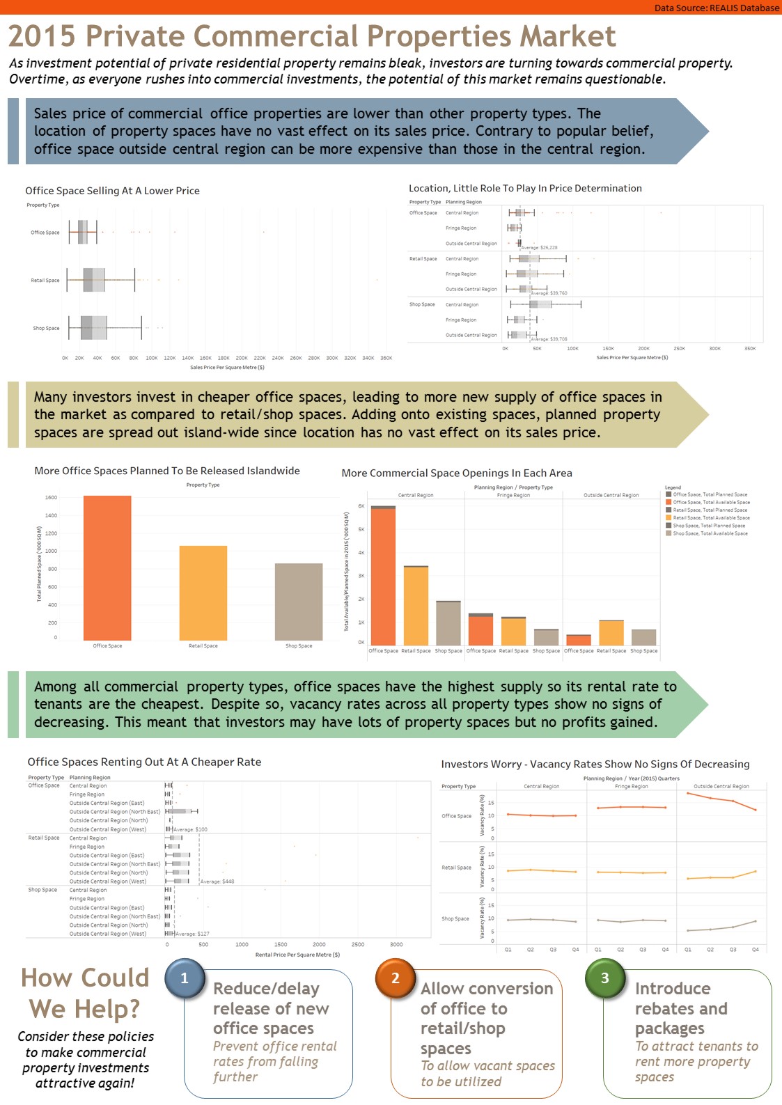
Infographic
Results
The design decisions, sorting and data transformation for each chart will be detailed according to the order displayed in the infographic. In general, the following principles are used across all the charts.
- As we are identifying polices to recommend, the main target audience of the infographic are assumed to be government officials or URA. They have little time to analyse each chart individually but have knowledge about the private commercial property market and the respective development/planning regions in Singapore. As such, the Singapore map depicting each region will not be shown to prevent information clutter.
- For each chart, the chart title will identify the main takeaway message. This aims to guide the user to better understand what’s going on in the chart and look out for areas they should pay more attention to.
- Similar colour encodings are used across all the charts to help users better identify the section that they are interested in. For example, bar/lines that are related to office space are highlighted in dark orange while those related to retail space are highlighted in light orange. When users are interested to focus on only office space, they can scan through the infographic and look at data which are highlighted in dark orange.
- Each chart will have its own X-Axis and Y-Axis labelled so that users will know what the data represents.
- All quantitative scale in the charts starts from zero to prevent data misrepresentations.
- All charts that took planning regions into consideration will be sorted in the following order: Central Region, Fringe Region and Outside Central Region. Moving out from the core to the exterior, this order will allow people to visualize the regions easily as they view the charts.
The charts will be elaborated based on the order in the infographic. Chart 3, 4 and 6 discuss patterns on the share of private property supply. Chart 1, 2 and 5 discuss patterns on the distribution of private property prices.
Chart 1 - Office Space Selling At A Lower Price
Data used - Sales price of each property based on per square metre
The chart is plotted based on the following data:
- X-Axis: Sales Price Per Square Metre ($)
- Y-Axis: Property Type
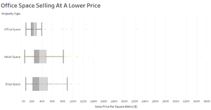
In this chart, we are interested to compare across 3 commercial property types. The use of a box plot will allow us to clearly identify the average sales price of each property type per square metre, at one glance. Also, we are looking at a range of property prices for sale, a box plot will be used to easily identify the general price range across all the property types.
Analysis/Trend Identified: Across all 3 commercial property types, office spaces are selling at the lowest price. However, there are also outliers where office spaces are more expensive than both retail and shop spaces.
Chart 2 - Location, Little Role To Play In Price Determination
Data used – Sales price of each property based on per square metre
The chart is plotted based on the following data:
- X-Axis: Sales Price Per Square Metre
- Y-Axis: Property Type, Planning Region
Data transformation is performed to get the planning region. In the data downloaded from REALIS, the planning regions are North/East/North-East/Central/West. However, in other datasets, the planning region are classified as Central/Fringe/Outside Central Region. Due to their differences, it may be difficult for people to suddenly visualize totally different region sets. As such, data transformation is performed in Excel to convert the planning regions into Central/Fringe/Outside Central. The planning area and REALIS’s planning area/region information are used to identify the regions correctly.
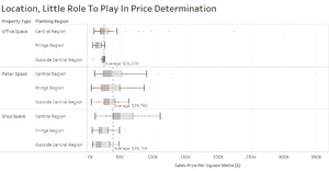
Similar to Chart 1, we are interested to compare the sales price of each commercial property types. This is a detailed version of Chart 1, where we zoomed into finding out whether the location of the property space affect the sales price of the property. Therefore, with similar reasons, the box plot is used for easy visualization.
In this case, we are looking at the breakdown of price distribution for each property type based on the planning region. The reference line is drawn to show the average cost of buying each respective property space based on the planning regions. On each reference line, the computation type (in this case, average cost) is shown so that users will know what the reference line means. The value is also shown on the reference line for greater precision so that people will know how much it takes to buy each unit of the space, on average.
Analysis/Trend Identified: Sales price of office space is the cheapest, as reflected in Chart 1. However, this chart shows that the location does not greatly affect its price as well. Looking at retail/shop space, the position of each box plot is relatively similar despite changes in its location. One interesting discovery is that prices of office space outside the central region can be more expensive than those in the central region. Although 50% of office space in central region is above average, the other 50% of the office space can be cheaper as shown by the position of the box plot.
Chart 3 - More Office Spaces Planned To Be Released Islandwide
Data used – Total planned space for each property type in 2015
The chart is plotted based on the following data:
- X-Axis: Property Type
- Y-Axis: Total Planned Space (‘000 SQ M)
In the dataset, the supply of planned space is given based on the respective quarters (Q1, Q2, Q3, Q4). To visualize the amount of new planned space for 2015, the sum of the planned space was taken.
A bar chart was used to show the distribution of the new supply of spaces for each property type. Generally used across newspapers and articles, use of a bar chart ensures that everyone understands the distribution of property supply. It also effectively shows the share of new supply in one glance.
Analysis/Trend Identified: There are more planned supply of office property spaces in the commercial property market.
Chart 4 - More Commercial Space Openings In Each Area
Data used – Total available and planned space for each property type in 2015
The chart is plotted based on the following data:
- X-Axis: Planning Region, Property Type
- Y-Axis: Total Available/Planned Space (‘000 SQ M)
To illustrate the total space at the end of 2015, only Quarter 4 data is used for both planned and available space illustrated in the chart.
Similar to Chart 3, a bar chart was used to effectively help users understand the share of property supply in the commercial property market. However, a stacked bar chart was used. Using similar colour encodings, each property type has its own colour codes. Using office space as an example, the available space was colour coded in dark orange. The planned supply was colour coded in dark grey and stacked above the available space bar. Together, the stacked bar shows the total supply of property spaces in 2015 sorted by planning region and property type. The planned supply was colour coded in the same colour regardless of its property type to prevent people from getting confused if too many colours were used.
A legend was also added to help users understand the colour encodings used in the chart.
Analysis/Trend Identified: There are new supply of commercial spaces across all regions regardless of its property types. Supporting Chart 3, the chart shows that office spaces have a greater increase in supply as compared to other property spaces.
Chart 5 - Office Spaces Renting Out At A Cheaper Rate
Data used – Rental price of each property type, given in percentiles
The chart is plotted based on the following data:
- X-Axis: Rental Price Per Square Metre ($)
- Y-Axis: Property Type, Planning Region
The dataset given for rental prices were limited, with the rental prices given by percentile. As such, it has to be plotted onto a boxplot so that the data can be effectively represented. Because of this, Tableau has made calculations on its own to plot the respective data points onto the chart itself. However, each respective values (median, lower quartile, etc.) of the box plot corresponds with the data given.
The planning regions indicated in the data also differs from other datasets. In order not to misrepresent the data by putting all the rental prices under the same planning region, the data label has been edited to allow users to visualize the planning regions easily. For example, the North Region is labelled as “Outside Central Region (North)”.
A reference line was also drawn to shown the average rental cost of renting each property space based on the respective regions. The computation type and value is also shown to allow users to understand the data clearly (similar reasons as the use of reference line in Chart 2).
Analysis/Trend Identified: Commercial office spaces have the lowest rental rate, as compared to other property types.
Chart 6 - Investors Worry, Vacancy Rates Show No Signs Of Decreasing
Data used – Vacancy Rates
The chart is plotted based on the following data:
- X-Axis: Planning Region, 2015 Quarters
- Y-Axis: Property Type, Vacancy Rate
The chart aims to compare the vacancy rates of each property type based on its region. As it illustrates the vacancy rate of a time-scale, a point is used to identify each quarter and a line is drawn to clearly show the changes in the vacancy rate overtime.
Analysis/Trend Identified: Vacancy rates remain relatively constant for all property types in the central and fringe region. There is a slow decline in vacancy rate of office spaces outside the central region, which signifies a good thing but illustrates a rise in vacancy rate for retail/shop space. Nonetheless, the vacancy rates remain relatively high, in the double-digit range. This shows that there is an over-supply of property spaces and there was no demand for it.
Conclusion
Based on the trends and findings, three policies to improve the situation has been identified. One major problem was the over-supply of commercial property spaces, especially office spaces. Rental rates were low for office spaces but for retail spaces, it remains relatively high. As such, it is important for the government to reduce the supply of these spaces so that rental rates will not decrease further due to the over-supply. At the same time, policies can be implemented to attract tenants to take up these spaces and allow property developers/investors to have the flexibility to convert their existing office space to retail/shop space in order to better utilize vacant spaces.
In future, more data can be collected to complement the above findings and identify reasons as to why vacancy rates are so high and whether the slowing economy has caused companies to close down or reduce their company space to cut costs.


