IS428 2016-17 Term1 Assign1 Liang Bing
Contents
Abstract
The focus of this report is using data visualization tools and techniques to find the change patterns of private property's supply and price by type of private property and regions in 4 quarters in 2015. By analyzing the patterns and their relationships, the report aims to give insights for suggesting development policies in 2016.
Problem & Motivation
Using the data set I have chosen, I have done a mini analysis to decide the attributes/variables which I am interested to study. And I found that the supply and price pattern for different types of private properties and for private properties in different regions appear to be clear and insightful. It drives me to think the following questions:
- What's the overall pattern for private properties' supply and price?
- What's the supply and price difference for different types of private properties?
- What's the supply and price difference for private properties in different regions?
- What's the relationship between the price and supply for the above two scenarios?
With these questions in mind, the data visualization and analysis conducted in this article should find out useful patterns, help me answer the above questions and suggest the policy of private properties supply for 2016.
Tools & Sites
Tools
- Microsoft Excel: Always powerful and user-friendly in dealing with huge data set. Used for merging data from different files.
- Tableau: Very powerful tool for data visualization and data analysis. However, it is lacking of a user-friendly UI and tutorials for rookies.
Sites
- The official Urban Redevelopment Authority website : It contains quite clear words explanation which helped a lot when I was confused about the URA data's terminology.
Approaches
Overall Supply Pattern in 4 Quarters in 2015
- Data Source: The data source selected for this portion is Supply of Executive Condominium Units in the Pipeline.csv,Supply of Landed Private Residential Units in the Pipeline.csv and Supply of Non-Landed Private Residential Units in the Pipeline.
- Step by Step:
1. Data set combination: to facilitate Tableau data importing, I used excel to combine the data from these three csv files. This excel file basically has one column for quarters and three columns for supply of three types of private properties.
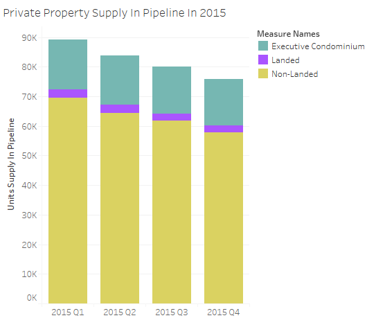
2. Data visualization: In order to know the supply pattern in 4 quarters in 2015, the graph plotted should clearly portray the total units supply for each quarter for comparison. Therefore, bar graph is used. Each bar represents the private property units supply for that quarter, and the height represents the sum of all kinds of private property units supplied in that quarter. Also, to prepare the insights for the following questions, the bar graph is designed to be stacked bar graph in which the portion of each private property type is included in the bar. The height of each colored portion represents the share of that type of private property over the total number of units supply in respective quarter. The higher the colored portion, the larger the share.
The graph is plotted by 1) place the quarter dimension at the x-axis and 2) place the measured value (contains the units supply for executive condominium, landed property and non-landed property) at the y-axis.
The graph showed the following two patterns for private property units supply:
- The units supply in 2015 is showing a decreasing trend
- Non-Landed private properties formed the major part for the private property units supply in all quarters in 2015
